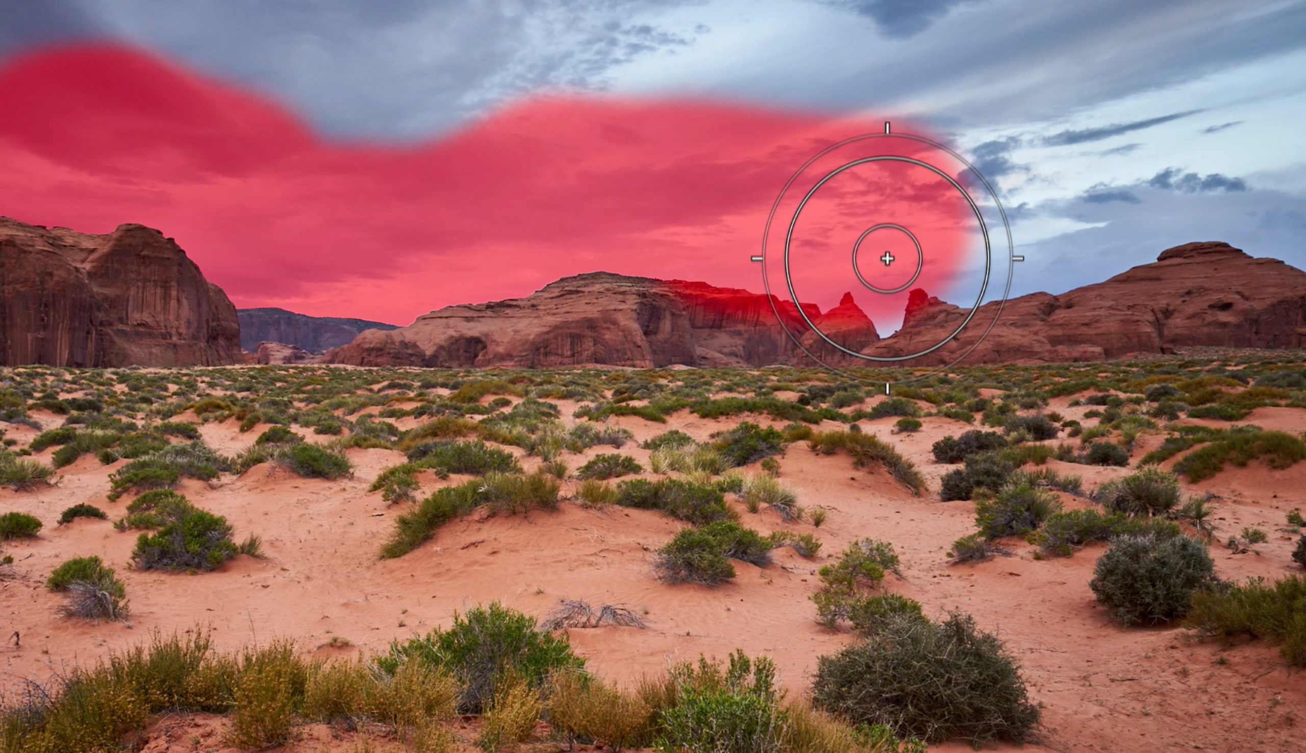
Capture One Pro 12
Learn how to:
✓ Dodge and Burn using Flow
✓ Refine and feather masks
✓ Auto-mask
Length: 6:00 minutes
Download a 30-day trial of Capture One.
Capture One Pro 12
Learn how to:
✓ Dodge and Burn using Flow
✓ Refine and feather masks
✓ Auto-mask
Length: 6:00 minutes
Download a 30-day trial of Capture One.
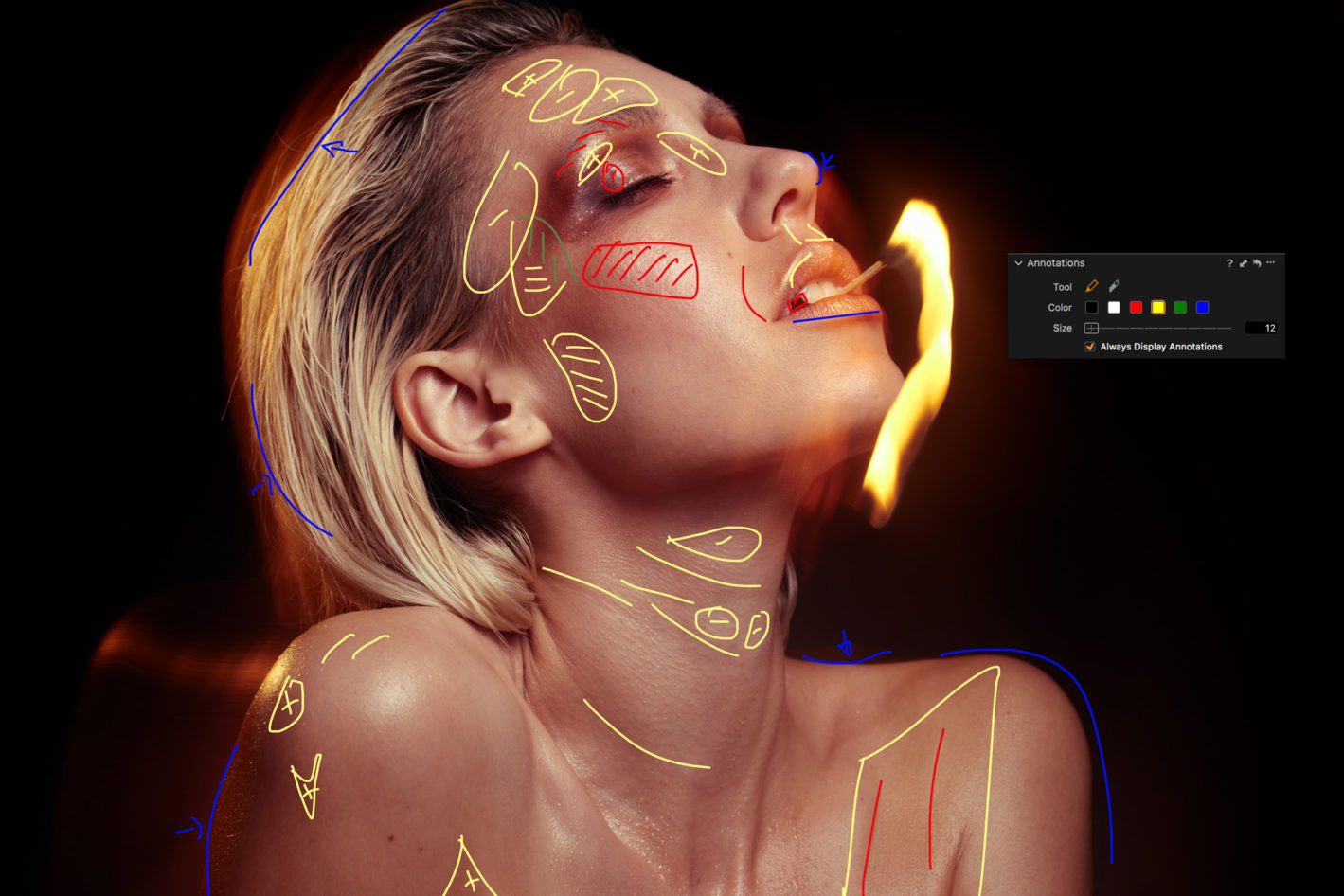
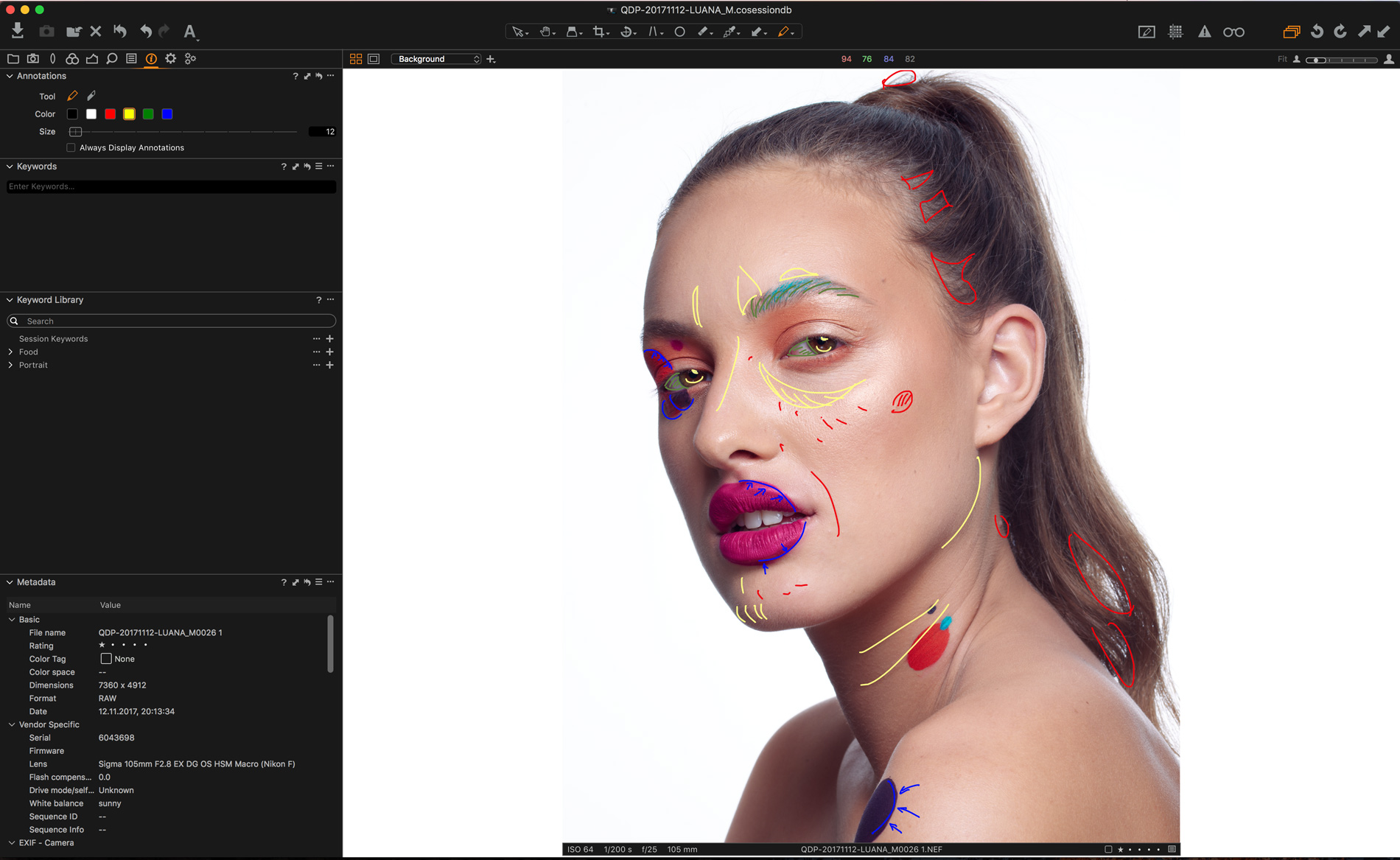
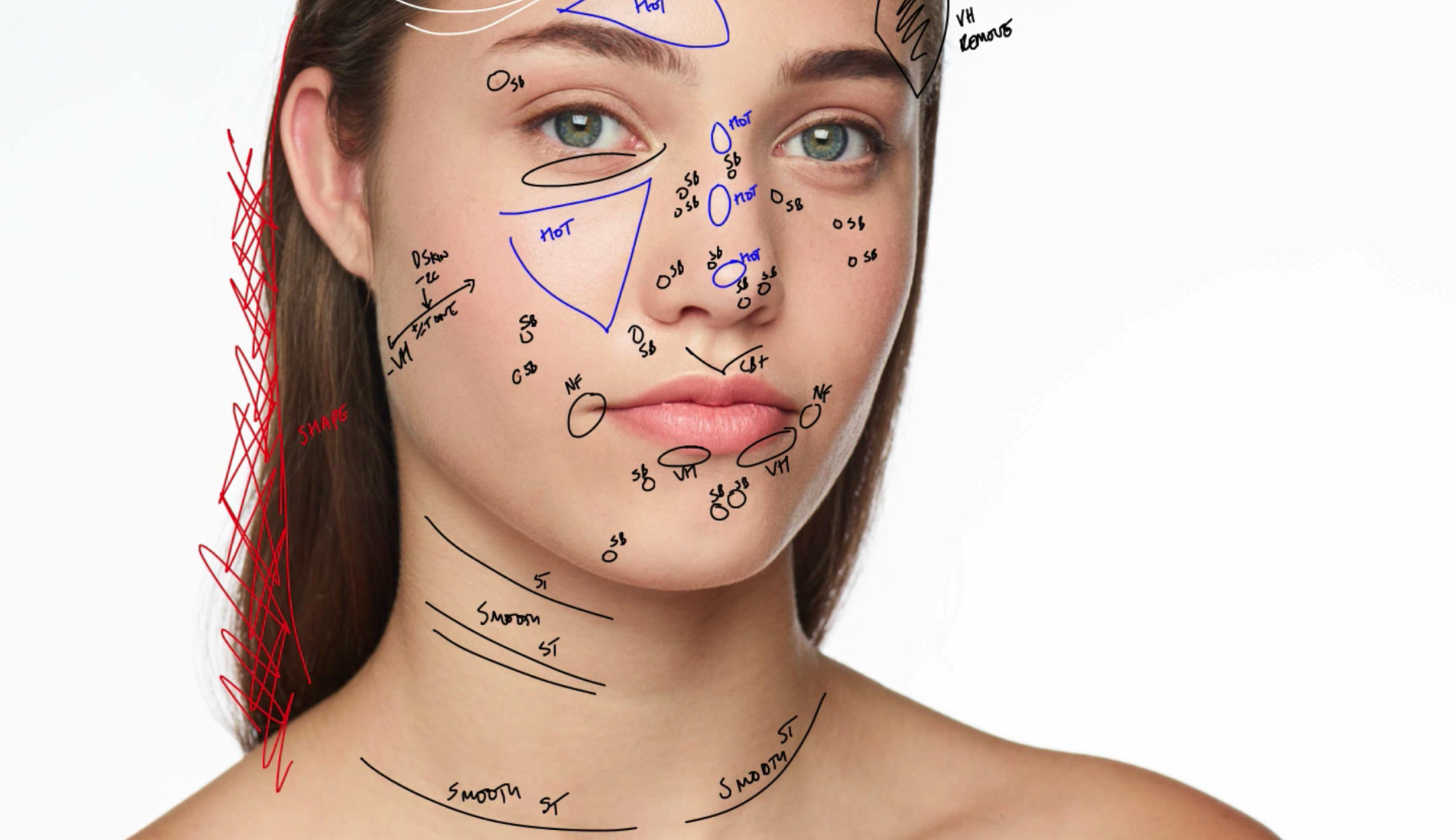
Analyzing an image before retouching is a crucial element to achieving a beautiful and natural result. You can learn all the techniques in the world, but if you don’t know what to retouch, applying those long hours of training may prove complicated. Thanks to Capture One 11 and the brand-new Annotations tools, this whole process can be made easy and visual to help you streamline your workflow and communicate better.
Annotations are fantastic for many reasons and different people. From the photographer to the retoucher, or the makeup artist and artistic director, everyone has a say when working on set. The photographer may ask the retoucher for a specific color grading, the makeup artist may notice something that will need some retouching later, or the artistic director may require a new crop to satisfy the client’s needs. Whatever it is, up until now you probably had to open up a text file and take notes of what had to be done on which image. Thanks to the new Annotations feature in Capture One 11, you can now add anything directly on your image without leaving your preferred photo editing software and without altering the image quality either.
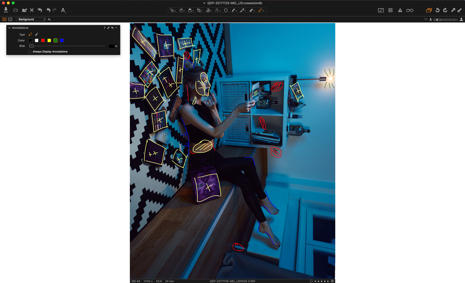
If you are working on your own and not with a team, relying on annotations may still be beneficial to your work. Have you ever found yourself editing your image but looking for what to do next? We’ve all been there. Analyzing the issues and how to make your picture visually stronger is a crucial part of the job. It’s one way to cut your retouching time dramatically and learn to stop going too far. Take it as a retouching meditation, slow down first to then be more efficient.
Adding annotations is straightforward. You simply use the Annotations brush tool and draw on your image. That’s it! You may not be the best painter, but it doesn’t matter: the goal is to make your annotations explicit enough for the person who will read them later on, be it your retoucher, client, or yourself.
You can rely on your trusty trackpad or mouse to make new annotations, but if you own a Wacom or any other graphics tablet, you’ll be better off using that as it’s easier to draw accurately and clearly. And, if you don’t have one, it may be a good excuse to treat yourself and bring your retouching to the next level!
By now, it should be clear why Annotations is so useful and how Capture One Pro 11 makes it easy for you to annotate your images. However, you can go one step further and use different colors. I’d even say that you really should use different colors to create annotations that are as useful as possible.
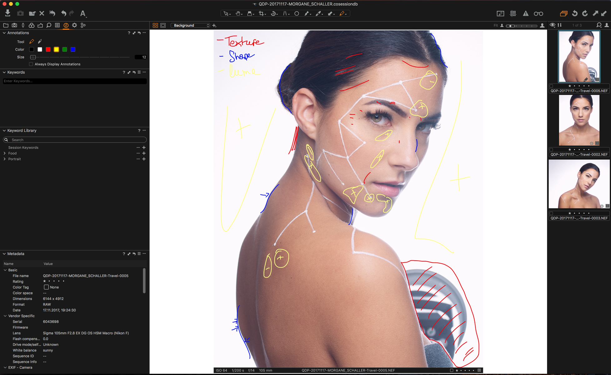
There are different color codes out there when it comes to image and art annotations. Some people use the GSCE Art annotation format, while others like to use the color order to then match it with layer colors in Photoshop (texture, luminosity, color, for example), and I’m sure there are tons of other styles of annotations out there. The most important thing is to make clear as to what color means what. Don’t circle in blue the texture issues in one session, and then use blue for color problems in another one. You’ll end up lost. Define your standard, make it clear to the people you’re working with, and base your workflow on that.
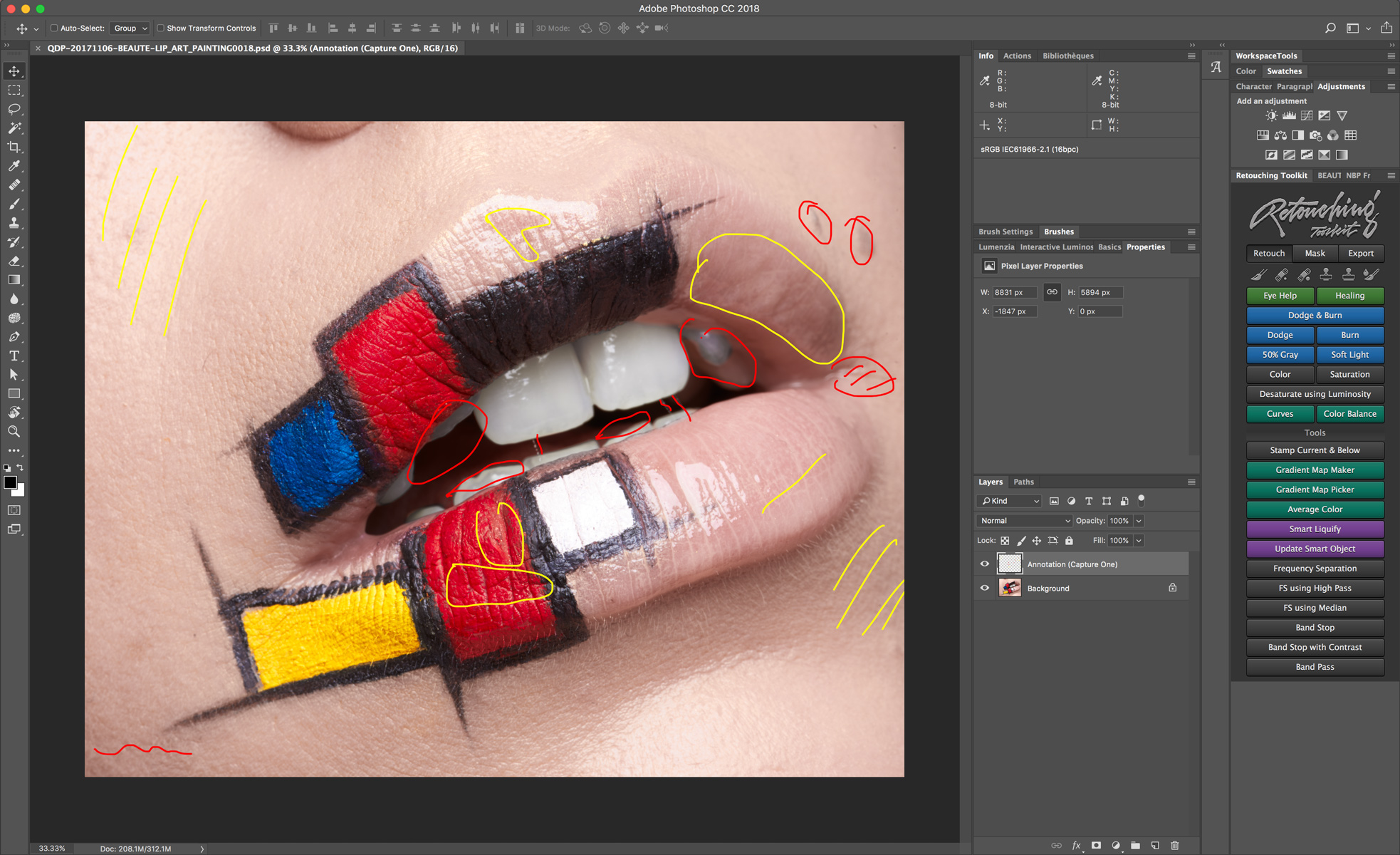
One last thing before you go to Capture One and try this fantastic Annotations feature. When processing your files using the Processing Recipes, under the metadata tab, you’ll find new options. One of which is designed to export your Capture One annotations as a new layer in your PSD file. It’s extremely handy if you want to keep your whole retouching workflow based on your initial annotations and not have to redo the work in Photoshop. It’s also fantastic if you give your retoucher PSD files instead of RAW files. There they’ll have all the info they need to retouch your image within the file, and you won’t have to write numerous paragraphs in a long email to explain what you want.
… And before I leave you with the free 30-day trial, here’s a page where you can see how to use the Annotations feature in Capture One 11 as well as all the other new features available – go to Capture One Tutorials.
NOTE: This article discusses an outdated version of Capture One. To learn more about our latest version, click here.
Capture One has many tools and features that might not be directly visible when first working with it. I’ve tried to gather some of the tips and tricks that help me when I work in Capture One. I hope at least one of them might be beneficial for your workflow as well!
If you don’t already own Capture One, download a 30-day trial and follow along.
Sliders make up most of the adjustment interface in Capture One. Even though they seem straightforward, there are a few tricks to learn that might optimize how you edit your images.
If you’re not familiar with Sessions in Capture One, you have probably been working in Catalogs, where you must import any image you need to work on. Capture One offers two different database types, where Sessions is the original way of working in Capture One.
When working in a Session, you can browse any folder on any available drive and see the content of this folder. This is useful if you need to quickly edit and export a few images where the RAW files don’t need to be stored anywhere inside a Catalog or Session afterward. Simply drag an image from any folder into a Capture One Session, or browse the folder via the Library Tool, and the content of that folder will show.
It’s important to mention that this will not add the folder or images to any indexed database. If you need this done, add the folder as a Favorite or import the images into a Session Folder. Read more in-depth about Sessions in our User Guide.
Sometimes you want to see your images with a lighter background than the default dark grey. This is easily done from [Preferences > Appearance > Viewer > Color]. You can, for example, switch to white to obtain an improved visual evaluation process, as some images will be used on websites with white surroundings.
Enabling Proof Margin and increasing the size of it helps a lot as well. You can even make a shortcut to toggle it.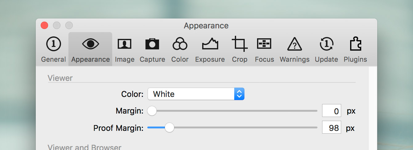
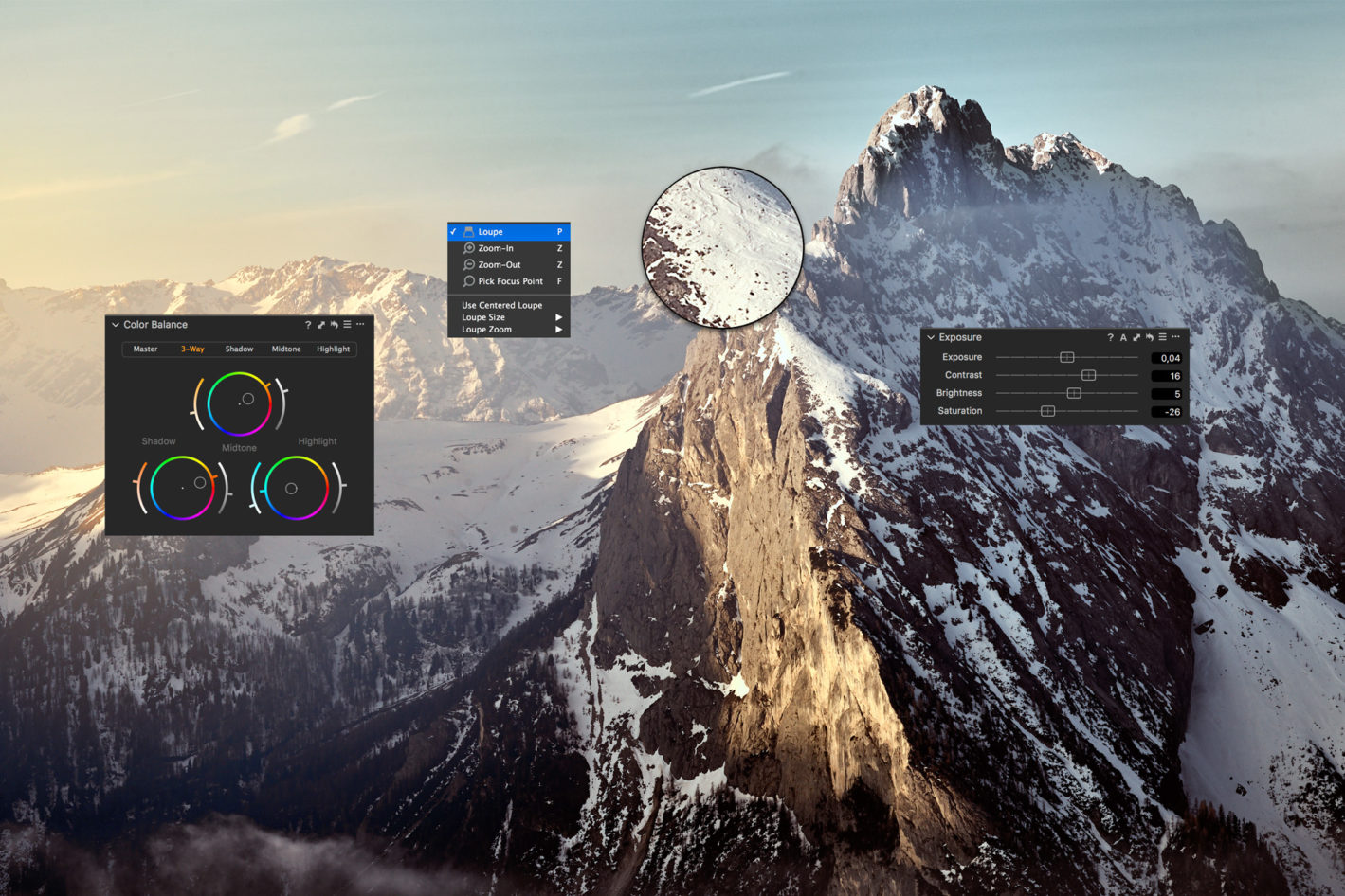
Having hundreds of images with different Kelvin values is very common for any type of event photography. Changing the warmth across all images is only a few clicks away using the Color Balance Tool. Select one image and tweak the warmth using the Master part of the tool. To copy onto the rest of the images, follow these steps:
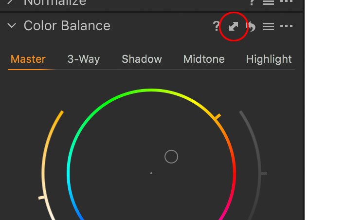
Read more about the Color Balance Tool.
If you have ever worked in the Advanced Color Editor and wanted to change more than the sliders allow to your selection, you’re not alone. Capture One can create a new layer from the selection in the Advanced Color Editor. Simply define a color range using the color picker, click the three dots in the top right corner of the Advanced Color Editor and select ‘Create Masked Layer from Selection.’ This will create a new layer with a mask based on your selection. If you need to blend the edges of your mask, right click on the newly created layer and select ‘Refine Mask…’
Remember that both color selections and masks can be inverted, for example, to separate the skin of a person from the rest of the image, or to select everything but the blue sky in a landscape.
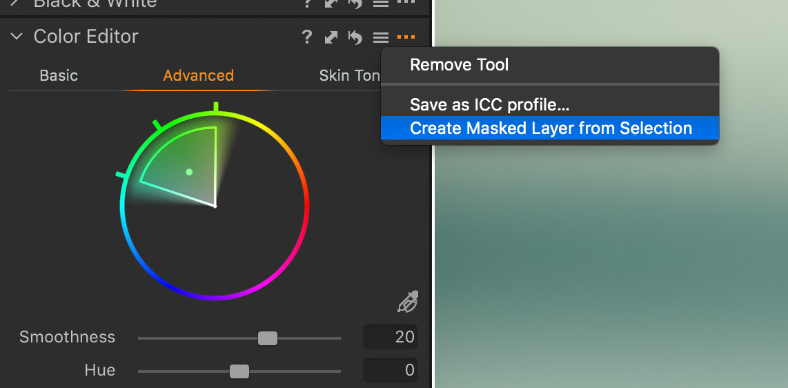
Read more about creating a masked layer from the Color Editor in our User Guide.
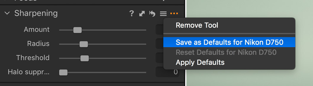
If you think your images always seem a bit over- or under-sharpened out of the box, fear not. You can change the value of almost any slider and save this value as the new default for your camera. Click the three dots in the top right corner of the tool you’re in, and select ‘Save as Defaults for (camera model).’
Every image from that specific camera model will now have these new default values applied.
Do you never use the LCC Tool? Remove it. Don’t like the placement of the Grid and Guides icon in the toolbar? Move it. Need a custom Tool Tab with your favorite tools? Add it. The interface of Capture One is highly customizable, and there’s no need for you to settle with an interface you don’t like when you can simply change it.
Read more about customizing your workspace.
When color grading your images, you sometimes want to adjust the luminosity and tweak the contrast a bit as well. In the Color Balance Tool, the shadows, midtones, and highlights all have a luminosity slider to the right of the color wheel. Play around with it to refine the luminosity of the three different parts of your image.
Just like the sliders, you can see the impact of a complete tool as well. Simply hold down the [option/ALT] key and long-press the tiny reset icon of the tool (a swirled arrow).

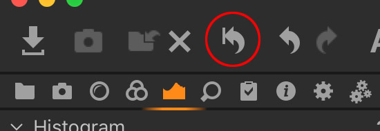
The same effect can be applied to all adjustments at once by holding the option/ALT key and long-pressing the global reset button in the top left corner.
You should always use the specific Black and White Tool to make your images achromatic. Bringing the saturation slider all the way down will not give you any benefits that the specific tool offers regarding color noise control and smooth gradients.
When adjusting the individual channels of the Black and White Tool, the White Balance will have an impact on the look of your image as well. Play around and you might discover a new approach to your black and white editing.
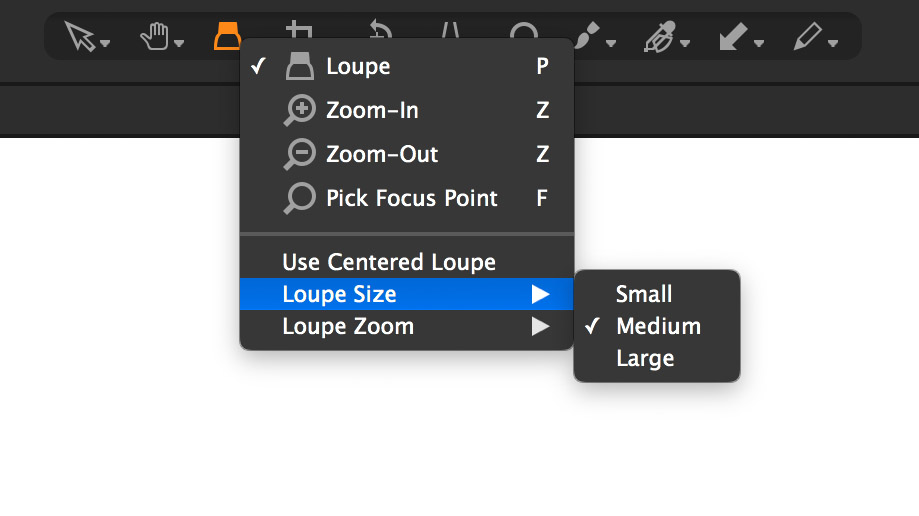
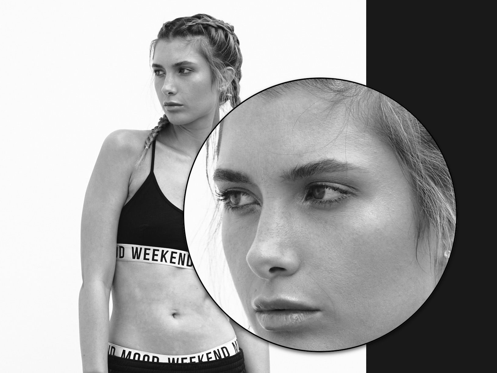
The Loupe Tool (shortcut: P) allows you to see a magnification of a selected area of your image in a loupe. Long-pressing the Loupe Tool in the top middle of the interface provides several options. You can change the size of the loupe as well as the zoom level inside the loupe.
If you need an instant quick-loupe without changing the cursor tool, press ALT + spacebar (CTRL + spacebar on PC) while hovering on the selected area of your image.
Do you have a tip that you would like to share?
Capture One Pro 11
Learn how to:
✓ Annotate your images in Capture One
✓ Include Annotations as a separate layer when exporting
Length: 1:42 minutes
Download a 30-day trial of Capture One.