Photography is all about telling stories from a new perspective. Or at least it is for Daniella Almona. Not seeing people like her represented in front of or behind the camera, the Nigerian-born fashion and portrait photographer has made it her mission to be a voice of change by centering blackness and color in all its forms in her work. Using Capture One Pro 23, the up-and-coming photographer has been playing around with the new features to find out how they help her better bring untold stories to life.

Daniella Almona has always been surrounded by bright colors. Growing up in Lagos, Nigeria, she recalls going to the market; the fruit and trees intermingled with the elaborate colors and patterns worn by the people around her creating vibrant scenes that still stand out in her mind. “I think that subconsciously inspired my love for color, which is a big part of my photography and the work I create.”
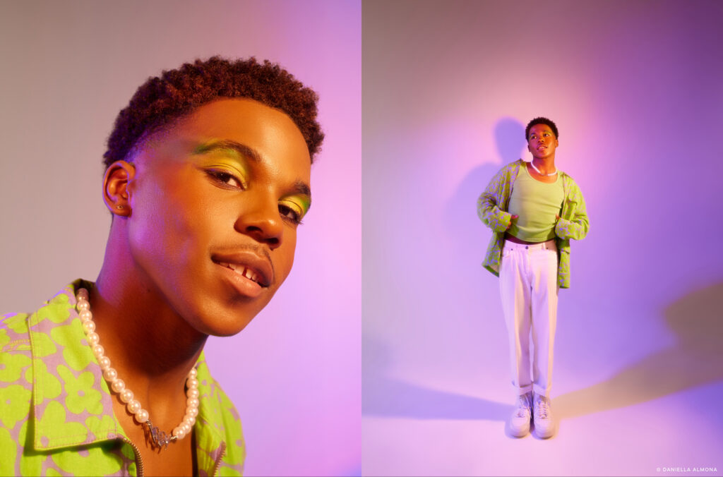
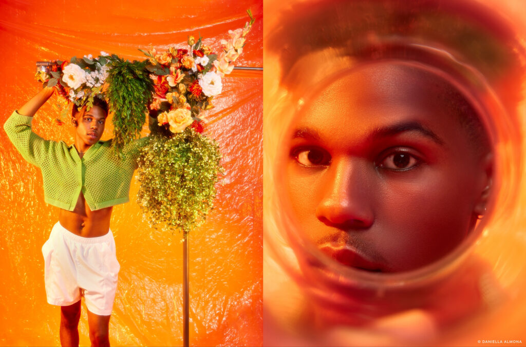
With lush greens, warm oranges, velvety blues, and more hypnotizing colors drawing the viewer into the frame, the now Atlanta-based fashion and portrait photographer has created a personal style that features intentional uses of color in her images to elicit emotion in both her subjects and the audience. “The way colors interact with each other is a huge part of what makes a person stop and admire a photograph,” she says.
Once set on becoming a doctor, Daniella first opened her eyes to the world of photography through an old, borrowed Canon, spending hours walking around her neighborhood taking pictures of the sky, grass, anything and anyone she would come across. Discovering the relaxation and a sense of calm in this exercise, her vision for the future changed. “I just never looked back”.
“I sort of realized that I like taking photographs of people specifically, that emotion. The personality that shows in the photo with each person and how different that is was very interesting to me.”
Highlighting blackness in all its forms
Despite her newfound passion, Daniella struggled to imagine herself as a professional photographer, not having seen many people like her in the job. And upon entering the industry, she could not overlook the glaring issue that Black women were hard to find on either side of the camera. “Growing up, I didn’t see a lot of representation of people like me in the media. And when I did see people that looked like me, it wasn’t portrayed by a person that looks like me.”
“I think it’s important that Black people tell Black stories. And of course, anyone is free to tell whatever stories they want to tell. But in my work, that’s the priority,” she says describing the level of consideration given to Black skin tones that Black creators and photographers often bring to an image. She feels that this is often lacking in a lot of the photos she sees.
“I do know white photographers that shoot black skin very well. But most of the time, the luminosity of the skin, the vibrancy of the skin, the skin tone aren’t paid attention to in the same way as if a Black photographer would have taken that photo. Because we know what lighting works on our skin. We know how to work with the shadows and highlights, how to work with the saturation and the skin. I think that’s one thing that many often overlook.”
RELATED: Polly Irungu on creating a space for Black women photographers
Today, her mission statement is highlighting blackness in all its forms. Most of her images depict Black models and stories about the lives of Black people. Like in her recent photo series “Crown” where she explores the topic of locks and Black hair. In the series, she works to portray the significance of dreadlocks and the meaning they carry for people who wear them. “Hair has always been a part of my identity as a black woman. These tight and coarse curls have become a crown I carry on my head.”
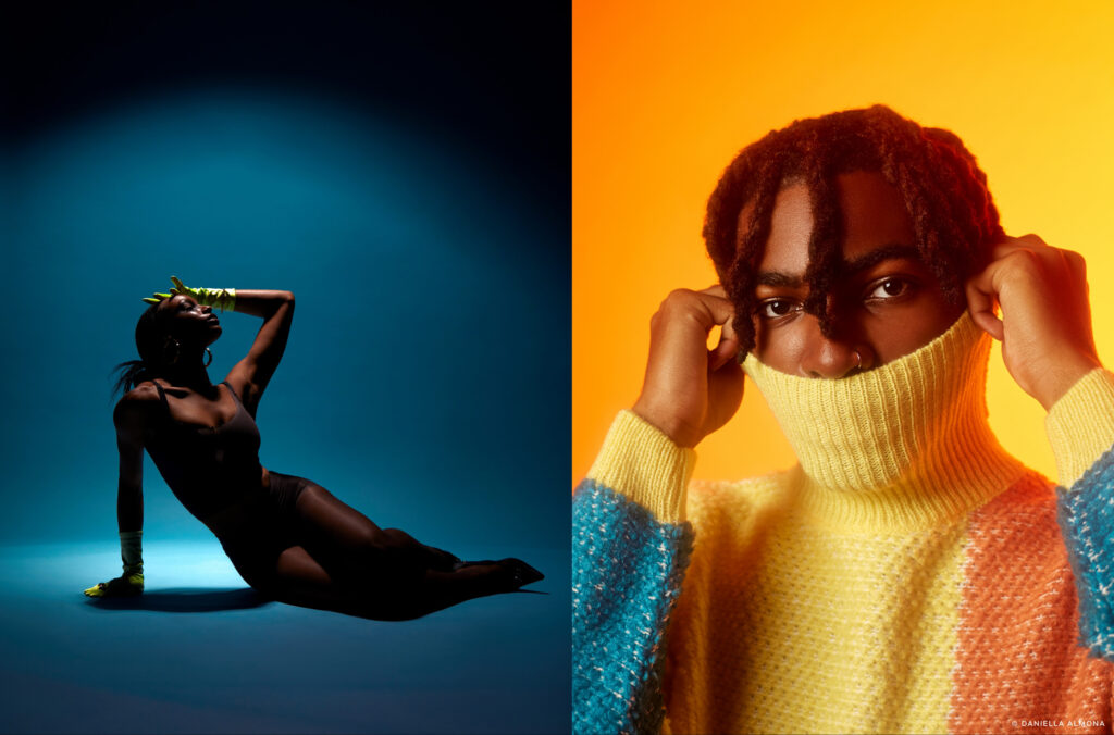
Shooting with her Canon Mark III and IV from a studio in Atlanta, Daniella’s love for colors comes out in her photo series for the release of Capture One Pro 23. Playing around with purple, orange, blue, and yellow lights in harmony with the colorful outfits of the models, she pays special attention to how the different tints reflect off their skin to pull out the emotion she wants.
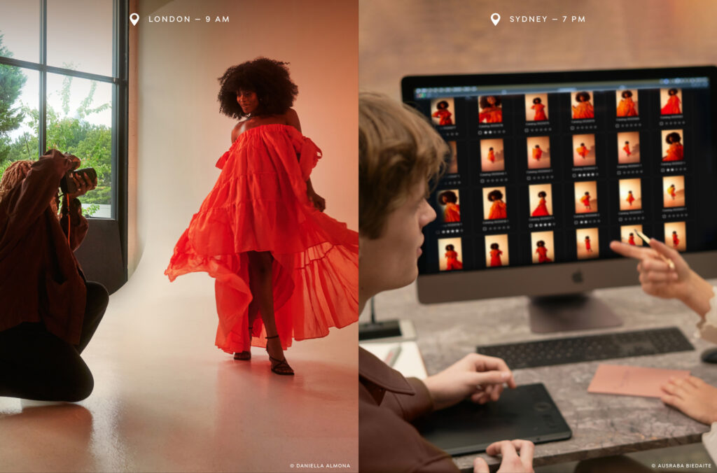
As a featured photographer, she has also tried her hand at some of the newest tools in Capture One Pro 23. It is, in particular, the new possibilities for faster culling that stand out to her.
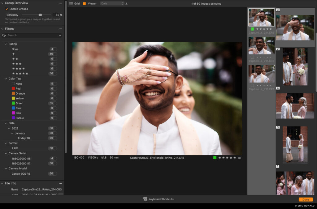
Updates to the importer in Capture One Pro and a new dedicated cull view are designed to make the culling process a whole lot faster. With zero-delay browsing, star ratings and color tagging, and the ability to group similar images automatically, the culling experience, especially for high-volume photographers, can be significantly cut down.
“Before, I have been going through individual photos trying to figure out what I want. This has improved my whole workflow,” says Daniella about the update.
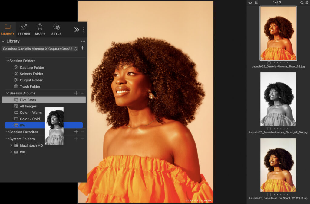
A relatively recent convert to Capture One, Daniella made the switch from Lightroom during the pandemic after getting a trial through the organization Black Women Photographers. “That was this single best decision in my photography career, for sure,” she says, adding that she now does 80% of her post-processing in Capture One. “I haven’t really worked with a software that handles color the way Capture One handles color. And color obviously is a very big part of my work.”
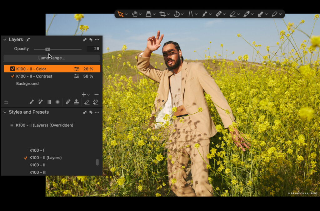
Getting up close and personal with her subjects, it is important that Daniella has as much control as possible over how the colors interact with skin, hair, clothes, and backdrops. The new layering capabilities for Styles have been a revelation for her workflow. “I just found out, in this version, how to create my own custom Styles with it in Layers. And that has been super helpful, super, super helpful.”
Continuing to tell stories from communities of color, challenging beauty standards, and working with models and organizations that do the same, Daniella hopes to use her photography to give people the opportunity to be their unapologetic selves.
We ask her what her vision for the future of photography is. She thinks about it and says, “I see a very diverse photography community where stories from different communities are told equally, where people have equal opportunities regardless of what they look like. I see authenticity, hopefully, because as photography progresses, there’s always this risk of people replicating other photos. But I hope to see photographers find their voice and be different as opposed to trying to fit a certain look or aesthetic that’s trending. So yeah, I see the future of photography as diverse and honest…diverse and honest.”
New to Capture One? Try Capture One Pro 23 for free here.