Creating a beauty image is more than just clicking a button, post processing and decorating my portfolio. The process starts long before the actual day of the shoot, from finding inspiration to team building, building rapport to studying the dos and don’ts.
In this blog post I’d like to take you on a little journey of this creative process and share the steps I take before, during and after picking up my camera.
Inspiration & Brainstorming
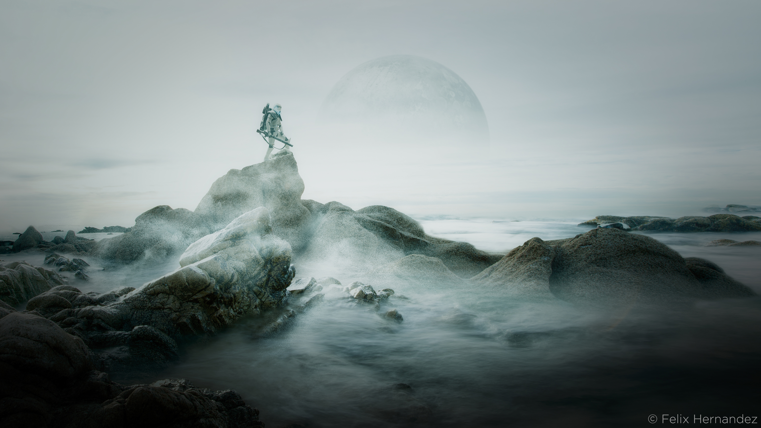
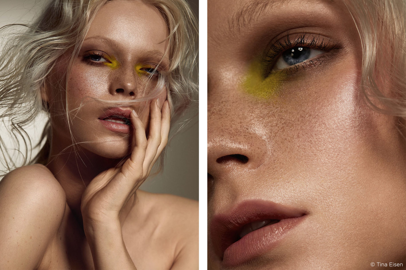
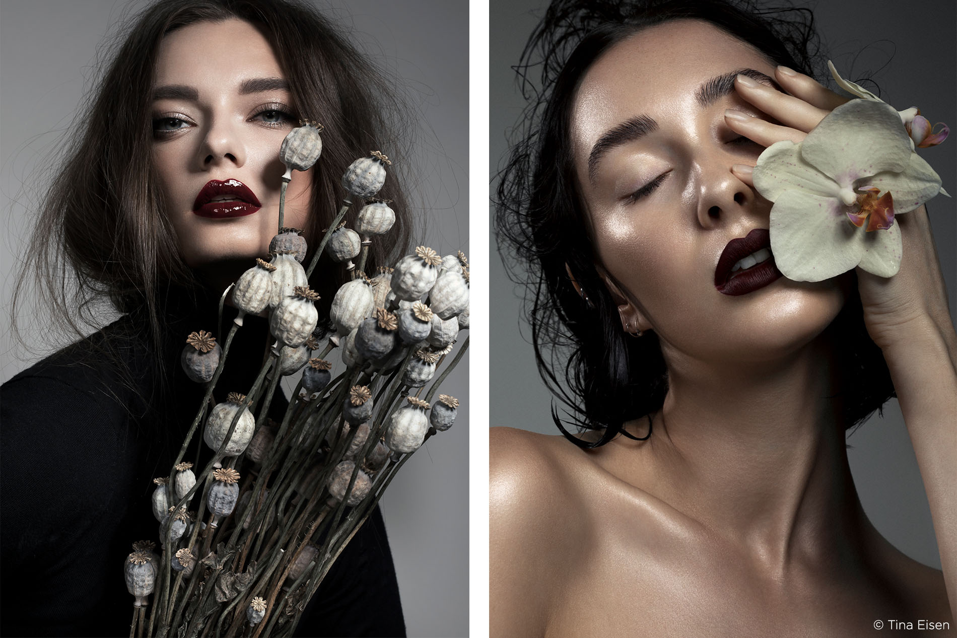
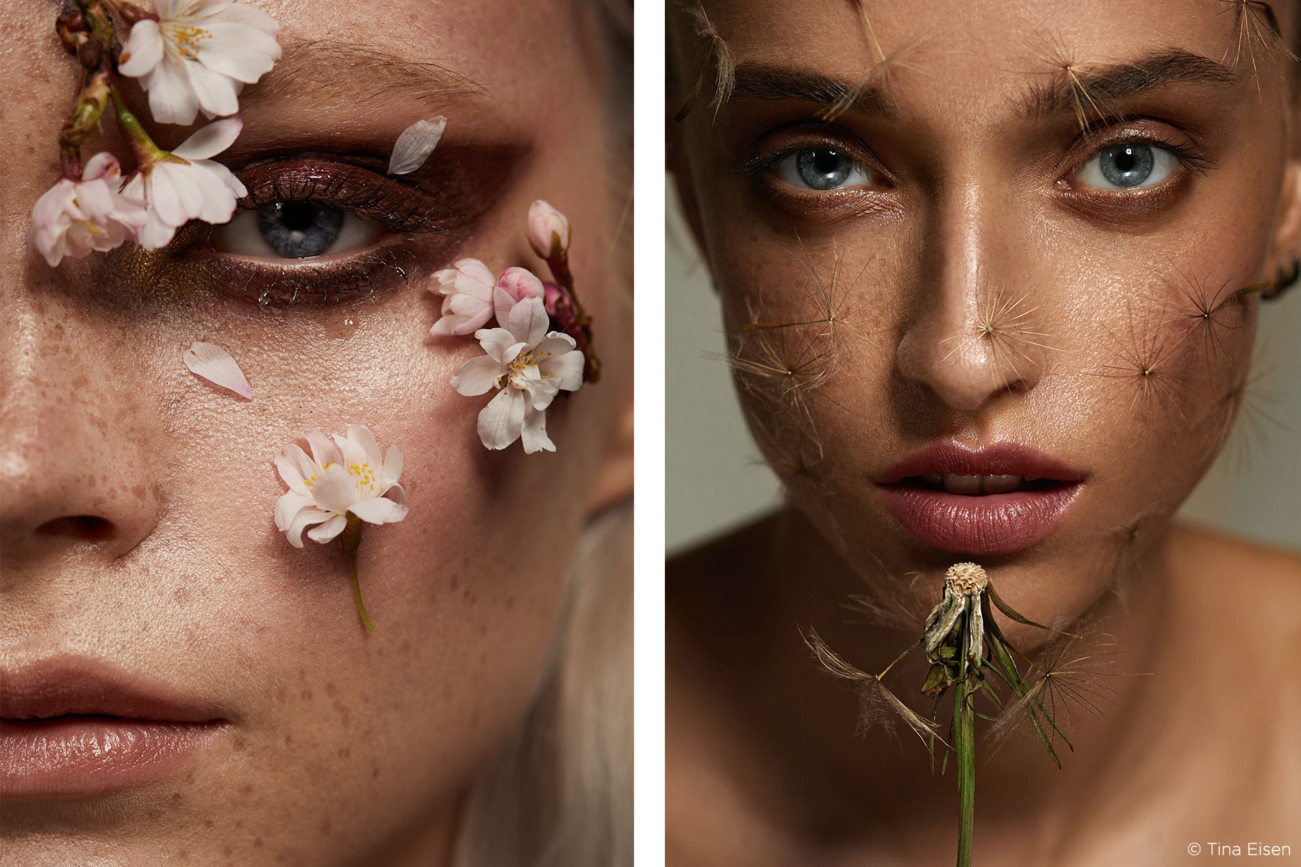
The fact that I’m in love with nature probably doesn’t come as a surprise! The theme of flowers runs through a large percentage of my images. But there’s more to it than pretty pink petals. The incredible patterns, colours and textures I have found over the years in the unsung heroes such as herbs, dandelions, mere weeds and even mould, are what really fascinates me!
I try to live with my eyes wide open, constantly exploring and figuring out why I get drawn to certain things.
Anything around me can inspire me, I don’t limit myself to other people’s images. Those have been done. Once I latch onto an interesting subject the brainstorming begins. For this there’s no better tool than the modern-day scrapbook called Pinterest. Dozens of folders containing brainwaves and ideas, in my case as general as “2018 Beauty Inspo” to the more specific “Different Types of Wispy Hair”.
Teamwork plays an important role during this step. Bouncing early ideas off make-up artist and hair stylist doesn’t just broaden the creative horizon of the shoot. It also allows your creative team members to bring their specific skill and knowledge to the table.
Team Building
The people I work with regularly I have known for years. Through countless tests I was lucky to find and build my team and fearlessly create with. Because of the connections and trust we built I’m now able to recommend these people for jobs I get booked for and vice versa, passing the skill and professionalism of my teams to future clients.
But what actually makes a good beauty model? Or a suitable make-up artist?
Models
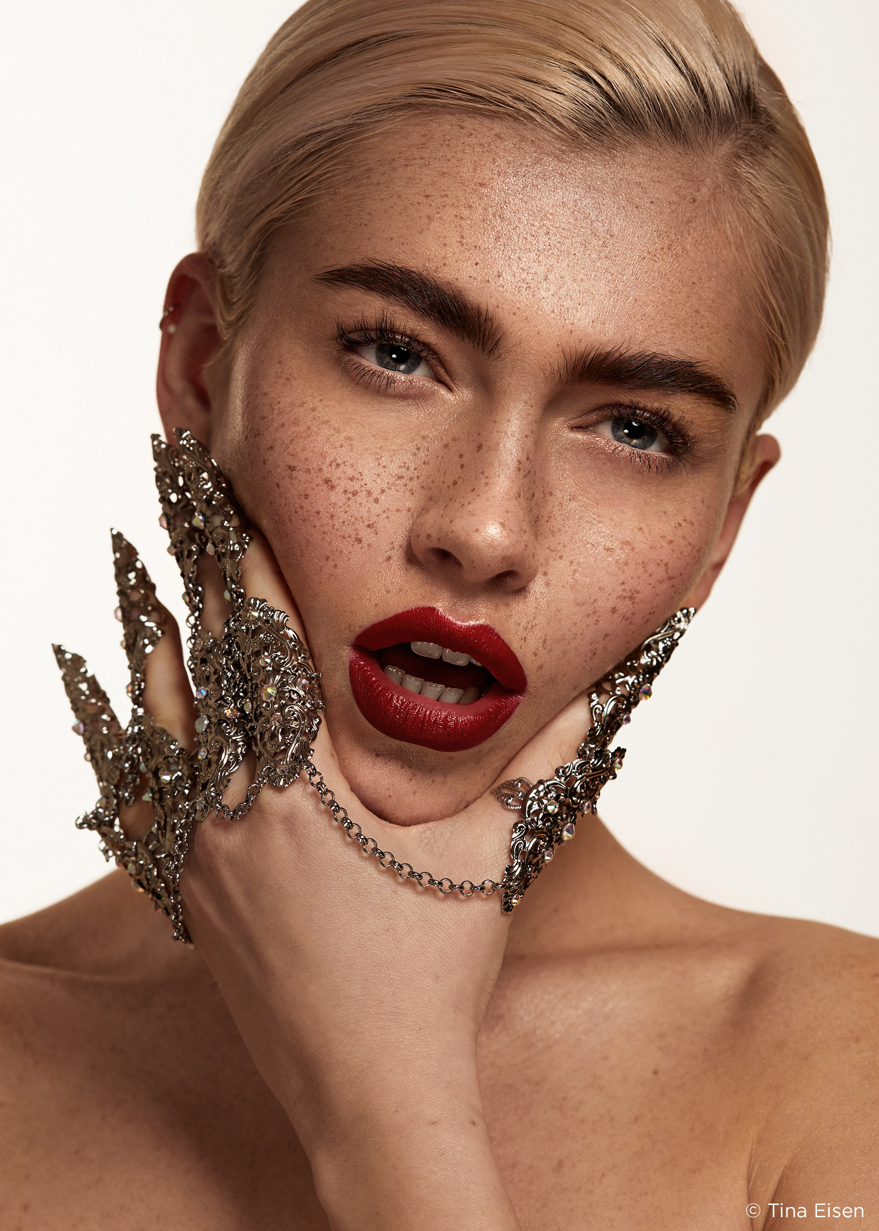
What society perceives as beautiful, your classic “girl next door”, isn’t my first choice of model. I want interesting features, angles, face shapes as these are the unique details that will draw the viewer in.
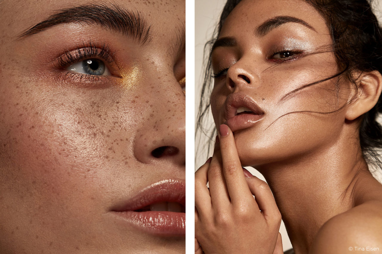
The most important bit in a good beauty model for me is the skin though. Shooting close enough to see every pore comes with the downside of highlighting every spot, dry patch and vein. I’m a big fan of dewy, healthy looking skin. To save myself hours in retouch, the skin needs to look as close as possible in camera as I imagine the end result to look.
Picking models by their portfolios alone can be deceiving. You’re looking at finished, retouched images that give you limited insight into the actual condition of the model’s skin. Asking for polaroids will give you a better idea of what you’re dealing with. Often a click through to a model’s Instagram. They are usually linked to their online portfolios, and that gives me some clues about the real person.
Make-up artists
At the same time not every make-up artist is a good or suited to beauty photography. Make up application for beauty (especially skin prep and foundation) is miles different from other “uses” of make-up, for example, a wedding day. Rather than coverage, I look for foundation that doesn’t cover pores and freckles and almost looks like it isn’t even there.
Make sure your make-up artist of choice’s portfolio reflects their experience with studio beauty photography.
On The Day – Rapport & Communication
In order to create images the viewer can connect with, I need to connect with my subject. Before taking any images, I get to know people, spend some time while they are getting hair and make up done (valuable bonding time!) and generally have a laugh. A genuine human connection is very hard to fake, so I rather spend some time creating a real one.
I treat my teams like I would my friends and family. I encourage them to make themselves at home, help themselves to drinks and snacks and not a single shoot has taken place under my watch where there wasn’t at least 3 types of cake present… breaking the ice Tina style.
During the shoot, communication is key
No matter how experienced your model might be, people want to hear what works well. In regard to my goals as a photographer, the more I’m aware of the industry I work in, the better I know the standards of the campaigns and publications I’m looking to book. I try to express my vision verbally but since this is a visual industry after all, showing reference images and even acting out certain poses, helps me pass ideas to the model.
Similarly, I will be communicating with the make-up artist and other team members while I’m shooting. The make-up artist’s job doesn’t finish when the model gets out of the chair. It’s their job to keep an eye on their creation while I’m shooting to give me the freedom to concentrate on my job as a photographer.
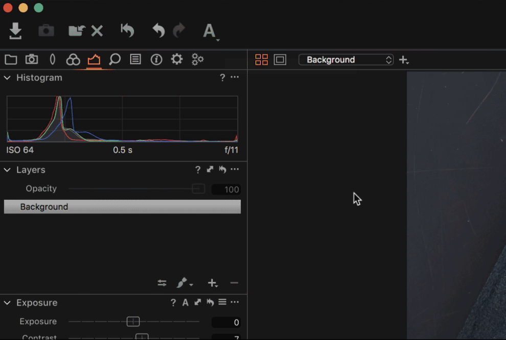
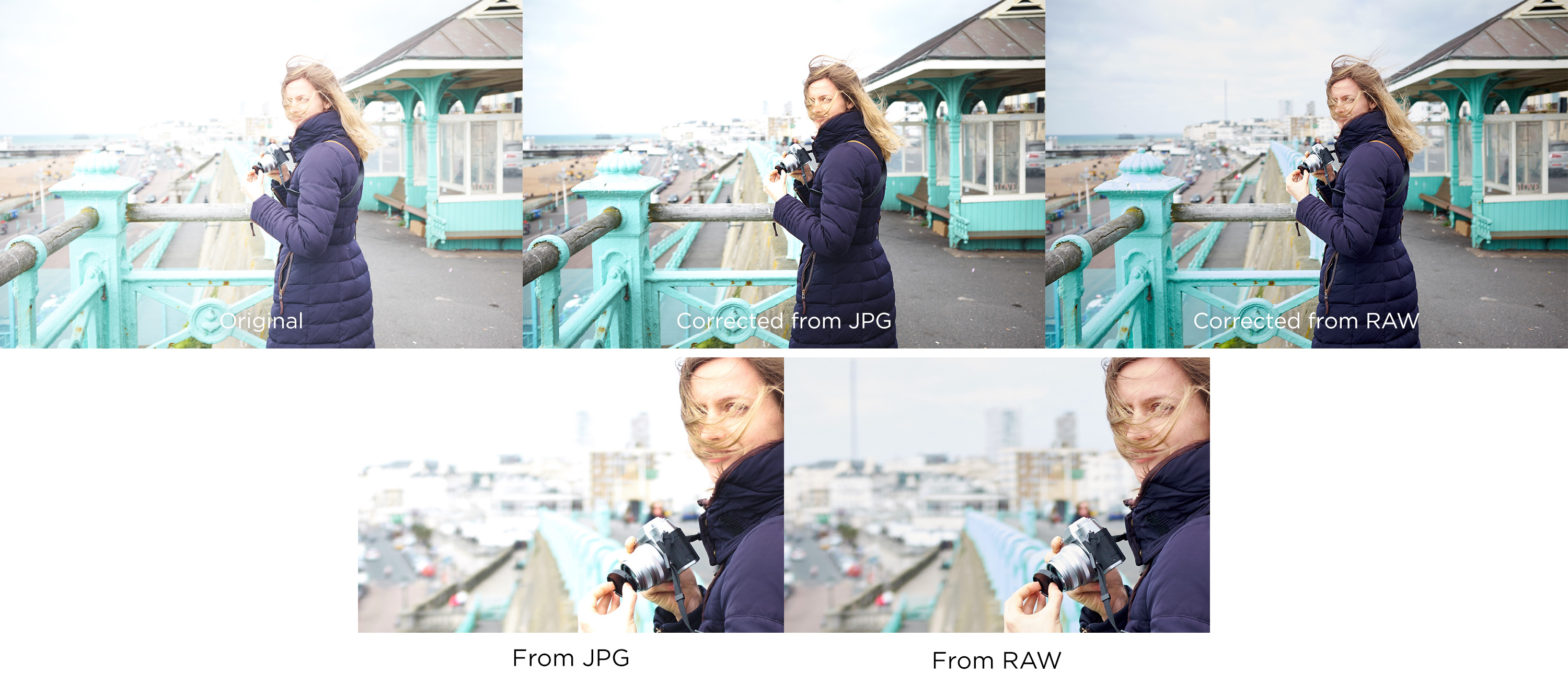
Shooting tethered
Shooting tethered straight into Capture One gives me and my team the opportunity to keep track of the results as they happen.
I’m guilty of accidentally knocking the aperture down while snapping away happily when shooting to card – only to notice 20 images later and awkwardly declaring “oh, yessss that was soooo good… um, let’s do that again!”
I will position my laptop to the side of me, so I can keep an eye while shooting. Keep the monitor out of sight of the model in order to not distract her.
Including the team
At the same time, my team is keeping an eye on the monitor. For a make-up artist, seeing the results on a screen and seeing how certain colours show up under the light conditions, being able to spot hot spots and uneven tones will enable them to correct mistakes on the spot and ultimately produce better results.
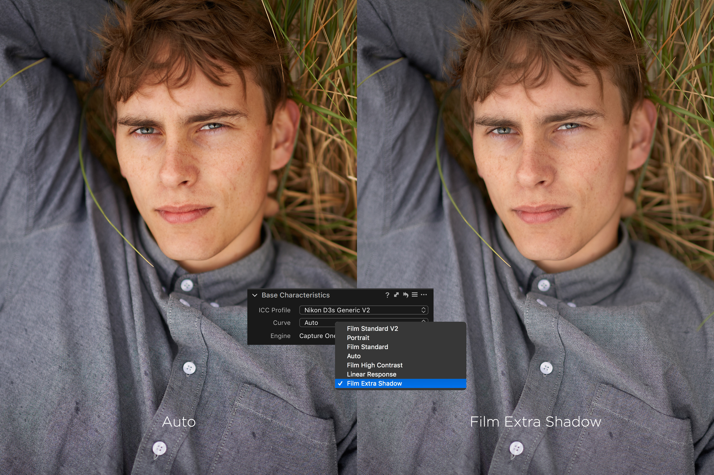
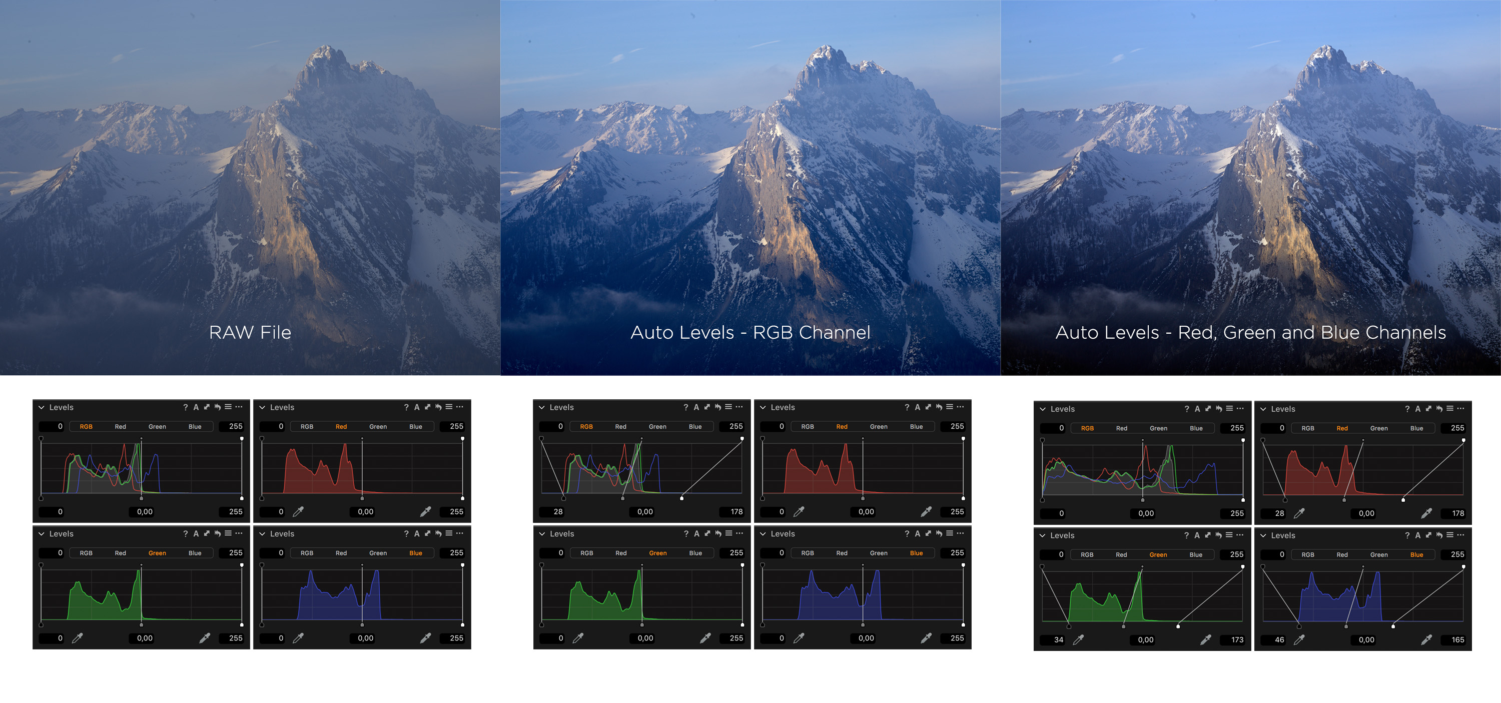
Once I know my camera and light settings are perfect, I’m able to make initial RAW adjustments in Capture One. This typically includes fine tuning the levels and making first decisions on colour, as well as fixing uniformity issues when it comes to skin tones.
When shooting tethered, these setting will automatically carry over to all the following images. This saves me time later on and gives the team an instant idea of the end result.
Seeing the images on a screen much larger than the camera screen gives me better control over the shoot and ensures the shots I had in mind.

Beauty Shoot Tips
There’s few DOs and DONTs when it comes to my work, most of which are personal preference and will vary from photographer to photographer.
The DOs
As mentioned before, I DO like to communicate throughout the shoot. It’s key.
Have your team near you while shooting. They can keep an eye on that smudged lipstick and those stray hairs that will cost you valuable time in retouch later on.
Once I know my technical settings are perfect, I allowing the model to pose freely for a series of shots without me taking the camera down and interrupting her. This has proven to give the best, believable poses and facial expressions.
Move around on your set. I rarely just shoot a model dead on straight, especially for macro images. You can usually find me on the floor somewhere under the triflector stand. And speaking of being on the floor… shooting a model from slightly underneath is a great, flattering angle for beauty!
The DONTs
Don’t stop shooting to check every single image. I have my laptop in my peripheral vision, but I don’t need to stop shooting after every click.
Ditch the “I can fix that in Photoshop” attitude. If it takes a couple of seconds or even minutes to be fixed on set, so be it. The end results will always reflect that initial attention to detail.
Don’t allow awkward hands into an image. Not every model has the skill to hold her fingers in a graceful manner. I’d rather have no hands in the image than an awkward one. These can ruin the whole shot.
And while we’re on the topic of hands, ask your model to not physically touch her face when placing her hands. Rather just pretend to touch in order to avoid smudges and harsh shadows. Unless that’s what you’re going for, of course!
After The Shoot – Now What?
The team is gone, the cake is eaten, and I’m still hanging out in Capture One.
Once the shoot is wrapped I like to immediately cull my images. Everyone has their own unique ways of doing so. For me it is “Red Tag” (Shortcut: ‘-‘) for the first round of choices and “Green Tag” (Shortcut: ‘+’) for the final picks. I aim to cull images as soon as possible after the shoot while they are fresh in my mind.
Lining up multiple images next to each other in sets immediately helps me identify images that look too similar. It’s much easier putting together a strong, non-repetitive set this way.
Once my choices are made I will export them into Photoshop where all the cleaning, dodging and burning, and cloning takes place. When the retouching is done, I review my results as a set in Capture One. Here I make the last tweaks in levels and tones to ensure uniformity throughout the set. This is particularly important if a set is meant for submission or for client work.
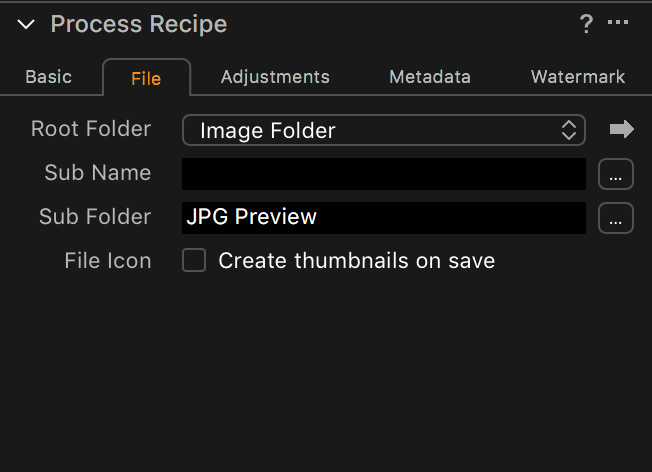
All that’s left for me to do is processing the images into any desired format and sending them to clients, magazines and team members. Last, but not least, social media! The most powerful of all marketing tools.
For more examples of my work, have a look at my Instagram account and come see me there for any questions and behind the scenes glimpses!
If you don’t already own Capture One, you can download a 30-day trial and discover the power of it!
Beauty related Capture One content
Shooting tethered in Capture One (Help site)
Optimizing tethered capture (60-minutes webinar)
Skin Tone Tool (Help site)
Achieving Perfect Skin Tones by Jonas Nordqvist (Blog post)