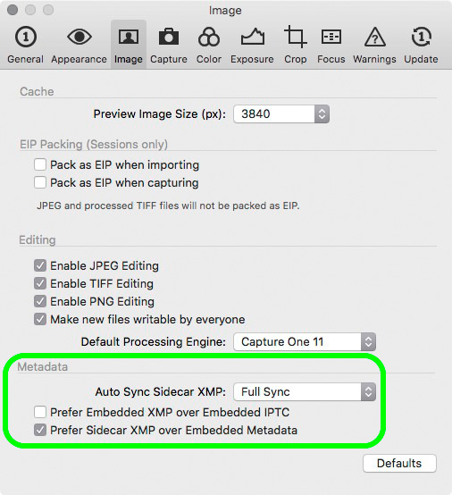
NOTE: This article discusses an outdated version of Capture One. To learn more about our latest version, click here.
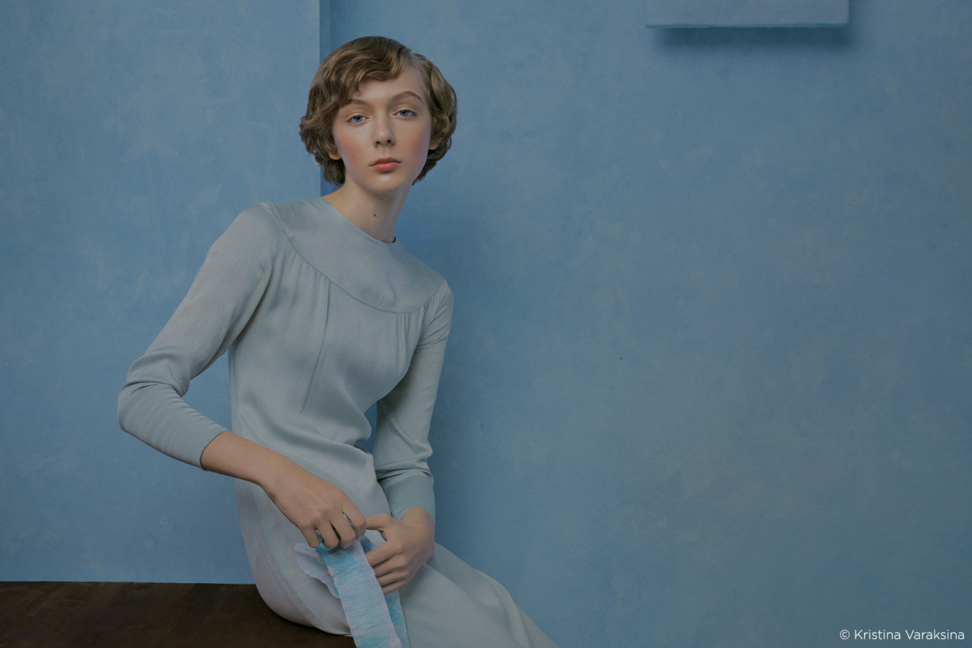
There’s a difference between a photographer taking a picture and a photographer creating one. I’m the one who creates. I create images in my head. Then I draw or look for references. Then I talk to my team and discuss how to make it happen. And only after a long prep process we go and shoot. The image from my head comes to life, but still not exactly the way I imagined it. But I know I will make it look right with the help of Capture One. My style is influenced a lot by paintings of 15th century, Renaissance, late 19th and early 20th century. I love softer painterly look and very controlled color palettes.
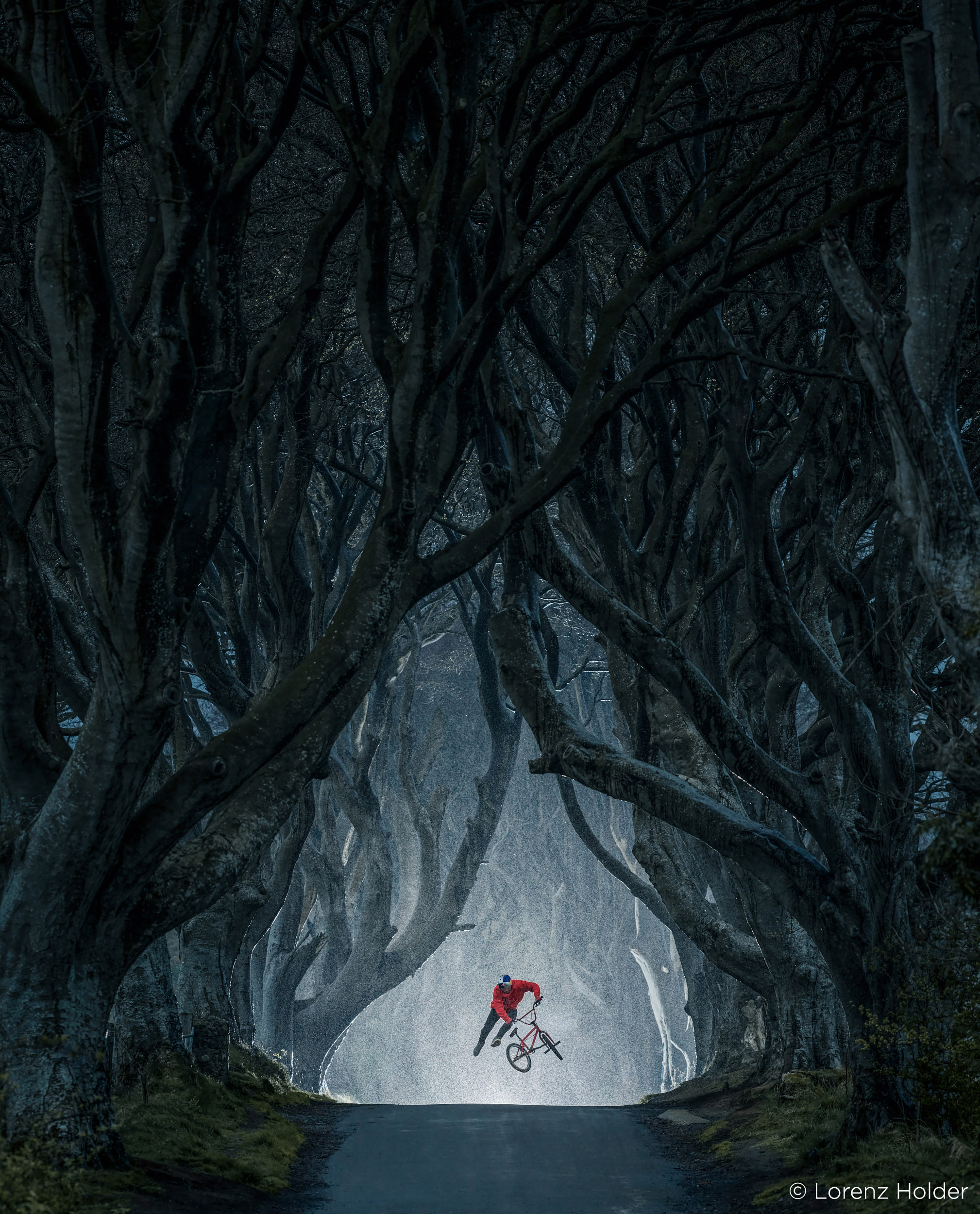
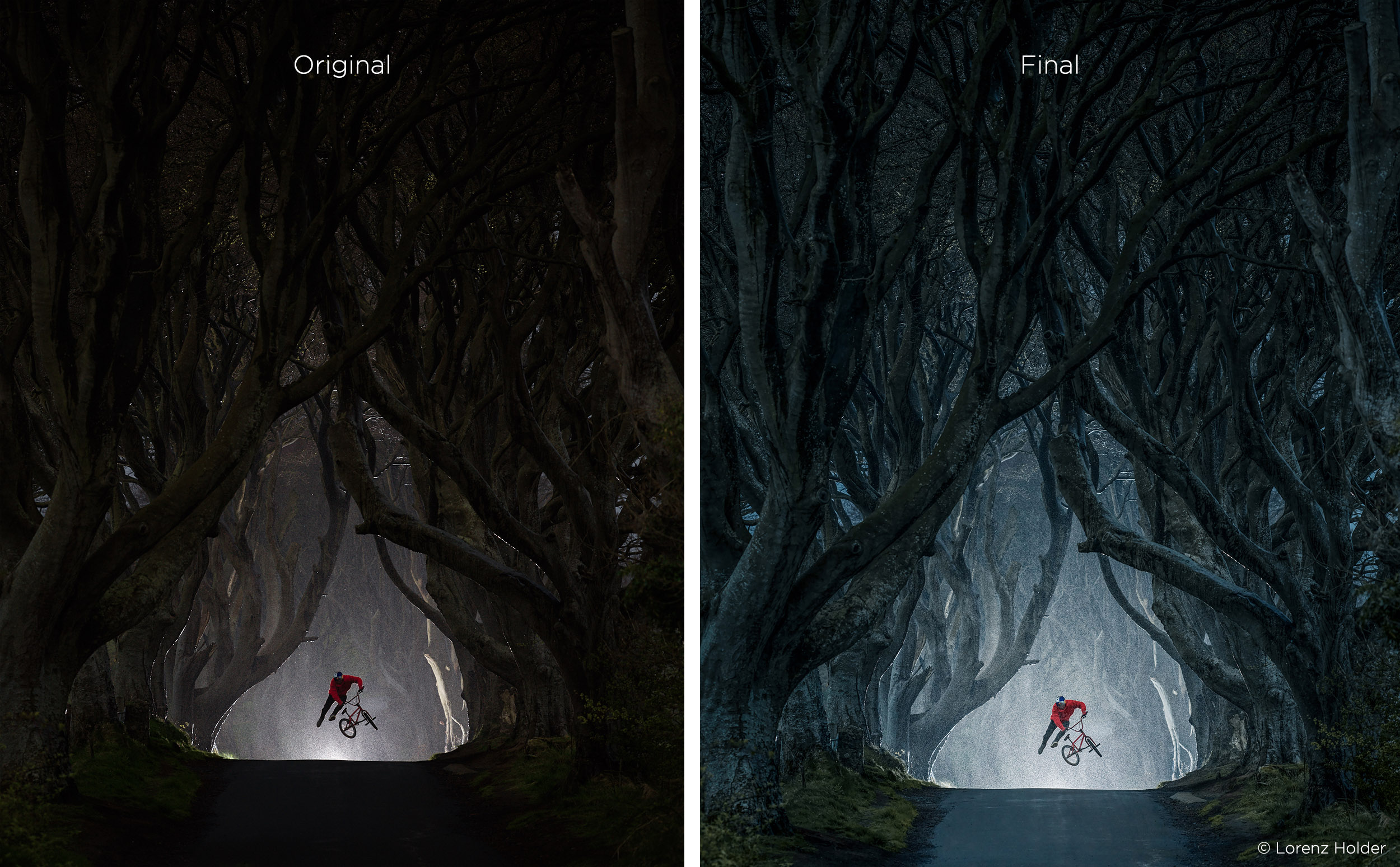
Here is a before and after of the image I recently shot for project Magical Realism. The one on the left is with the adjustment I did in Capture One.
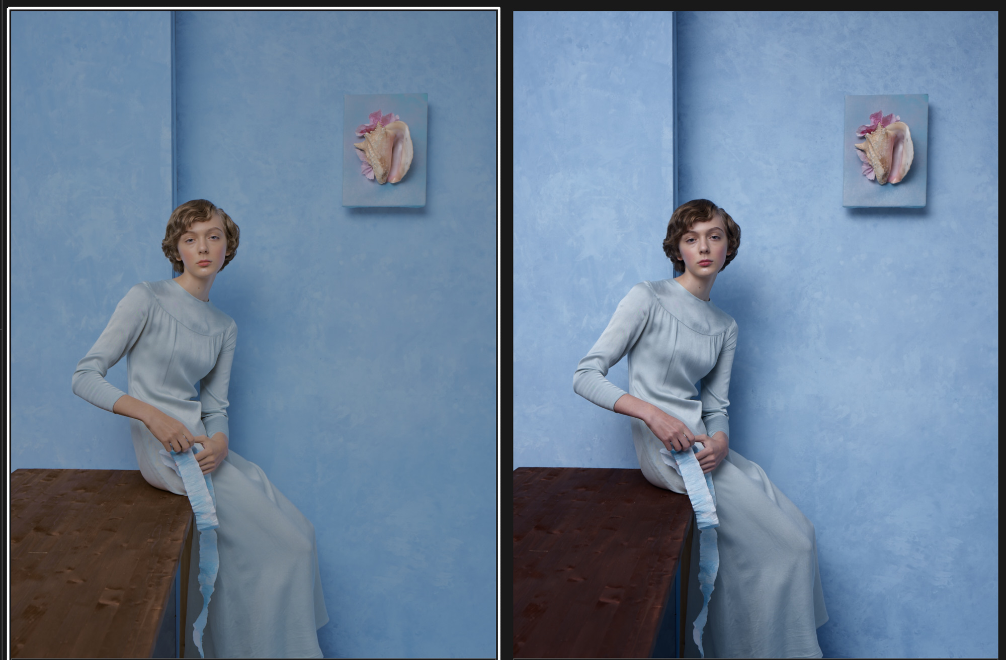
Contrast and Tonality
I start with Exposure and Dynamic Range adjustments. I almost always go up to +30 +40 on the highlights and +10 on the shadows. I don’t overexpose when I shoot and my details in the highlights are safe, but I prefer my images to look more flat. Flatness gives a softer look. And I like the softness, because it automatically adds painterly quality to images.
When it comes to tonal adjustments it definitely feels like Fuji and Capture One were made for each other.

In this image in addition to Highlight and Shadow adjustments I also opened up a lot of shadows in Luma Curve while keeping the midtones and highlights intact, to create that flatter look. You can see that as soon as the shadows are not as dark, the image starts looking more delicate, tender. All the tonal adjustments were done on the background layer.
Color Adjustments
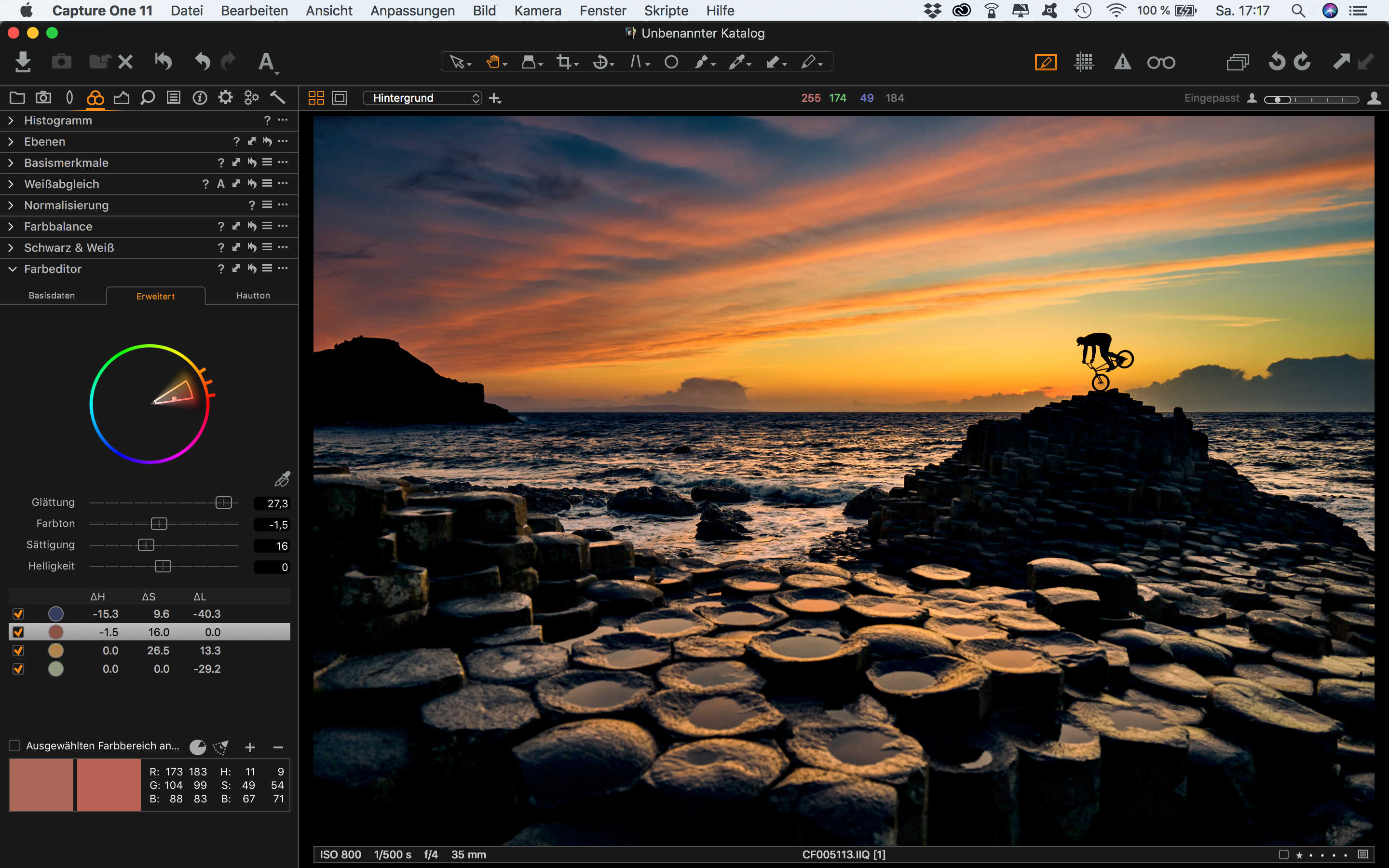
Next step is adjusting the colors. I create a separate layer and go to Advanced Color editor and start picking colors. I like playing with individual colors, changing their hue, saturation and lightness to see what difference it makes to the image overall. Another thing I need to remember is to not overdo the adjustments, otherwise the edges of the selected area may start looking funky. And in general the color, saturation and the lightness of each selected area should belong with the areas around it. I usually have 2-4 color ranges selected and I change parameters of each, go from one to the other and compare until I find a perfect balance.

In this case I change the Hue of the blue, made it a bit more green, and increased its saturation a bit. I also played with brown colors by subtracting magenta from them.
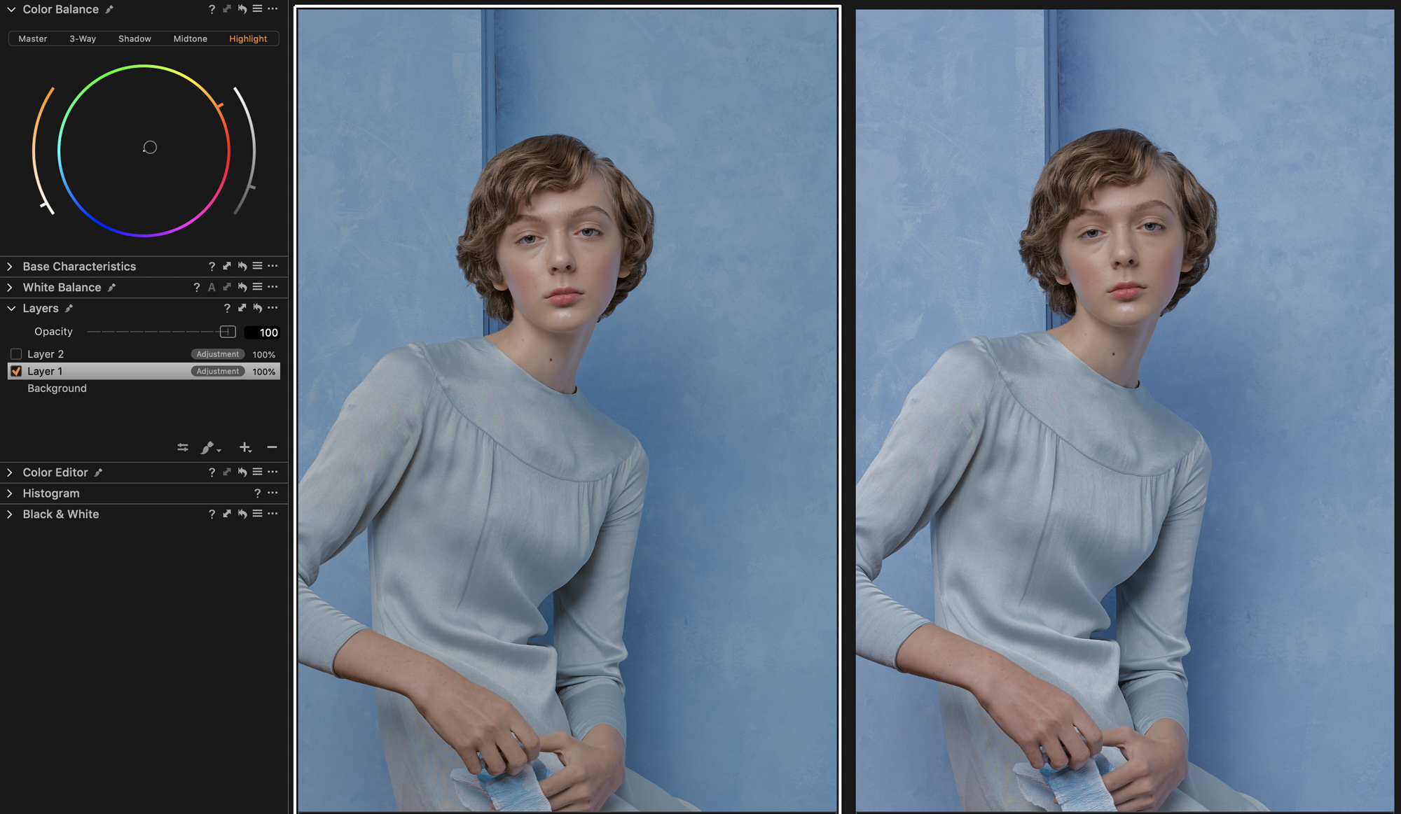
My third step is color grading with the help of Color Balance. Color toning certain parts of the tonal range gives an image more character and also more depth. I often make my highlights a bit warmer and shadows a bit cooler, therefore adding a bit more separation. However, I never go higher than one third up on the slider to the left of the color circle. It’s important to not make the color grading too noticeable. The whites should still look relatively white and the skin tones should have natural color. It also depends on the dominating colors and the mood of an image where and how much of color grading you want to apply.
Skin Tone Adjustments
Since I mainly photograph people, the step I never miss is Skin Tone adjustments in Color Editor. I make a new layer just for that, I prefer painting a mask specifically on the skin, avoiding lips, blusher and other similar colors that are not skin. Then I either saturate or desaturate skin by 5-10%, depending on the concept. Then I go to Uniformity sliders and add about +20 +25 on both Hue and Saturation, to make the skin tones more even.
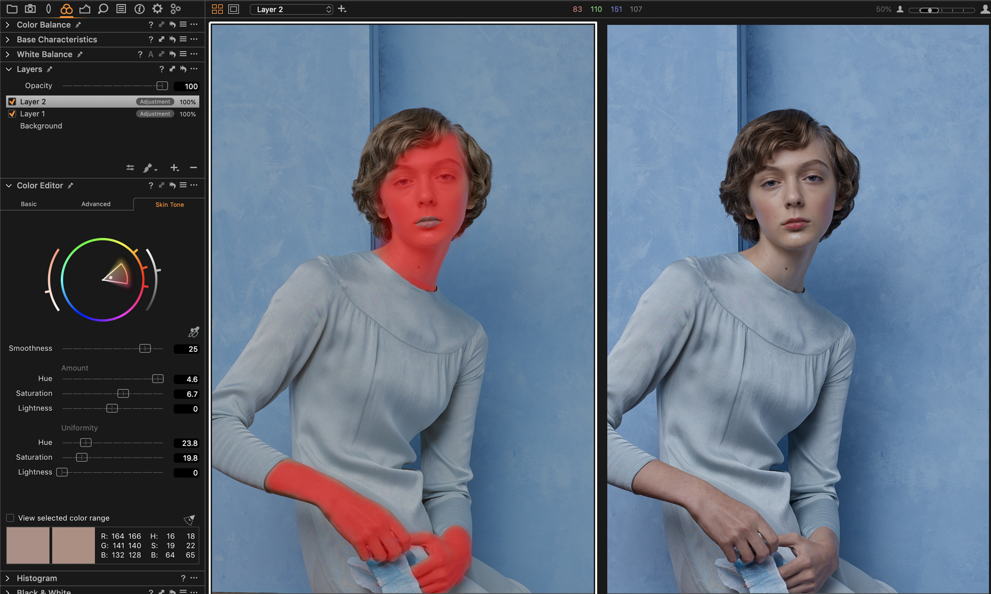
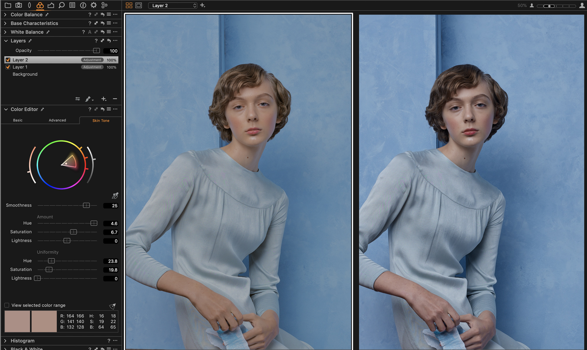
In this image I increased the Saturation of the skin tones a bit and I also changed its Hue quite dramatically – I wanted the skin tone to be much warmer that it had originally been captured. Therefore I achieved a nice contrast between the blue in the background and the warmer tones of the skin. I also reduced the contrast a bit more for an additional softness in the face, just on this layer.
Finalizing the look
As a finishing step I click through all my layers and see if I want to tweak any adjustments further, whether it’s tones or colors. Everything should look balanced and reflect my original idea. I love the option of changing Layer opacity offered in Capture One, I can always reduce several adjustments in one move of the slider.
I often work on series of images from the same shoot, for example, a story for magazine, or a designer lookbook. Therefore after finishing my first image I create a User Preset for each set of adjustments or just make a User Style with selected adjustments. That allows me to apply the same settings to each image from the series and then only tweak it slightly.
Below are the before and after versions of the selected images of several looks from the same story.
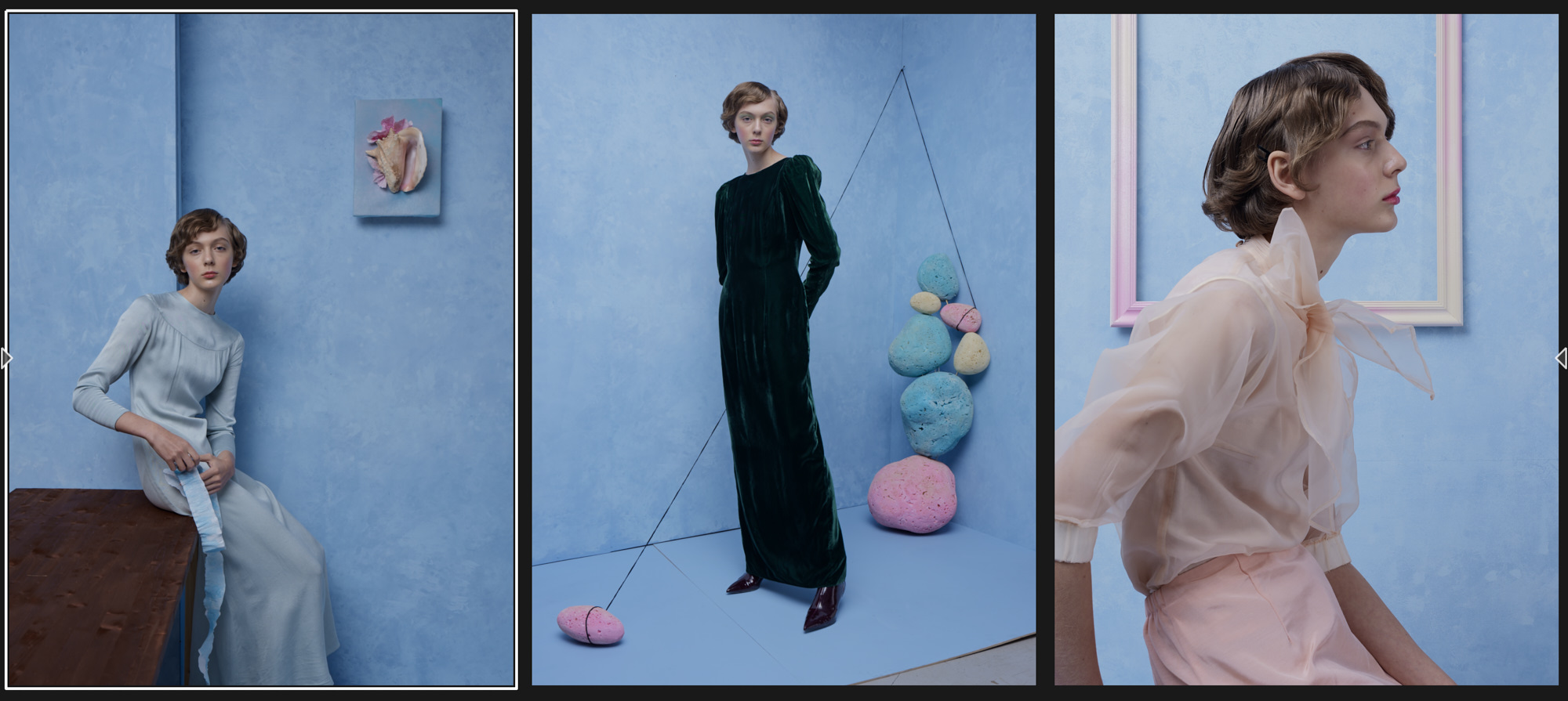
Before. Although it was the same blue on the walls, due to differences in lighting it turned out differently in the images. The contrast and skin tone also looked quite different.
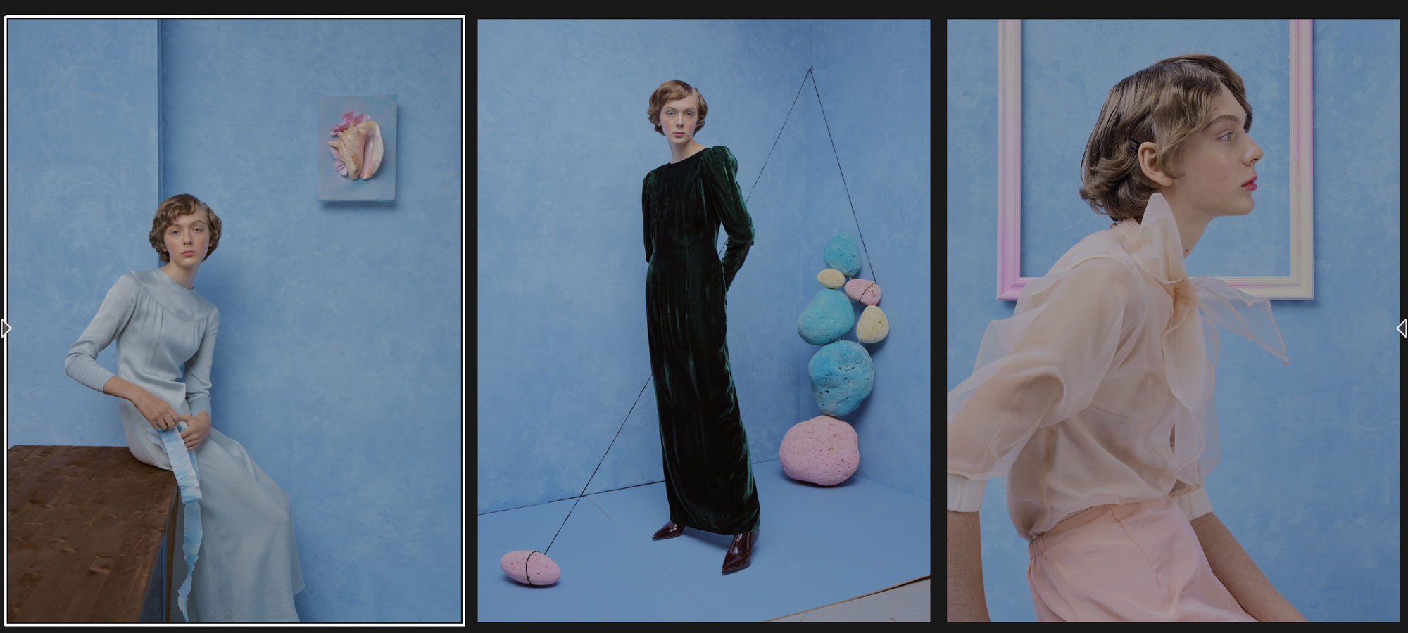
After. I applied my soft look across the series by reducing the contrast and opening up the shadows. I evened out the blues and the skin tones across the looks.
When I’m done with all the adjustments applied to all the images I always take a break. I get back to it in a few hours or next day. I need to rest my eyes before I can objectively assess the adjustments made. My goal is to find a perfect balance between giving my image a personal look, an artistic touch and making it look unnatural. I stop when I see the image looks right, like I had initially envisioned it.