Latest Posts

The trick that changed my approach to color correction

In this second blog post I will show you an easy and somewhat unusual trick that was taught to me by Steve Hendrix of Capture Integration in Atlanta, Georgia, USA.

A way to push a mood or grade an image

I was looking for a way to take a large section of brown grass in a housing development and shift it towards green. Steve suggested that I use the Skin Tone Editor in the Color Editor in Capture One Pro 7. Using this tool has changed how I approach color correction and how I shift colors to push a mood or grade an image.

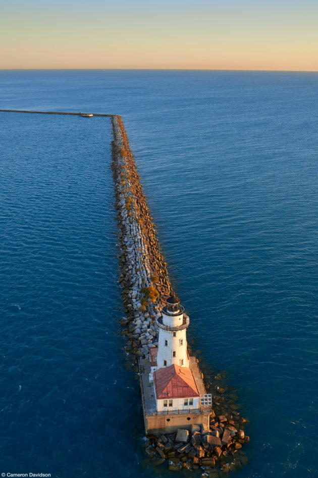
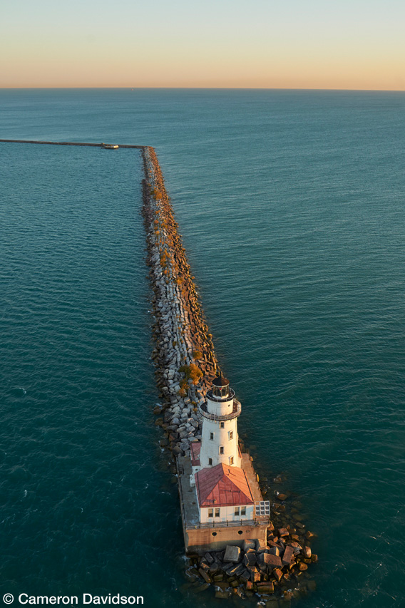
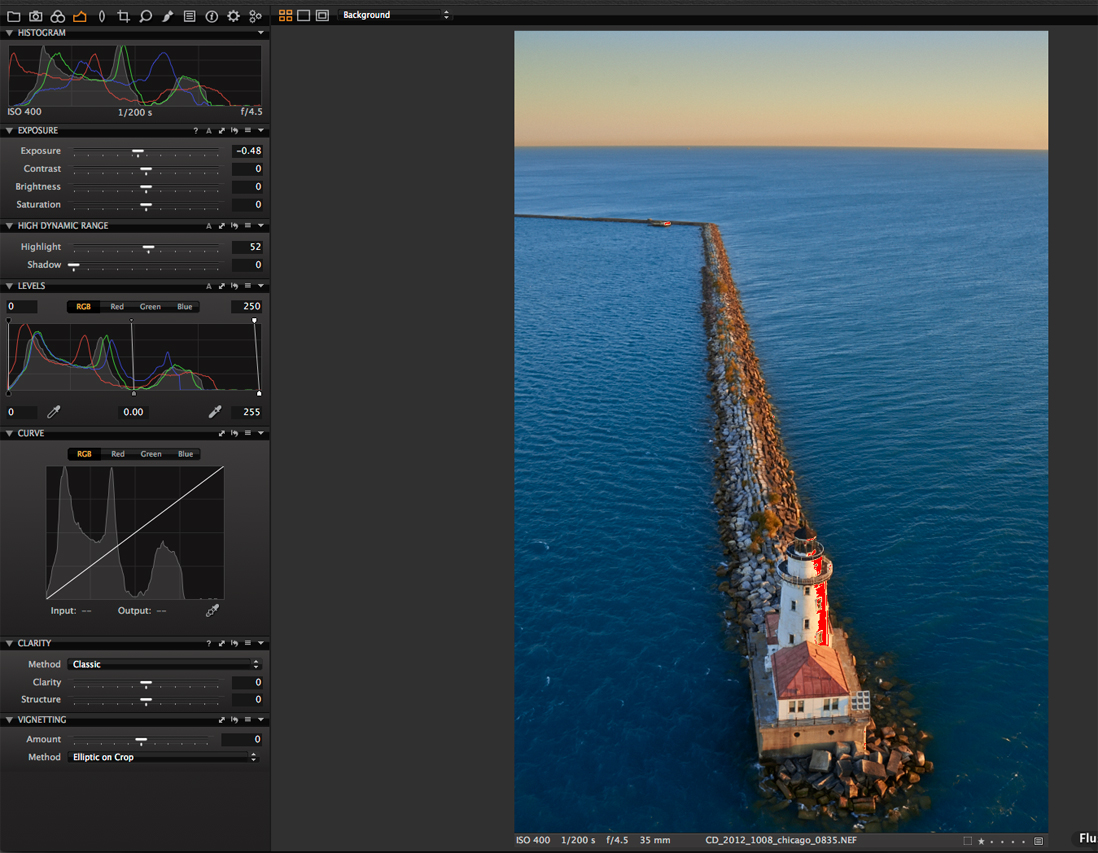
In the fall of 2012 I shot aerials of Chicago, Illinois for a book project and my stock library. A few minutes before sunrise, we flew a Schweitzer 300 helicopter out over Lake Michigan and along the Chicago shoreline. I wanted to see if I could make a stronger photograph of the Chicago Harbor Light than the one I shot in 2003 for the Chicago book project mentioned above.

The water appeared greener than I remembered

We were flying in a “severe clear” high-pressure system.  The light was clean, crisp and perfect for low-level aerial photography.

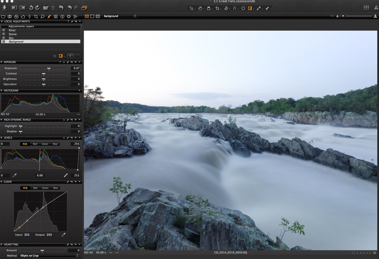
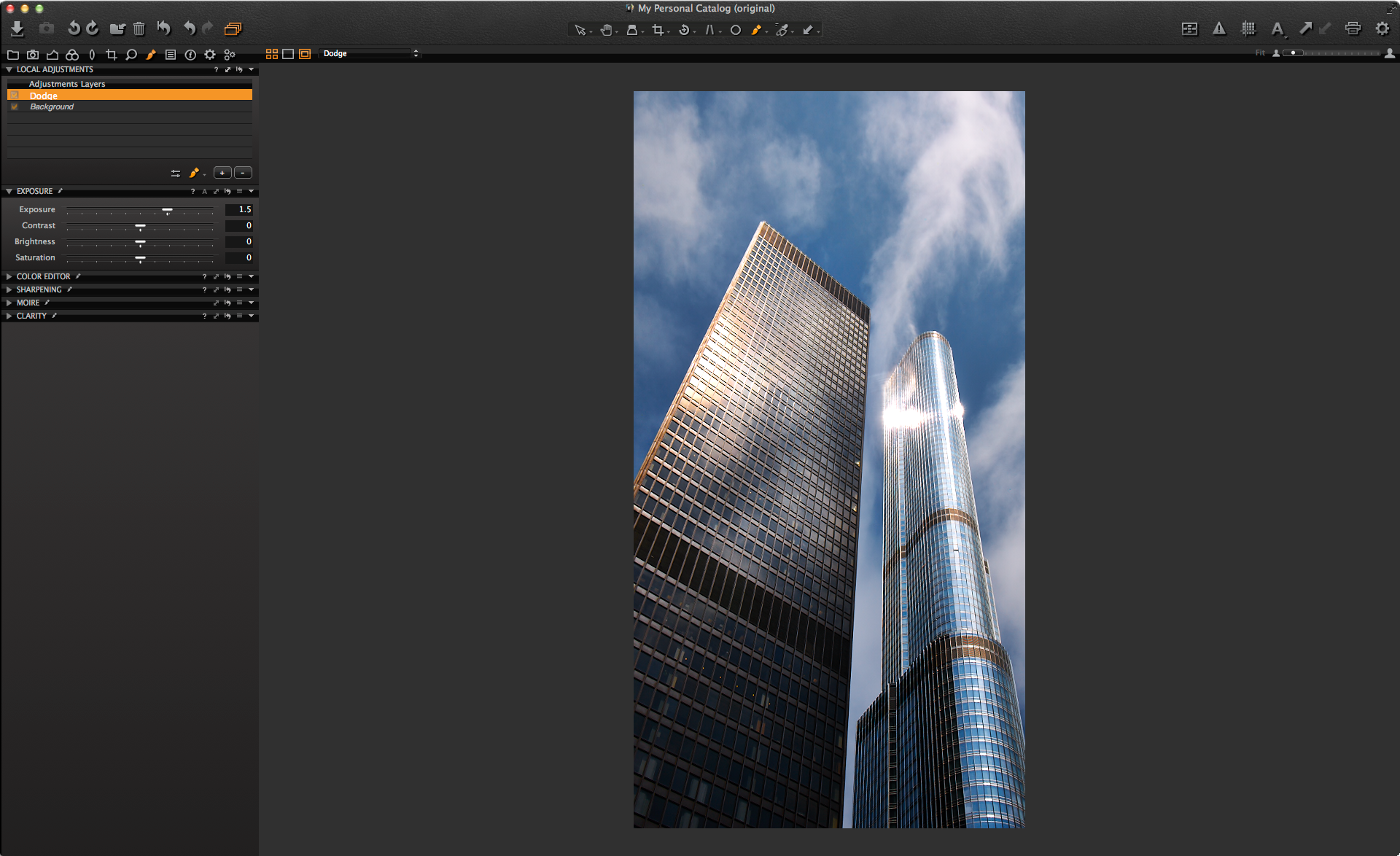
When I imported the images in the Capture One session for this shoot, I noticed the water appeared greener than I remembered.  I shot this image with a Nikon D4, 35mm F/1.4 Nikkor G lens and a B+W Polarizer.  The sky was close to where I wanted it but the water was a bit lacking.

IQP-w2814-image1_CR

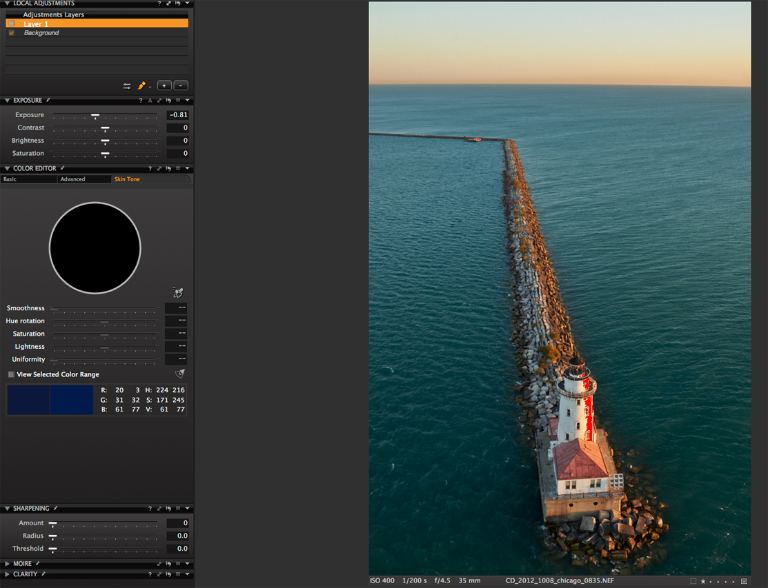
First off was an adjustment the overall exposure. I brought it down about half a stop to dampen the highlights on the sunward facing side of the ligthhouse.  I used the highlight recovery tool to bring down the clipped highlights and also brought the output level down to 250.

2_uncorrected_color_exposure
Why I used the Skin Tone Editor

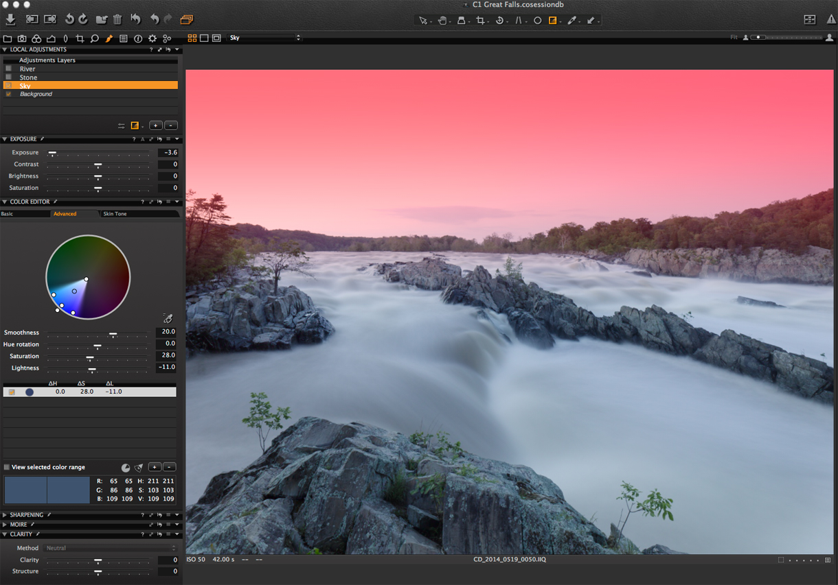
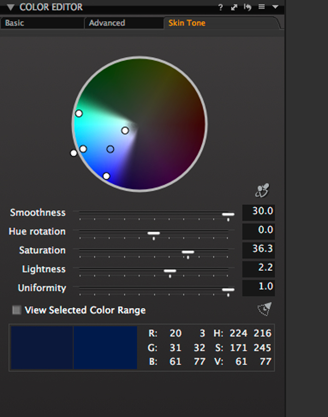
I thought about Steve Hendrix’s Skin Tone editor suggestion and used the editor to shift the water color toward blue.

For those wondering why I use the Skin Tone Editor to shift color instead of the Advanced Color editor – it is just another arrow in the quiver. You can shift the color a fair amount and the uniformity slider allows you to spread or restrict the color.  I find it useful for coloring grass or shifting the color tone in water.”

After taking a sample of the green water, I shifted the color quite a bit plus increased the smoothness and uniformity.  The water was a bit dark to my taste and I increased the lightness to 2.2. This is a great trick for decreasing or increasing brightness in an area.  I often use it to bring down skies and to increase the color.

3_skintone_colorshift_water
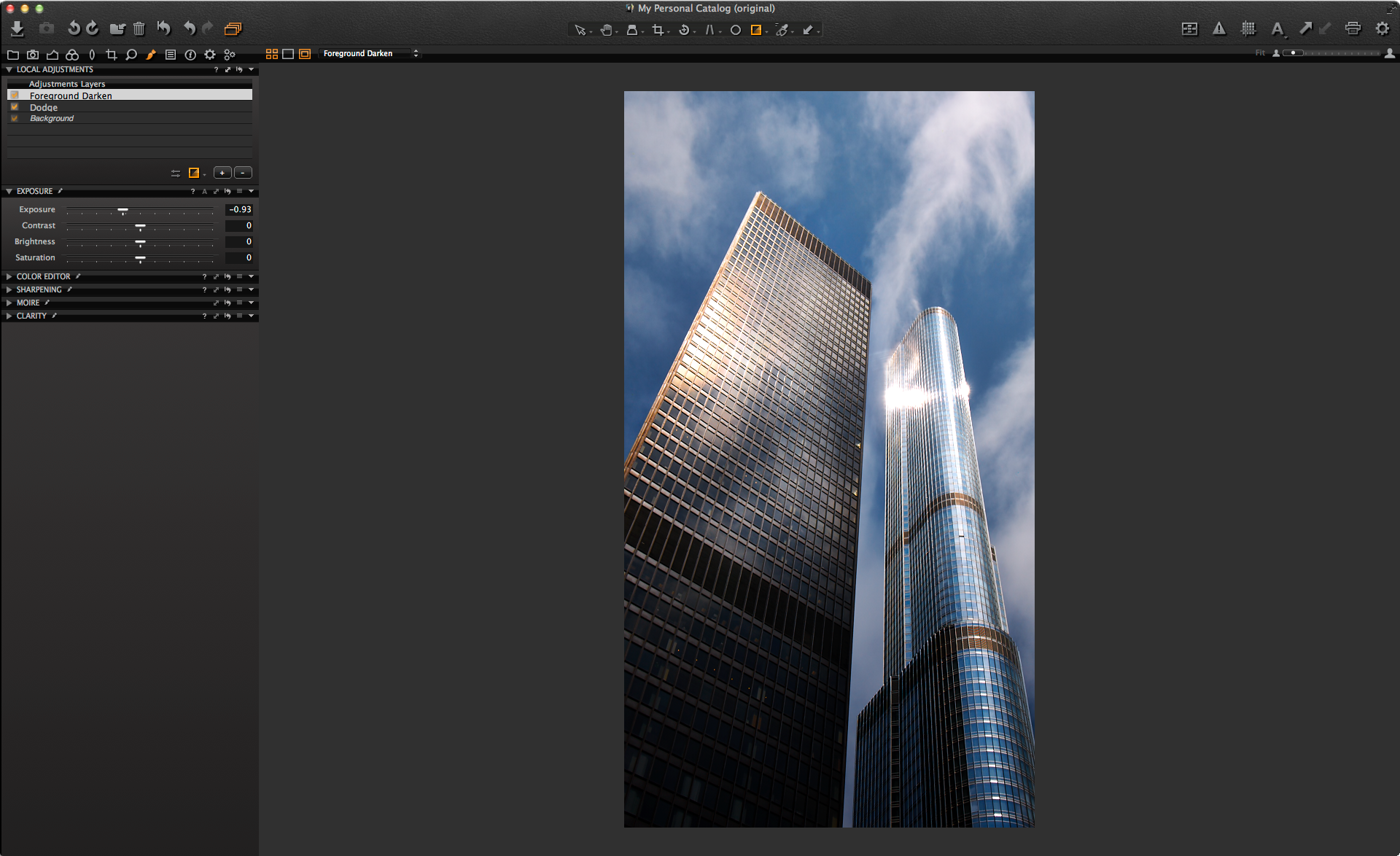
Next up was the sky.  It seems as if it is almost a must-do wtih aerials that if you expose for the surface than your sky tends toward overexposure.  I prefer to not use gradient filters while shooting aerials. They can be one more item that can drop out of the helicopter and my philosphy is, safety first. I take a minimalist approach while in the helicopter becuase more weight equals less power and the less equipment in the rear cabin the less chance something can go missing.

4_sky_grad
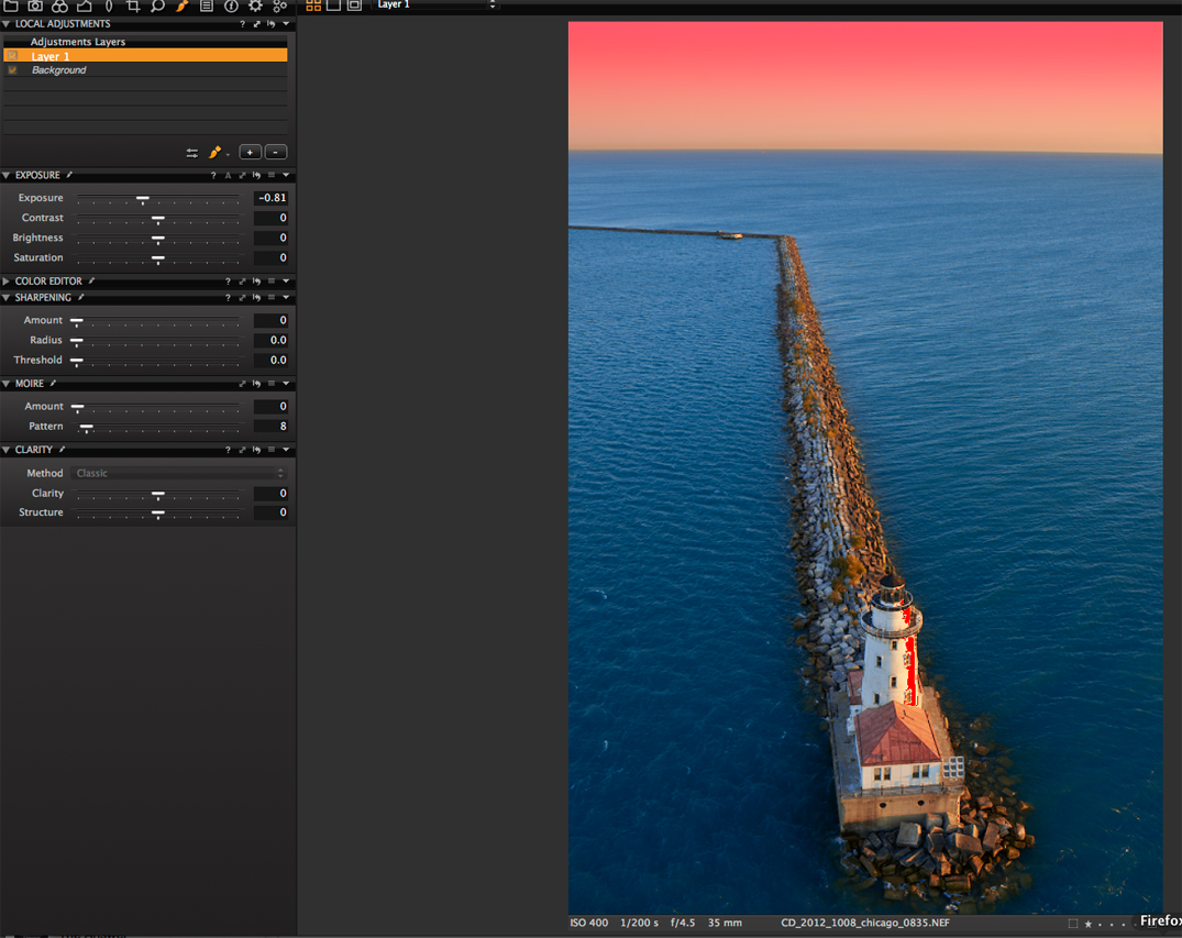
The sky correction was made on a second level and was close to 3/4’s of a stop.

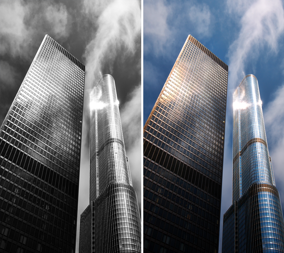
Since this image was intended for stock, I wanted the colors to pop a bit when seen as a thumbnail on the agency website.  I find for many of my aerial and landscape images that I can process the image out to a final delivery file without going into secondary image editing programs to correct or enhance.

5_lighthouse1Best regards,

Cameron Davidson

email: cameron@camerondavidson.com
web:  http://www.camerondavidson.com

Sign up for the webinar

Focus Tool for tethered work

Capture One Pro 7 has a Focus Tool, which allows you to inspect your image at a zoom range of 25 – 400%.

Useful for tethered shooting

The Focus Tool is especially useful when creating still-life images or product shots in a tethered setup shooting directly into the Capture Folder in Capture One Pro 7.

By using the Focus Tool you can at the same time have an overview of the whole image while being able to inspect a critical area at 100%.

In Capture One Pro 7 on a Mac it is even possible to have multiple Focus Tools open at the same time for instance to be able to control the total depth of field in a scene.

T730 Img2The Focus Tool in its default place in the Details Tool Tab

The Focus Tool is by default placed in the Details Tool tab but as with most tools in Capture One Pro 7 you can make it floating.

At the bottom of the tool you can select the “pick focus point” cursor and click in the viewer to inspect the preview image at 100%.  At the bottom of the tool you can also change the Focus Tool zoom rate.

If you select the Pan Cursor Tool (hand) you can pan inside the Focus Tool. Double-click in the Focus Tool to change zoom resolution between 25% and 100%.  With a scroll wheel mouse you can simple scroll to zoom in or out.

A third method to navigate the Focus Tool is by using the overview feature.  On a PC you simply press the spacebar while the Pan Cursor is inside the tool.  On a Mac you need to right-click with the Pan Cursor Tool inside the Focus Tool and click into the overview window.

T730 Img3The overview window inside the Focus Tool 

The white frame indicates the area, which is displayed in Focus Tool.  With the mouse you can now simply move the white frame.

Multiple Focus Windows

When using Capture One Pro 7 on a Mac Computer you have the option to use multiple Focus windows simultaneously.  This is a very useful option when creating an image where you need to control your depth of field very precisely.

T730 Img4To add another Focus Tool simply select “Create Floating Tool” / “Focus” in the Windows menu.  Once you have a new Focus Tool you can dock it below the first one in the Details Tool tab.

T730 Img5I have now docked my extra Focus Tool right under the first Focus Tool in the Details Tool Tab.

When working with two or more Focus Tools, only use the Pan Tool inside the Focus Tool to navigate to where you want to inspect the image. This way the two Focus Tools can inspect different areas of the image simultaneously.

When you browse between different images or when you capture a new image tethered the two different zoom positions will be maintained.

In the example below I was using the Schneider Kreuznach 120mm MF TS f/5.6 tilt and shift lens. I wanted to place the focus on all the bottle labels even though the bottles were placed at a 30-degree angle.

T730 Img6On the viewfinder it is hard to see, if I am perfectly focused so I need to check the focus in Capture One Pro 7. I used two Focus Tools to inspect each end of the row of bottles. This way it was much faster to achieve the right setup of the Tilt and Shift lens.  So even though I need to iterate a few times to get it perfect it was achieved very quickly.


All the best,

Niels


Sign up for the webinar

Potomac River: Behind this long-exposure image

I am going to take you through my process for three images – one for each blog post. The first is a recent landscape image shot with my Alpa Max camera and Leaf Credo 60 back.

I have used Capture One since version 2.7 and am always learning new tricks from the Capture One Webinars, The Image Quality Professor’s Blog and the good folks at Capture Integration in Atlanta, Georgia, USA.

The right day at Potomac River

The image of Great Falls on the Potomac River was shot on May 19th when the river was above flood stage and cresting after several days of intense rain. The Potomac River watershed is huge and drains a good portion of Virginia, West Virginia and Maryland.

All of this water flows across Great Falls, which is a few miles upriver from Washington DC. This view was shot from the first lookout around 8:30 in the evening. Two days earlier, when the river was higher, the rocks in the center part of the frame were completely submerged.

CD_2014_0519_0050_before_doneAbove is the original image as shot. I will walk you through what I have done and why.

The very first thing I do when shooting with the Alpa is to apply a Lens Correction to the file. I was shooting with my Alpa 35mm XL Schneider lens with a center filter and a five-degree down shift to include the rock in the lower portion of the frame. This can produce a slight lens cast, which LCC can fix.

lenscastWith the LCC I enable uniform light and then back off the percentage to 35. I find 100 percent uniform light for my landscape work to be too precise and clinical.

One advantage of the LCC is you can enable it to remove dust in the frame. I often shoot LCC’s for my aerial work with my medium format or Nikon cameras. I keep several LCC’s shots with my prime lenses at infinity and the f/stops and ISO’s I often use.

Bring out detail

Next up is to apply an exposure correction to bring up the details for the overall view. This was a bit more than I expected and I ended up opening up the exposure by .87 of a stop.

I also applied a slight curve to the image and brought the highlights down to 251. I wanted to keep a little bit of moodiness in the water and not brighten it up overall by bringing in the highlights all the way to 217.

exposure_correctionNext up were the blown out highlights in the sky. I used a gradation and brought the end point to just above the center of the rocks in the river. The exposure reduction was pretty heavy: 3.6 stops.  In reality it was 2.73 stops since the original exposure was opened up by .87 of a stop.

skycorrectionI also shifted the color in the sky a bit using the Advanced tab in the Color Editor. I find the Color Editor is a great place to start when you want to refine the exposure of a color. I dropped the lightness of the blue in the sky by 11 percent and increased the saturation to 28. The smoothness was set at 20.

Smooth edges & more contrast

I then used the Erase Mask Tool at 17 percent opacity and erased the gradation along the tree line and edges of the river. The hardness was set to 0. I like to keep the edges smooth and not have a hard line when I reduce exposure in a mask. One advantage of using the Erase Tool in the mask is you can easily dodge parts of an exposure.

I wanted the stone in the lower portion of the frame to be a wee bit darker to create contrast against the flowing water. I used a low level of opacity with the hardness set a zero and painted over the center portion of the rocks.  Additionally, I added a fairly heavy dose of Clarity at 61 and of Structure at 26.

stoneThe water flowing near the rocks was a bit murky and I decided to open it up just a bit. The mask is little hard to see below – but I drew over the water on the left side of the frame and the opened it up 2.31 stops plus added a bit of brightness.

riverI shifted the color balance to 209 on the hue scale along with 20% saturation.

Color_balanceAll in all a pretty simple process. For me, to be able to do these adjustments with the RAW file is a plus and makes my workflow a bit faster. Plus, I can always go back to the raw file and make adjustments with the layers or even add additional corrections.

CD_overviewBest regards,

Cameron Davidson

Sign up for the webinar

The secret side of the Aspect slider

In last week’s tip, Peter Eastway mentioned that he often uses the Aspect slider in the Keystone Tool to adjust the appearance of the image.

Although I’m sure the developers in Copenhagen didn’t design the Keystone Tool for me, it’s amazing how often I use the Aspect slider to either squish things together or stretch them out.”

Therefore I decided to elaborate on Peter’s technique in case you can find a place for it in your workflow.

The Aspect slider is found in the Keystone Tool.

2014-06-09_11-35-06The traditional use of the Aspect slider is to alter the effect of any perspective adjustment to make it look more natural to the eye.  Sometimes the ‘perfect’ correction isn’t the best one visually.  This is why by default, if you use the Keystone correction tools, the Amount slider is set to 80% as opposed to 100%.

The Aspect slider has no automatic values applied, so it’s up to you to dial in the look you want to achieve.  In a lot of cases of the normal use of the Keystone Tool, the Aspect slider can be left alone, but it’s often worth experimenting with it, in case it can help the image.

2014-06-09_11-43-01For example here, if we correct the perspective of this image using the Keystone Tool.

We can reduce the aspect value a little to make the building a little taller.  Notice that the Amount slider has defaulted to an 80% correction.  This still removes most of the ‘falling down building’ syndrome but looks more natural.

2014-06-09_11-44-37With some images, the perspective is too extreme to make a visually pleasing correction, but this doesn’t mean we can’t still make use of the Aspect slider.

The lead image without any corrections looks like this.

P1040181 3As there are a couple of lofty towers in Chicago’s skyline, it makes sense to try and convey that a bit more… even though it is cheating somewhat!  The image could also do with some help in the way of contrast and probably some Local Adjustments.

If we start to drag the Aspect slider we can gradually stretch the buildings making them look taller.  You can see the difference between the original and the same image with a -18% Aspect adjustment.

2014-06-09_11-52-15You may find that the crop needs adjusting after the Aspect slider has been moved.

2014-06-09_11-56-18I have also played with the Vertical and Horizontal sliders to change the look a little as well.

Now that the building shape is a bit more dramatic I can complete it with some image adjustment.

The contrast is really flat, probably from a lot of flare from the sun off the glazed surface.  The Levels look ok with a nice even Histogram, but the mid tones could definitely use some help by pulling the mid tone slider towards the highlights.

A positive Clarity adjustment will also help with the haziness of the image.  Remember, set to ‘Punch’ the saturation will be increased as well, which is perfect for the blue sky.  The final thing that needs to be done is to warm the white balance so the sun is more obvious on the side of the building.

2014-06-09_12-04-02To bring out the warmer sun even more, I can use a pick on the Advanced Colour Editor to darken that tone and increase saturation.

2014-06-09_12-05-56As a final step, to get a bit more variation in light in the building, I will create a Local Adjustment layer, which I can use to ‘dodge’ selected areas of the image.

Before brushing onto the image, I’ll call the new layer ‘Dodge’ and right away increase the exposure for that layer by 1.5 stops.  The brush Opacity should be nice and low so the effect can be built up and remain subtle.

2014-06-09_12-09-11A few brushes and I can improve on the lighting on the windows.

2014-06-09_12-11-50I think that’s it, except for a small adjustment on the crop and a Local Adjustment gradient mask to darken the foreground a little.

2014-06-09_12-14-23Here is the final result against the original.

beforeafterIt would be interesting to know if you have found another use for the Aspect slider?  Or if it has benefited your images?

Oh… and here is a Black and White… now to stop playing!

bwcolor


Best regards,

David


Sign up for the webinar