I have done a few months of comparisons between printing from Capture One Pro 9 directly and exporting tiffs from Capture One Pro 9 to doing additional work in Photoshop. There are things that can be done in Photoshop with selections and masks, and advanced sharpening workflows that cannot be done in Capture One Pro 9. But, with the quality of files that you are capable of getting from Capture One Pro 9, there might be less of a need for that additional work in Photoshop, and with some images it might be possible to skip other processing, resizing, and sharpening software altogether before printing.
Download free 30-day trial of Capture One Pro 9
Before I print in Capture One Pro 9, there are a few things that I do to set up the interface and tools that allow more control and ease in making those final adjustments before printing.
Setting up your Capture One Pro 9 Workspace for Printing
Display calibration:
This should go without saying, but having consistent color and brightness settings for your display will make the editing and printing process easier and more repeatable. There are a few things to keep in mind when creating your settings.
One of the most important things is getting your brightness correct, so that your adjustment will be accurately reflected when viewing the print under normal conditions. Dody Thompson, Edward Weston’s last assistant and a fantastic photographer in her own right, wrote about Edward bringing his prints out of the darkroom and evaluating them under a bright skylight. Now people always complain that museums light his work too dimly (mostly for preservation and conservation purposes) and that they are always too hard to see. Our eyes tend adjust for the dimmer environment naturally after being in the gallery for a short while, and if there is a room full of Edward Weston prints that all have a similar range of tones, they will look consistent and beautiful.
But, we are not Edward Weston, so we better get the monitor settings right. A good place to start for a normal room with normal room lighting is around 105 cd/m2. I’m glad we no longer have to work in dimly lit offices looking at CRT displays for all those hours of editing, and a normal room light with those settings should be fine.
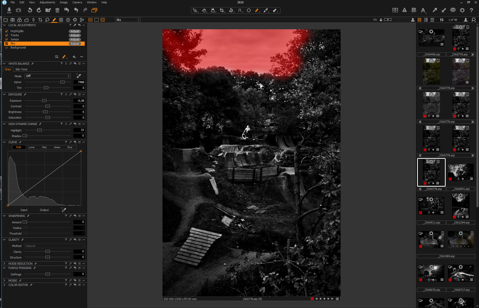
Background and Proof Margins:
The Capture One Pro 9 default dark gray interface is great for long hours of editing, but when it becomes time to print black and white, you might be surprised at how dark your images look when compared to a lighter background border.
Unless you are printing completely to the edge of the paper, you are going to have some paper white, or mat board, or white gallery walls around your prints. Having that bright white reference point is going to make your prints seem really dark if they were previewed with the default dark interface only. To lessen the need for additional proofing and reprints, there are two things I do to make sure the overall brightness is correct before sending it to the printer.
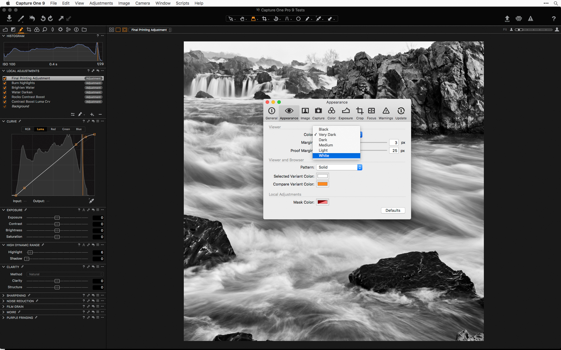
I go to Preferences, choose Appearance and change the background color to white (I’d prefer a 2% gray, but white will do just as well here). That will give you a new white point as a reference for the brightest areas in your image. It will also make the shadows appear darker than when it was previewed with the darker background. I also change the proof margins to have a little more white background showing. The default setting is 25 and I change it to 32. That isn’t critical, but I want to see it more in the center of the display with slightly more white space around the image.
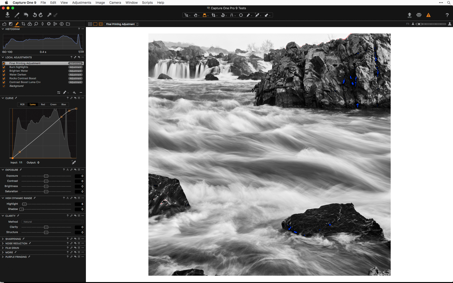
Now I am ready to do any final brightness and contrast adjustments with one last Local Adjustment layer and Luma curve.
Final Printing Adjustments

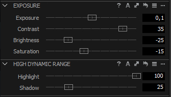
I do my final tonal edits with a new local adjustment layer called Final Printing Adjustment, using a curve adjustment and an inverted mask (you can see my previous post on the Phase One blog to see how I use Curves in Local Adjustments). I use this curve adjustment similarly to how I’d use a Levels adjustment, by moving the black point and white point output sliders and controlling the toe and shoulder of the curve to prevent any abrupt tonal shifts. Doing this on the top-most Local Adjustment layer allows it to be affected by everything below, whereas a Levels tool will take effect before the Local Adjustment layers.
This last step is generally a global adjustment, but an added benefit of using a Local Adjustment layer is that I can erase the mask in any areas that are too heavily affected by the final adjustment.
Printing by the Numbers:
It is true that the print on the page is all that matters and pure numbers will never tell you exactly how you are going to feel about a print once the ink hits the page. But with calibrated printers and a way to match luminance values to a printed target, you can understand what that reading of 7, or 248, is REALLY going to look like when printed. I use a combination of the Curves tool and color readouts to do a mental soft proof, sometimes with a print of a step wedge with the inks and paper I intend to use. Like most things, it isn’t essential, but can be useful, especially if you are still learning what a printer or paper is capable of doing. I created a 256 step target with RGB and black ink labels for the last 2, 5, 10, and 20 percent of values at either end of the scale. You can download a version of the file with and without the labels here.
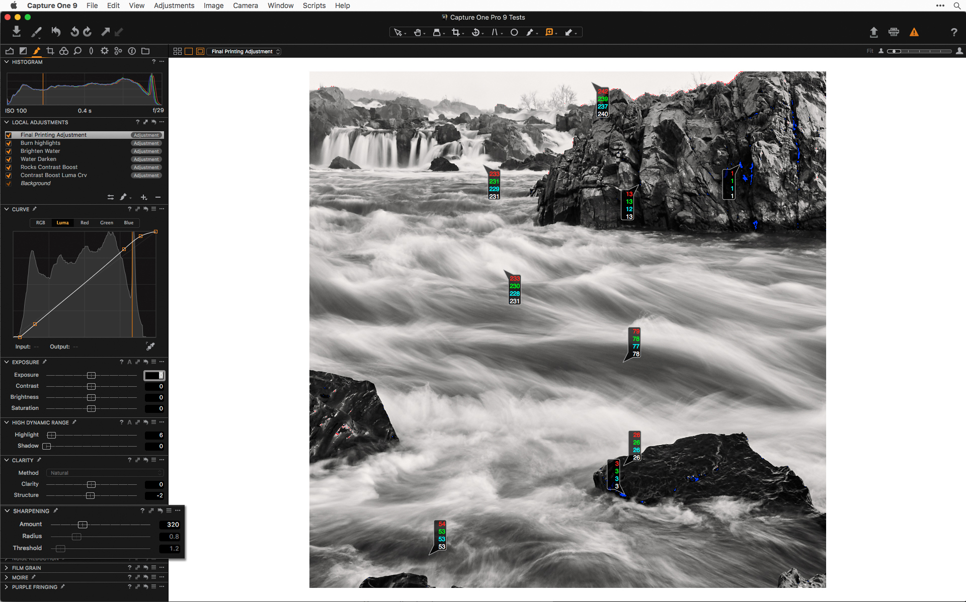
Using Color Readouts:
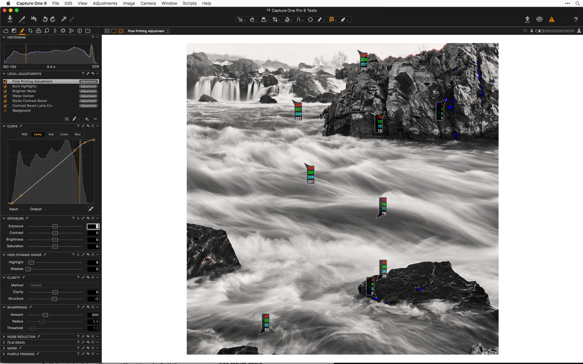
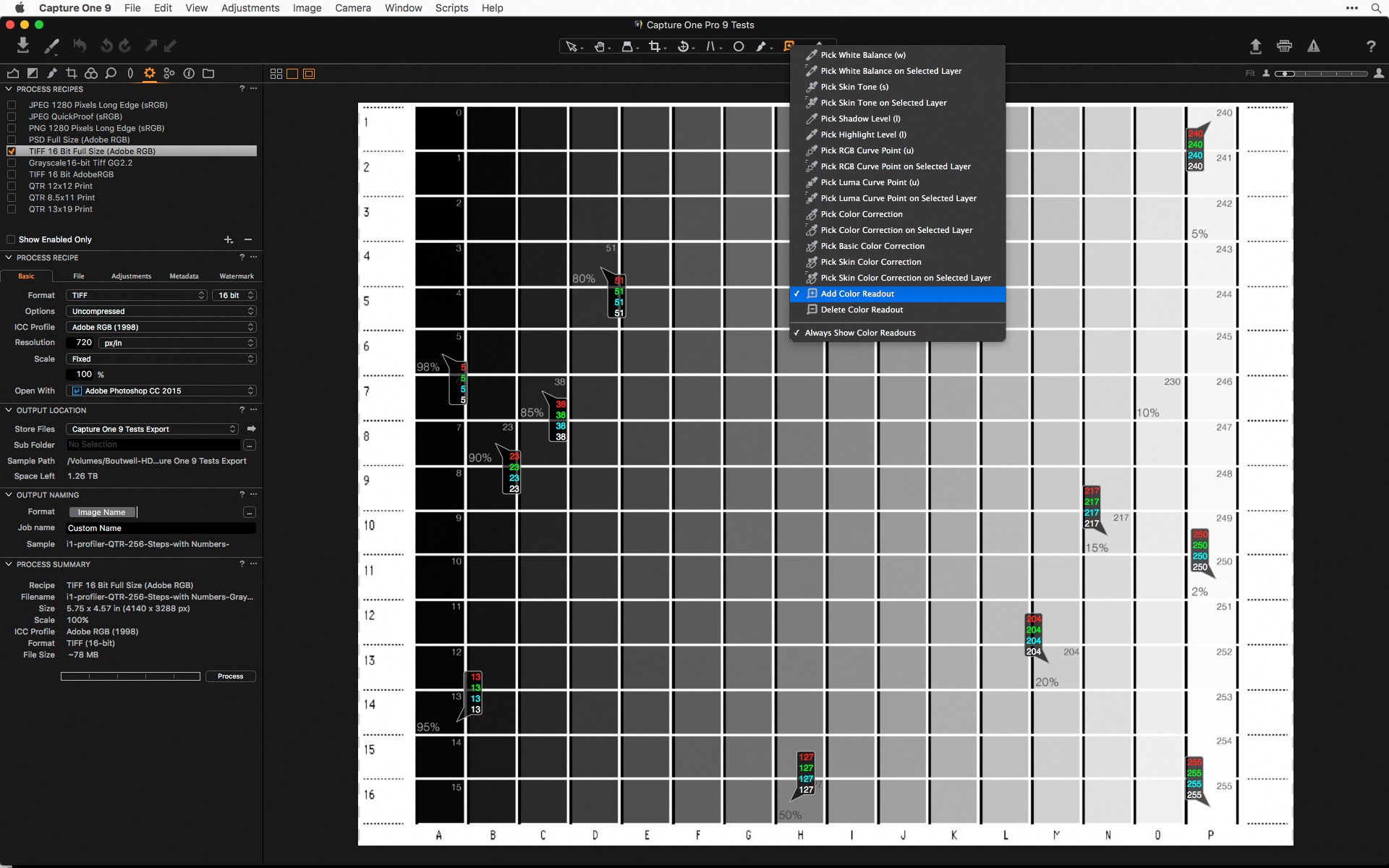
The next step is to use some kind of color readout to see exactly what the image tonal values are, and to make sure there are no large areas blocking up in the shadows or blowing out in the highlights.
Under the Color Picker icon there are several options for different tools. The Color Readout tool is all the way at the bottom of the list. The number of readouts you will use varies from image to image, but once you have the tool active, there will be the same number of readouts in the same position for every image. For that reason alone, I tend to keep the number of readouts fairly low—maybe three to five. That way, I can easily move them around without too much aggravation. You are really only looking at one or two highlight and shadow areas and a midtone area.
When printing with black and white we usually use ink percentages, rather than RGB values, so it’s a good idea to have that target I created or some other scale handy to easily translate luminance values to ink percentages.
Exposure Warnings for Output Thresholds:
It is easy to check for highlight and shadow clipping in Photoshop by creating a new Levels adjustment layer on the top of your layer stack, and, while holding down the option/alt key (the image will turn white if moving the black point slider or black if moving the white point slider), move the input slider to where you start to have parts of the image fill in with bits of black (or white if checking highlight clipping).
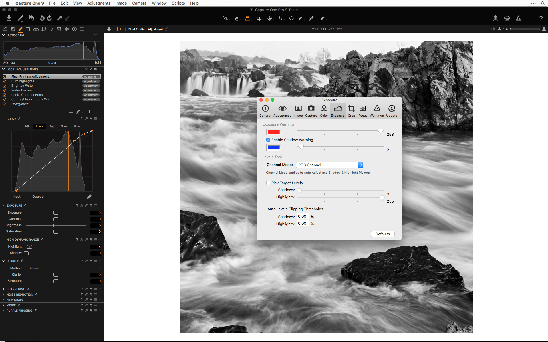
When working in Capture One, you can do something similar with the exposure warning tool. To define the clipping point you need to go to preferences, and choose the warnings option. I put my settings for the highlights at 253, and 3 for the shadows. This will show you at which point you reach the beginning of paper white and 100% ink density.
I generally do not like to have anything lighter than a 5% gray and usually nothing very large. Similarly, I do not like to have large areas of 100% ink. I might have larger areas, or even whole images made up of 92%-98% ink, but there are subtle gradations in those darkest tones, and being able to accurately control and pre-visualize them is helpful in making that kind of dark and moody work. One reason I use dedicated black and white printers is to be able to control the inks at low end of the grayscale.
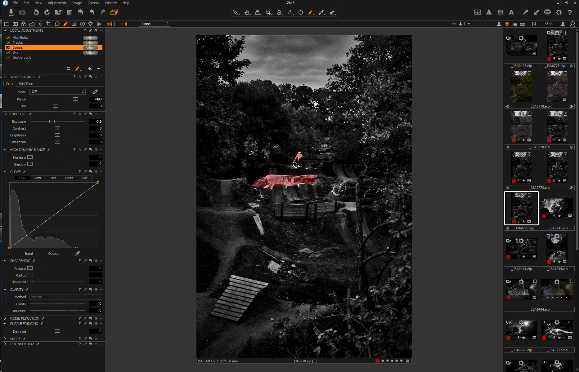
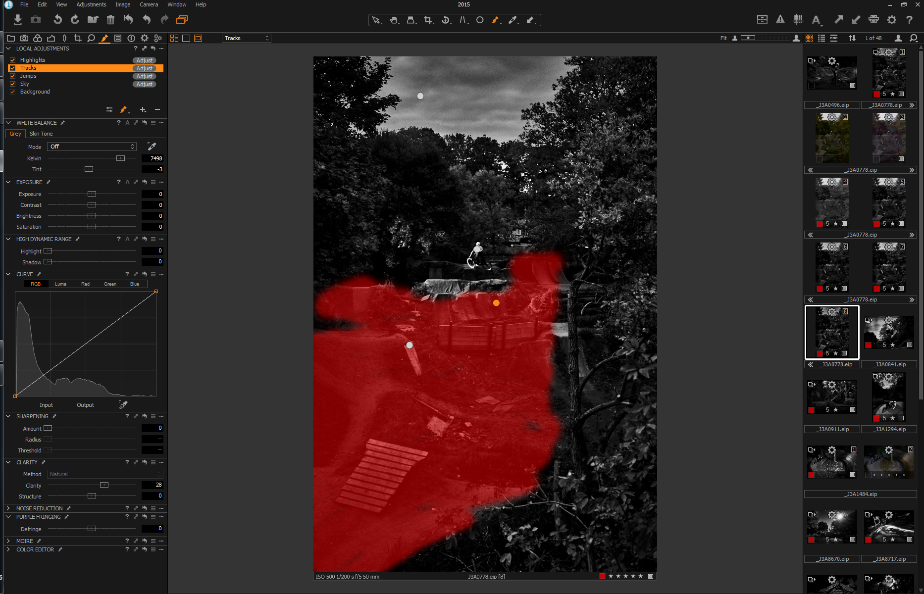
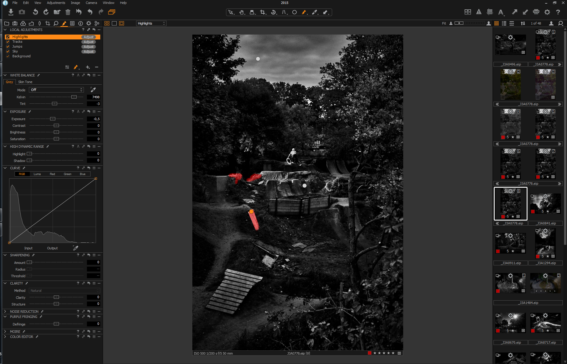
Local Adjustments for Output Sharpening:
Sharpening can be a contentious subject, and there are people firmly entrenched in different camps. I know there are strong opinions and formulae that people have for sharpening for different print sizes and media. My belief is that it is better to under-sharpen than to over-sharpen.
If I am printing directly from Capture One I will use a new local adjustment with an unsharp mask setting strictly for output. If there are areas with a lot of sky or smooth water, I will usually protect those areas with a mask. The same can be done with a different local adjustment for noise reduction.
If there are no areas that I need to mask, I will generally use the same local adjustment layer that I used for the final tonal adjustments.
Sharpening in the Print Menu:
The final print sharpening built into Capture One is a bit of a black box, and the degree of sharpening is based on print size, output resolution, and paper type. Most of the sharpening effect is controlled with the local adjustment layer, but I use a small amount of sharpening in the Capture One print menu. You will need to do some experimenting to see what settings work well for you, but I start with it set between 5 and 20. I’ve found that this produces enough of a sharpening effect in the print without introducing artifacts and unwanted halos.
Another way I have started to address output sharpening is to make the setting very low in the print menu, and use a local adjustment layer for increasing the sharpness and previewing how it will look in the viewer at something close to print size.
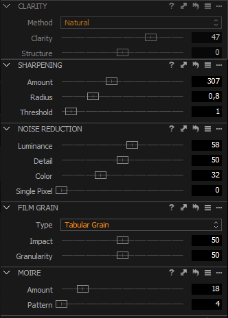
Film Grain:
Due to my background in large format, the film grain options are something I don’t use too often. The only time I use them is when I have done some sharpening and noise reduction, and want to hide that with the randomness of the film grain. In most cases I use the Fine Grain or Tabular Grain settings with the Impact setting to the point where the grain is just barely noticeable. That is a personal preference, and I have seen some very effective use of harsher and larger grain settings for different types of images and matching prints made with small format film cameras. It is a personal decision that needs to be relevant to your work and have a definite purpose.
Output Scaling:
One of the new features in Capture One 9 is the updated interpolation engine, and I have been doing some preliminary testing to see if allowing Capture One to do the scaling to the printer’s native resolution is a better option than allowing the printer driver or RIP to do the interpolation. QuadToneRIP converts the input resolution of every image to 720 pixels per inch, and if you are printing from outside of Capture One, the operating system (on OS X) or the RIP (QTRgui on Windows) is doing the up-resing. I don’t have a clear answer on the exact formula OS X uses, but on Windows it is a simple bilinear interpolation. I’m still working on these tests, but one thing I love about Capture One is discovering how new features can be used in fine art printing environments.
Wait, where’s the proof?
Capture One takes an interesting approach to soft proofing, and it makes final printing adjustments easy. Capture One always displays how the image will look with the selected output ICC profile used in the current Process Recipe in the Output tool tab.
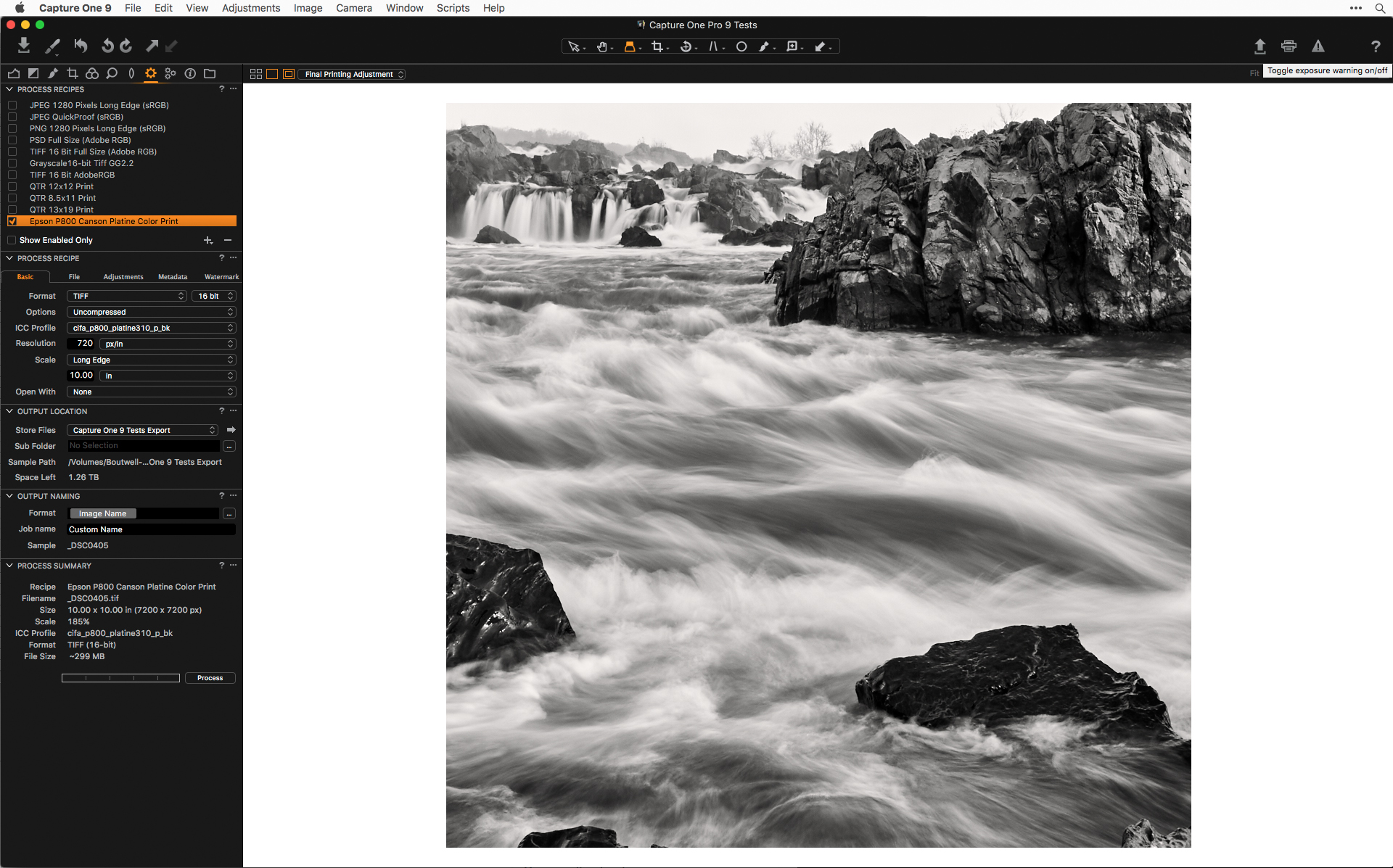
The grayscale working space I use, and what the Piezography system is designed for, is Gray Gamma 2.2. That has the same gamma as Adobe (RGB 1998) and that is what I leave my output recipe set to, and I let the black and white tool handle the conversion.
When I am doing my color to black and white conversion and all of my local adjustment, I leave the process recipe set to Adobe RBG 1998 so I can easily turn off the “enable black and white” setting and see the color version. If I were to do the editing in GG22, and turned off the “enable black and white” option, the image would be a desaturated version of the color image, without any of the black and white filtration. The only time I change to PhaseOne GG22 is before exporting a tiff to do more work in Photoshop or printing with a different RIP or print layout tool. This workflow seems to work well across all the dedicated black and white printing systems, but other options might be better suited to your specific requirements and print toning methods.
Making the Print
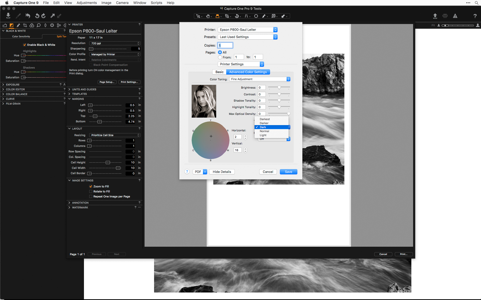
Printing Black and White with Color Color Managed Toning
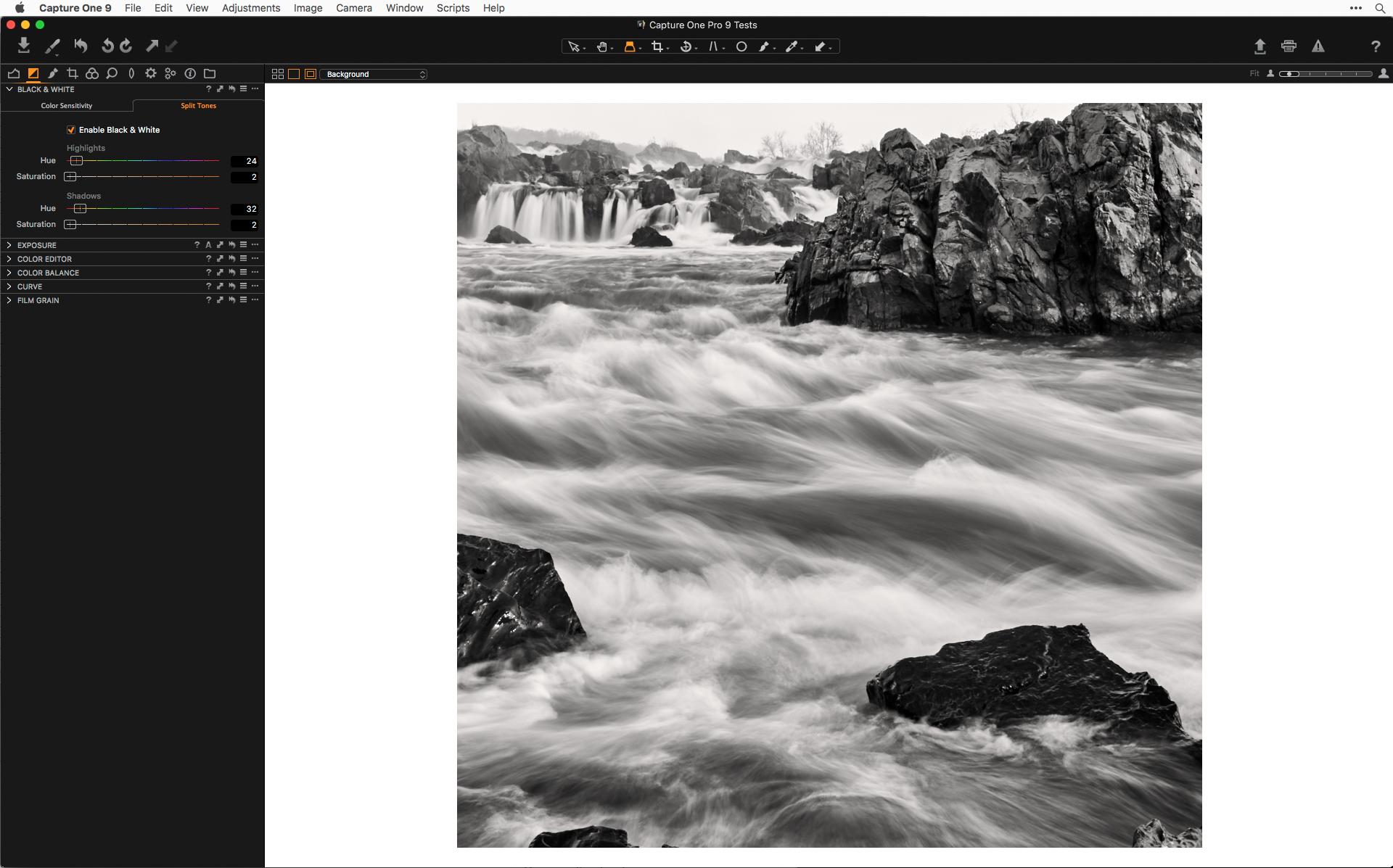
I prefer to do this kind of work in QuadToneRIP, but if you want to be able to control the final print color from within Capture One, you can go back to the black and white tool, and click on the Split Tone tab. This will allow you to select a hue for the light tones and hard tones separately, and control the degree of coloration with the saturation slider. If you use this option, you will need to make sure you are printing with a color managed workflow and printing in the color mode in the printer set-up dialog, and not the printer’s own black and white mode.
Capture One has resources that discuss the use of specific paper and printer ICC profiles and soft proofing before printing. These color management and print mode settings will vary based on the different printers and ink systems you might be using, so you will need to consult your printer driver or third-party developer for specific recommendations. But, as good as a soft proof might be, the real proof is in the print – especially when working in black and white.
Using the Printer’s dedicated print modes, Epson ABW or other Printer’s Monochrome Modes:
These print modes use the multiple black inks and the manufacturers’ software and driver settings for controlling the image tone and print color. This method can produce slightly better prints than using the color print mode and controlling the color through Capture One and ICC profiles. I personally like to have more control over the way the gray inks are blended and how color inks are introduced for shifting the print color warmer or cooler, so I don’t use these manufacturers’ print modes. They don’t allow you to accurately see what your image will look like before printing, and the settings can be vague and require some trial and error to dial in what will work best for your images. The results from the Epson ABW are decent and might be acceptable for people making the occasional black and white print, but they aren’t as good of a print as what is possible with other dedicated black and white software and RIPs.
Dedicated Black and White Printing with Capture One Pro 9
I am a big advocate for a dedicated black and white printing system. I personally use a modified Jon Cone Piezography system, but have also seen great prints made with good profiles for use with the Eboni-6 ink set, created and popularized by Paul Roark. These systems work with Epson and Roland Printers exclusively, and this post is about integrating these dedicated black and white printer workflows with Capture One Pro.
Why Not Just Use the Built in Black and White Features for Your Printer
If you compare a print made with the Default Epson Driver using the Advanced Black and White print mode and one made with QuadToneRIP, you’ll see that the print made with QTR is slightly smoother than the one made with ABW. That is partly due to the way ABW introduces a slight shadow compression that creates a little more contrast than a print made with QuadToneRIP, but that isn’t exactly what makes a print made with QTR better. The QTR print has smoother highlights, and better subtle midtone gradation. It also appears sharper, like there is more information in the original file. There isn’t really any more information in the file, but for whatever reason, ABW can’t resolve it.
The differences between a well made QTR profile and a Piezography print are subtle, but the Piezography print is still better. There is more uniform paper coverage, and because of that, it can render more detail than the dithered inks. The image also appears to be in the paper rather than sitting on top of it.
Printing the dots between the dots:
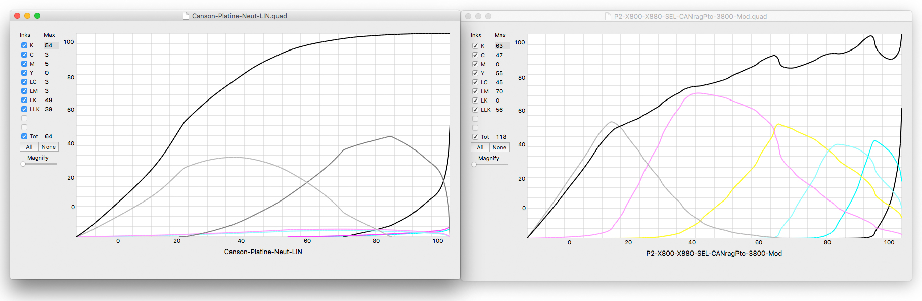
Black and white prints with OEM Epson inks are made from three dilutions of black and gray inks, and the inks need to be heavily dithered to render the lighter tones in the print. When the inks are so heavily dithered, the printer spreads the individual ink dots further apart, allowing the paper white to show through. This is fine for most photographers, but if you are using Capture One, you want more than “most photographers”. You want the most you can get from your photographs.
With more shades of gray inks in the printer, the inks are laid down with much less dithering, creating the appearance of smoother tonal transitions. Additionally, there is more overlap of each neighboring shade of ink, often three or four overlapping inks for any given tone in the image. These overlapping inks fill in those spaces between the dots of the other shades, providing a more even coverage of the paper and creating a richer feeling print. The actual density measurements might be the same from one system to the next, but it is a three dimensional presence and depth in the print that we are after. It is like comparing the appearance of an RC gelatin-silver print and a good silver-chloride contact print. The densities might match for each of the steps measured, but the contact print will feel more alive.
Driving a Dedicated Black and White Printer with QuadToneRIP
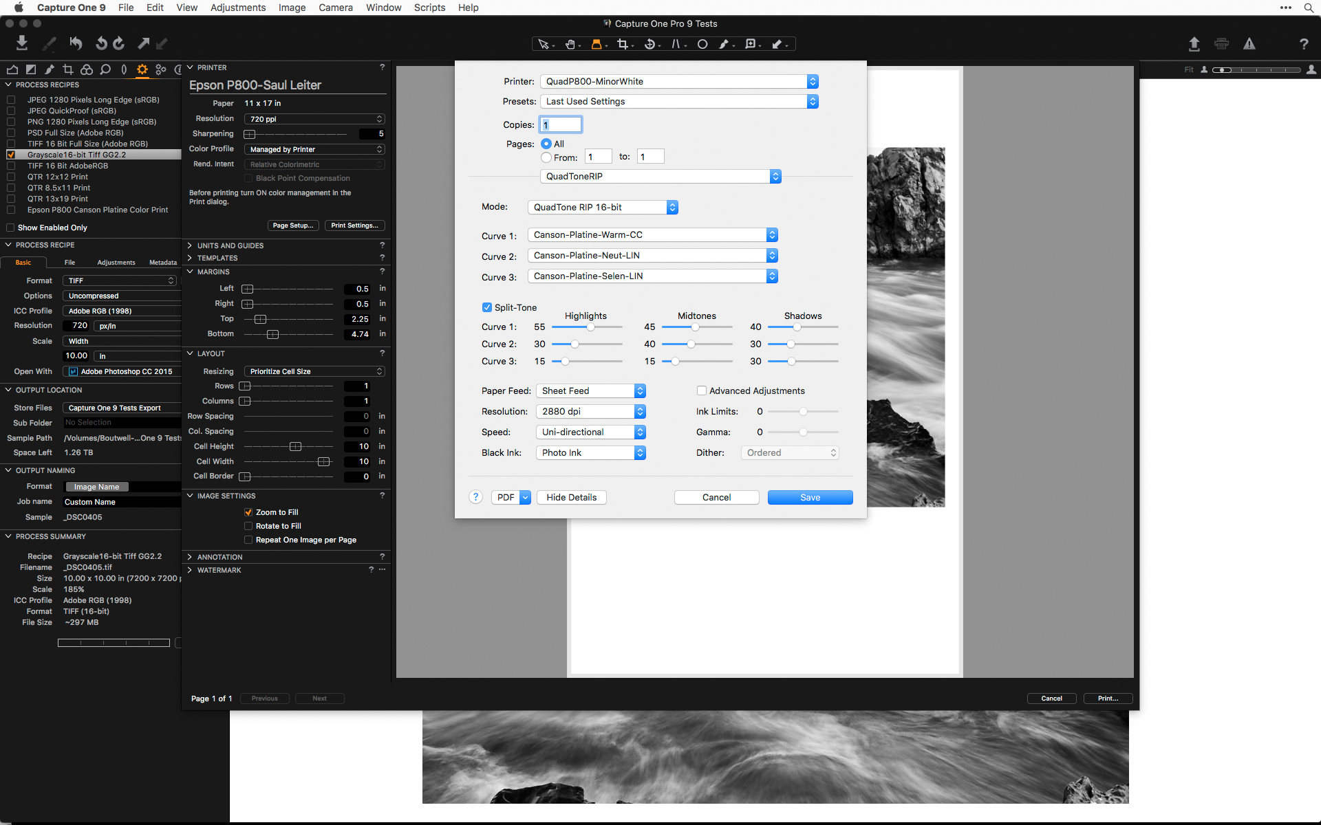
Piezography and Eboni inks use QuadToneRIP to drive a dedicated black and white printer with as many as seven dilutions of black and gray inks. Printing with these black and white ink sets is integrated into the normal printing system on OS X and is similar to the standard printing workflow when using Capture One on a Mac.
On a PC, you will need to export a tiff from Capture One to print through the Windows QTRgui, the dedicated QuadToneRIP printing environment on Windows. That would be the case for printing with QuadToneRIP if you were working from Lightroom, Photoshop, Qimage, or whatever your favorite image editing program is. If you are unfamiliar with QuadToneRip, I included a few links here that are good places to get your feet wet.
No matter how good your black and white images look on the screen, there is nothing like holding one in your hand. And knowing the characteristics of your printing materials and what they are possible of producing, and processing the file to get the most out of it is where digital black and white can reach beyond what was possible in the traditional darkroom.
Best regards,
Richard Boutwell
B&W Mastery
To learn more, sign up for Richard’s upcoming webinar on Fine Art Printing
Download free 30-day trial of Capture One Pro 9


