I had the privilege of being asked by David Grover, Support and Business Development Manager at Phase One, to experiment the new color grading tools inside Capture One 9. I knew the existence of this RAW processing software, but never had the time to explore it until a couple of weeks ago. David wanted to know what an experienced video colorist thought of their new color grading tools, so I dove into Capture One Pro 9 with that in mind.
Coming from Adobe Lightroom and Photoshop, it took me a bit of time to understand CO9’s file management and overall way of doing things. The learning curve was a bit longer than I thought, but it was worth it… Once you get the gist of things, the tools are pretty easy to comprehend.
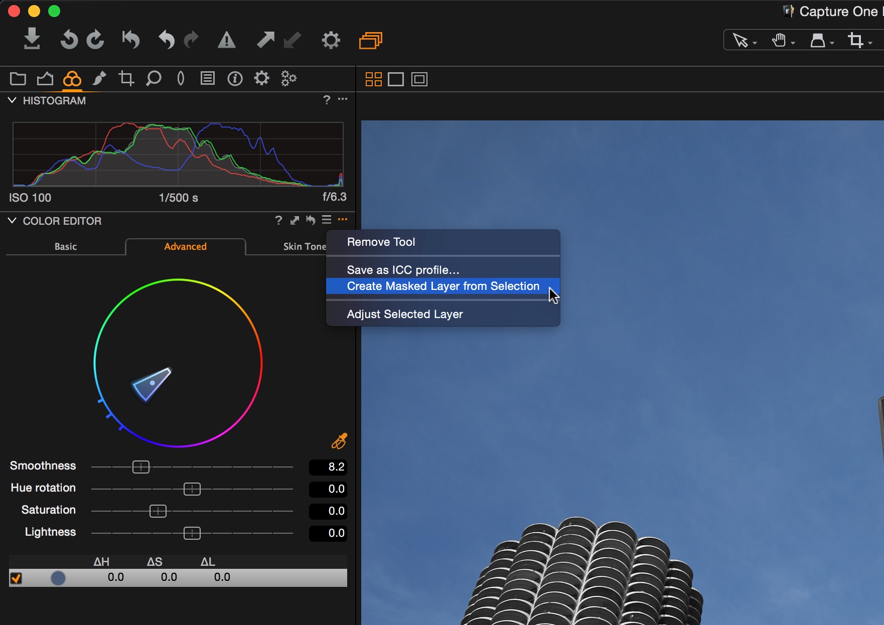
Capture One Pro 9 is a rich and feature heavy retouching software. There are a lot of things I would like to talk about, but instead of doing a very lengthy blog post, I will break it down into different parts. This first part is dedicated to Capture One Pro 9 latest addition, the Color Balance Tool. I’ll start by quickly explaining how the tool works, continue by showing some grading examples and finish off with sepia looks.
Color Balance Tool
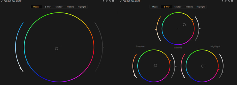
The Color Balance Tool introduces into Capture One the concept of color grading all colorist are familiar with; the three way color wheels. As a Lightroom user, I used to combine the temp & tint sliders, the RGB tonal curve and the split toning tool to push the colors in the desired direction. I got used to retouch my pictures that way and although I always ended up satisfied with the result, it felt a bit unnatural compared to how I grade videos.
How it Works
I assume if you are reading this on my blog, you must already be accustomed to how color grading roughly works, but here’s briefly how the Color Balance Tool functions inside Capture One 9.
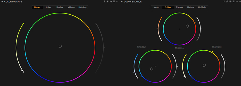
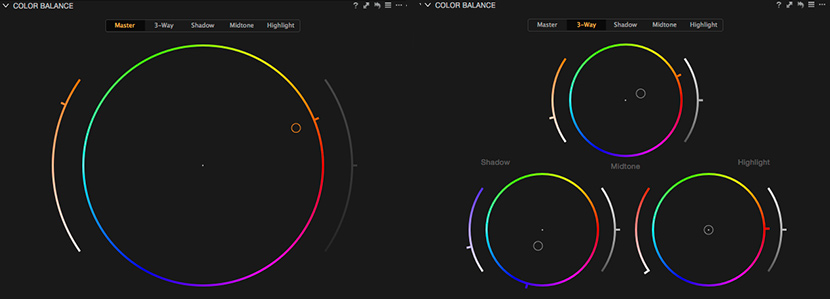
Let’s start with the Master Wheel:
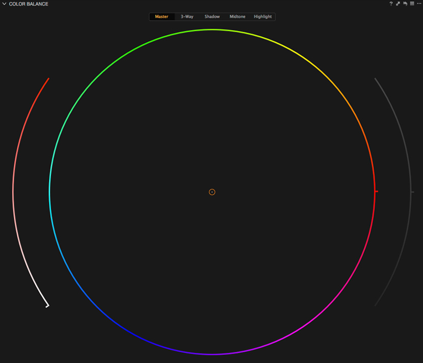
You’ve guessed it! Drag the point in the middle to change the color of the image. The further you go, the more saturated the image will get. Since we are in the Master Wheel, the changes will be applied to the entire image. I like to think of this wheel like a “color brightness”. The changes you’ll do using this wheel will push the colors around and also affect the overall brightness of your picture. If you want to be more precise, you can use the left slider to adjust only the saturation of your selected color. If you wish to adjust only the hue, simply drag the tiny handle directly on the color wheel (located on the right on the above screenshot, but it will move depending on the color you chose). The right slider is solely for the brightness, but it is greyed out in the Master section. There is of course a Brightness and Exposure slider located in the exposure tab of Capture One 9 if you wish to adjust it.
You might ask yourself why use the Master Wheel when we have the 3-Way at our disposal that offer much more control. Well… I personally always use it before starting any specific color work. This wheel is great to establish your base look. I find it more organic to push the colors in a general direction with the Master Wheel and then mix things up with the 3-Way Wheels. But that’s just me!
Speaking of 3-Ways, here’s out it looks:
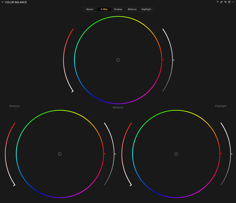
The same principles explained above apply here, except that you now have individual controls for the shadows, midtones and highlights. And you are now able to adjust the brightness with each wheels. Whether you are looking for an extreme bold look, or just a subtle color adjustment, this is where the magic happens. Fool around with the controls if you want to experiment weird looks or apply your color theoryknowledge!
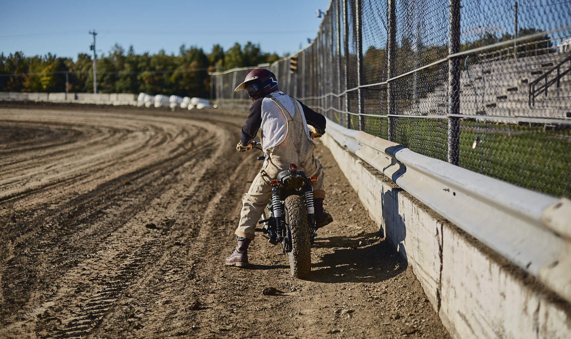
Alright, now that we’ve go the basics covered, let’s take a look at some examples of how the Color Balance Tool can have a great impact on your pictures.
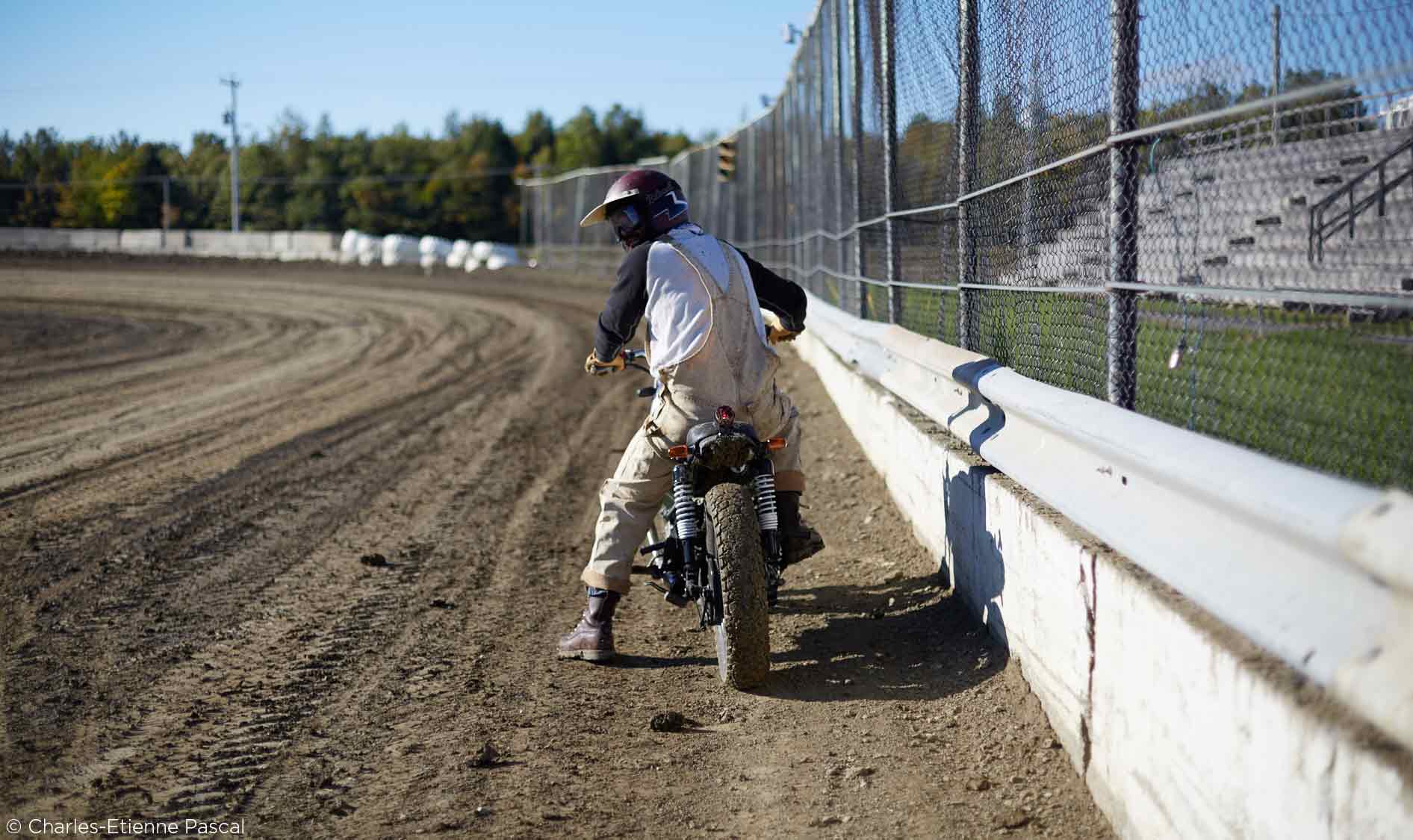
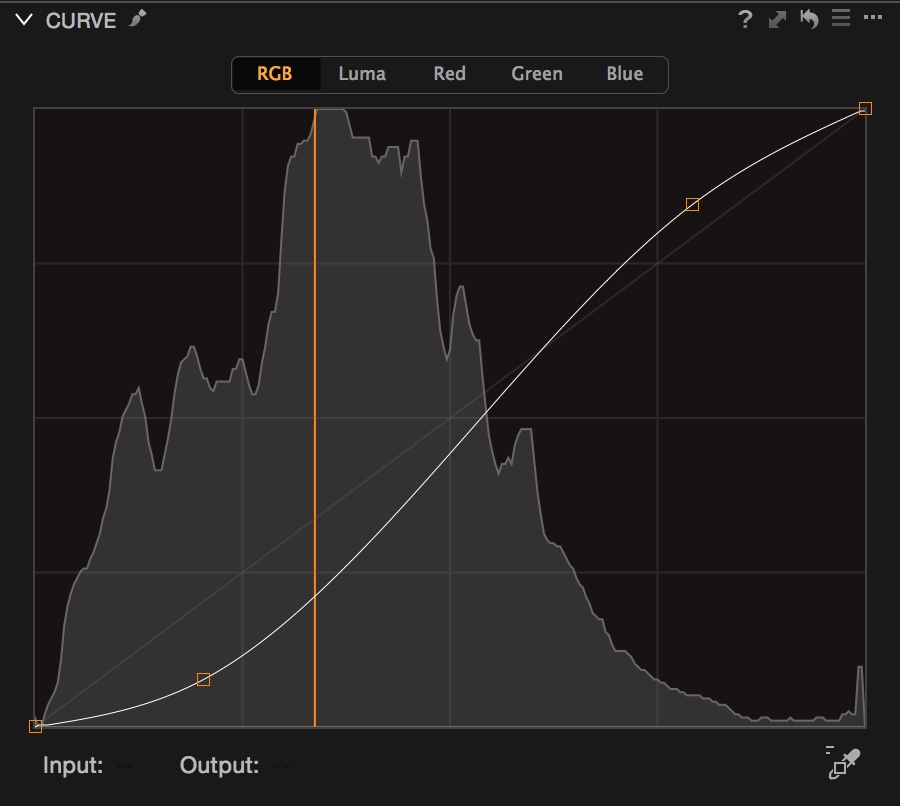
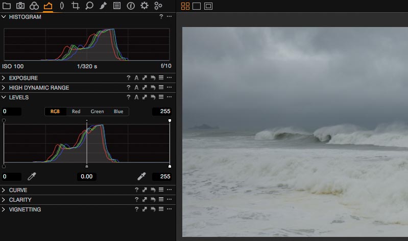
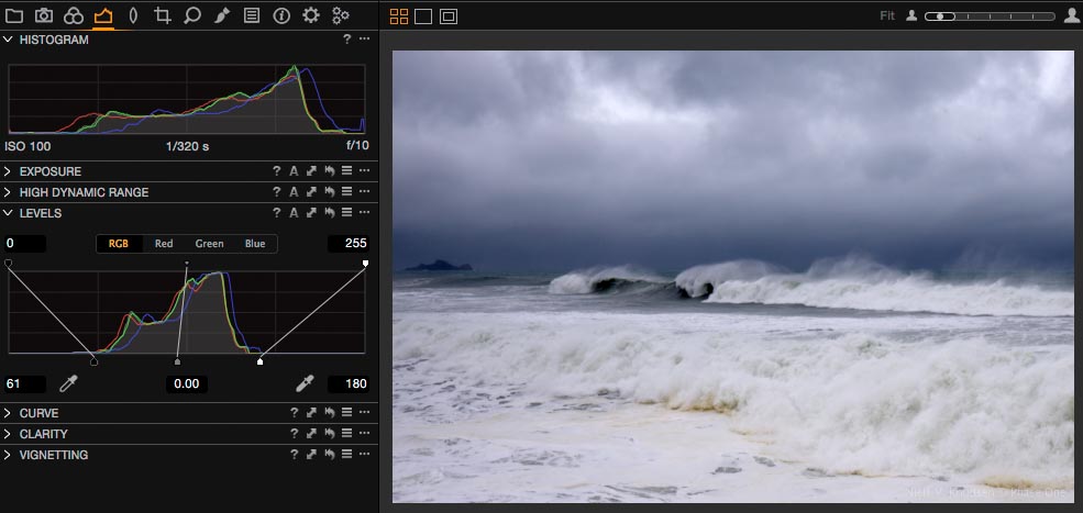
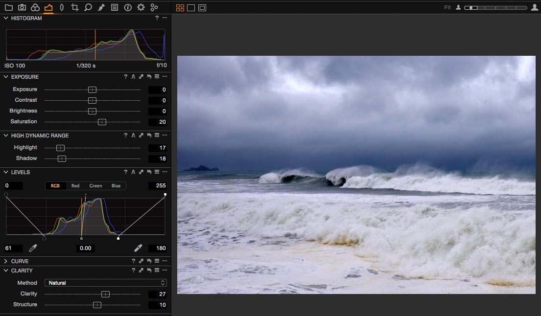
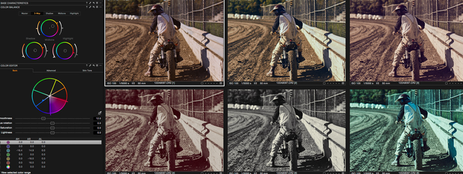
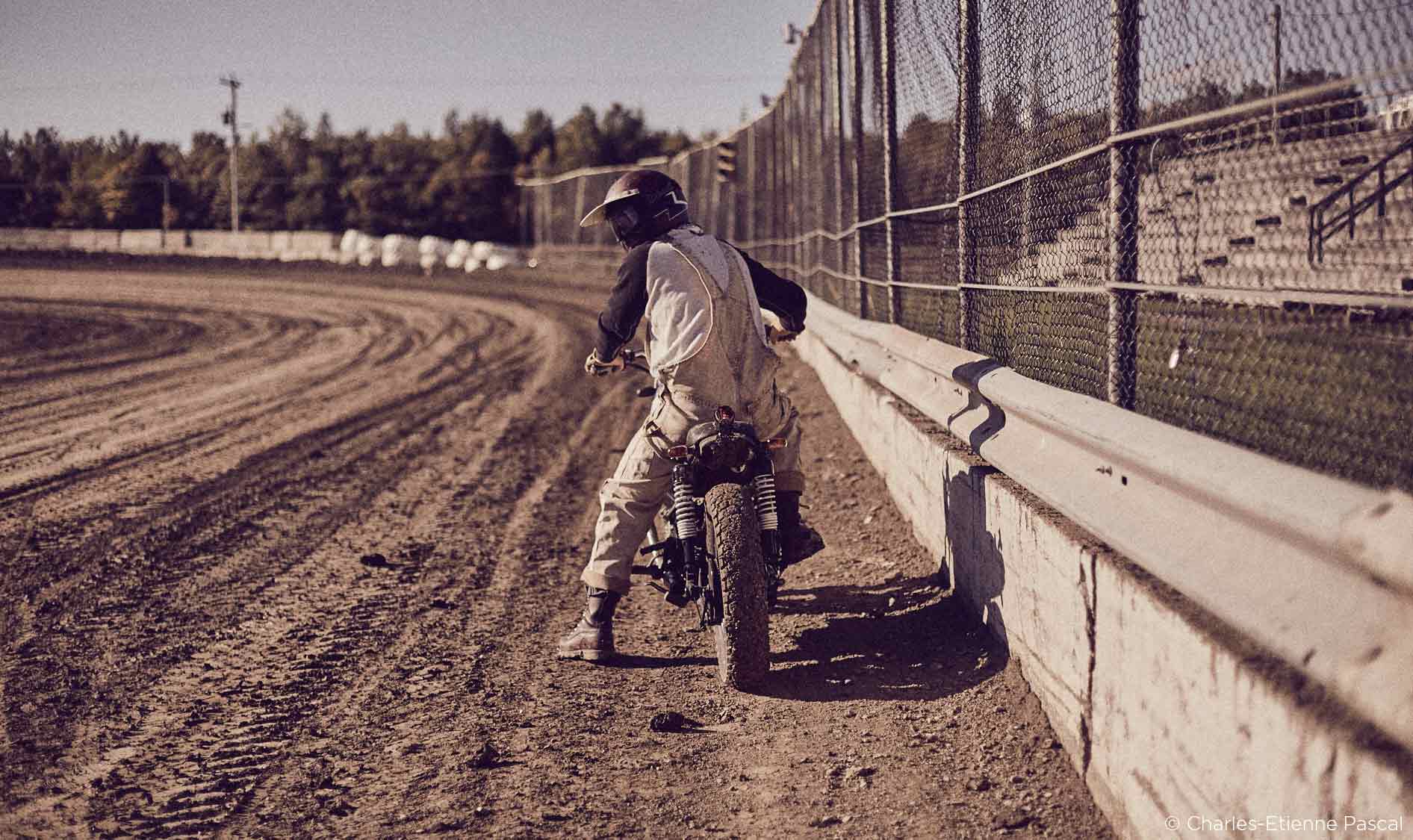
Before I start playing around with the Color Balance Tool, I always try to get the best dynamic range possible and also sharpen the picture. This article is focusing the color tools of Capture One 9, but I think it is essential to start grading your pictures with a decent base look. This is process is similar to what I do when I grade videos such as commercials and music videos. You can of course come back later on and tweak the exposure a bit if you wish.
It’s not a dramatic change compared to the original, but as you can see below, I have more details in the highlights and shadows, the image is sharper and a little bit warmer. I’ve included the main parameters (click on the image) I used to create my base look. This will obviously vary depending on your original image and on your taste. Hopefully, it will you a hint as to how I generally start my looks!
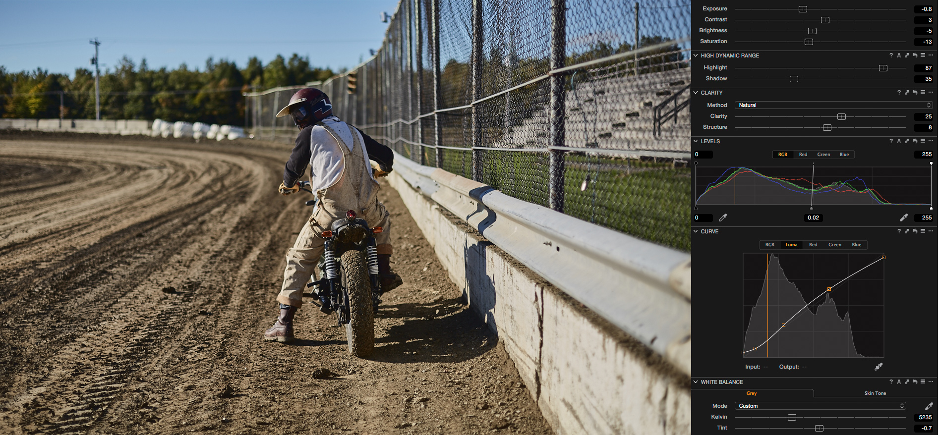
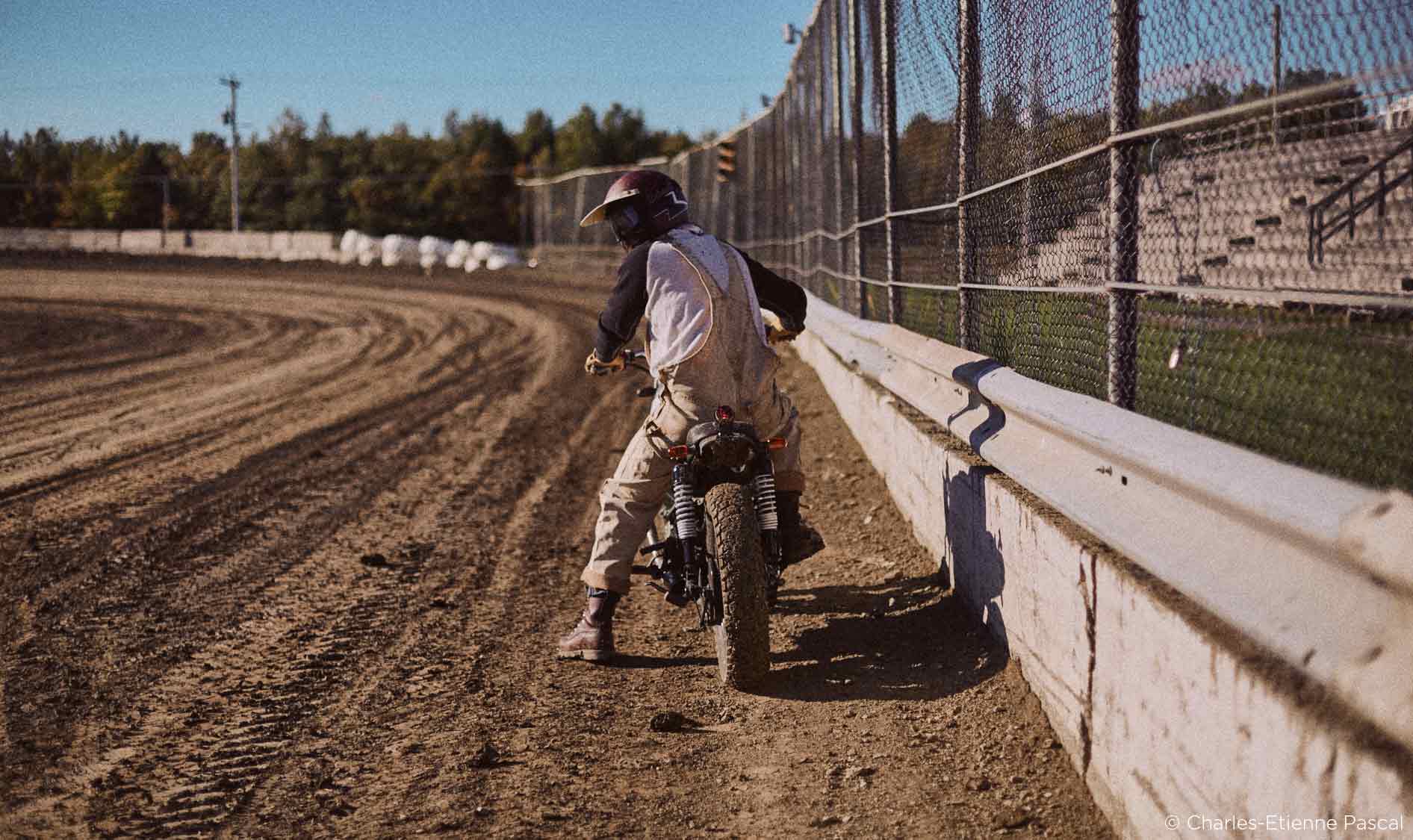
Now that we have a decent base look, it’s time to push these wheels around! In the following examples, I will compare the base look (not the original picture) and the graded image. That way, you guys will be able to see what the Color Balance Tool brings to your image more easily. Just drag the slider to compare the two images.
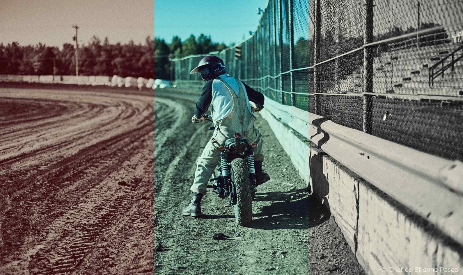
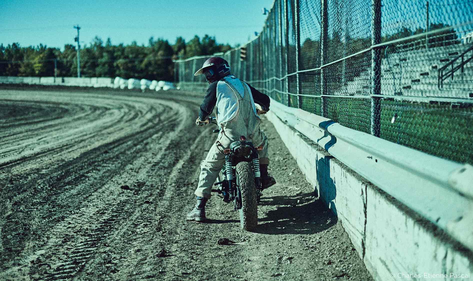
Grade 01: Reddish color cast

Grade 02: Blueish shadows and warm highlights
Grade 03: Old School Cyan
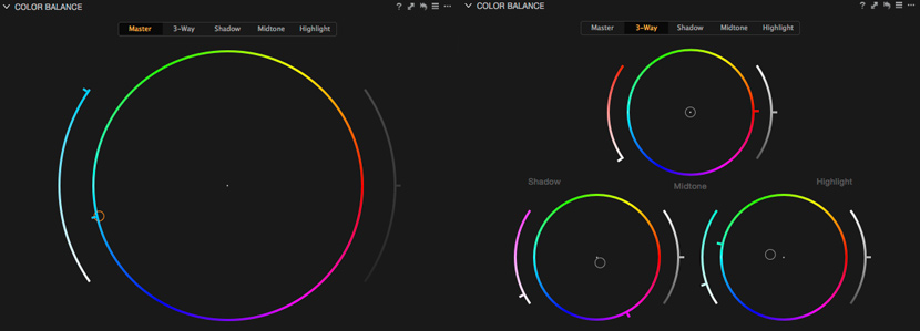

Grade 04: Old School Purple

As you can see, the possibilities are infinite. From a colorist standpoint, these tools are crucial to experiment and push my looks to the next level. I usually don’t go too far and stick to something somewhat realistic like example number 2, but I might consider exploring bolder looks for my next photography projects.
Split Toning
Just like Lightroom, Capture One 9 has a split toning tool to craft nice sepia looks. It works great, but I was curious to use the Color Balance Tool instead. In order to make it work, I completely removed the saturation from the image before pushing the color wheels. If you use the Black & White tool, it won’t work.
I found it much more intuitive and precise to use the Color Balance Tool rather than the regular Split Toning Tool. Here are a few before and after sliders:

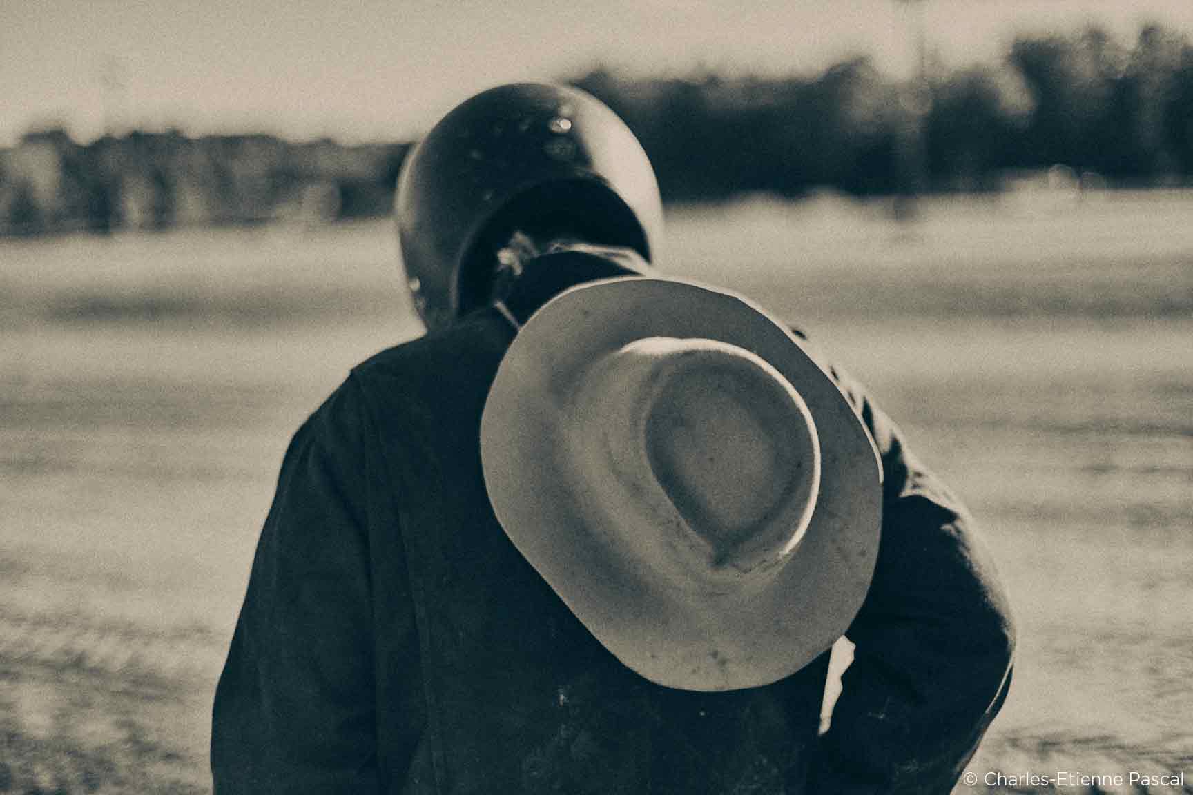

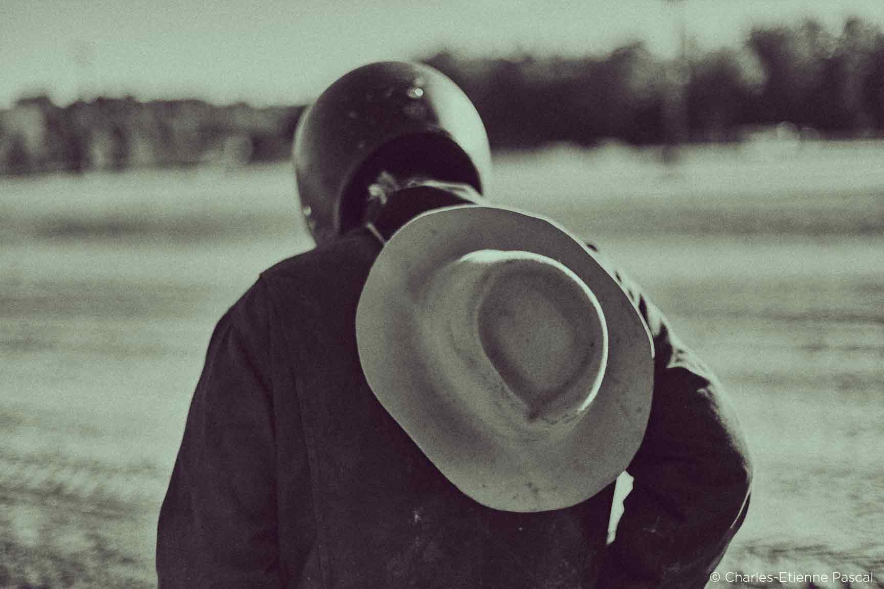

I did these last examples rather extreme to demonstrate what you can do with this technique, but you can also it in a more subtle way. Most of the time, I rarely do a pure black and white image. I like to add just a notch of color in the highlights, like the example below. It almost seems like a regular B&W image, but with an extra warm touch. The Color Balance Tool is great at doing that!
Conclusion
The Color Balance Tool is definitely a must when it comes to color grading. Capture One 9’s managed to implement this tool inside a photo software brilliantly… the controls feel organic and I have to say that I really like the “handles” they added to precisely control the hue and saturation. Give it a try!
Thank you for reading and stay tuned for part two featuring another great color grading feature inside Capture One 9, the Color Editor Tool!
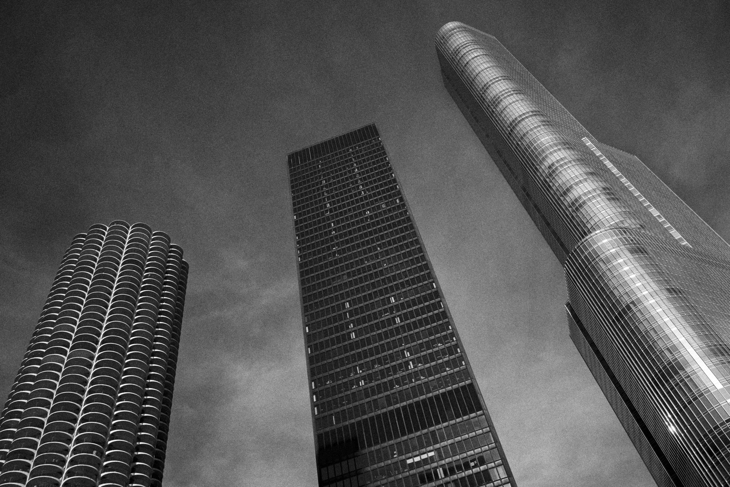
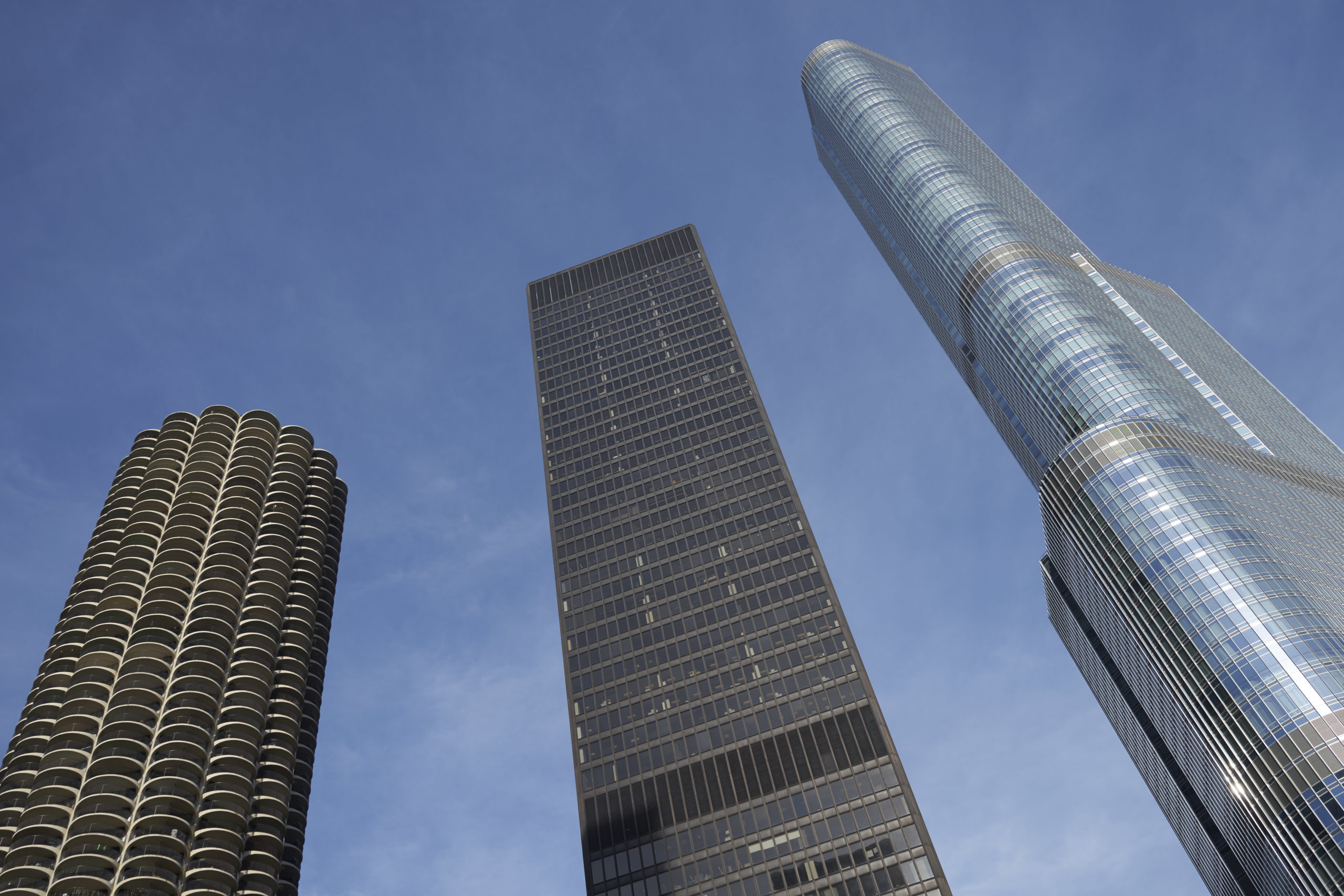
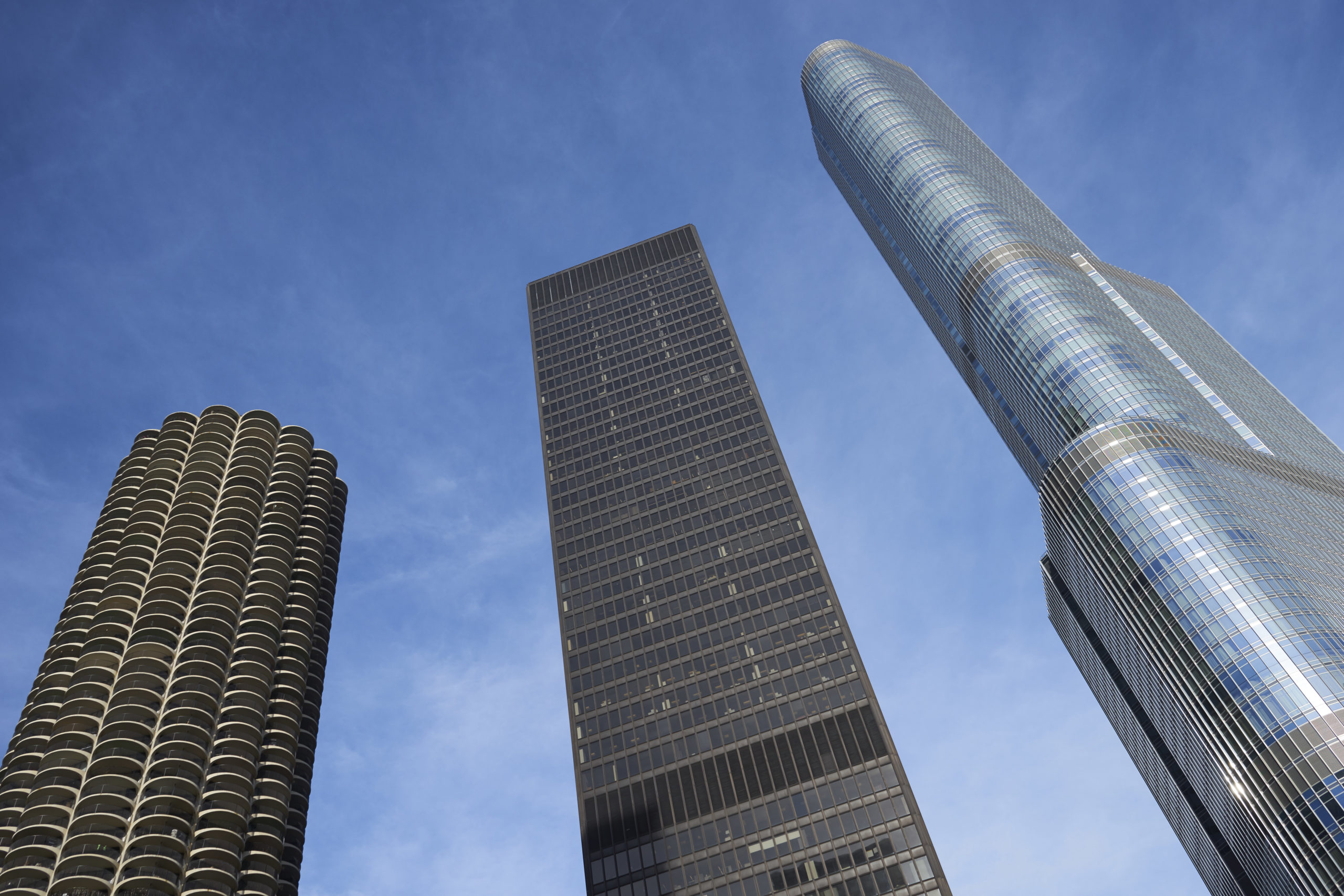
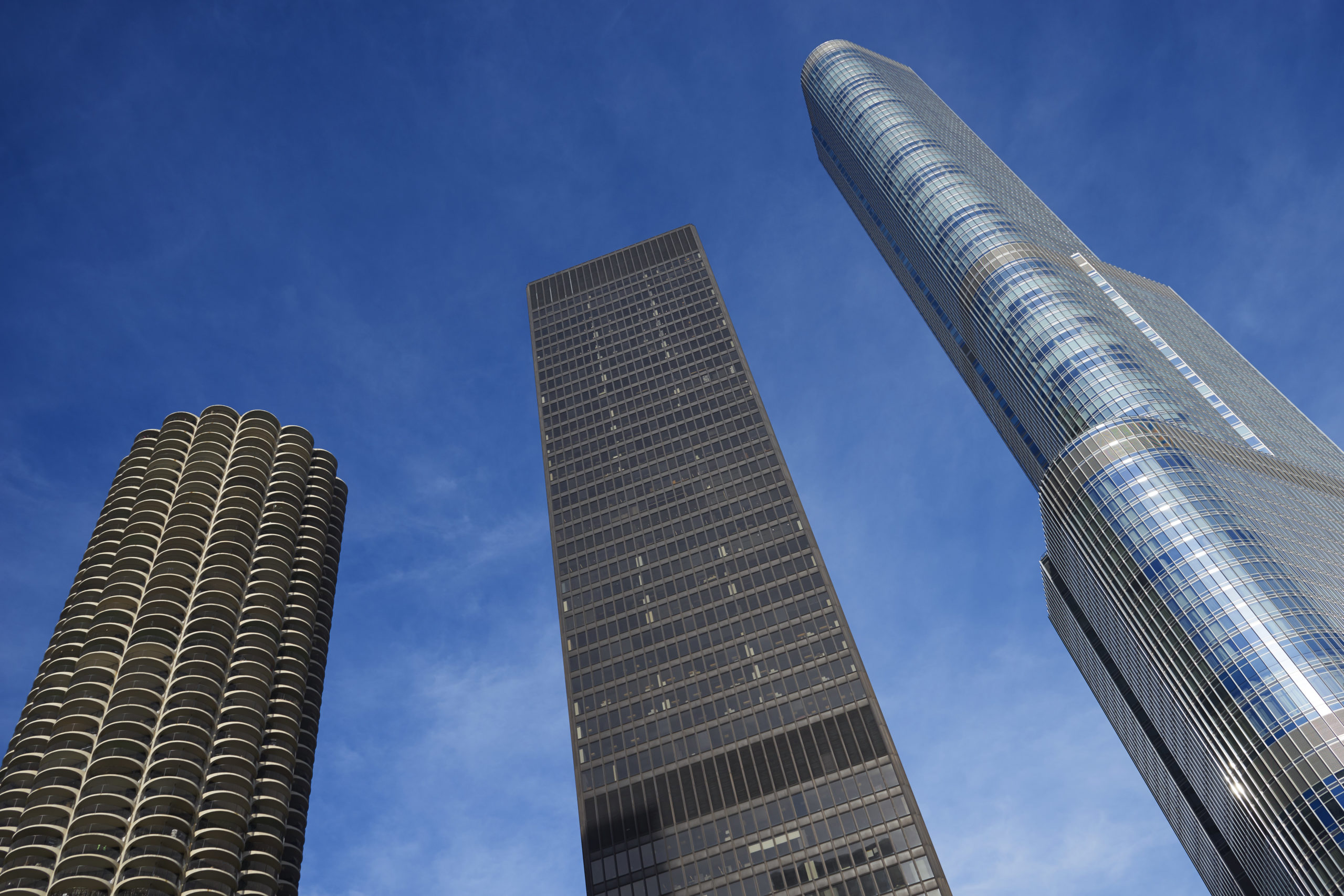
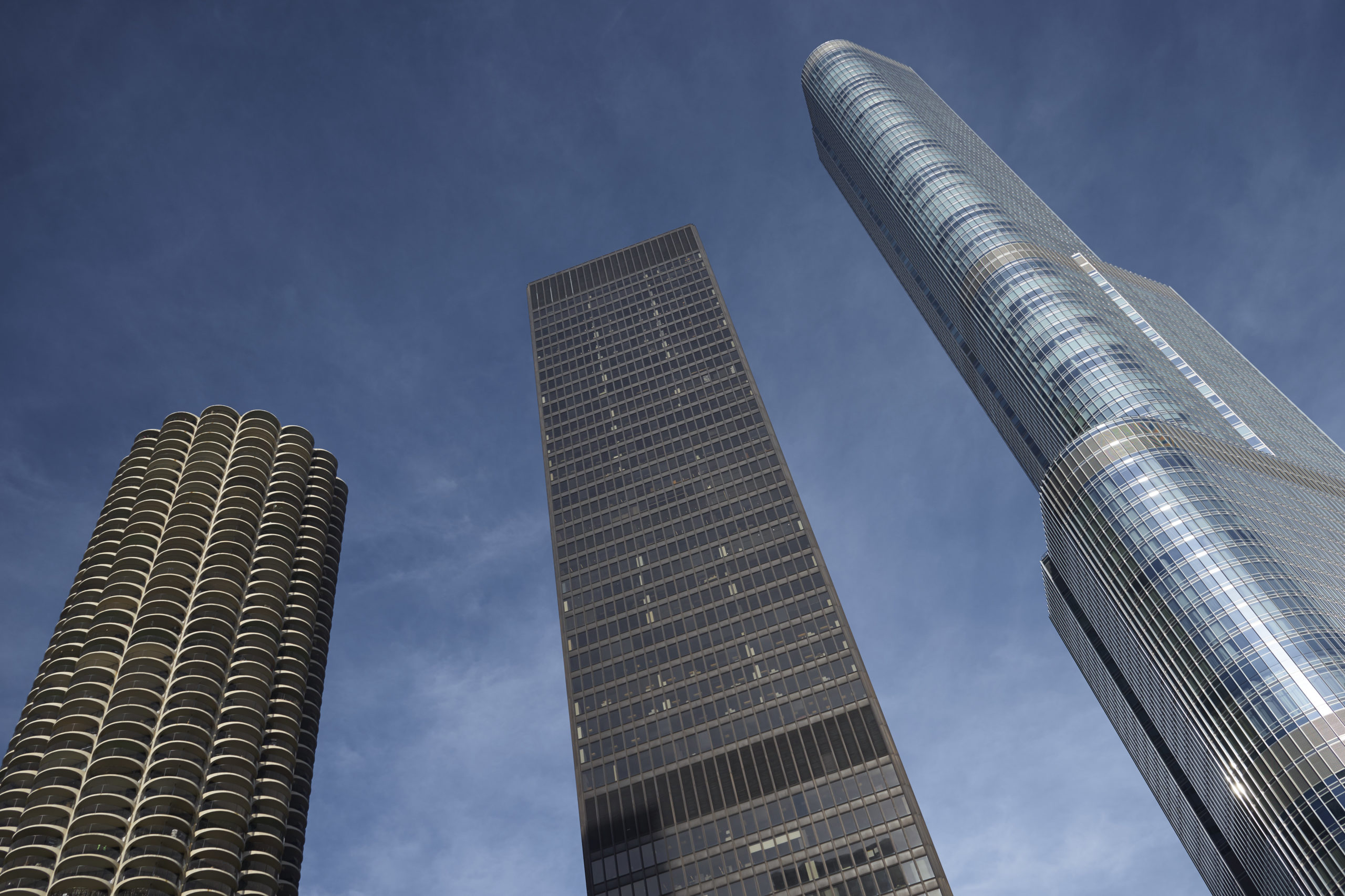
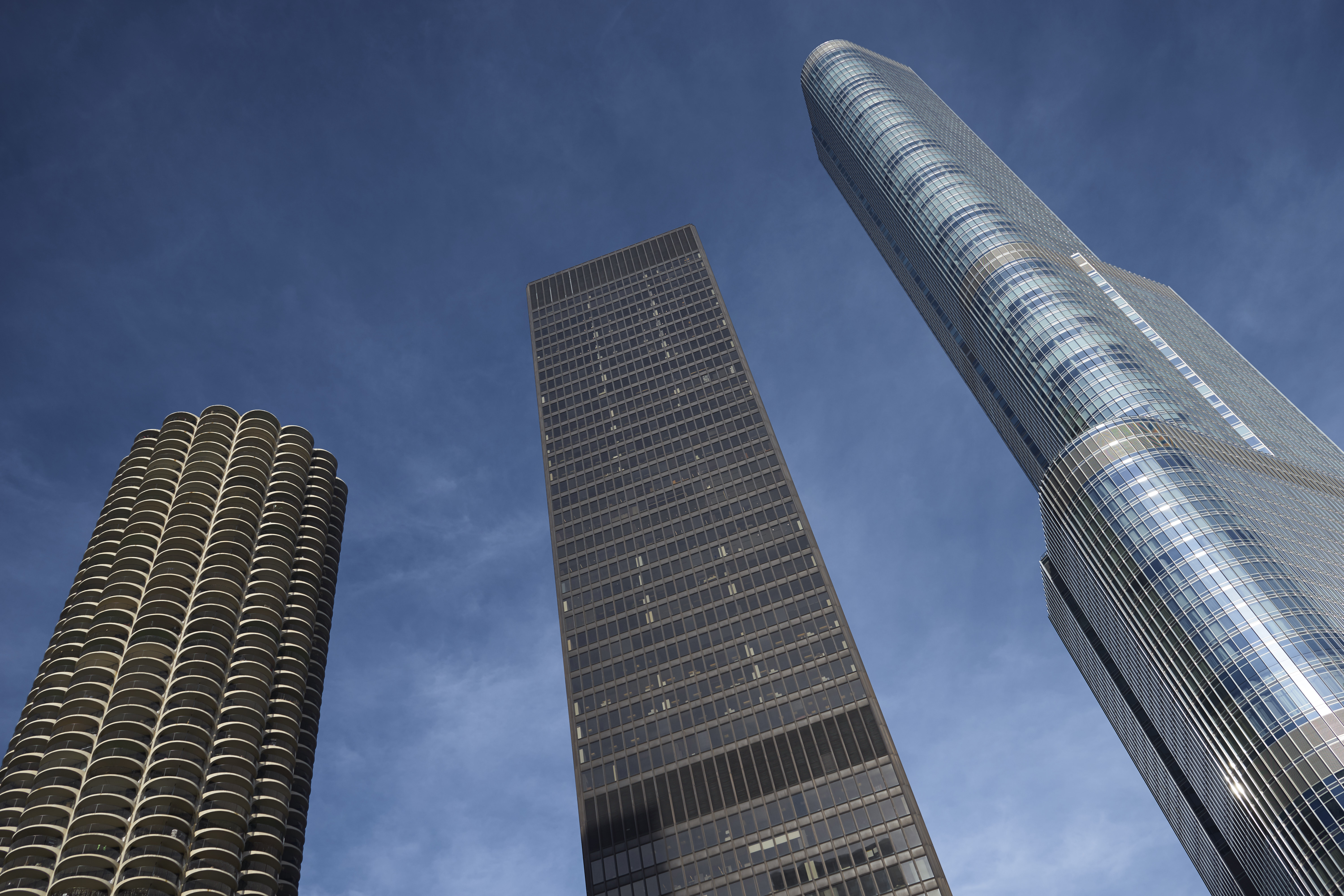
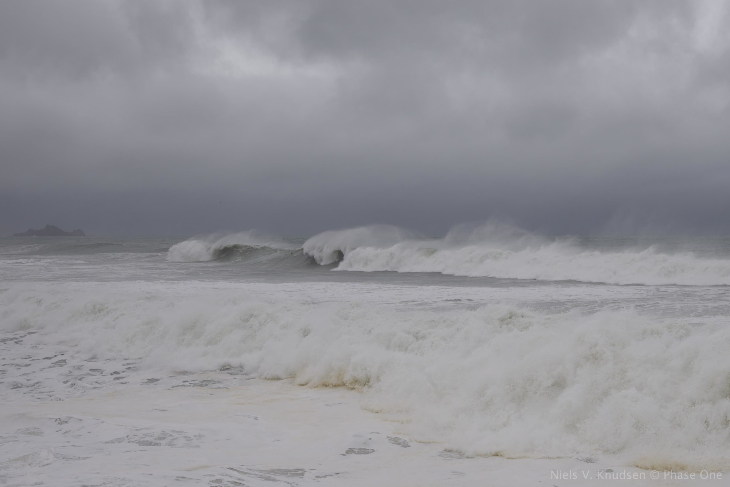
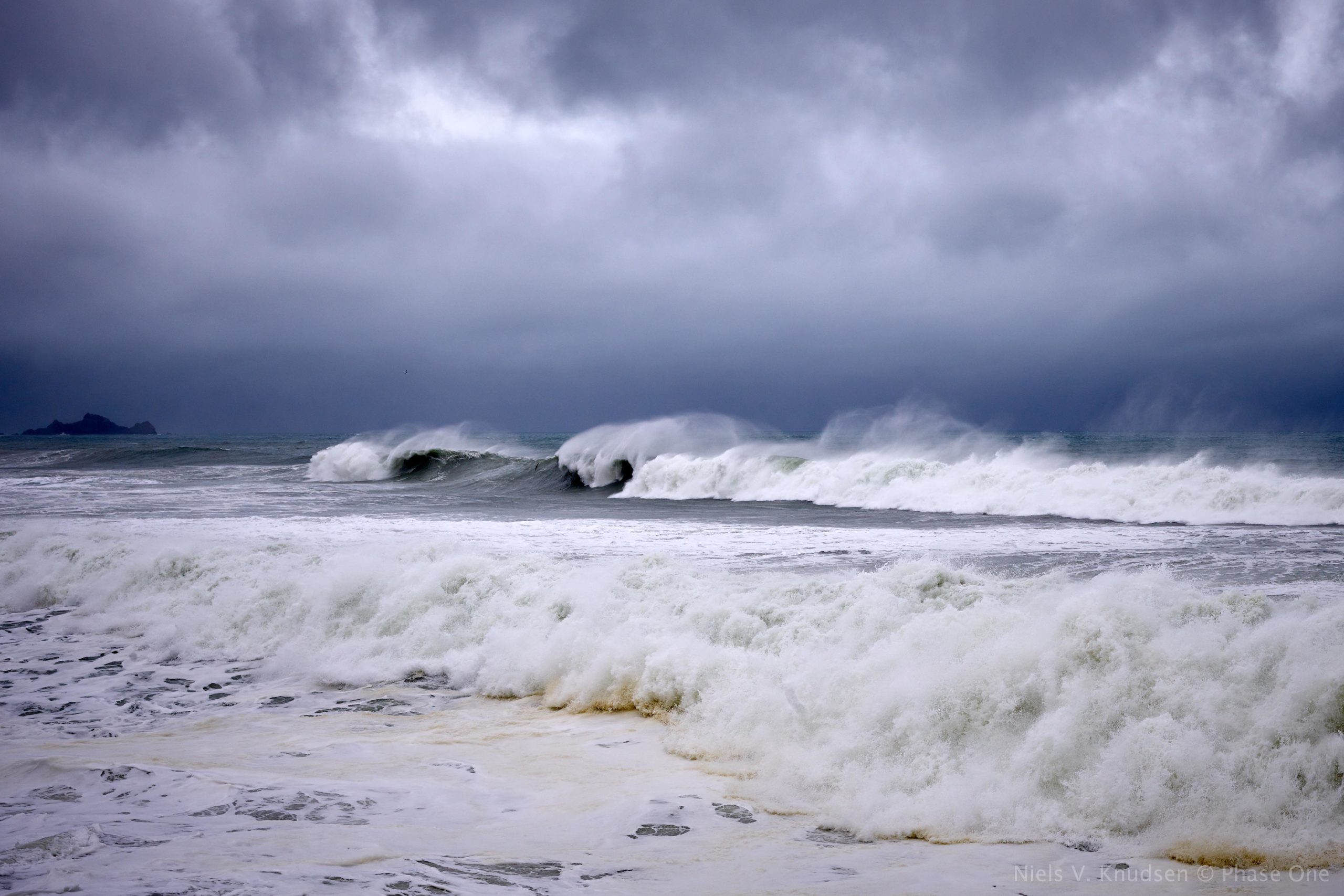
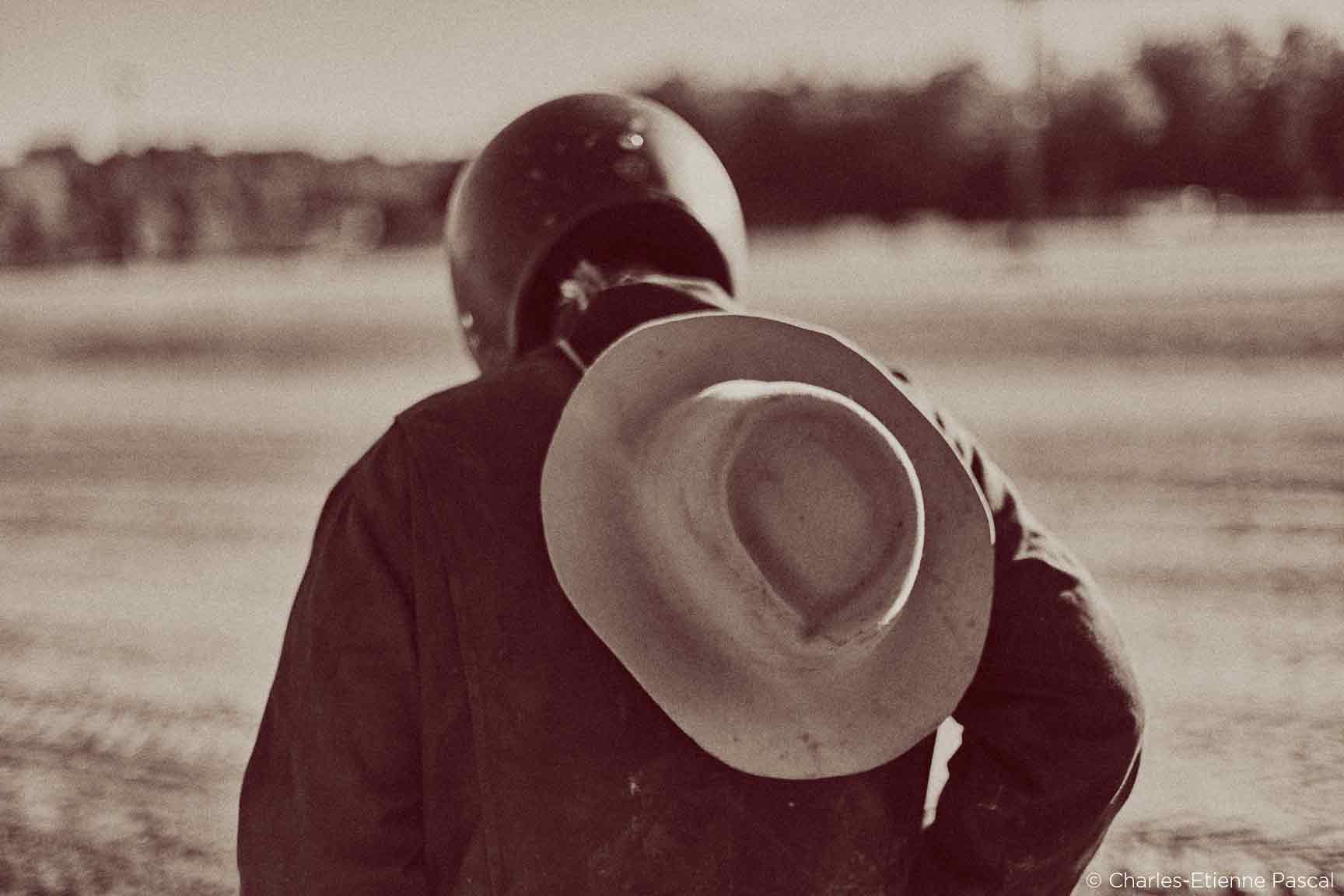
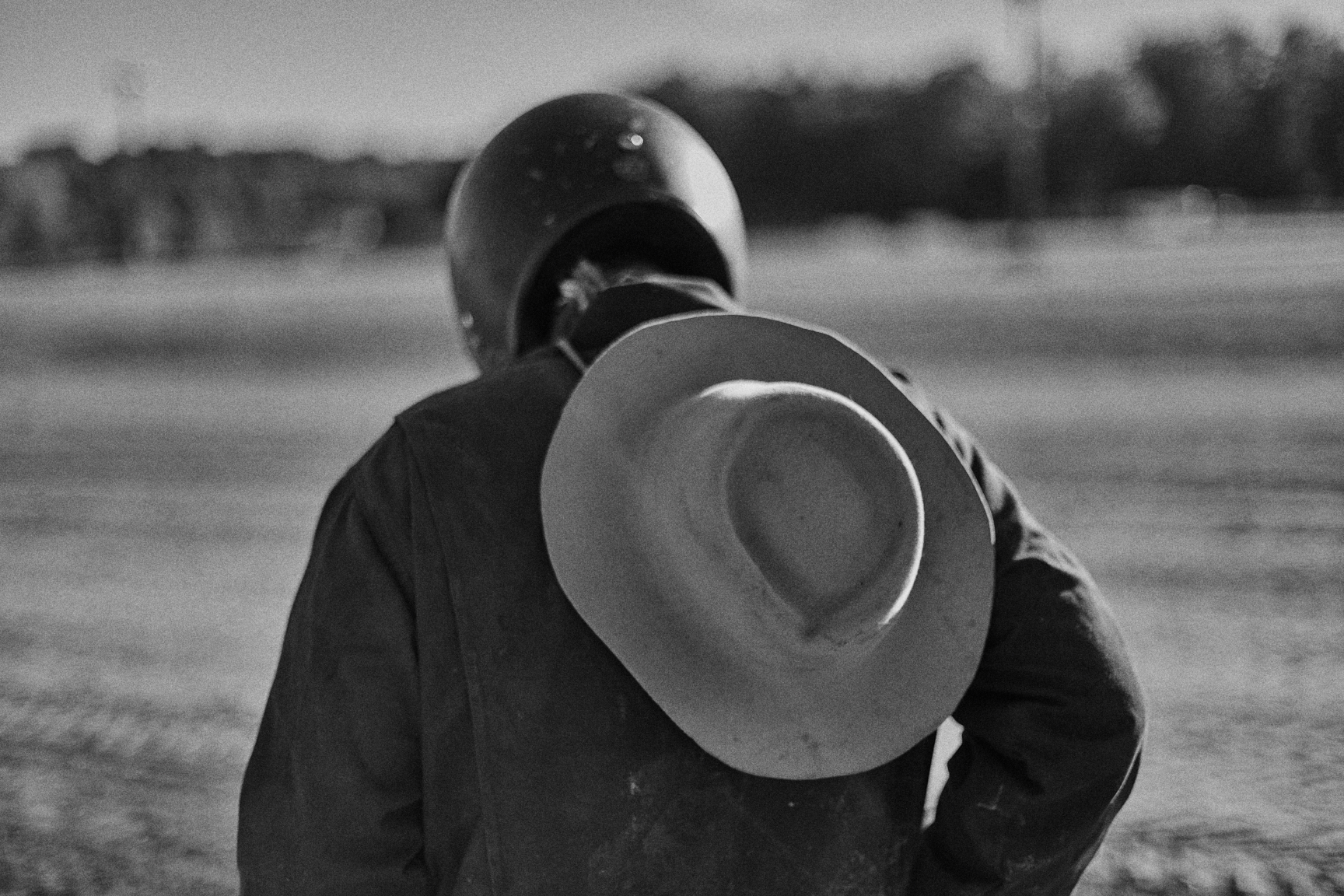
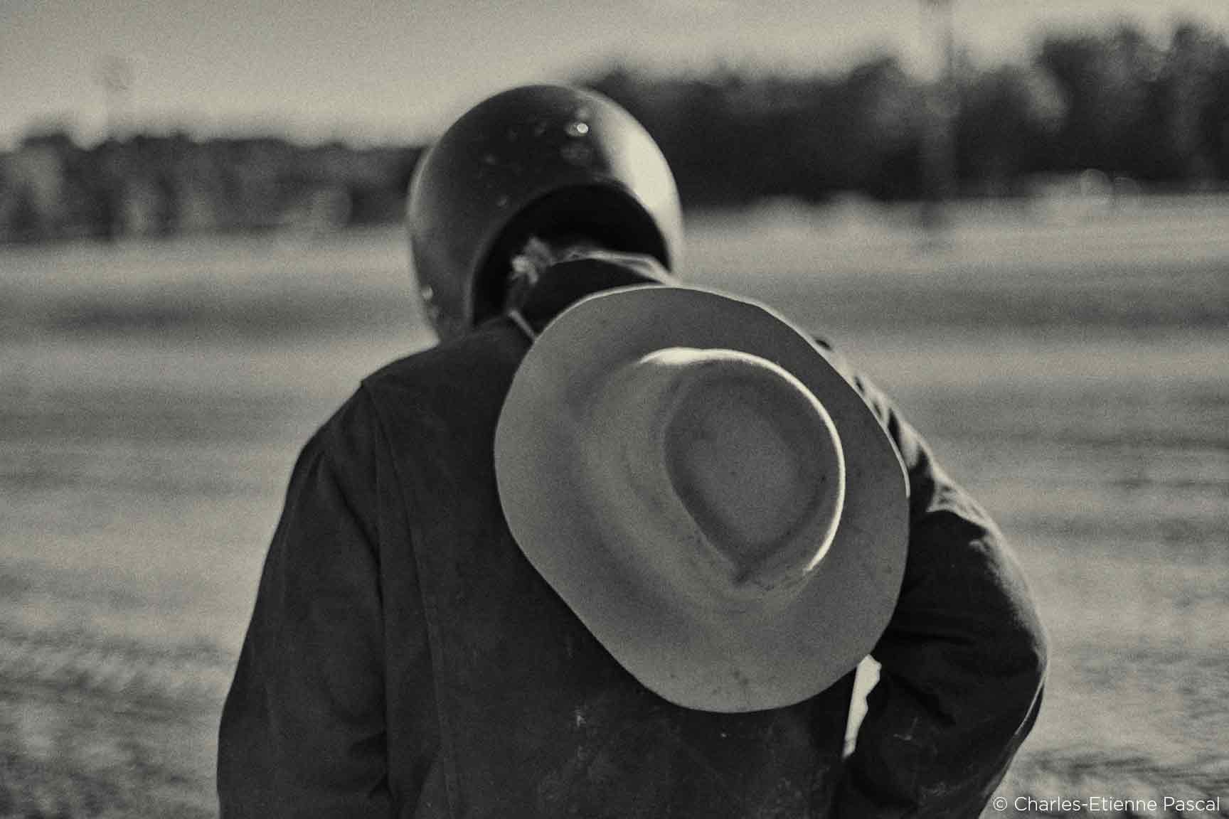
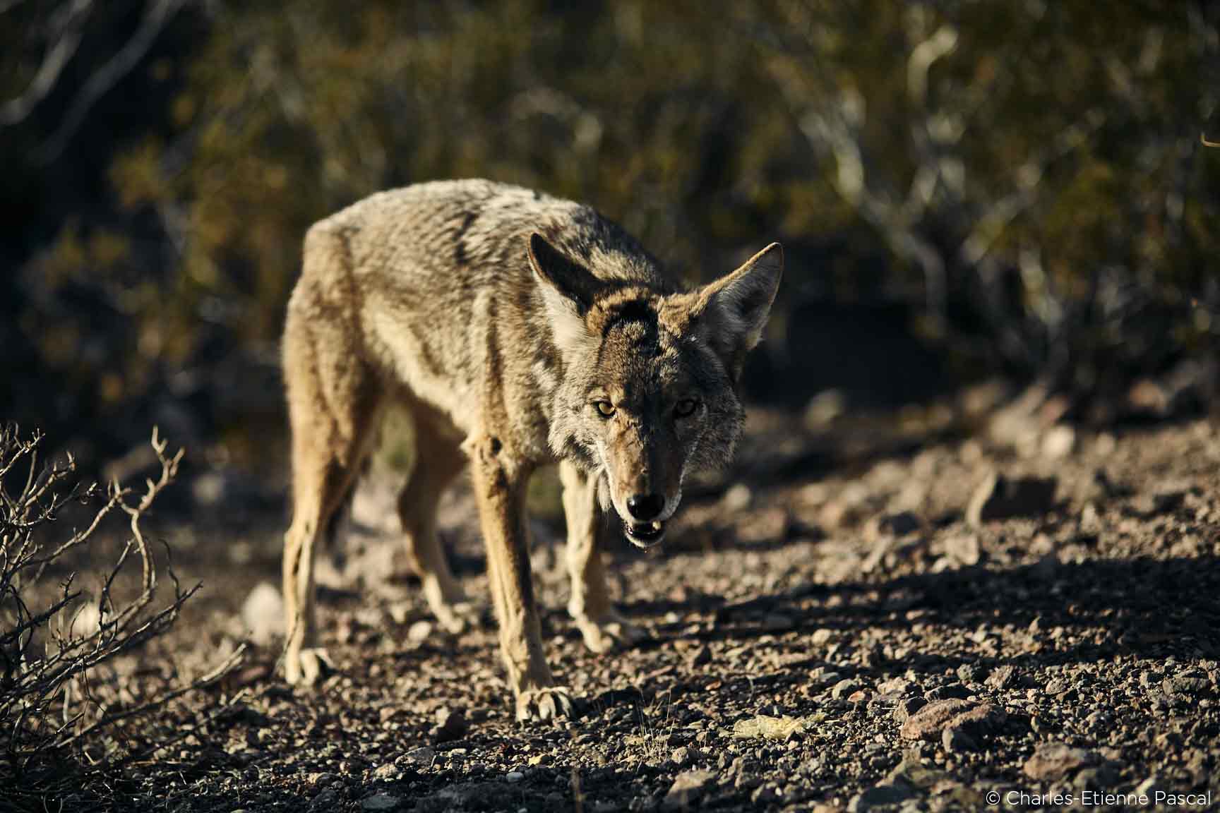
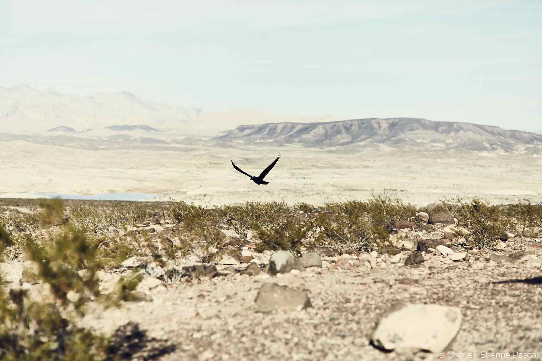
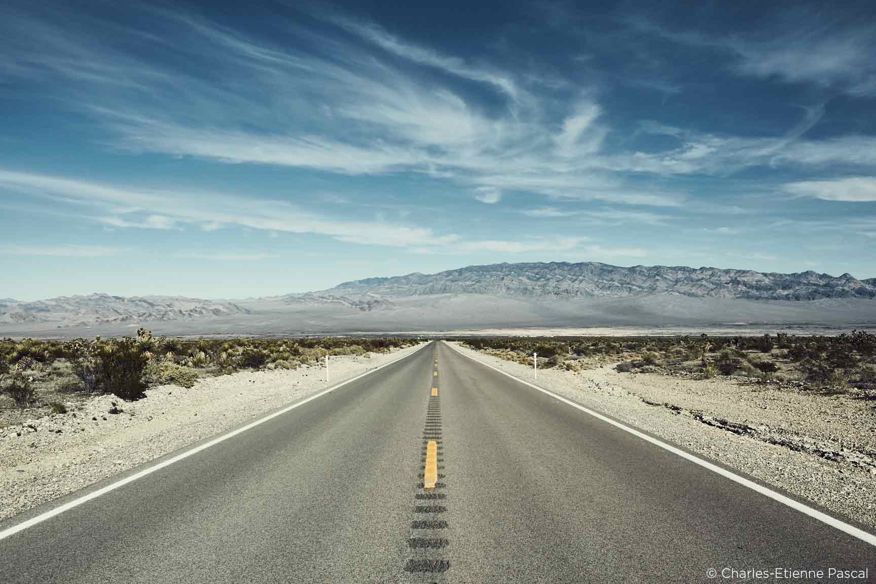
Oh.. and to conclude, here are a few other pictures I shot on my 5D and processed in Capture One Pro 9:

Best regards,
Charles-Etienne Pascal
Check out my website: I SEE HUE