NOTE: This article discusses an outdated version of Capture One. To learn more about our latest version, click here.
Normally, we write lots of stuff on how Capture One Pro’s newest features expands functionality. Today, I’m going to write about a project that actually means doing less in Capture One.
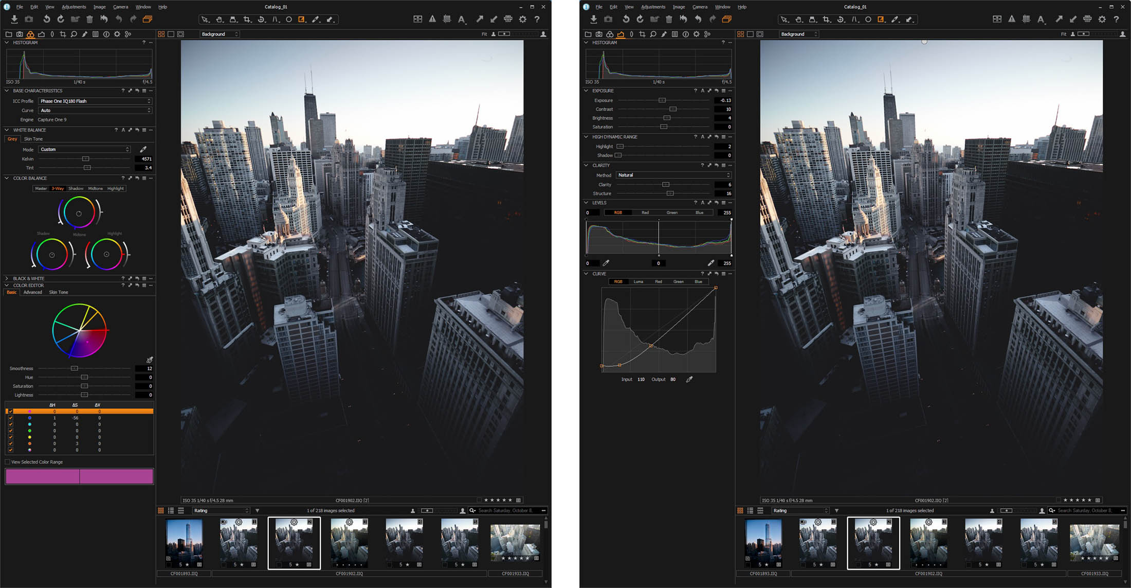
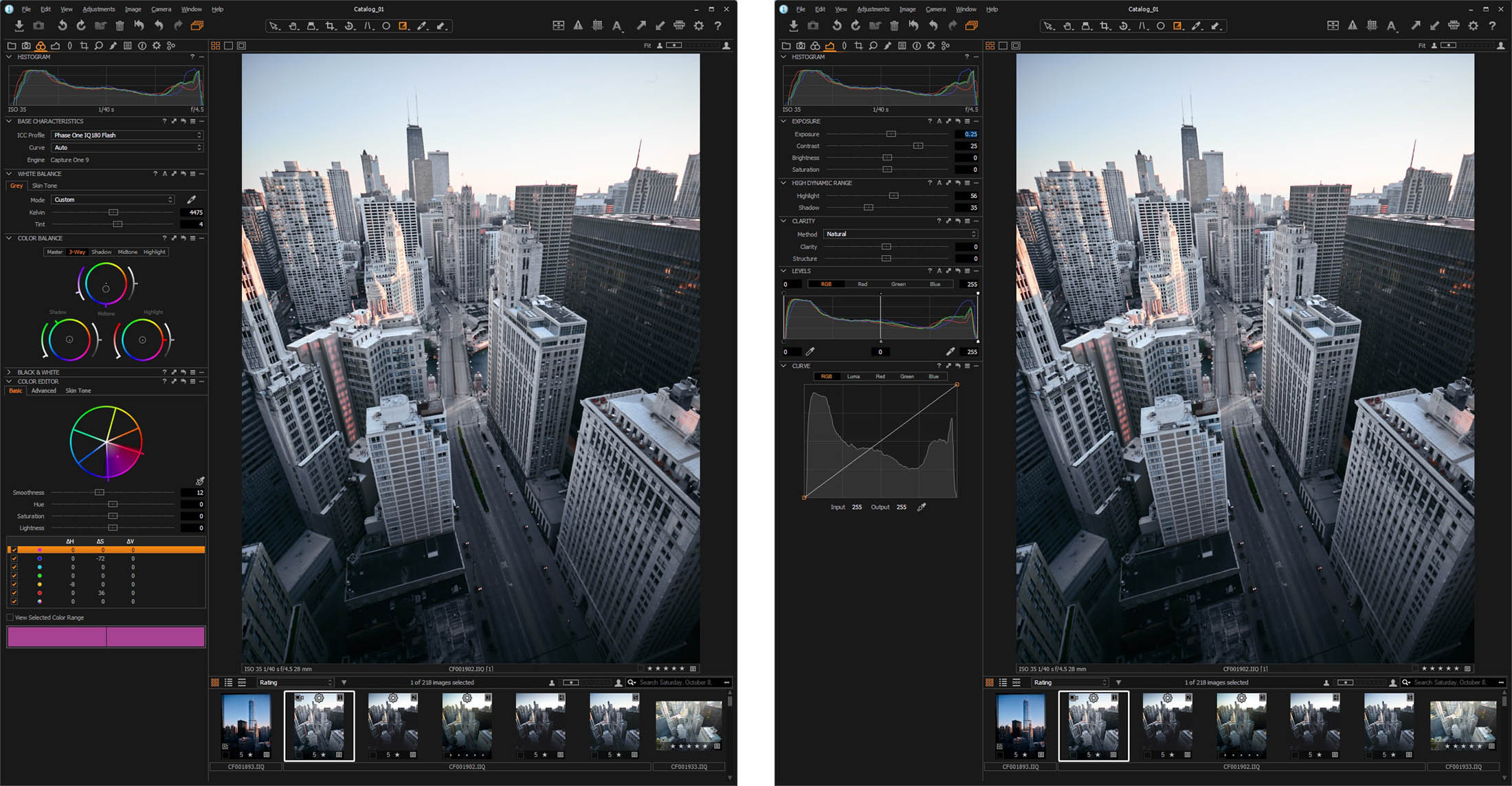
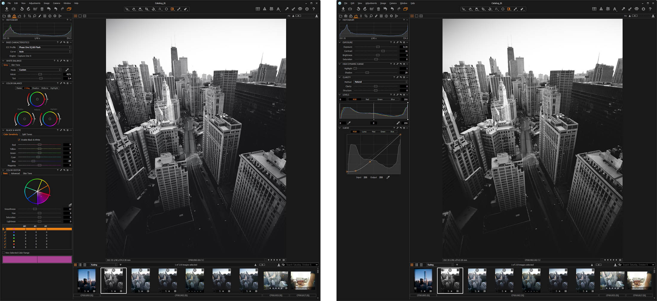
Around Capture One 8.2, we re-designed the Color Balance Tool. This was a bit of a moment for Capture One on the ideas of how to do GUI (Graphic User Interface) not least because the traditional curves interface is often complex to get your head around for color adjustment (and this made it way simpler), but also because the design has roots in a concept that doesn’t actually require a mouse to use it.
Stop chasing the mouse
The idea of using a mouse to interact with a GUI (a concept known as WIMP – window, icon, menu, pointing device) actually dates back to the late 60’s to Doug Engelbart’s “oN-Line System” (NLS).
Modern applications like image editors are complex beasts. The range of adjustment you can put into it quickly reaches a point when the UI and the tool-set start to overwhelm this rather simple concept. In some cases, the mouse simply limits what you want to do.
Demand on the user also increases to a point where the work-over-workflow equation may become a little top-heavy and you lose focus on what’s really important: image and vision. Multiple clicks, undo, more clicks, switch tabs, click, click, click.. and when you do this day-in day-out with the kind of volume of images a modern professional does, there’s this nagging feeling that there must be an easier, better, faster way to get to the image you have in your head.
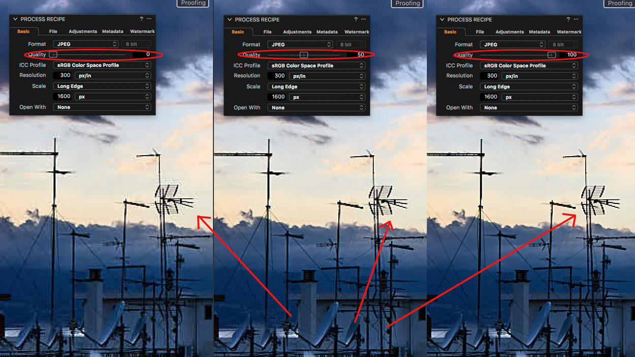
When faced with the above proposition, most professional users add a myriad of shortcuts to use with the pointing device. Moreover, most apps allow you to assign functions to a keyboard key for quick access. This works well for toggle functions and simple “switch” commands like Reset and Next image. However, it doesn’t work well for accessing sliders or tools with ranges.
It also requires learning a huge array of keys and modifiers to do adjustment parameters. Who here knows the default shortcut for increasing contrast? (Ctrl + Shift + Cmd “+” for those who care). Multiple this by number of sliders and we have a distinct usability problem.
Post WIMP interface design (the best example here is touch and multi-gesture input) offers great experiences for controlling almost anything.
However, despite recent additions using haptic feedback, there’s one underlying drawback with touch. Touch screens lack a tactile surface, which requires you to look at it for spatial reference. Putting complex UI on it to mimic buttons and sliders is a bit distracting if you always have to break focus from a primary monitor to check what you just pressed. Those not convinced, try this for yourself: Pick a random friend in your life. Now, put your smart phone behind your back and dial that person from your contacts list.
The optimal alternative
Ideally, what one needs is a solution that can leverage both multi touch and provide a de-coupled, hand-eye coordination and adjustment experience that a mouse provides. Something like a panel.
Typically, panel systems consist of several devices with various physical input controllers: knobs, trackballs and buttons. They exist in a variety of shapes and sizes from homebrew switch kits to full blown midi decks.
The commercially produced end of these systems are already used in high-end film and video editing solutions for Grading – a term used more and more generally in the stills industry to describe a process of color adjustments.
At first glance, you might mistake it for an aircraft simulator but what it allows is fast, multiple input commands simultaneously; all the time keeping eyes on the master monitor as the editor “feels” input into the color engine.
Tangent
For Capture One 10, we’ve focused development on the high-end systems from Tangent, primarily on their flagship product ‘Element’. The first impression of the Tangent Element is the stellar build quality, sturdy weight and level of precision in the mechanical controllers.
The panels are a modular design which comprises 4 parts: Tk, Bt, Mf and Kb (see implementation detail below). These can be used as stand-alone units or as a complete system.
You connect the panels to the computer via standard USB. Once connected, the system utilizes custom mapping software to allow you to map any property exposed by the supported application to any of the controllers.

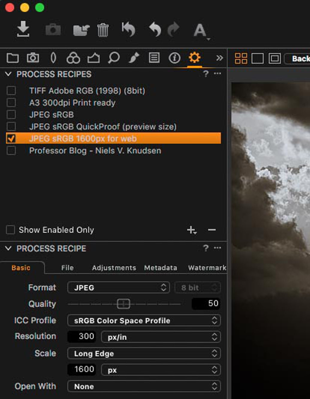
It’s easy to re-map/customize your favorite tools when you use bundled software (Tangent HUB). You can set over 460 shortcuts to almost any function. Capture One 10 ships with a default set, but this is only the tip of the iceberg in what you could do. Just consider the HUB application supports modes (switch between complete maps), banks (layers of controls for each panel in a map) and alternate functions for each mapped property.
Implementation
As already noted, the HUB app is fully utilized and allows full customization rather than a hardcoded configuration. It’s worth noting the implementation in Capture One is far more than a simple hack-and-link to the current shortcuts.
By talking directly to the command layer, you can achieve a more analogue experience of adjustment. Also, it keeps binding separate from any shortcut-map in the application. It also allows the user to utilize the ramp-rates and variables in the mapper without relying on hard coded increments.
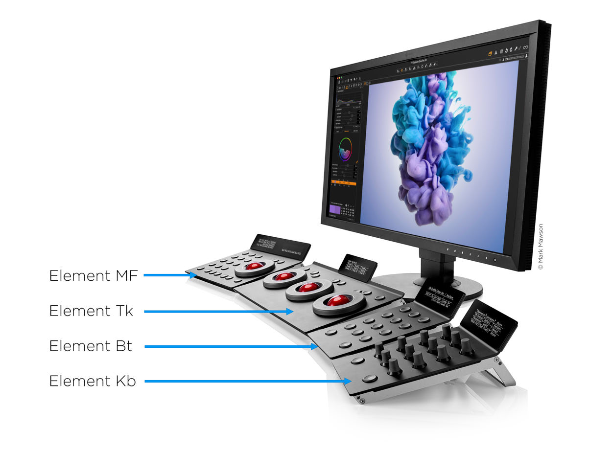
- The Tk panel (TracK-ball)
As this article started out, the core driver of the project of bringing tangent into Capture One was the Color Balance Tool – it’s no coincidence that the three track balls in the Tk panel match the three wheels in the Color Balance UI. The ball shape directly imitates the Color Balance Tool: The ball controls X/Y tint and saturation point in a 2-dimensional space, and the ring controls lightness. Two buttons allow a quick reset of ring and ball independently of each other.
Where the implementation beats the mouse is the ability to do adjustments simultaneously. As an example: lifting highlights and darkening shadows at the same time.
You may start to see how this removes barriers to adjustment while you get to the end result faster. To round off the Tk, a ‘hold to reset grading’ command is mapped to the B button for a temporary reset of the grade.
- The Kb panel (KnoBs)
This panel consists of 12 encoders, and you can map it to most sliders in Capture One 10. The ramp rates are tuned per tool for a decent speed of adjustment. You can slow these when adjusting by holding the A button (mapped to alternative function) for finer tweaks. You can also adjust them simultaneously – for example Exposure and Contrast, or Sharpening and Threshold. Push the knob to reset the specific slider.
- Mf panel (MultiFunction)
This is a hybrid of the Bt and Tk. It’s configured with a mixture of edit and rating shortcuts and experimental ideas in using the track ball.
The track ball has two banks. The first one works with brushes, which gives a dynamic interface into size, hardness and opacity. The second one quickly scales and set overlay position.
The buttons on the Mf panel are configured to rate and cull in sessions. The play and advance buttons are mapped to ‘Next image’ and ‘Next set’ respectively. ‘Stop’ marks the image green (for pick) with other tags and select by tags above. In order to for example delete or create an album from selection, you can use ‘Selected by tag’.
- Bt panel (BuTtons)
The Bt panel is a simple button bank which can emulate button presses and toggles, or for bigger maps configured to “go to mode”. In the default set, most toggle functions allow quick access to things like Focus mask, Exposure warning and Proofing. It also allows deep menu commands for things like local adjustments and hiding parts of the user interface.
With practice, hiding the user interface is the show piece of the implementation. You can remove everything from the monitor except the viewer and user still has control over every tool. Working full screen on an image with no clutter and total focus is simply a dream coming true.
Summing up
This project started, as most “blue-sky” ideas do, in a pub with a developer friend who suggested MIDI devices could be an interesting way to adjust properties. That was nearly 5 years ago. The question for me was not if it would work but how important this solution could be in the future. During testing under The LABS initiative, the beta testers saw such a positive effect on their workflow we knew we just had to get it out there.
If you want to try or see a panel in action, visit one of our participating dealers or join us at one of the upcoming STAND OUT events. Moreover, David Grover will be hosting a webinar on the tangent topic on the 15th of December. Feel free to sign up here.
If you have further questions for this topic, please don’t hesitate to leave a comment.
All the best,
James
Software Product Manager, Phase One