Recently, Capture One released Capture One Pro 10 with a bunch of surprising features.
Starting from version 6, Capture One boarded a high-speed train rolling out breakthrough editing tools with every new release. This year, developers decided to enhance some features which were missed in previous updates.
Capture One 10 brings completely new image sharpening, amazing output proofing, snappier performance and a mass of other useful improvements. Let’s find out what the new version can do to boost our workflows.
Main features
Output Proofing
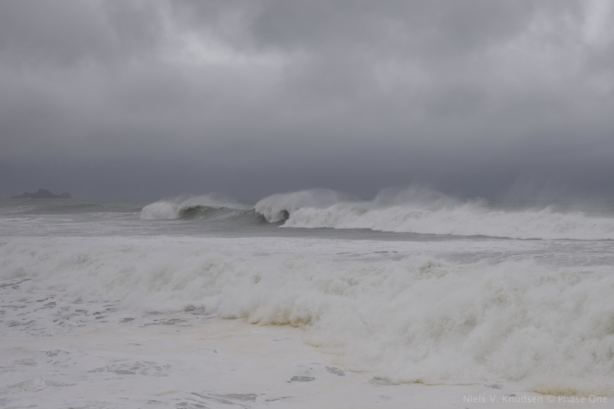
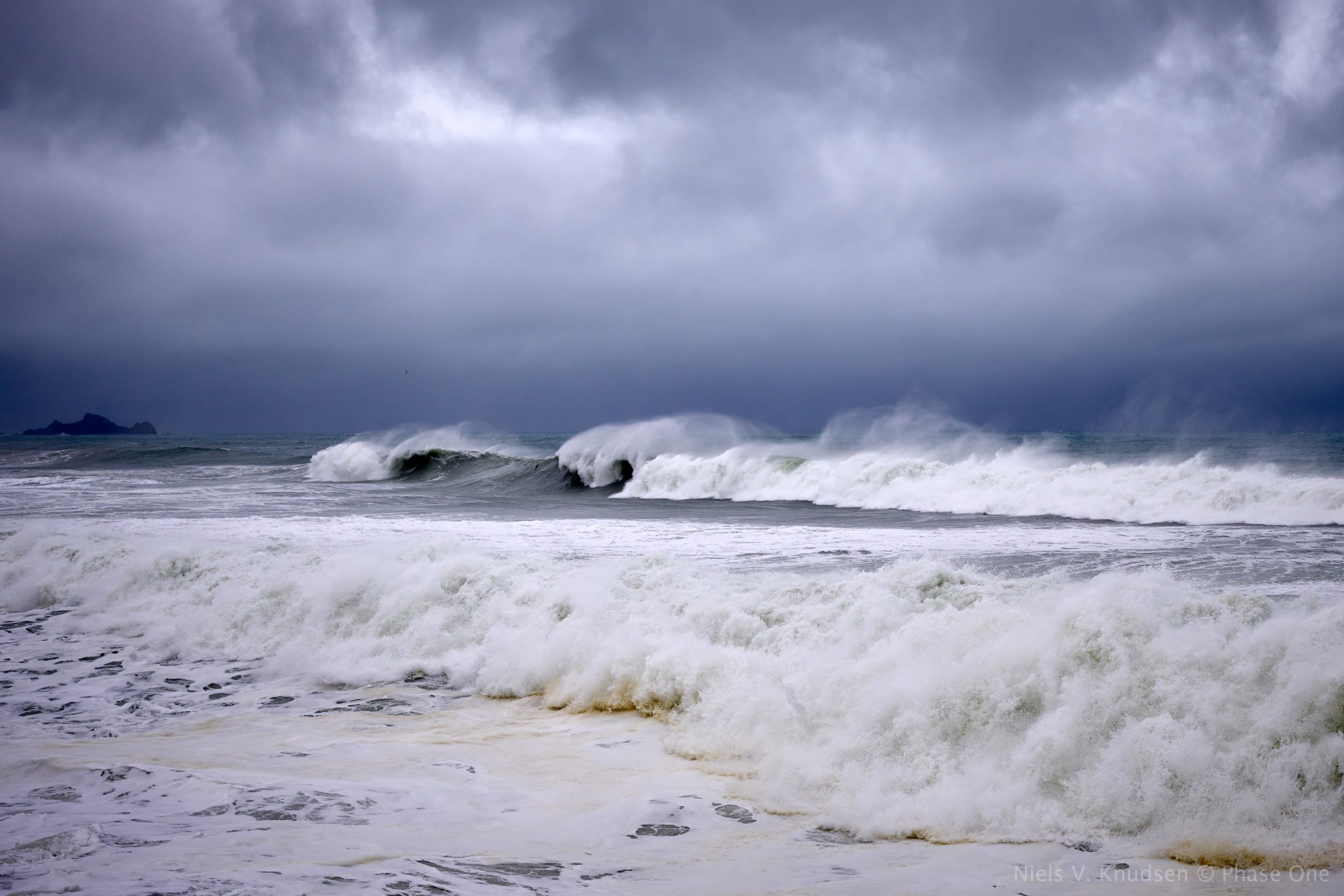
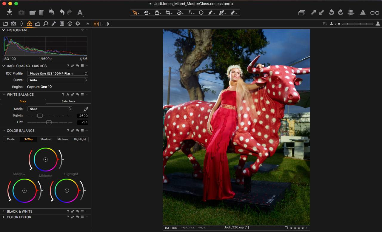
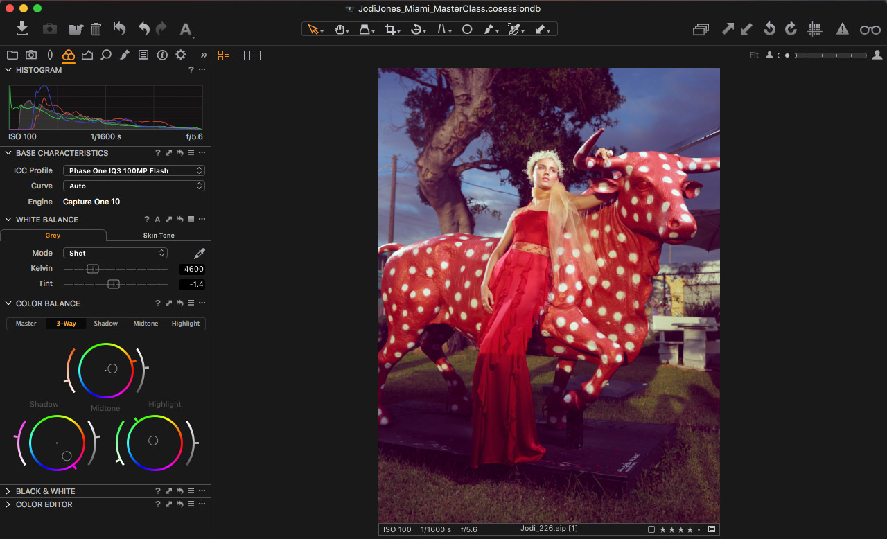
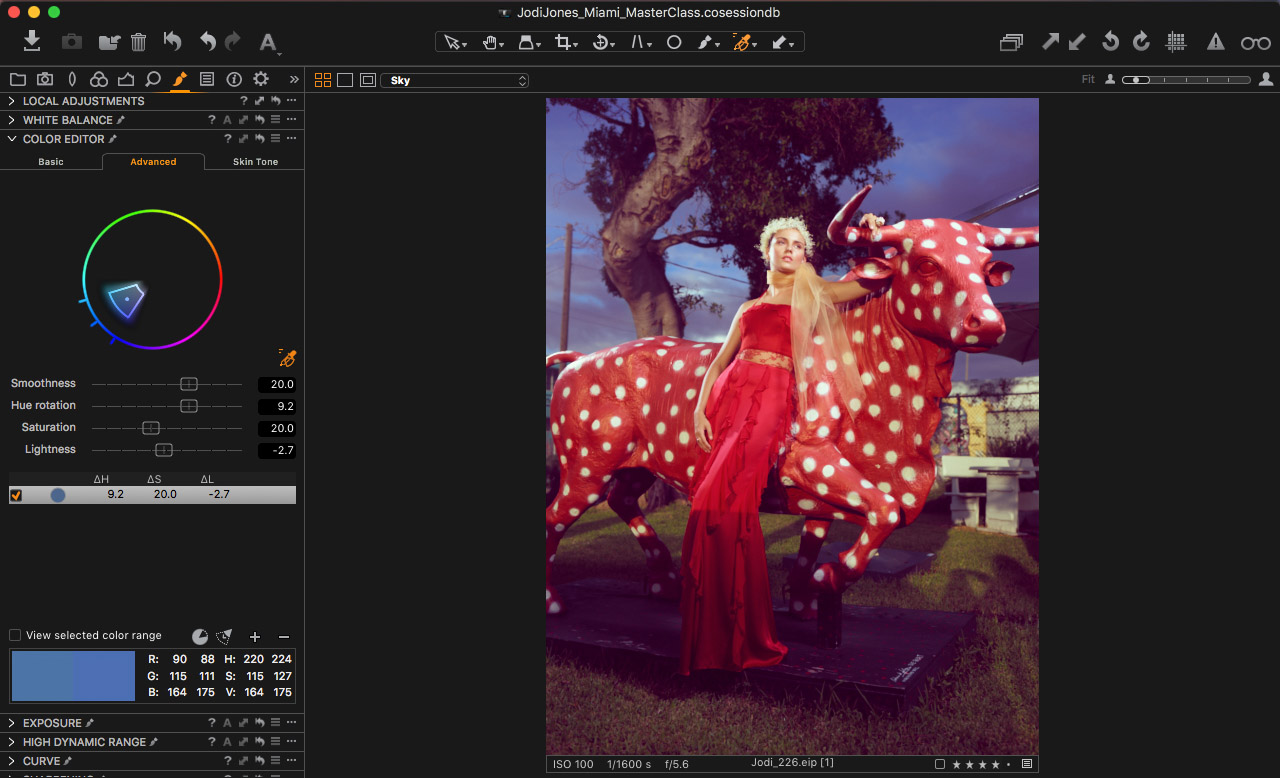
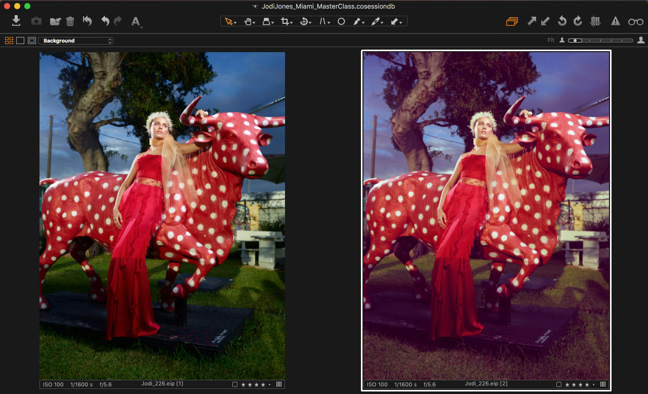
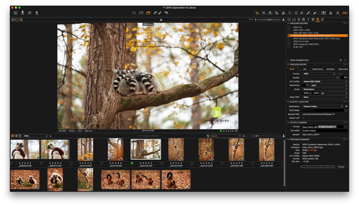
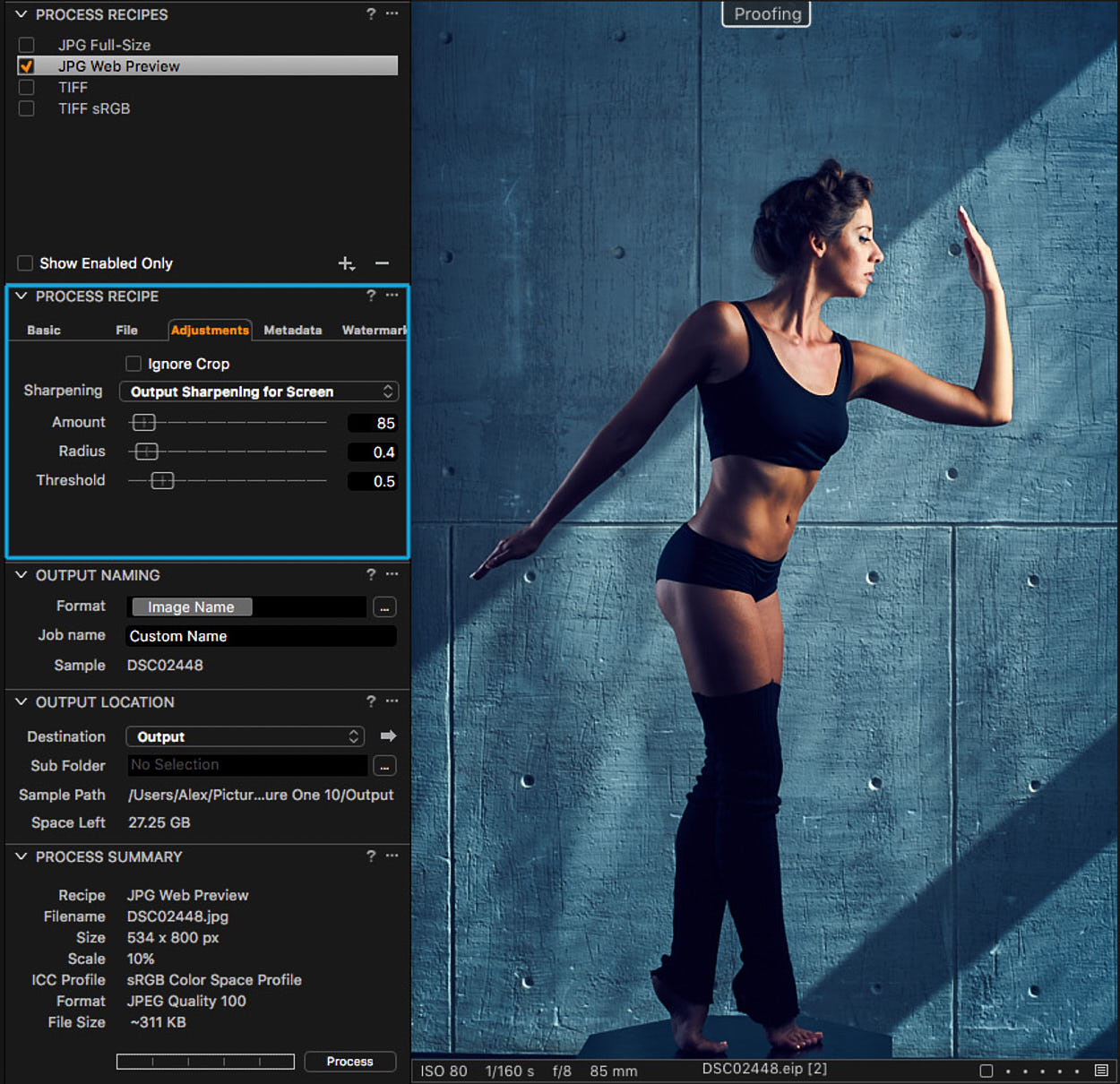
Output Proofing, the first novelty of Capture One 10, is dedicated to showing you how exactly the RAW-file would look after the processing.

When you are working with RAW, there are many options to convert it to the final JPG or TIFF. For different purposes, you may need a particular color profile, size or sharpening settings.
Previously, at times it was quite difficult to predict the final image’s look. Now, you can turn on Output Proofing and you would immediately see the prepared image with applied preferences from the selected recipe.
Output Proofing is especially useful when you’re processing images for web.

“Proofing” sign shows that Output Proofing is turned on and you see the image with applied settings from selected recipe.
With Output Proofing, you can set the best Sharpening for your image depending on processing size. Hence, Proofing allows you to check your image to look good with selected color profile. You can even simulate JPEG compression artifacts.
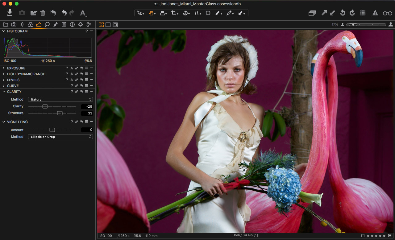
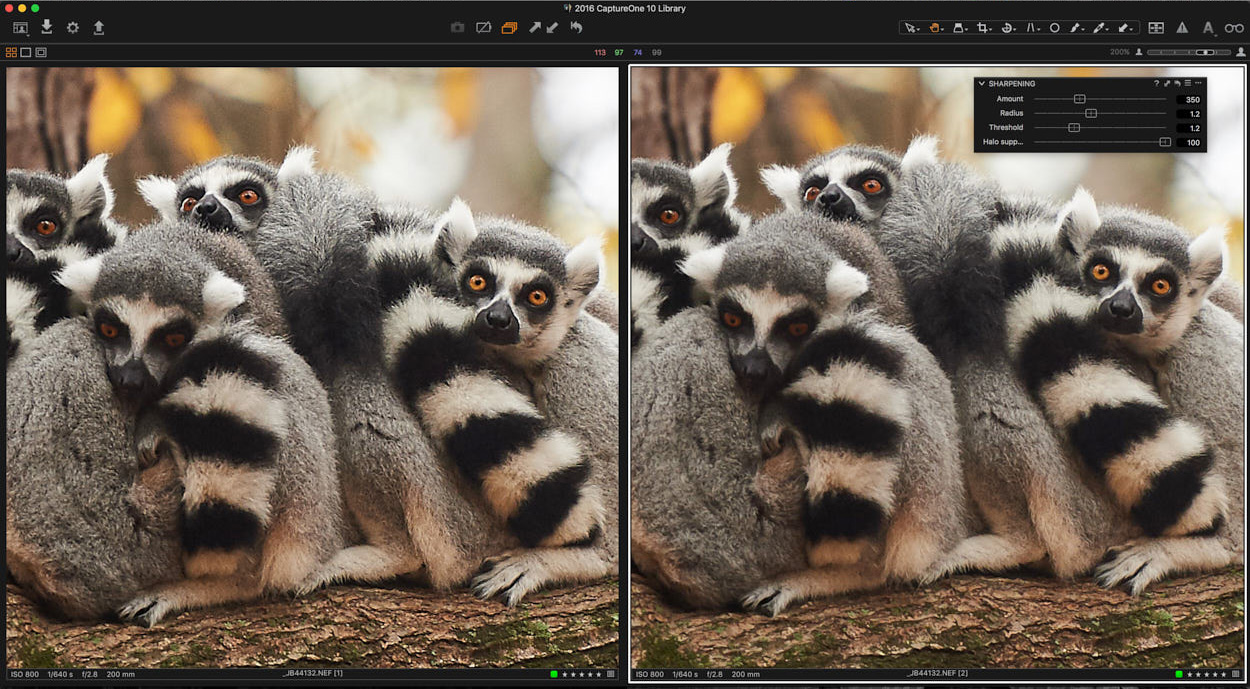
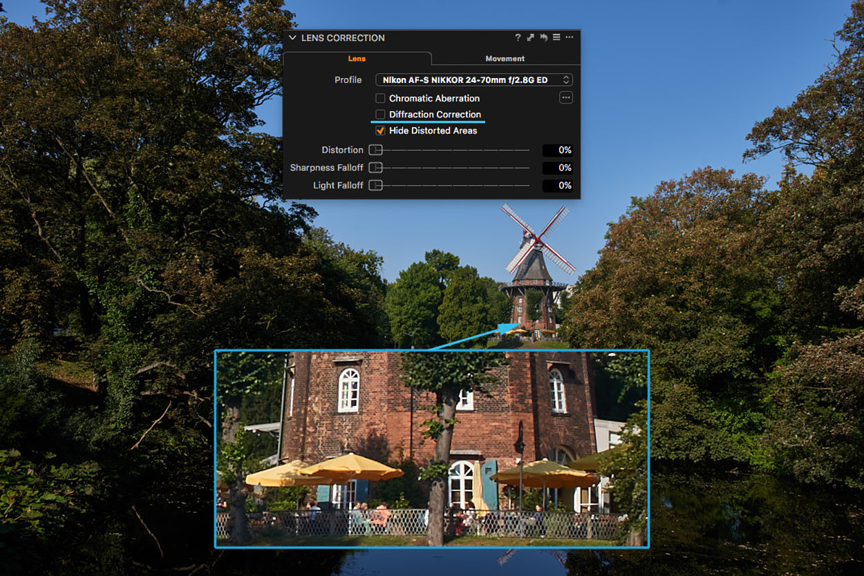
New sharpening
Capture One 10 brings entirely new sharpening workflow called “3-phase sharpening”. Now, you can separately apply sharpening settings to three different editing stages:
- Input sharpening
A sharpening process starts with “Diffraction correction” check box in Lens tool. That feature automatically corrects basic problems with sharpness related to your lens.

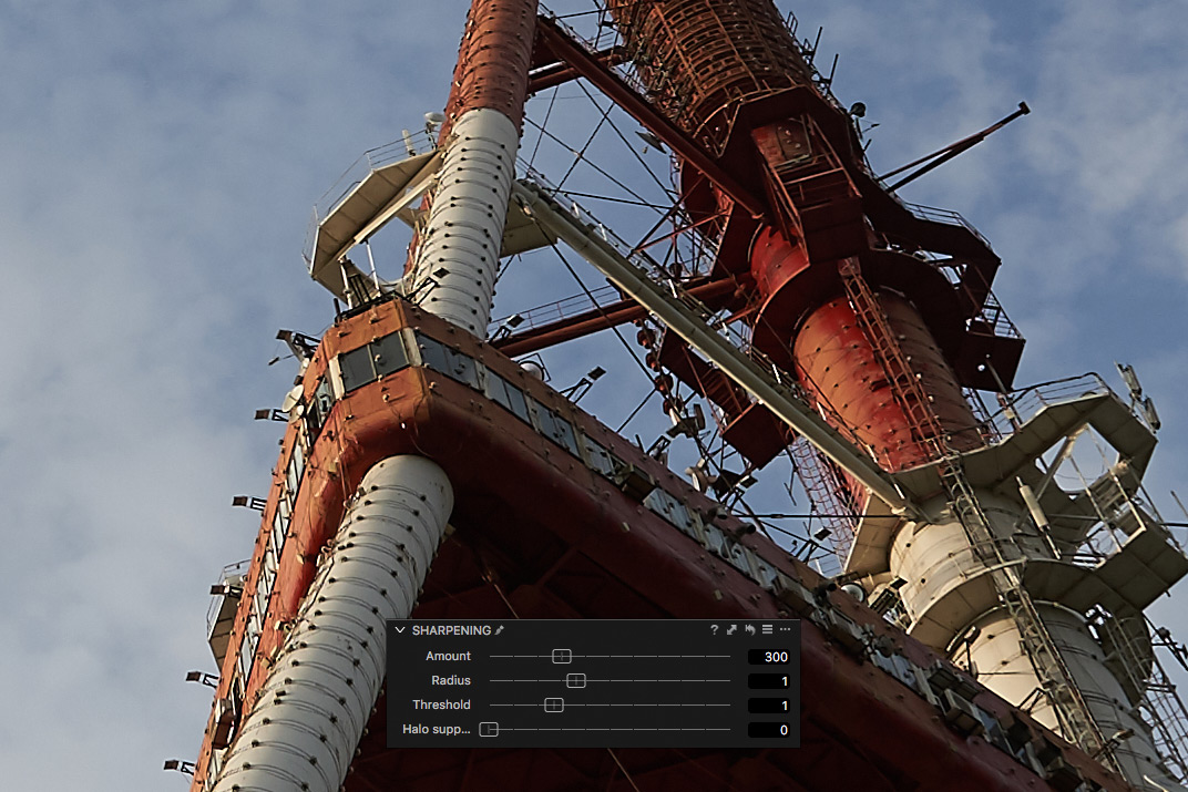
- Creative sharpening
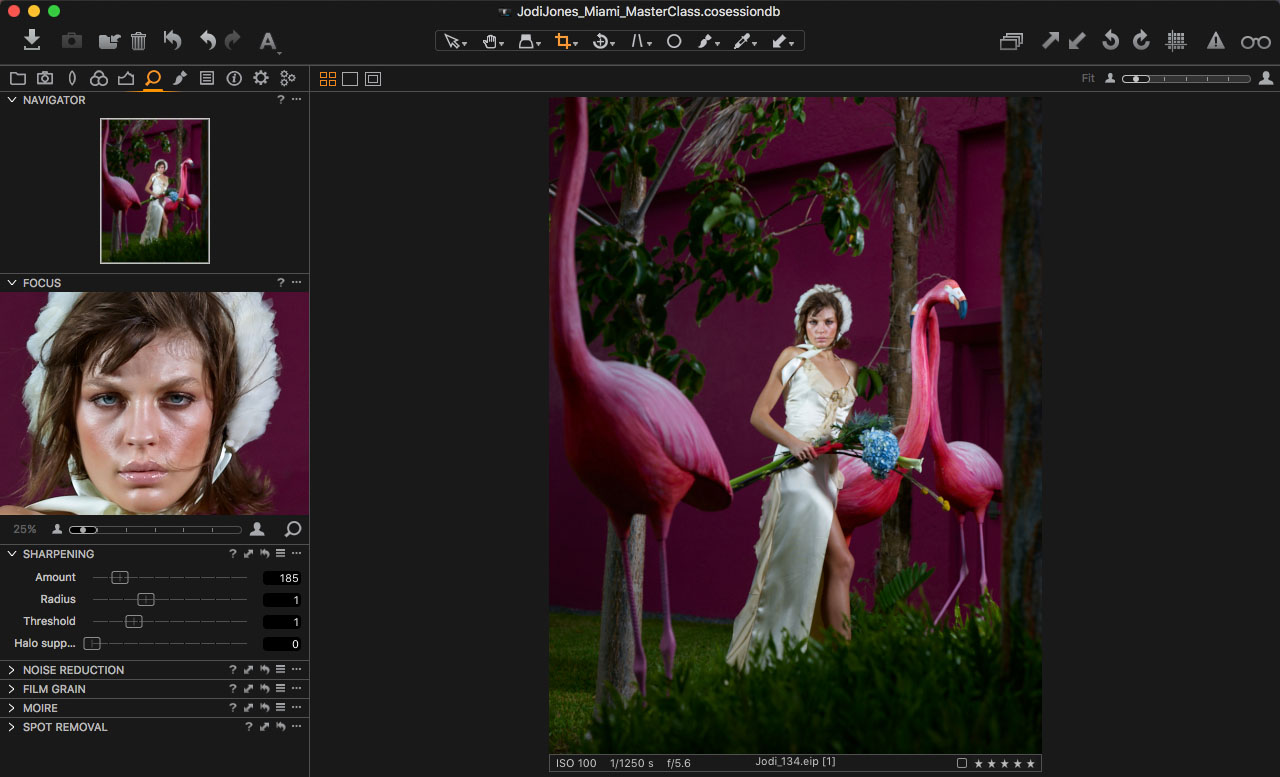
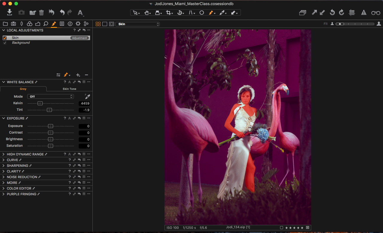
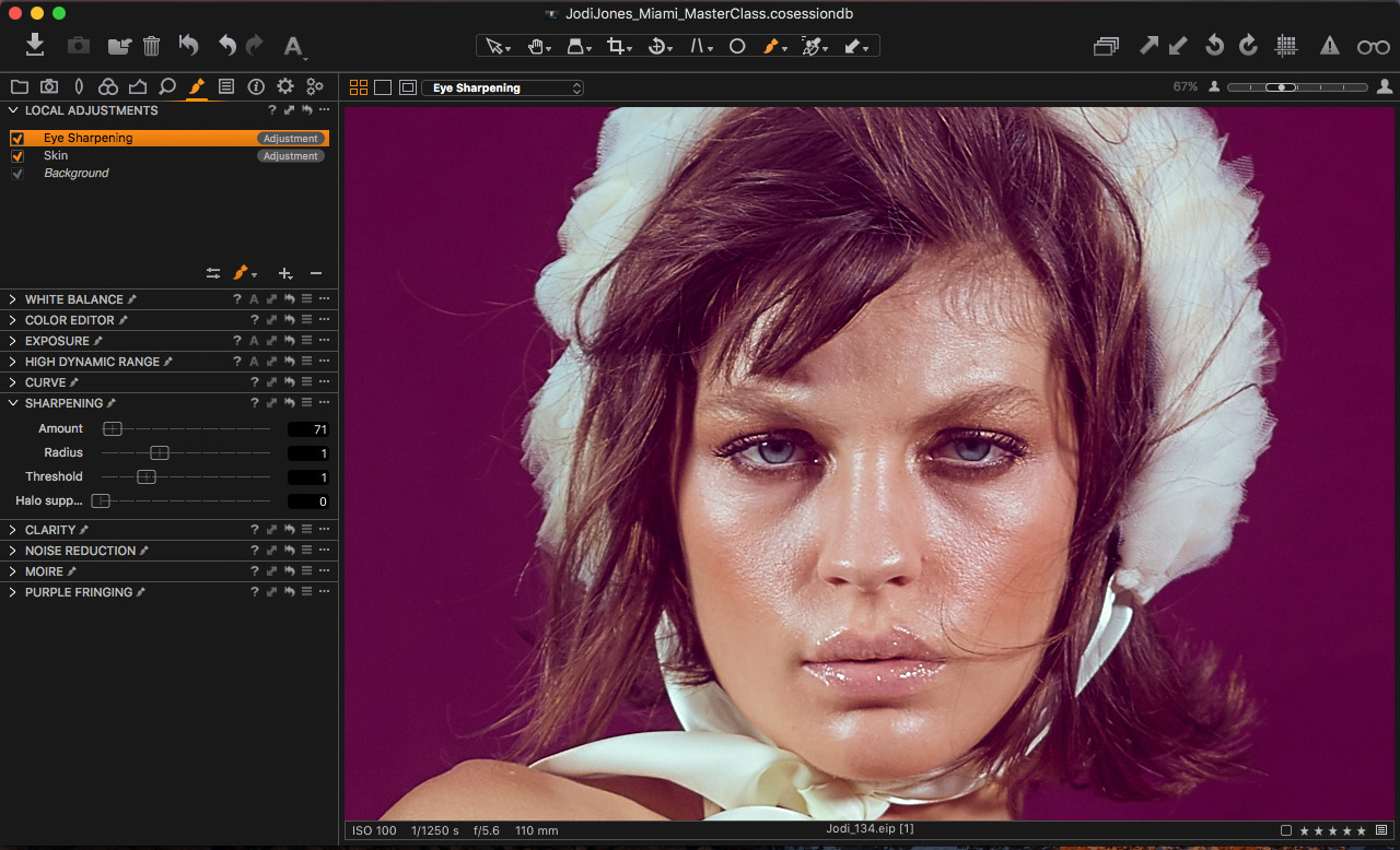
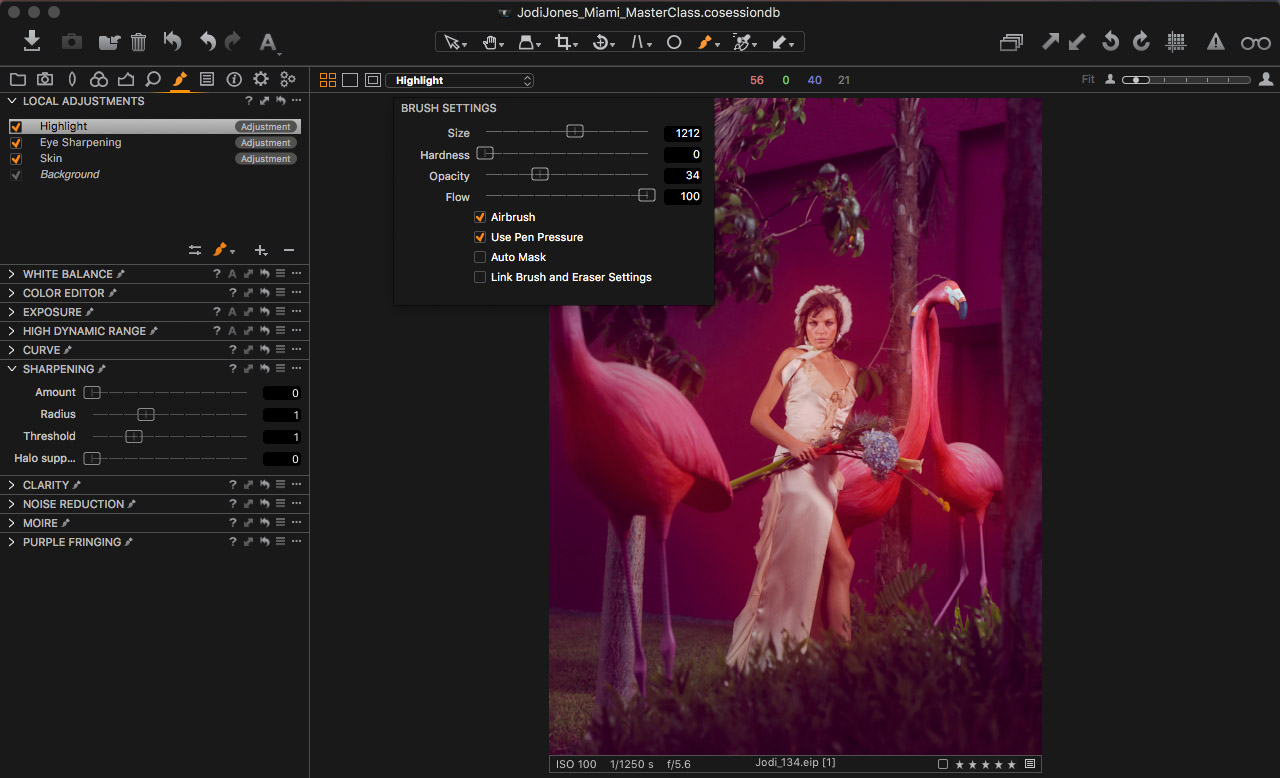
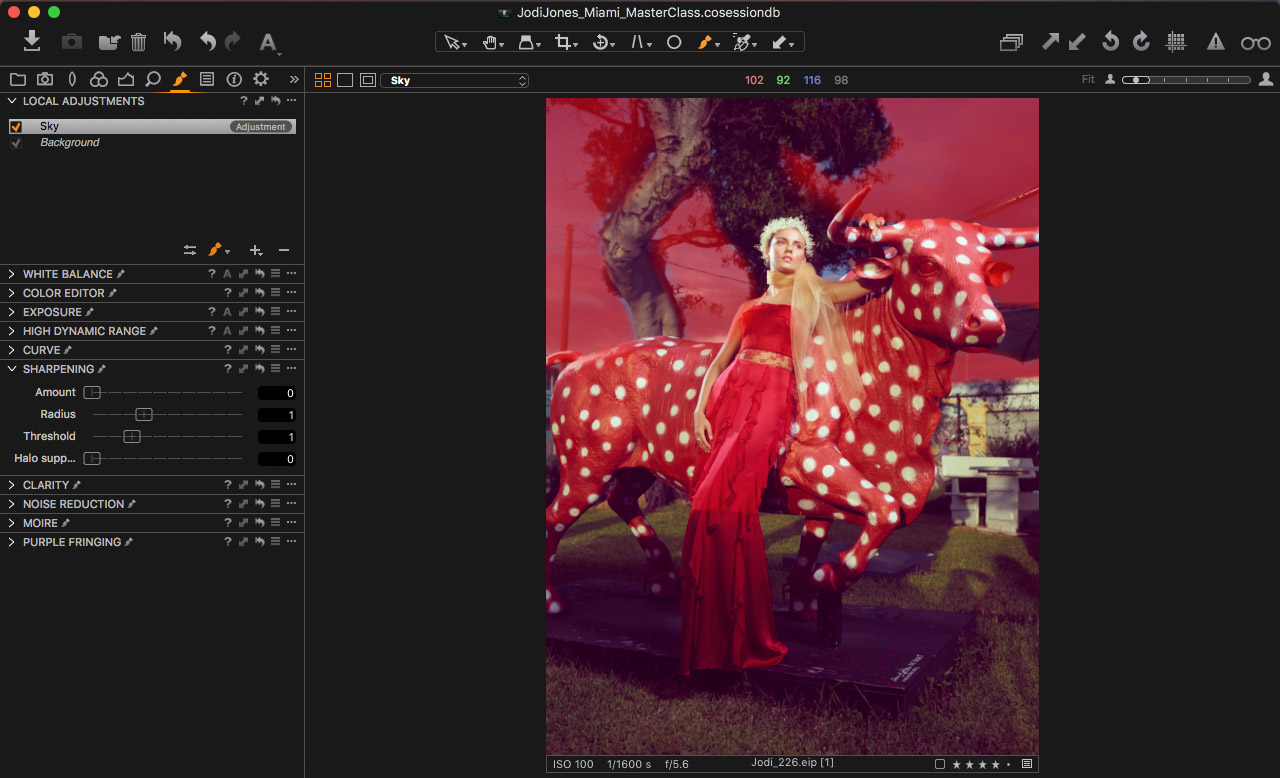
At this stage, you can manually add sharpness to your image, as it was in previous versions of Capture One. At the same time, Sharpening Tool has got two handy improvements in Capture One 10:
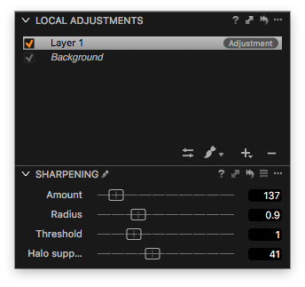
1. There is a new Halo Suppression slider to remove specific «halo» effect, which often appears during sharpening.

Above: Image before and after Halo Suppression
2. All the sharpening sliders are now able to work in layers. That means you can locally apply various sharpening settings to different parts of the image.
- Output sharpening
Furthermore, you can now adjust sharpening right in recipe’s settings for different purposes. For example, it allows you to set specific sharpness for web and print recipes.
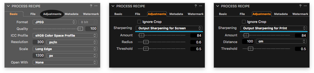
Output Proofing will show you how it looks on the final image. For prints you can also specify the distance you want to view the image from.
New sharpening and Output Proofing allows you to prepare the image for web or print in all the details.
Improved performance for faster viewing experience
With almost every new Capture One release, developers continue to increase app’s speed and stability. This year, they focused on refining viewing and working with images’ performance.
As a result, caching speed, drawing latency and framerates for adjustments were significantly improved. It’s quite difficult to measure, but try to work with layers in Capture One 10, and you’ll immediately notice the performance boost.
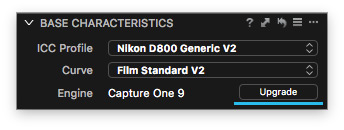
By the way, make sure to upgrade your RAW files engine to the 10th version to get all the features of Capture One 10.
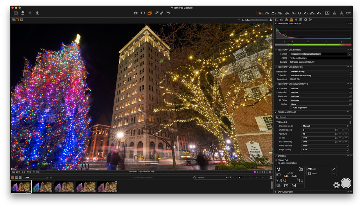
Camera Focus tool
The tethered shooting was always one of the main features of Capture One, and in the 10-th version, it has got a new Camera Focus tool.
The new tool allows you to automatically and manually adjust focus during the shooting. And the best news is that Camera Focus tool works with Sony, Nikon, and Canon cameras as well as with Phase One IQ/XF.
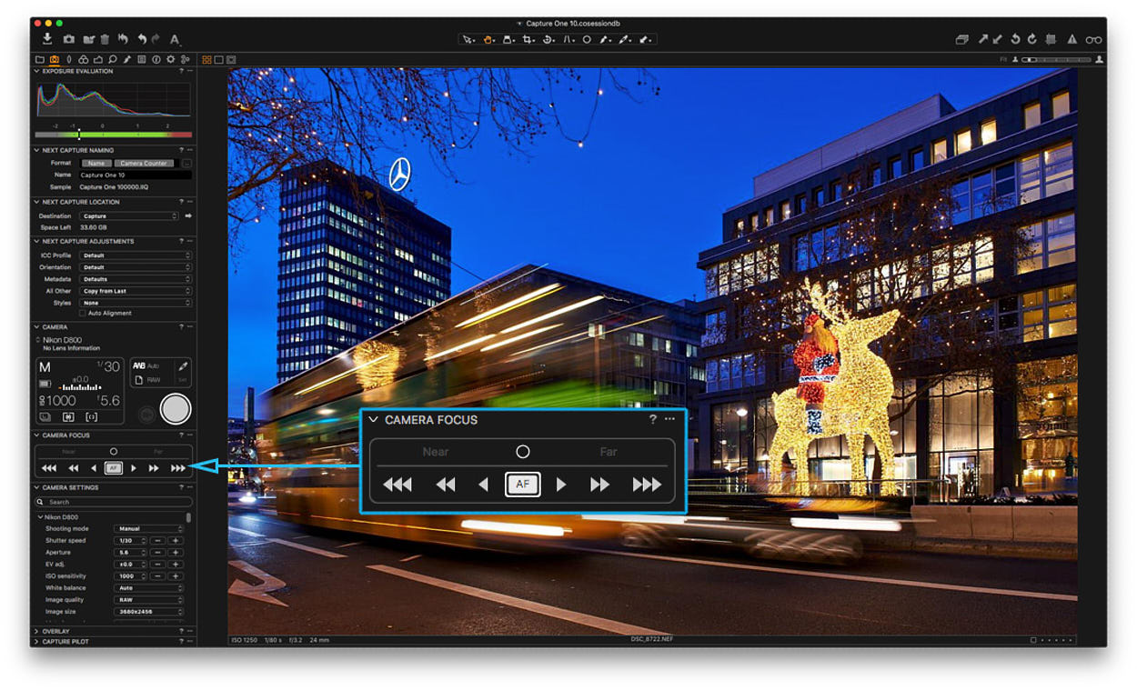 Due to some hardware specifics, Camera Focus tool with Nikon and Canon cameras work in Live View mode only. It’s also worth to point out that the Auto Focus indicator isn’t available with Canon cameras and Manual Focus Adjustment Buttons – with Sony cameras.
Even with these restrictions, it’s a great tool for interior, food and product photographers.
Tangent devices support
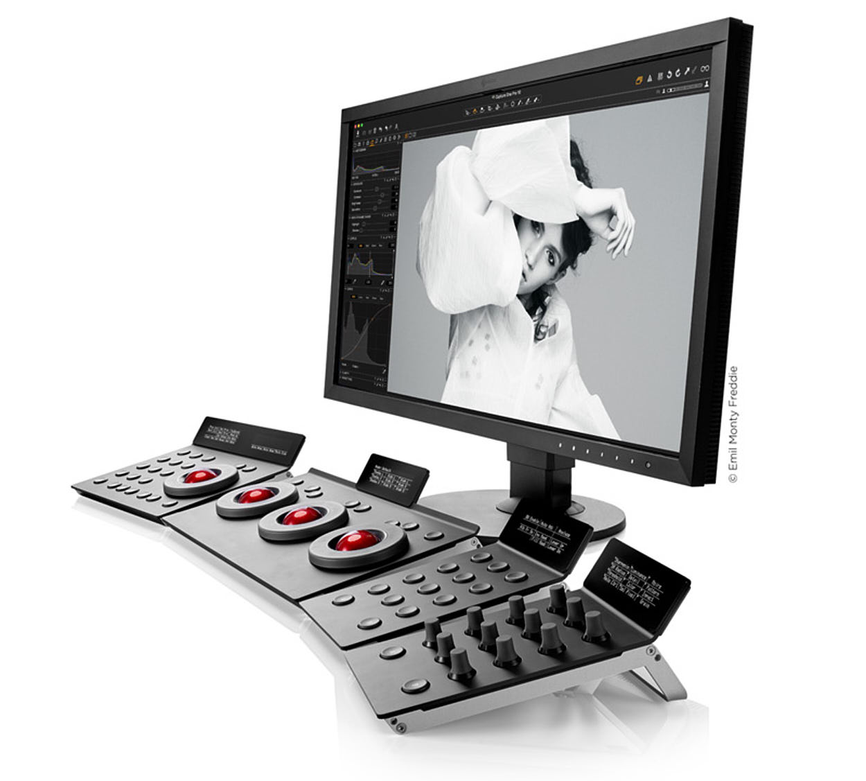
Another significant update is Tangent hardware support. All the previous versions miss support for editing devices, which professional retouchers often use.
You can now connect Tangent devices with Capture One and gain an amazing analog control over color correction and processing.
Other improvements
Compressed RAW Support
In previous versions, some useful features like Lens Correction, Chromatic Aberration Analysis and LCC weren’t available for compressed RAW files.
However, all these tools now work great with Canon mRAW/sRAW and Nikon RAW M (and RAW S for D5 and D500).
Auto Masking
There is good news for Fuji camera owners as well: Auto Masking has been updated to support any editable file type, including Xtrans.
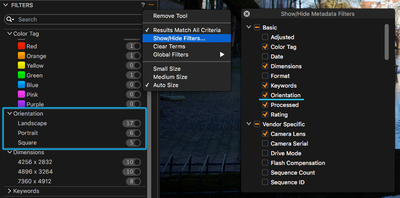
 Filter for orientation of images
One more annoying issue of previous releases was fixed, and now you can filter images by orientation: landscape, portrait, and square. Note that the filter considers applied crop.
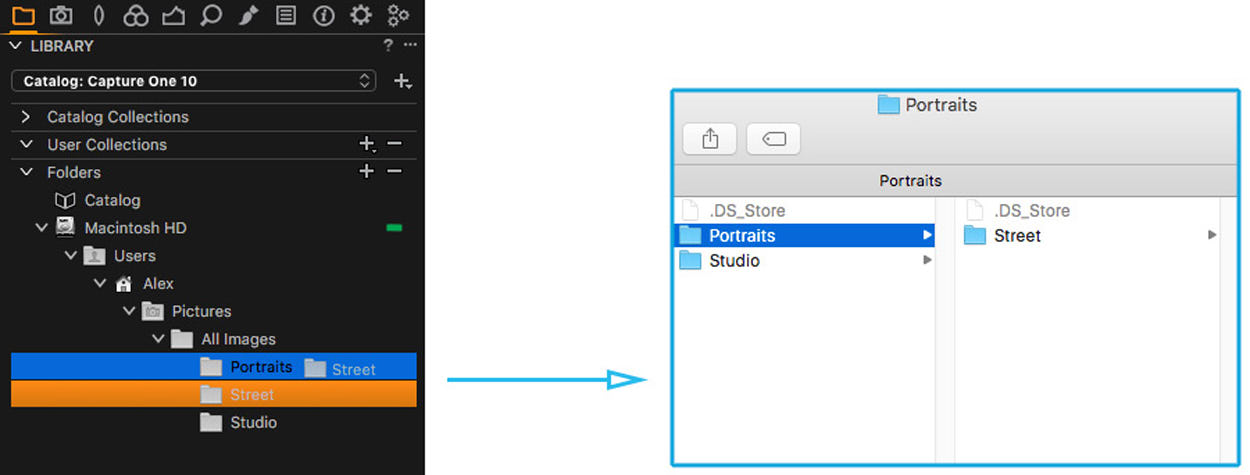
Move folders in Catalogs
Talking about small, but useful improvements: In Capture One 10 you’re now able to move folders inside Catalog’s “Folders”, and they will also move on your hard drive.
Consequently, if you wish to relocate the folder with your images, you can just drag it to a new place in Capture One, and it will automatically move on your HDD as well.
New workspaces
In Capture One 10, the default workspace is updated; Now, the browser is on the right side of the screen, and Composition tab tools are merged into the Lens tab. Developers have also added the new “Migration” workspace that provides more familiar UI for former Lightroom users.
At any moment you can switch to the classical Capture One 9 workspace or fully customize the workspace to your personal preferences.
Here is a video to show you how it works:
More Apple Script properties
Apple Script is one of the most underestimated features by Capture One users. It allows you to create an action sequence which is performed automatically as you run the script.
With previous releases, Phase One significantly expanded the amount of Capture One properties to work with Apple Script.
In the new version, they also have added some new features. Now, you can use commands to Pack/Unpack EIP, sync metadata and select variants; You can target Exif properties (R/O) and IPTC (R/W) fields using scripting for metadata change.
Optimization in Capture One 10
- JPEG creation algorithms are optimized to provide the best quality at the smallest possible size.
- LCC speed generation is increased by 20%.
- OpenCL, graphics acceleration technology, is now enabled by default in Capture One settings.
New Cameras Support
• Sony a99 M2 support
• Sony RX100M5 support
• Sony a6500 support
• Sony a3500 support
• Olympus E-M1 mkll Support
New Lenses Support
• Mamiya Sekor Fisheye ULD C 24mm 1:4
• Sony 70-200mm F2.8 G (SAL70200G)
• Sony FE 70-200mm F4 G OSS
• Sony E 18–200mm F3.5-6.3 OSS
• Sony E PZ 18-105mm F4 G OSS (SELP18105G)
• Sony E 55-210mm F4.5-6.3 OSS (SEL55210)
• Sony E 10-18mm F4 OSS (SEL1018)
• Sony E 20mm F2.8 (SEL20F28)
• Zeiss Vario-Tessar T* E 16-70 mm F4 ZA OSS (SEL1670Z)
• Zeiss Sonnar T* FE 55 mm F1.8 ZA (SEL55F18Z)
• Sony DT 50mm F1.8 SAM (SAL50F18)
• Sony DT 35mm F1.8 SAM (SAL35F18)
• Sony DT 30mm F2.8 Macro SAM (SAL30M28)
• Sony 16mm F2.8 Fisheye (SAL16F28)
• Olympus M.ZUIKO DIGITAL ED 25mm f/1.2 PRO
• Olympus M.ZUIKO DIGITAL ED 12-100mm f/4 IS PRO
• Olympus M.ZUIKO DIGITAL ED 40-150mm 1:4.0-5.6 R
That was my tips for Capture One Pro 10. Feel free to leave a comment or a question.
Best regards,
Alexander Svet