When social media was born in the early 2000s, human connection, community, and discovery were at its core. In 2007 Facebook introduced the “like” button, starting its first experimentation with algorithms. Since then, they have been dictating what we see on our feeds and when we see it.
Born out of a frustration with this development, the increased preference for video, and ads taking up more and more space on other social media, Glass is offering to become the new home for photographers online. The photography-first app, which launched in August 2021, goes back to the basics of creating a photo-based community and shared creative space on the internet.
We spoke to Glass co-founder Tom Watson about what makes Glass special, what it can offer to photographers, and how they think about the future of the industry.
What is Glass?
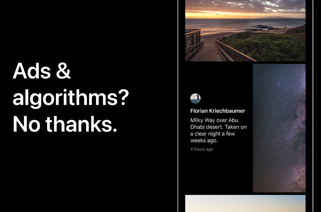
We’re a photography community and platform. We have a few key differences from other platforms. No ads or algorithms, no invasive data-tracking, no public counts, no video, no outside investors telling us what to do. We forego all of that by charging a small membership fee of $5 USD a month or $30 USD a year. Oh, and a chronological feed. With a gorgeous (optional) public profile.
We wanted a space that listened to and was built for photographers, instead of using them to rapidly grow a platform and then pivot away from them because investors need a better return.
Why would a professional photographer join Glass?
We get this question framed in a different way all the time — ‘Why would I want to market to other photographers?’ And it’s such a sad way to frame the question because there’s so much more to photography and sharing it online than marketing. As Instagram shifted from sharing photos to becoming a full-blown marketing channel that only shows your work to 10% of your followers without dancing or paying, our behavior with sharing photography online shifted too.
The work you create for an algorithm is different from the work you create when you’re shooting for yourself. Growing as an artist requires experimentation. Glass is the spot for that experimentation.
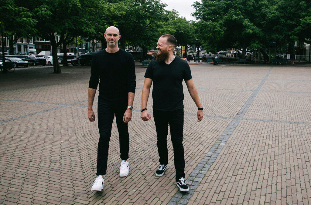
Glass founders Tom Watson (left) and Stefan Borsje (right).
Are there any well-known professionals on the platform?
Danielle Leong shared her work in progress on the way to her first gallery show. Om Malik joined Glass immediately after our launch even though he swore off joining another photography platform years ago. Artist-in-Residence at the National Academies of Sciences, Engineering and Medicine Christopher Michel has been sharing snapshots and stories from his travels. Sam Hurd, one of the best wedding photographers working today, recently shared some of his thoughts on Glass. I really loved this quote from his post:
“Eventually I realized I felt something I hadn’t felt since starting the blog on my own website… freedom. The freedom to post at 1am. The freedom to post at 9am. The freedom to post at 10pm.
The freedom to post whenever I wanted (with whatever caption I wanted) because there was no ghostly algorithm scooping me up with all the rest then measuring the performance of my content against some unknown metric.”
With being sincere and transparent on the app – including showing EXIF data – are pros giving away their secrets?
Sharing your EXIF data is optional — we only display what’s there. But one of our favorite things is members regularly sharing in their captions or the comments how they made the shot they’ve posted.
The gear or presets you use isn’t the thing that makes your work special. It’s you. It’s your eye. How you see the world, how you interact with your models, the intimacy you create, the light you catch.
The best chefs in the world write cookbooks with explicit instructions on how to make their most popular dishes from their restaurants. But their restaurants have reservations for months and months in advance. They don’t put themselves out of business by sharing their secrets. The secrets aren’t what make them great. It’s their skill and dedication to their craft. Photographers are the same way.
Can you explain this feeling of ‘purpose and calmness’ while being on the app?
Facebook and Instagram’s business model is built on engagement. How long can they hold your attention so they can sell it to a third party.
These choices introduce a scarcity mindset. There’s only so much time, only so much attention, to go around. It creates artificial conflict and comparison. But the greatest part of the internet is the abundance!
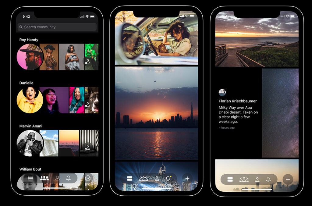
When I was designing Glass, I intentionally set out to build the opposite of a dopamine casino like Instagram. Glass is just edge-to-edge photos. No ads, no videos, no UX dark patterns making you click or shift your behavior. No addicting behavior built-in. It’s just photos in a chronological feed.
Which sounds simplistic, but it’s a really novel thing. It allows you to focus. Notice things you’d otherwise miss. Your good feelings are earned. It’s restorative rather than extractive. It’s inspiration instead of comparison. It’s a calm community instead of winner-take-all algorithm to game.
You mention ‘early Flickr’ in several interviews – can you explain what do you mean that? How is Glass bringing that back?
Every photographer online has had their heart broken by an app or platform they once loved. Depending on how long you’ve been posting photos online, it may be three or four. Flickr getting sold to Yahoo, a forum you loved shutting down, Instagram pivoting to video, whatever. For us, that moment was Flickr missing the boat on mobile. Flickr was the first time a global community of photographers got together to share online.
As the internet has grown over the years, we’ve gone from chronological feeds to endless algorithmic feeds. That shift has caused a noticeable difference in how we all interact with the internet. As algorithms took over and prioritized polarization and other’ing instead of real connection, we lost a human part of the internet. Internally, we call it an earnest internet. That’s what we’re trying to revive and help thrive.
It informs all the decisions we make. From deciding to not do ads or video, to skipping engagement algorithms or data-tracking. But also in how we built our business or prioritized launching with safety features such as blocking and reporting instead of more features.
The experience of Glass is vastly different from other social media apps; any recommendations on how to experience it the best?
Honestly, it’s really simple. Just comment on photos. Have conversations about a photo that caught your eye. Ask a question about composition or editing. Be open. Share. And above all, be kind.
When you’re used to other platforms providing little hits of dopamine at every turn and surfacing content tailored specifically to you and the decade’s worth of data it has on you, Glass can feel like work. It takes effort to build relationships. But the relationships you build are more rewarding, more honest, more direct. And that effort is worth it.
What is your vision for the future of photography? How is Glass going to be a part of it?
There has never been a better time to make photographs. But sometimes it can also feel like there’s never been a harder time to make a career out of photography.
It’s hard to overstate the seismic shifts that photography as an industry has gone through over the last three decades. Tumultuous changes and explosive growth. The death of Film. Digital cameras. Sharing photos online. Camera phones that are legitimately wonderful and affordable digital cameras. The reduction of local journalism across western countries. Pivots to video. And now AI technologies are popping up left and right that threaten our livelihood and the future of our industry.
Any single one of these shifts would be considered world-shattering, let alone all of them. It’s hard to predict the future with how fast technology is moving right now, but a few things are timeless. Photography is best when shared. Art isn’t going anywhere and we’re seeing more solidarity among creators. Owning your audience and marketing channels is more important than ever. But investing in your craft and skill is just as important and it feels like that’s been lost in the last few years. We’ve been collectively shooting for an algorithm instead of ourselves.
As photography continues to be democratized, spending time honing your visual voice and point of view will be the thing that sets you apart. Glass is already a spot for photographers to experiment and grow in their work. The need for a space like this isn’t going away.
Sometimes an ‘Instagram killer app’ pops up within the photo community, but nothing had managed to create an exodus of photographers to a new platform just yet. Why do you think that is?
Instagram’s lack of a clear product vision and point of view is going to kill Instagram before another app does. Is endlessly scrolling video more addicting than endlessly scrolling photos? Apparently. But let’s not pretend like these weren’t clear UX decisions. The algorithm stopped showing people photos, but for six or twelve months there, everyone saw your story. Now you have to dance in a reel for someone to see it.
Our collective memory around Instagram seems to be stuck in 2015. But Instagram hasn’t served or helped photographers for nearly a decade. It’s increasingly difficult and erratic to use — folks spend hours every day trying to game an algorithm into showing their work to folks who already follow them in hopes that one of those people books them for a shoot. But it doesn’t work like that anymore. That version of Instagram, and the internet as a whole, isn’t coming back.
Instagram’s grip on the photography community feels absolute, but so did Facebook’s. So did Flickr’s. So did forums circa 1995. Photographers deserve better. But it requires a shift in how we think about funding internet businesses, how we use these platforms, and what we really need from them. It takes so much effort, so much energy, so much time, to build something new. Something different.
Glass isn’t just about showing off nice photos without ads. It’s about helping show that we can collectively build the internet that we want. That we deserve. An earnest internet. A kinder one. Instead of being built on outrage and addiction, we can build things that inspire and lift us up. It just takes a little effort and a little hope.
We hope you’ll join us.
Sign up to Glass using this link and get $10 off your yearly subscription