We’ve had a really good response so far making it really difficult to choose the first one of your images to adjust! In the end I decided to use an image from David Goldman.
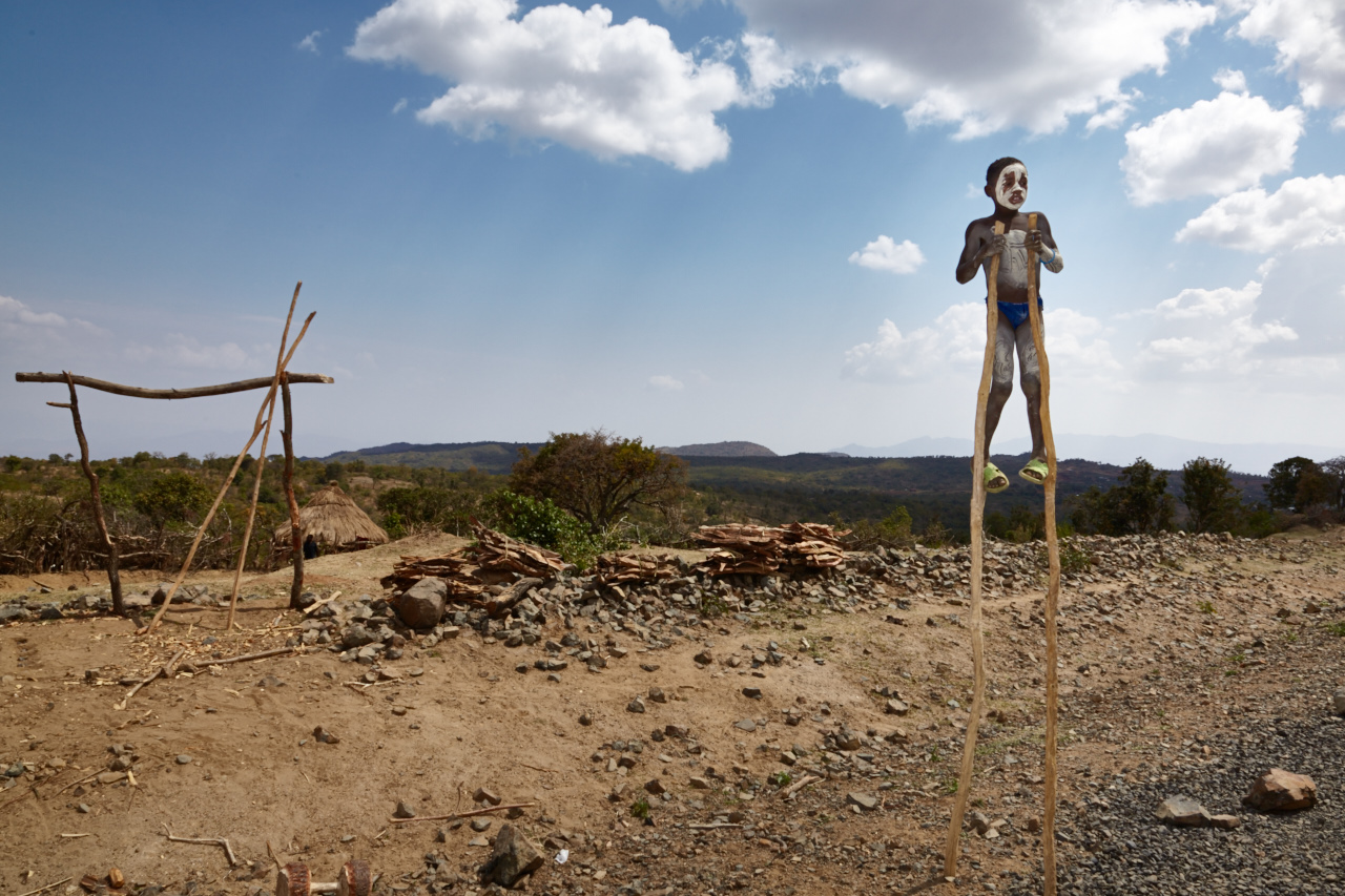
The kid of stilts
David gives us the background story on this image:
“I was in Ethiopia doing a story about The Hamlin Fistula Hospital and the work they do to help women recover from the devastating damage caused by an obstetric fistula: death of the unborn baby and often incontinence. We were traveling down to the Omo valley in Southern Ethiopia when we came upon this kid on the stilts. Basically he is doing a show on the side of the road. The hope is that tourists will stop and give him money in exchange for photos”, says David and continues:
“We took some photos and gave a bit of money. He felt we underpaid him so he was going to throw some pretty big rocks at our truck. We ended up paying a bit more :)”.
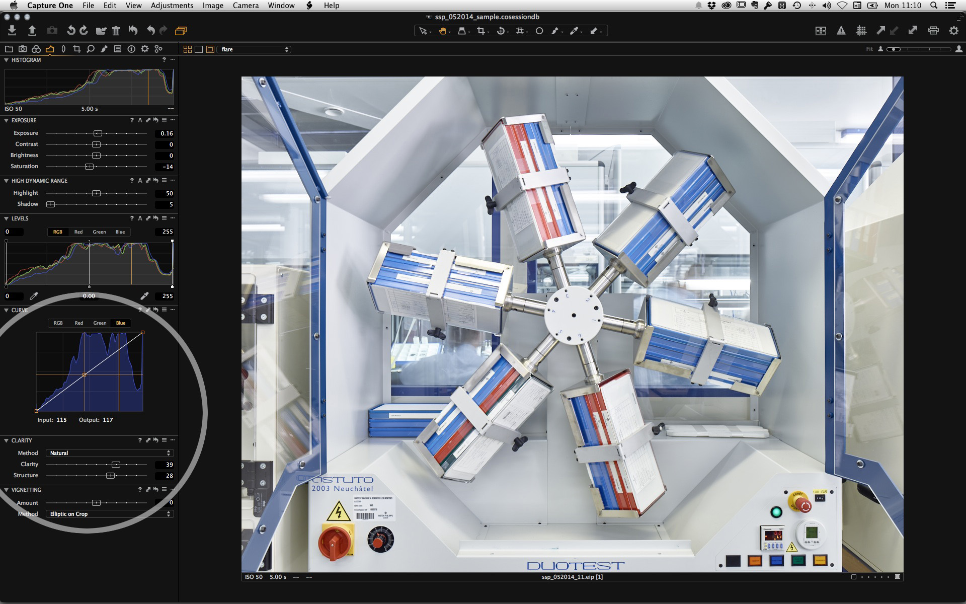
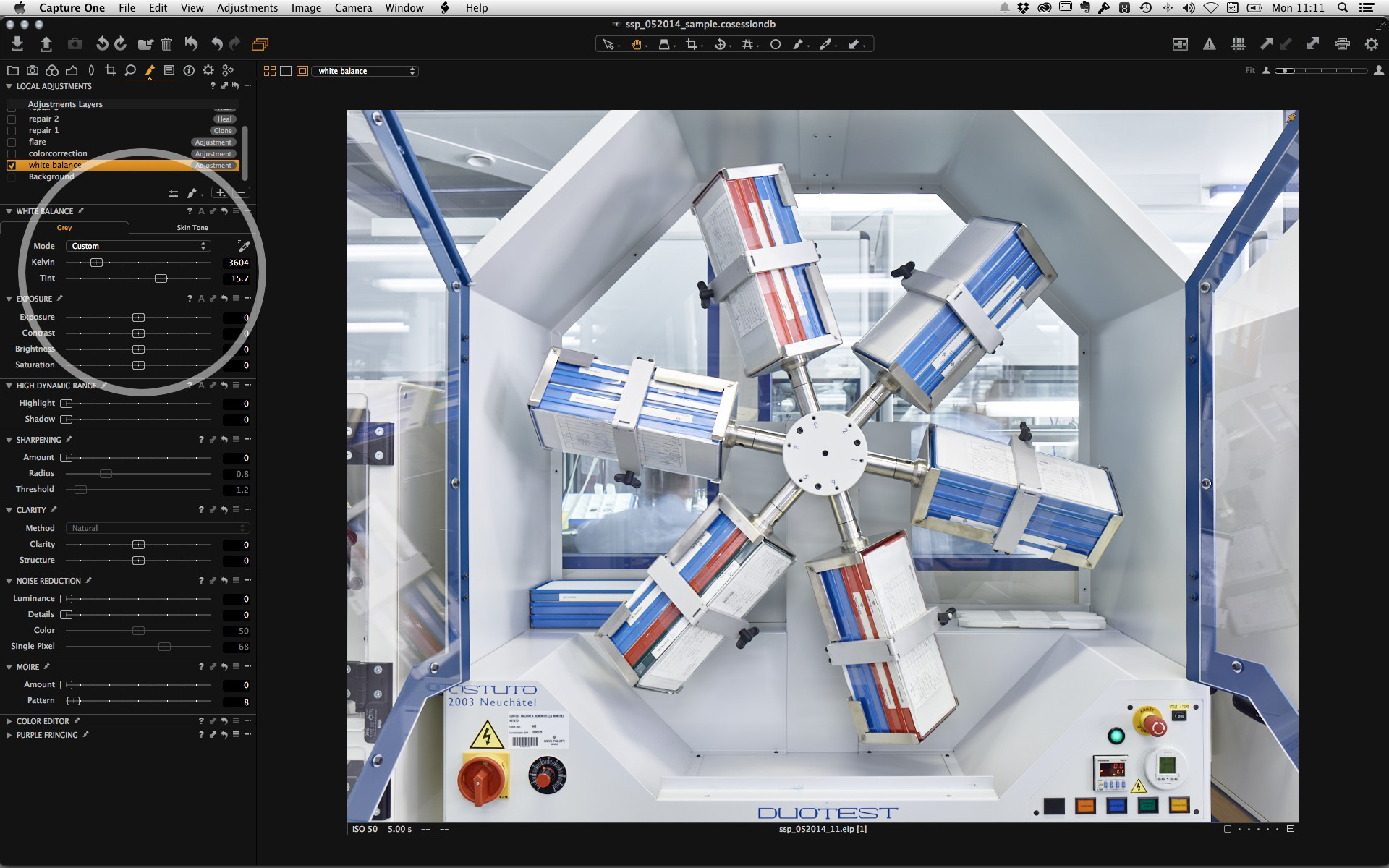
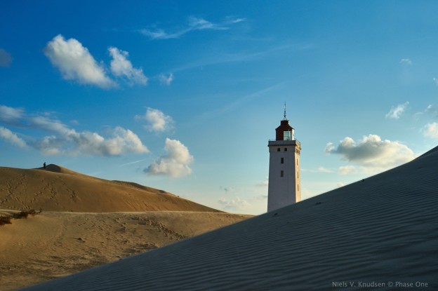
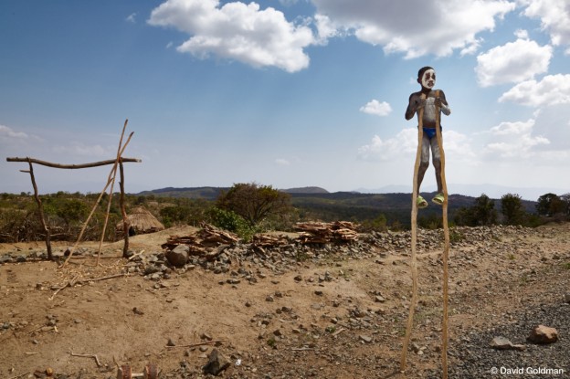
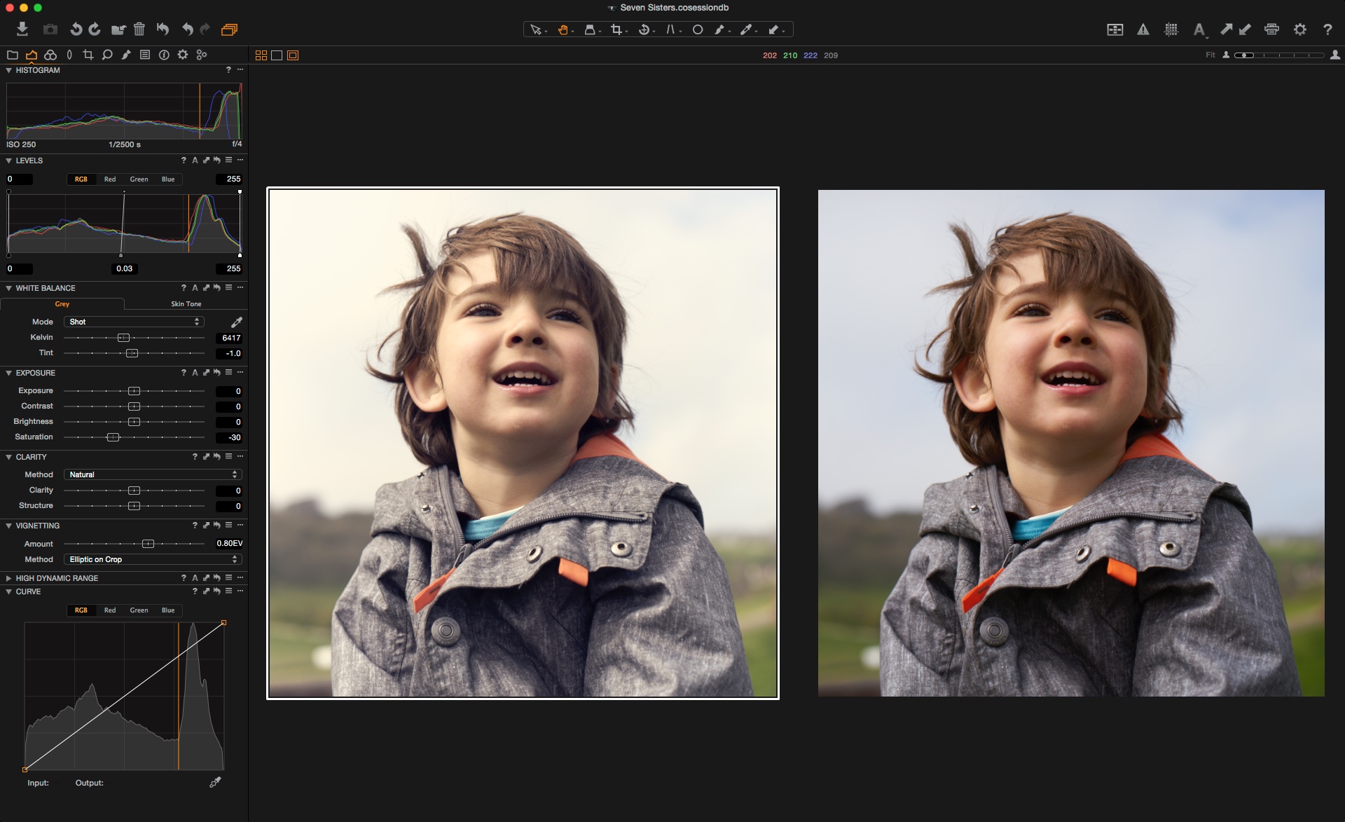
Above is the image in Capture One Pro 8, all purely on defaults.
Luckily David has given me a head start with a nicely exposed and composed image. Thank you David!
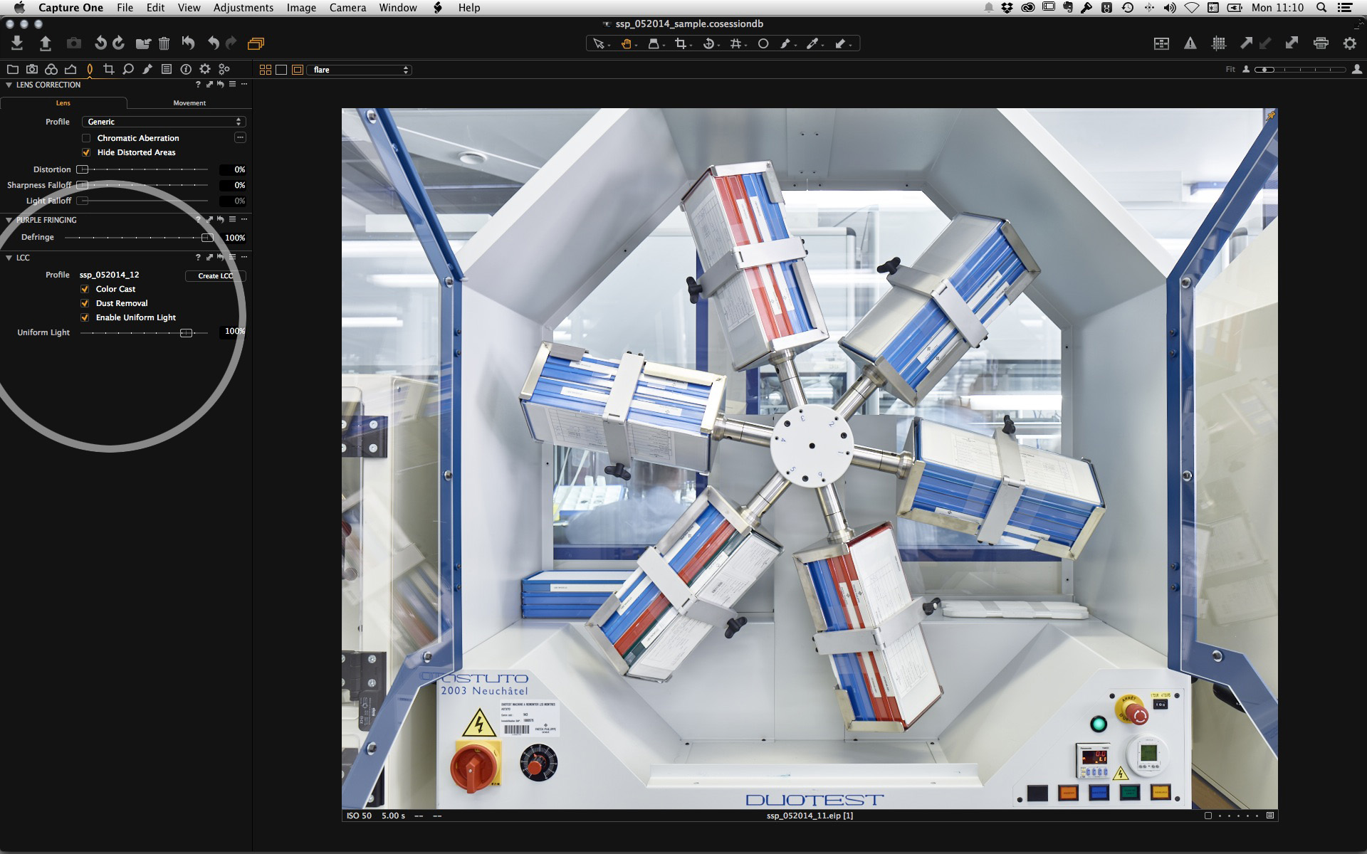
Before getting into some specific adjustments I will check up on Lens Corrections and make some changes there.The lens has been automatically detected and the distortion corrected to 100%. If I wish, I can also make changes to the Sharpness and Light Fall-off if necessary.
One option I definitely recommend is to “analyze” the Chromatic Aberration of the lens and camera combination. Even though we can remove this based on the lenses we test, it can vary. So this way you get the best correction possible. Fortunately in Capture One Pro 8, you can do this on a batch of images simply by selecting multiple ones first.
I couldn’t really see any noticeable purple fringing in the image so I have left that slider untouched. Compared to version 7, this is now a variable adjustment as opposed to a checkbox. You can even apply it as a local adjustment!
On to the fun stuff!
With those corrections done, we can go onto the fun stuff! White Balance-wise I think it might be a little too warm for my liking (remember I said it’s subjective!) so a simple reduction in the Kelvin value looks good to me.
Looking at the Levels, the only slight change to make is pull the highlight slider in a touch. You can turn on your Exposure warnings, if you like to make sure you don’t clip data. (Cmd-E for Mac or Ctrl-E for PC). I think I might lighten the mid tones a little as well, also in the Levels tools. Now I know the image could be looking a little flat now, but don’t worry we will come onto Contrast and Clarity next.
Capture One Pro 8 saw the addition of the ‘Natural’ clarity mode. This is my favorite choice for Clarity adjustments now, as the effect is nice and subtle without adjusting the Saturation.
A value of 50 is about good here and also a touch of Structure helps to bring out the details in the rocks in the foreground.

I am pretty happy so far, but I think we can make the sky look a bit more interesting and maybe the boy on the stilts could also look better in David’s image.
In the Color Tool Tab, the Advanced tool can be used to select the blue sky only with the picker, and increase the saturation and decrease the lightness. Just to get a bit more richness in it.
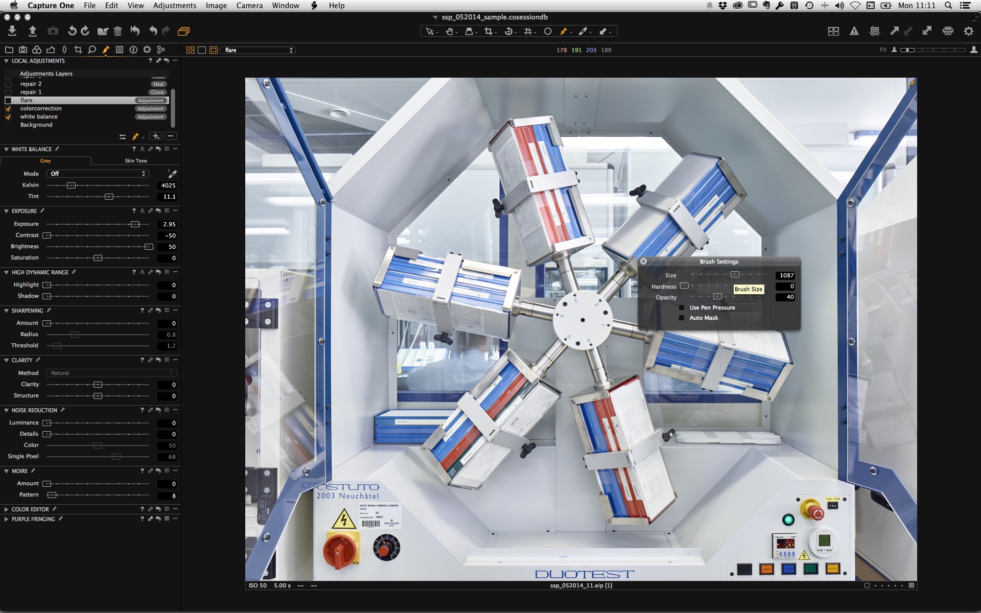
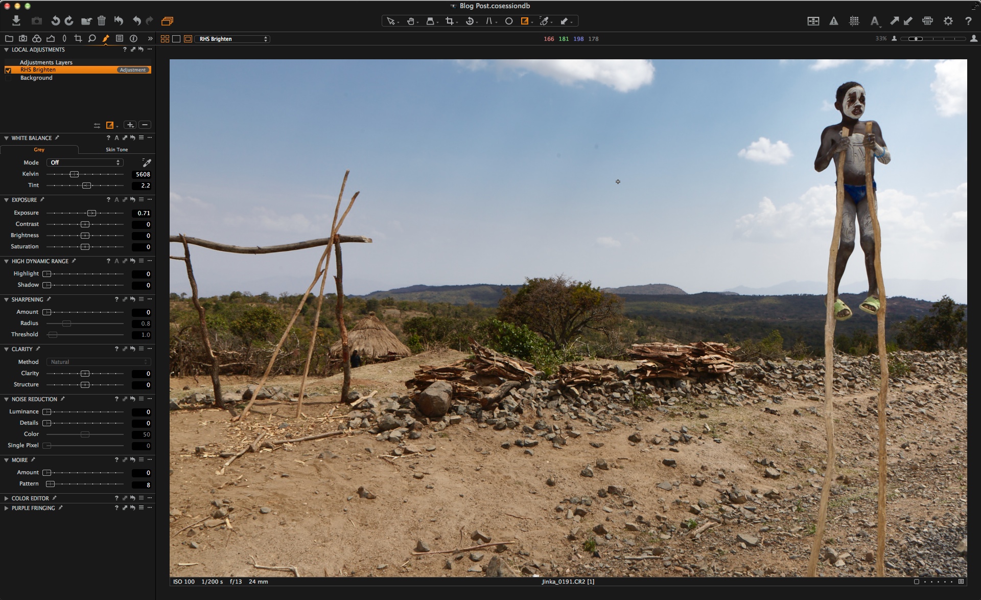
Now, I feel the right hand side of the image has a bit of an exposure imbalance, which I am finding distracting, especially as I am ‘reading’ the image from left to right. So, I am going to correct it with a gradient mask on the right-hand side only and lift the exposure a little. This might make the overall image too bright, but then I have the freedom to adjust it as a whole with the exposure on the background layer.
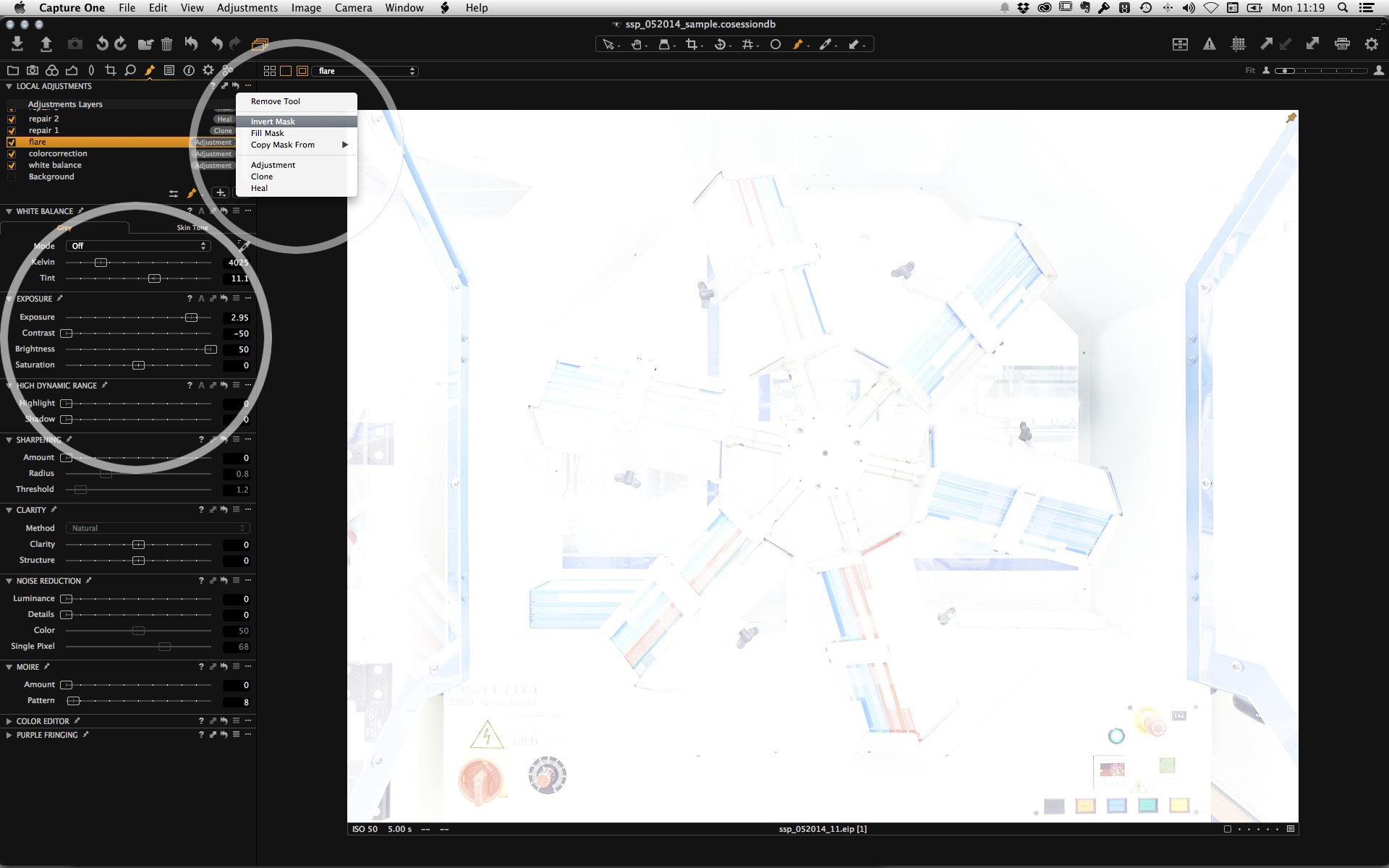
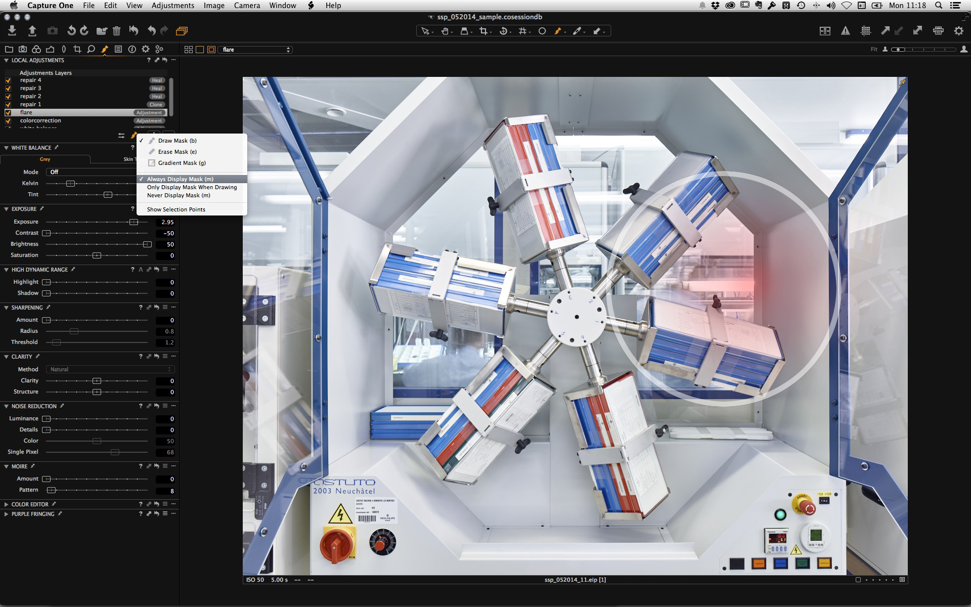
The mask looks like this….

and I think raising the exposure on that layer by 0.71EV works for me…
As I said, maybe the image is too bright now and I think this is when I approach the ‘playing’ stage, which might be hard to document as it involves me going back and forth a little with what I have got so far.
After playing a little I ended up increasing the Clarity more (still on the Natural mode) and adding a slight Vignette.
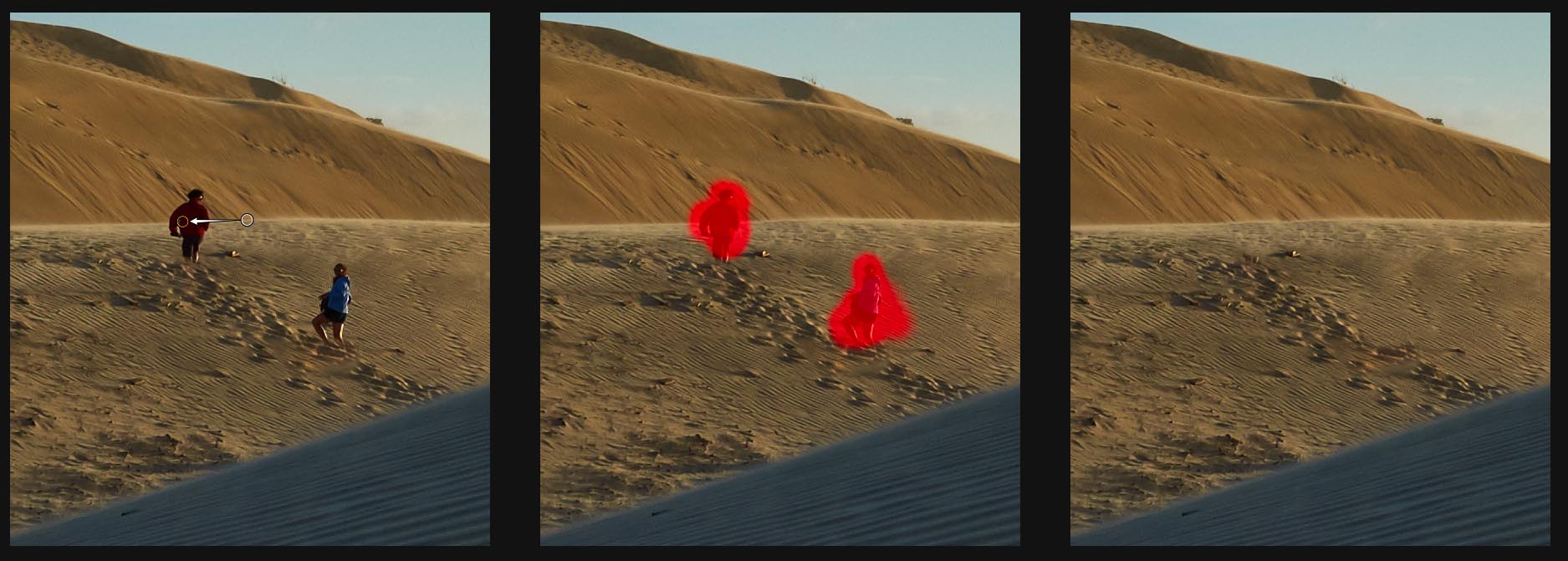
One last thing to try is see, if I can brighten the boy a little without it looking over-processed or fake. I made a pretty rough Local Adjustment mask around the boy, and then just increased the Shadow slider in the HDR tool a little. As this is only affecting the lower tones, the lack of a precise mask does not matter and only the skin is brightened.

The HDR tool is another adjustment that was added to Local Adjustments in Capture One Pro 8!
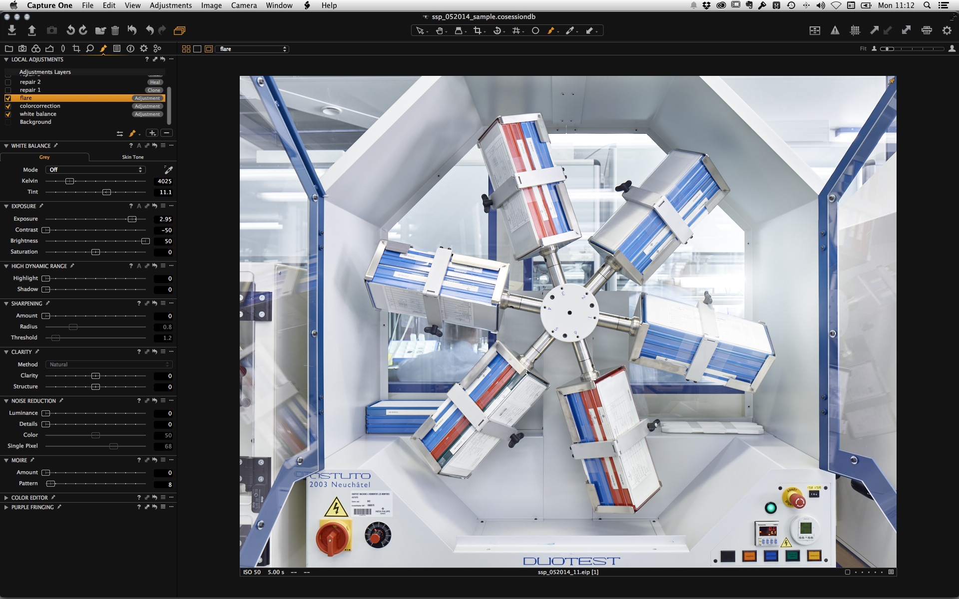
I hit another playing phase and actually added another Local Adjustment to lighten the boys face a little as it was just falling into shadow. I also bumped up Saturation overall a tiny bit as felt it was a bit too low in hindsight.
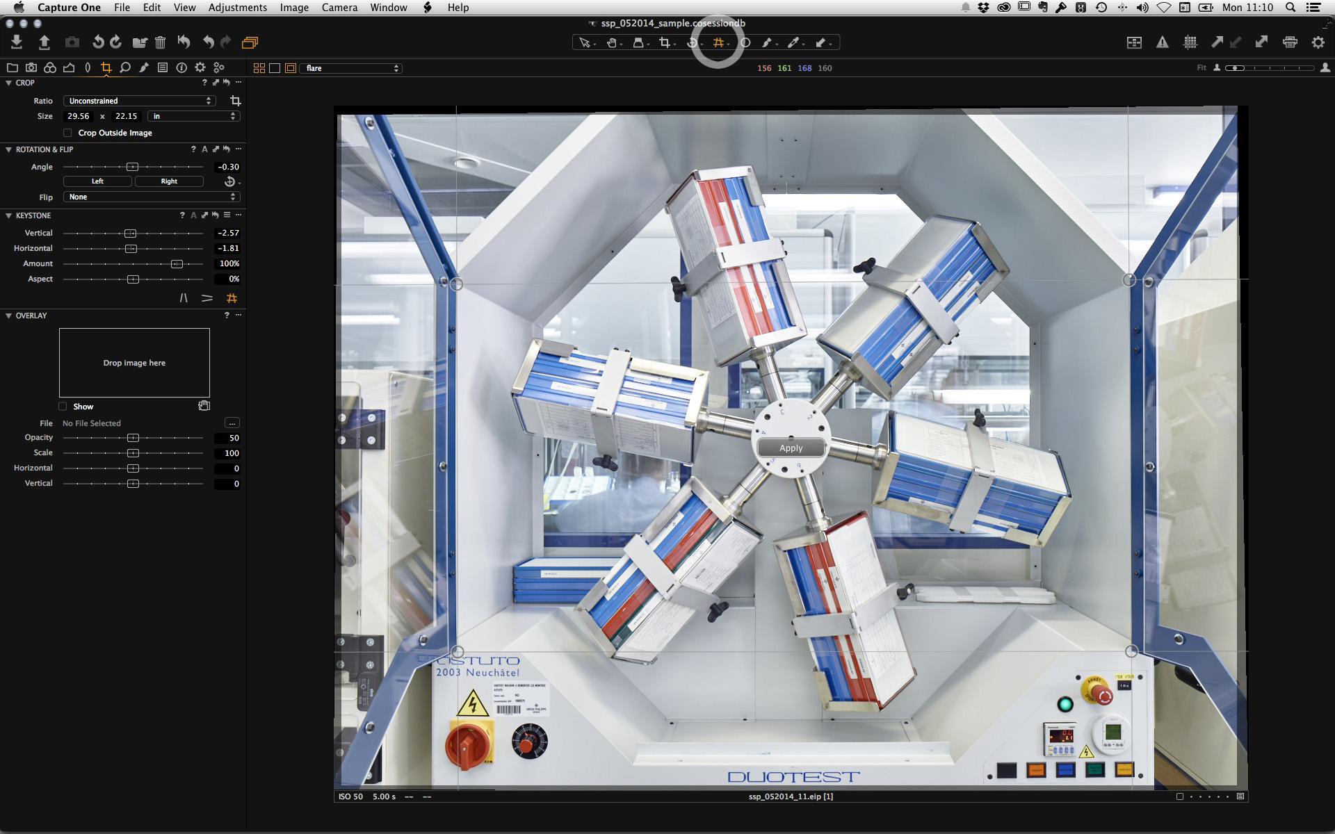
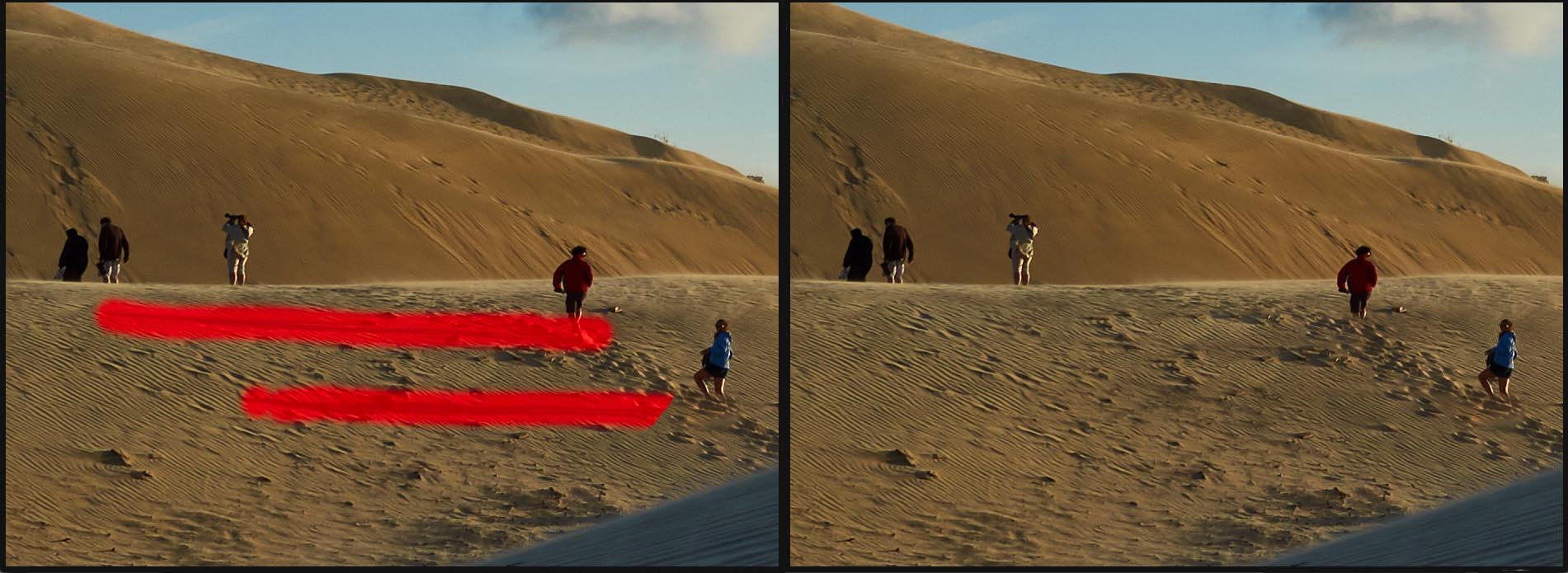
The last thing to do was to get rid off two dust spots in the sky. The Spot tool worked just fine for that.
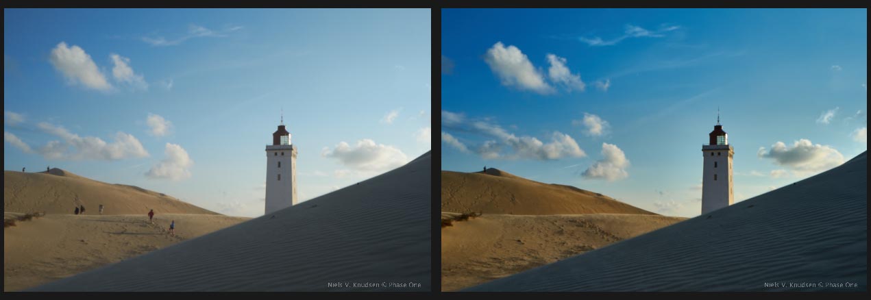
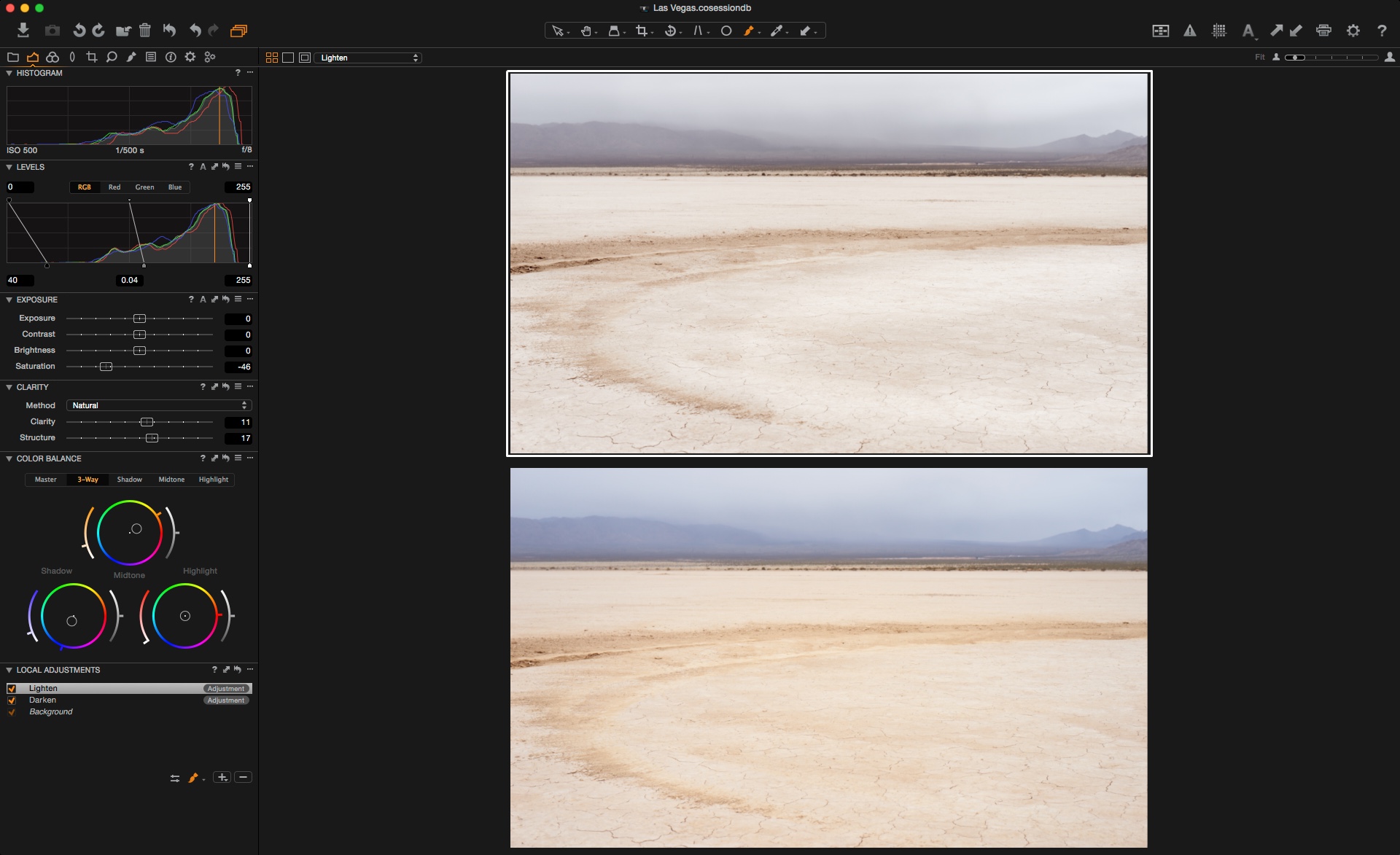
Below is David’s image with my adjustments on the left and defaults on the right. I hope I did it justice!

Below is the final output.
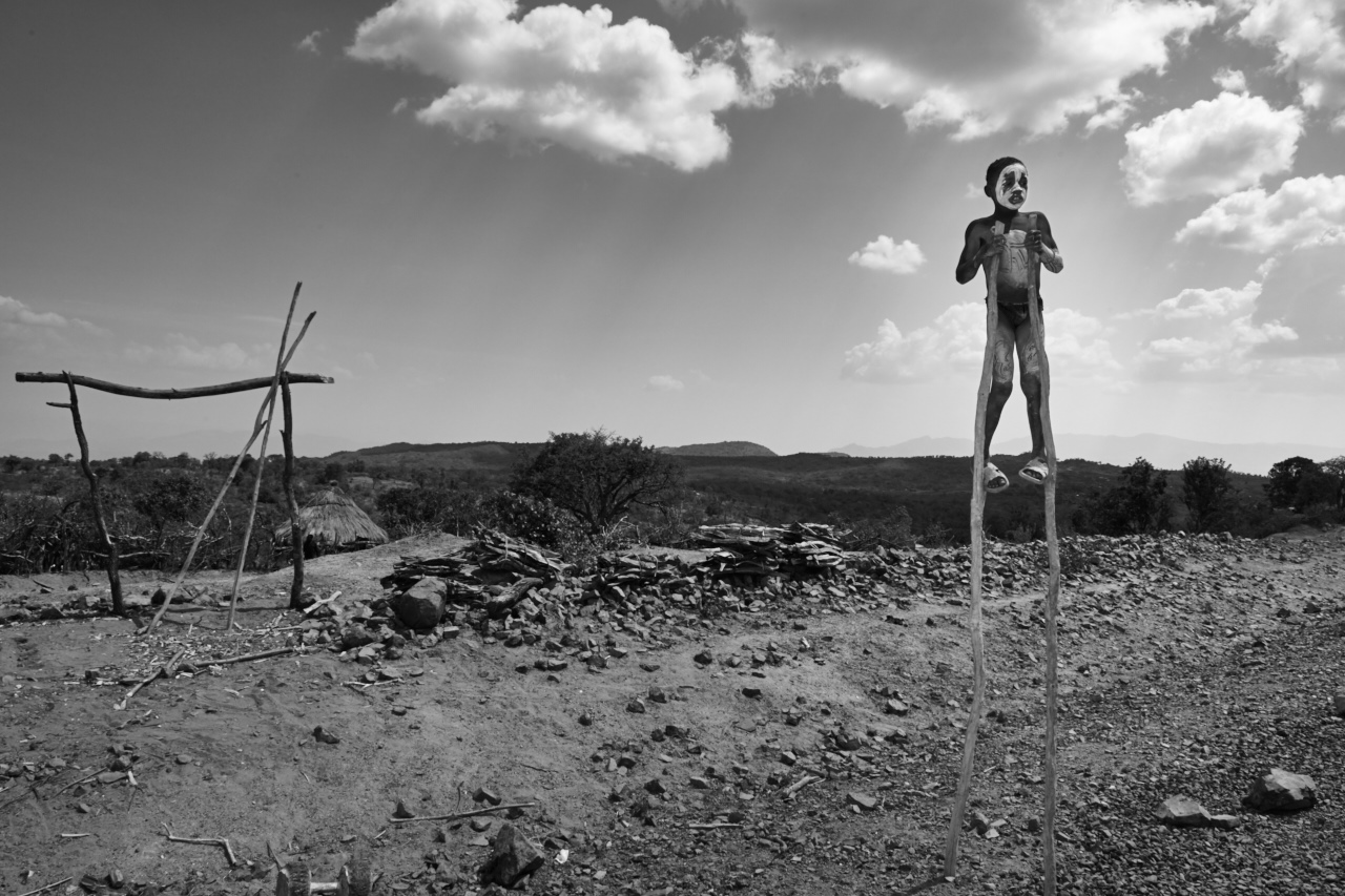
It also makes for a nice Black and White.
Thanks to David Goldman for sending us this image.
Best regards,
David