First of all let’s clear up what the difference is between a Style and a Preset. It’s very simple!
Preset – An adjustment from a single tool, which can be saved for easy recall and application to any image. An easy example could be a particular Curve.
Style – A multitude of adjustments from several tools, which come together to create a Style. An easy example could be a Curve, a Color Balance adjustment and a Film Grain application.
Presets can be stacked together if you want to build a look in that way too. You can in fact stack a Style on top of another one(!). Check out how. This is not something I personally do as then I believe it gets confusing, but more on that later.
Presets and Styles can also be applied during Capture and Import. This is a very useful additional feature.
Creating a Preset
It’s a very simple process to create a Preset. Simply go to the tool you want to create a Preset for, adjust the tool and then save it.
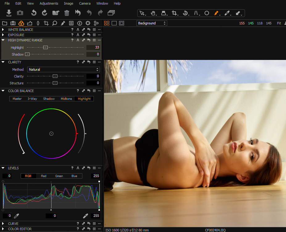
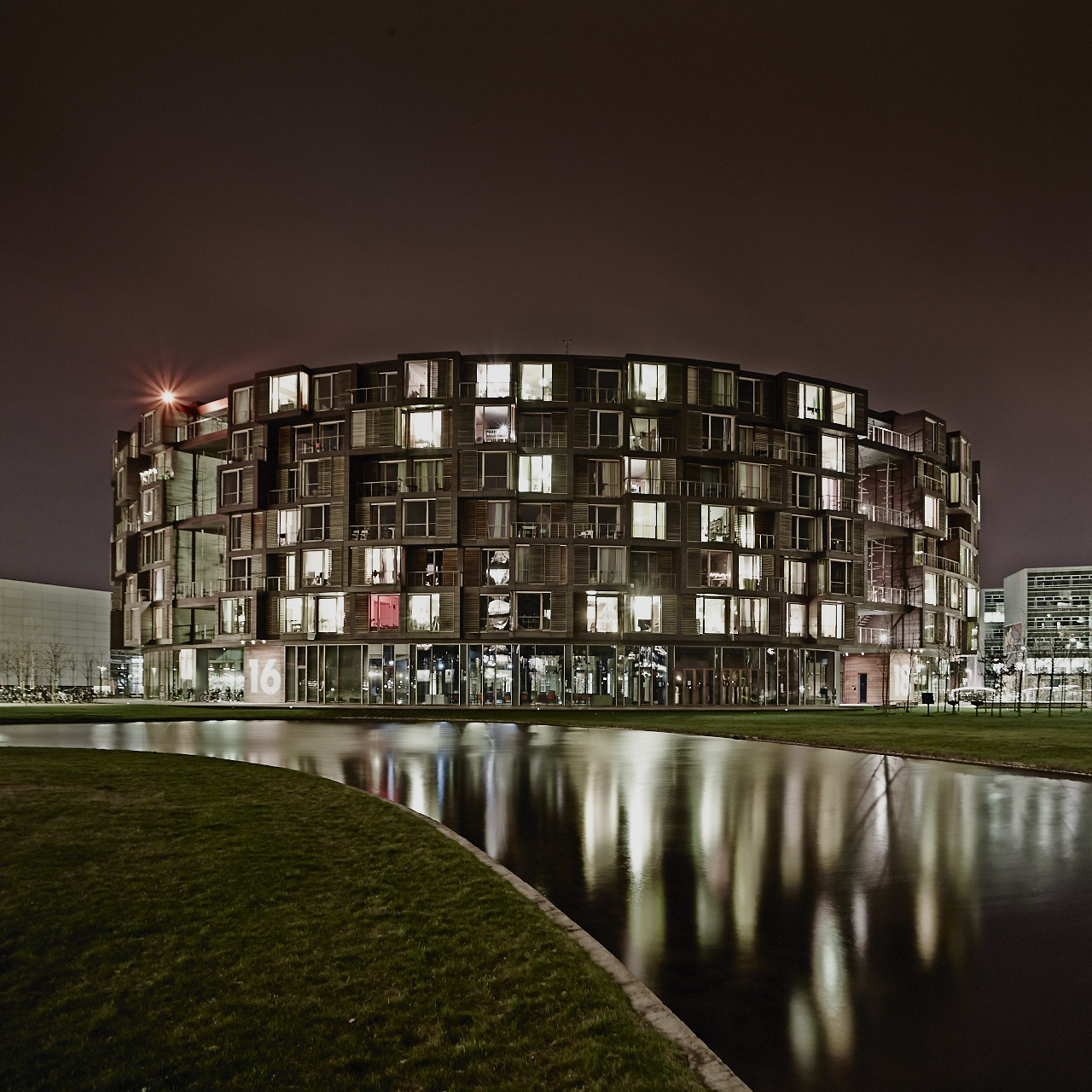
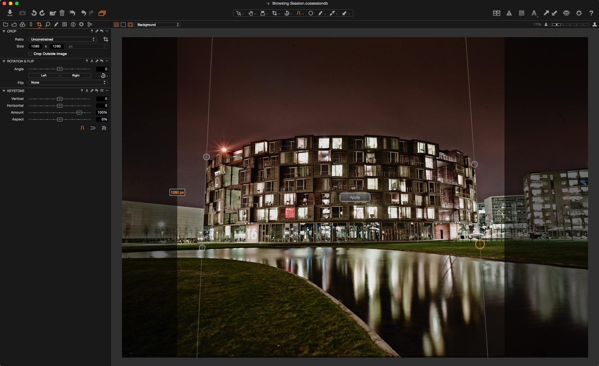
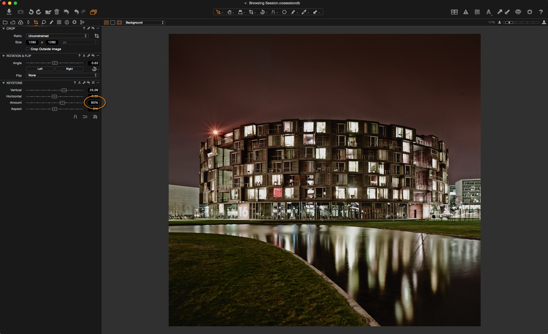
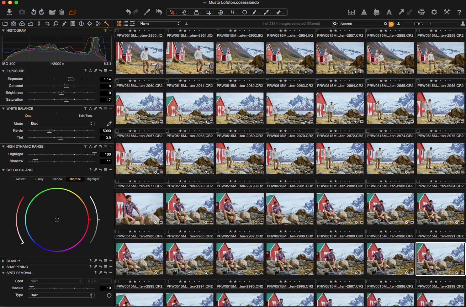
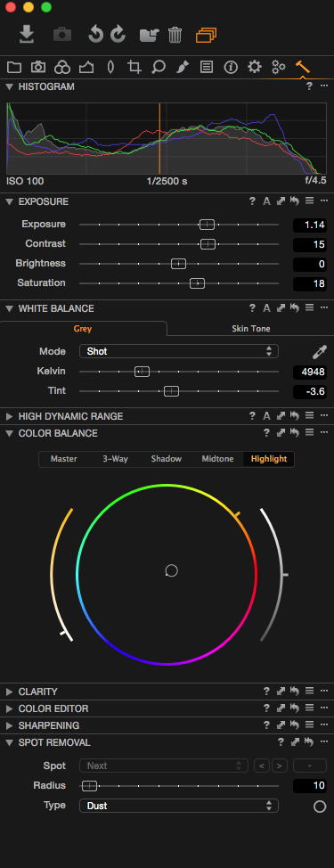
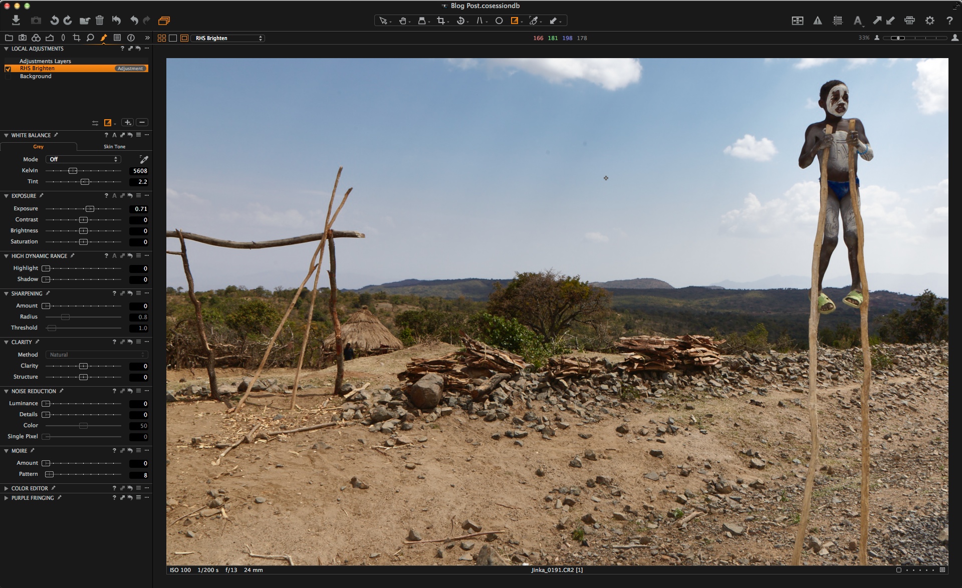
For example on some of my landscape images I like to have more Clarity and Structure. So in this example I have set the values accordingly:
Then it is a simple case of using the tool contextual menu to save it as a Preset:
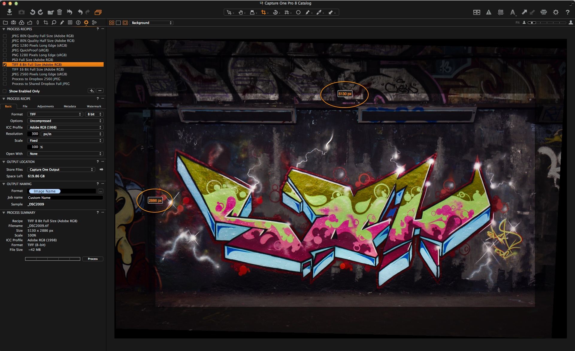
You will be prompted for a name, so call it something recognizable. This Preset will then be available on any other image from the same menu in the tool. Hovering over the Preset also gives you a preview of what it will look like. This is very handy if you are comparing different Presets:

Presets can be recalled from the Styles and Presets tool. More on that later.
Creating a Style
A Style is a very similar concept except it allows you to save and control more than one tool adjustment.
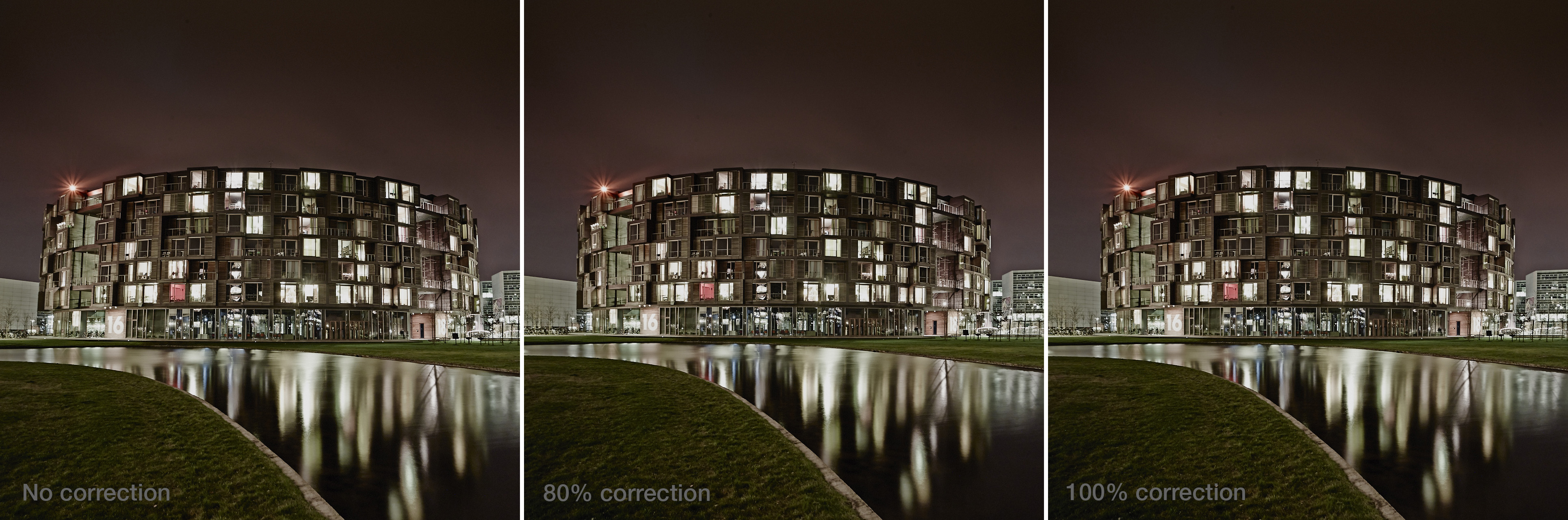
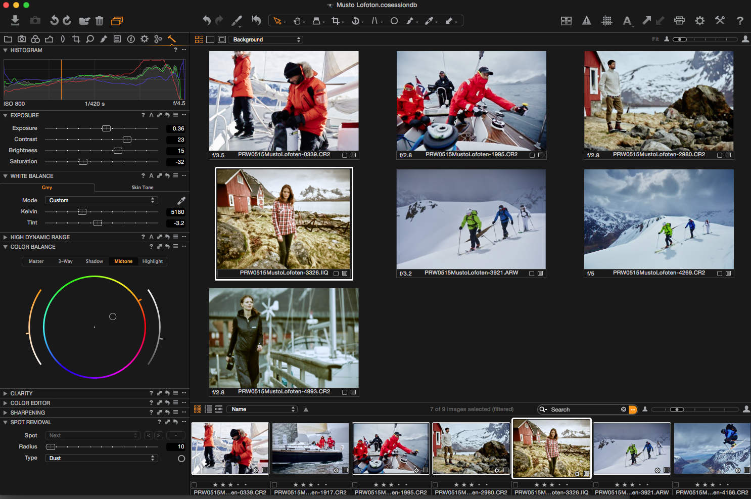
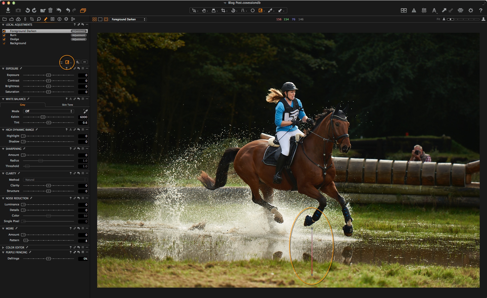
Let’s continue on with the same landscape image and add a few more touches that I could conceive might be general starting points for other landscape images. But it’s important to note that no Style is set in stone, once applied it can always be adjusted further.
I have reduced saturation a little, added a simple Curve and some minor adjustments to the 3-way Color Balance tool. Now, some of the adjustments might not be suitable for other images, for example Levels adjustments. The beauty of saving a Style is that you can pick and choose what elements on the current image will be included in the Style, omitting the ones that won’t be suitable.
Styles can be created in the Styles and Presets tool. By default this sits in the Adjustments tool tab.
To save a Style, click on the plus icon in the tool:
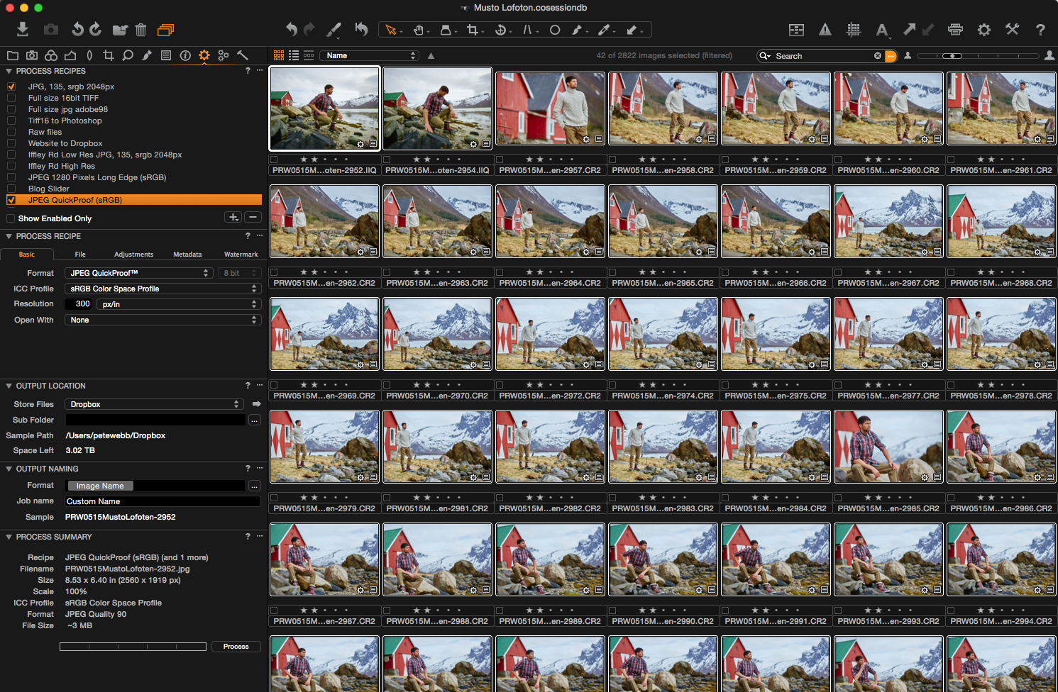
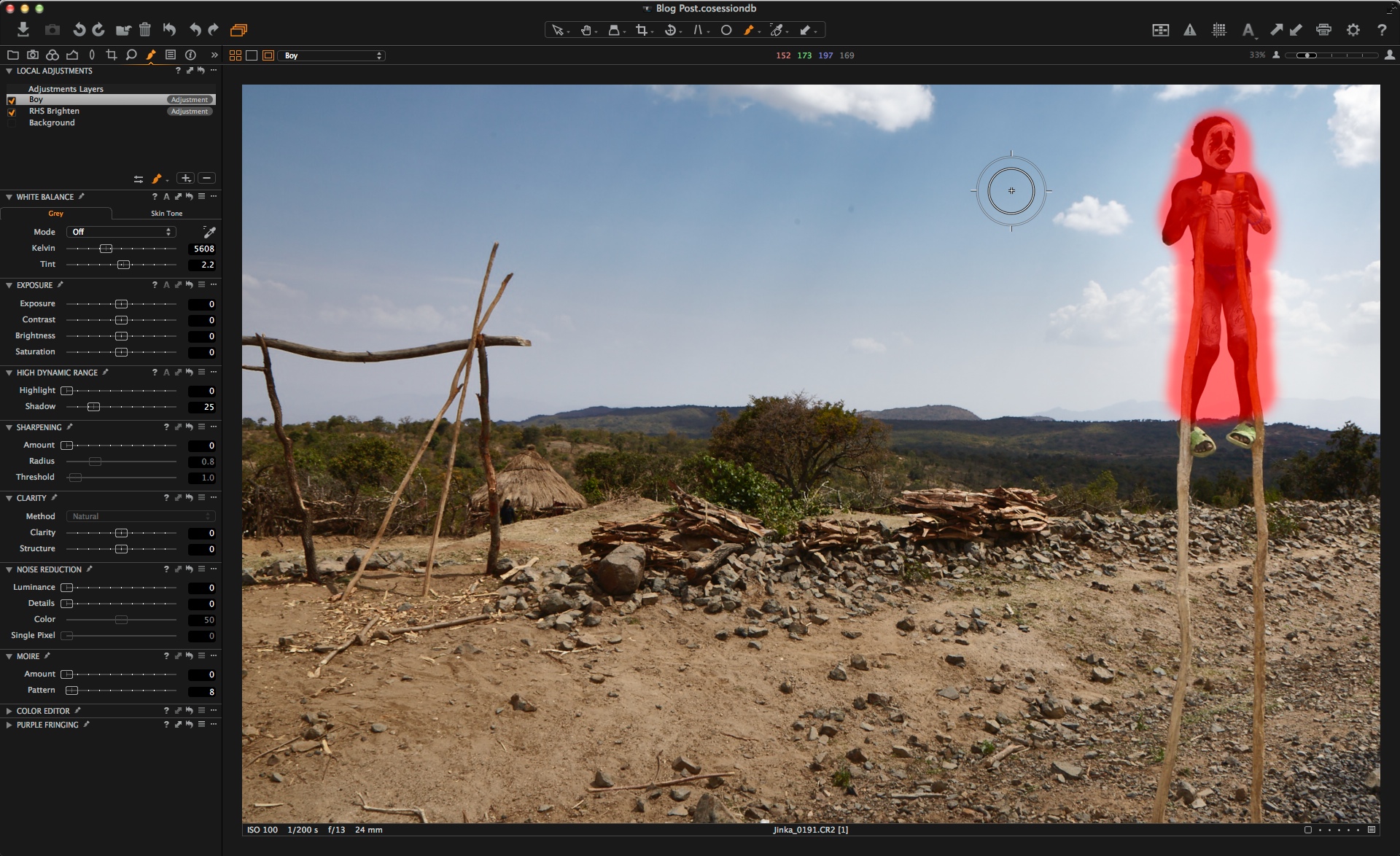
The subsequent menu lets you pick and choose what current adjustments should be saved into the style. I have collapsed some of the menu items, which contain no adjustments at all to save a bit of space here:
If we scan down this list, a few things would not make sense to save in the Style. For example, Exposure compensation, Levels and Rotation. Therefore we simply have to uncheck them and then click Save:
Think of a name for your Style and Save it:
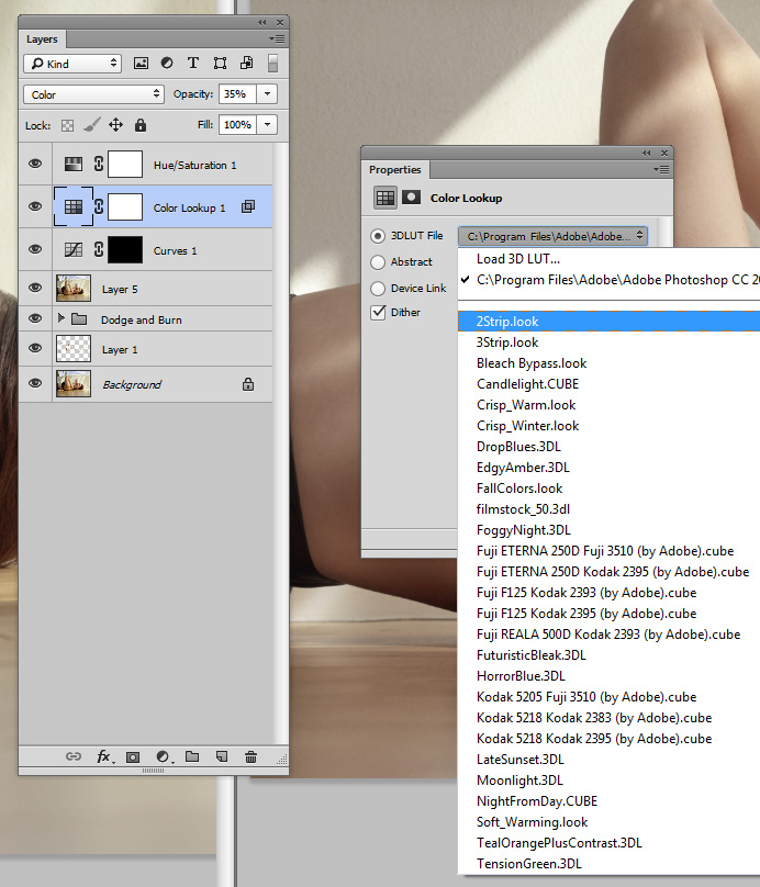
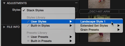
Now this Style can be applied on any image:
Remember, you can always use these as starting points for further adjustments. I also tend to normalize Exposure and White balance before attempting to apply them.
As I mentioned earlier on in this post, you can also recall Presets from this tool as well.

Here it could be useful to choose a bunch of Presets on an image. Note that the ‘Stack Styles’ option is checked which allows us to stack Styles and Presets.
I personally don’t stack Styles together but building a look from different Presets can be a useful exercise!
If you want to experiment with some existing Styles, there are a number included already in Capture One. Look in the Built-in Styles section of the library and try them out! There are also a few third party companies that sell some Capture One Styles to try.
Don’t forget that you can also apply Styles and Presets on import and also during a tethered Capture Session.
In the Import Dialog, look in the Adjustments section…
I personally use this to apply a Metadata Preset to all images on import…..Like Name, Address, Copyright information, etc. Just save this as a Preset in the Metadata tool.
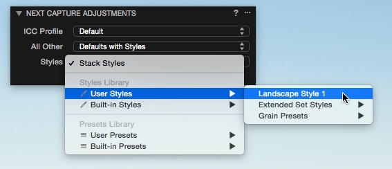
During tethered capture, a Style can be applied on each shot as chosen in the Next Capture Adjustments tool:
I hope you can see that saving different Styles can be a fun way to experiment with the various tools in Capture One, or a way to achieve consistent looks over a variety of images.
As I mentioned earlier, you can’t always expect different images to behave the same way with a certain Style. The final result will also be influenced by the image content. So use your Styles as a good starting point to develop further from or use them to accelerate workflow by applying a number of adjustments that you know you will do by default.
Best regards,
David Grover