NOTE: This article discusses an outdated version of Capture One. To learn more about our latest version, click here.
In late May I had the opportunity to try the Phase One DF+/IQ280 system for jewellery photography. I’ve used Phase One digital backs and Capture One for all my career and the people at Phase One thought it would be interesting to see what could be produced with the highest resolution single shot digital camera system commercially available.
The exercise was timed for when I would have some interesting gemstone jewellery to shoot for clients. As it turned out, it was an extremely busy period, with a lot of new collections to be shot in a short space of time.
So there was no time to run lots of specially set up comparisons or investigate many of the other great features offered by the system, just the opportunity to produce real images of some beautiful jewellery for clients and to see how the system fitted my workflow.
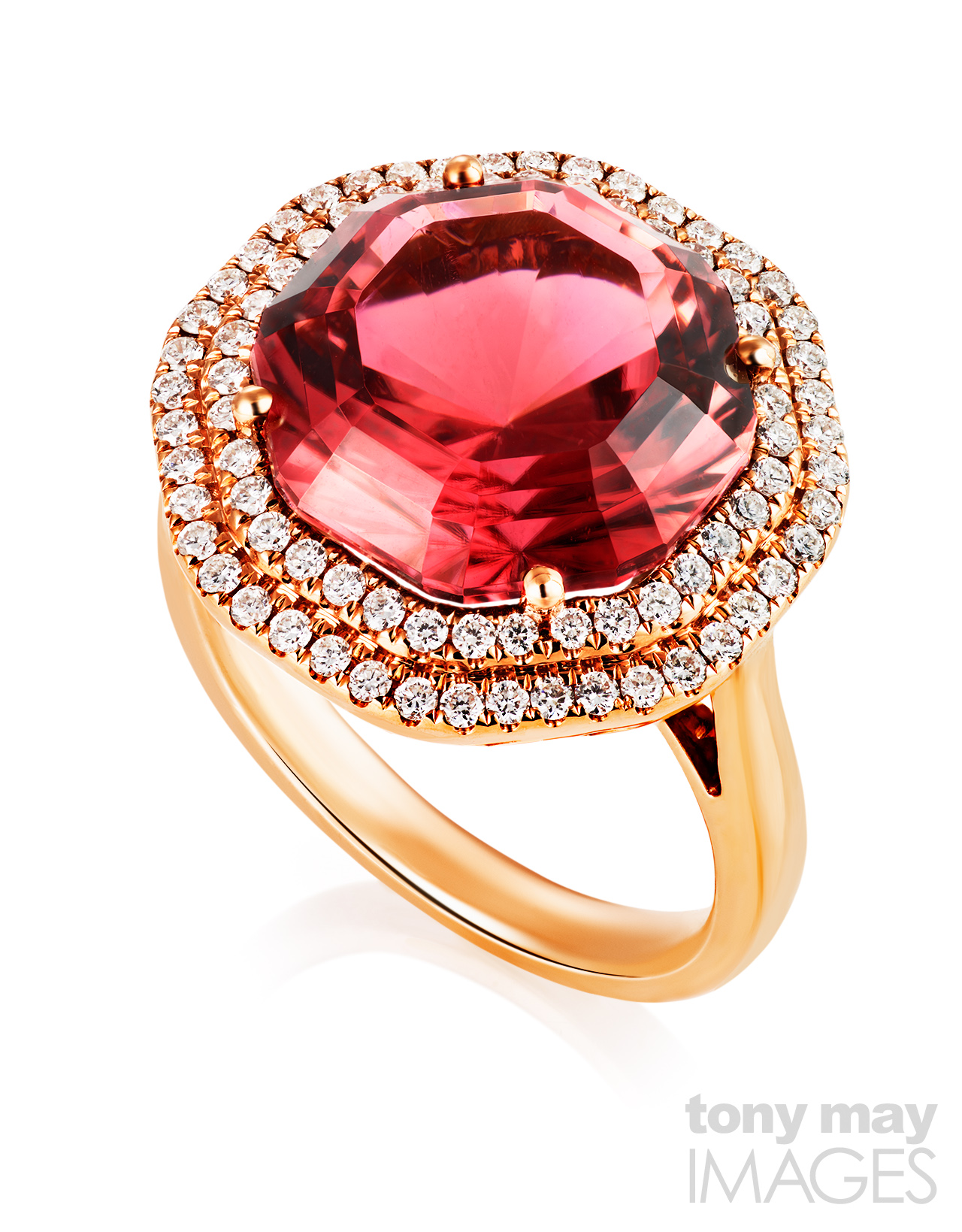
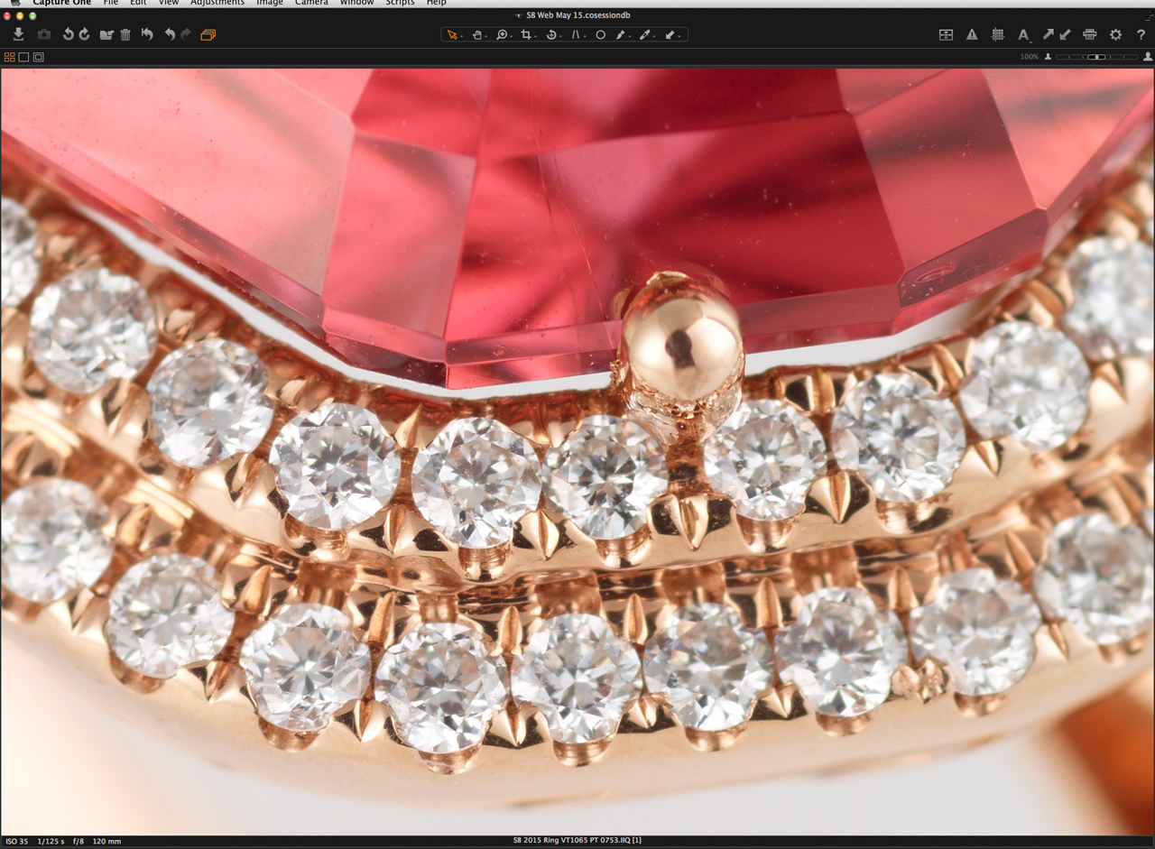
Pink Tourmaline and Diamond Ring in Rose Gold
Why an 80 mega pixel medium format system for jewellery photography?
Most products are not shown actual size in advertising images for the simple reasons they are too big or we don’t need to see them actual size. But jewellery photography involves producing images of very small products that are often viewed many times larger than life.
Rings are mostly around 20mm (less than an inch) across with gemstones usually a few mm across and the small diamonds used around larger stones in “halo” settings can be as small as 1mm in diameter whilst still having the same facets and cuts as larger stones. Images of rings may appear anywhere from life-size to 6 inches (150mm) or larger in a magazine or on a website. On posters for advertising or point of sale, jewellery images will be blown up even bigger, showing up any inadequacies, lack of detail or over-sharpening in the original image.
I shoot fine jewellery with gemstones and small diamonds and capturing the details and cut of the stones requires good resolution and a sharp lens. Depth of field is minimal when shooting so close. Tilts and swings aren’t the answer with small items if you want them sharp all over when shooting very close. Focus stacking and compositing is used extensively.
Technical and and large format camera systems with digital backs allow some of the very sharpest lenses for ultimate resolution as well as lens and camera movements but a medium format system with a very good macro lens can offer potentially faster workflow with excellent results for advertising and brochure use.
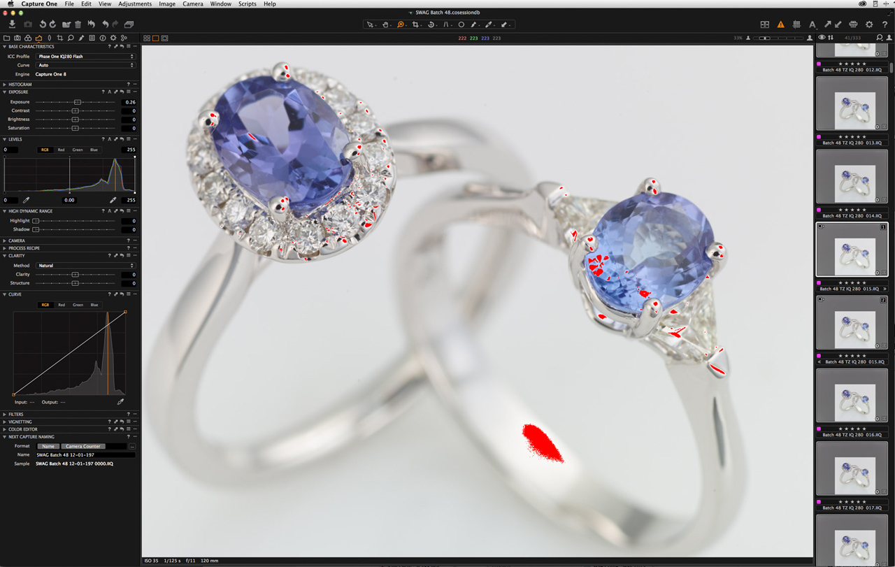
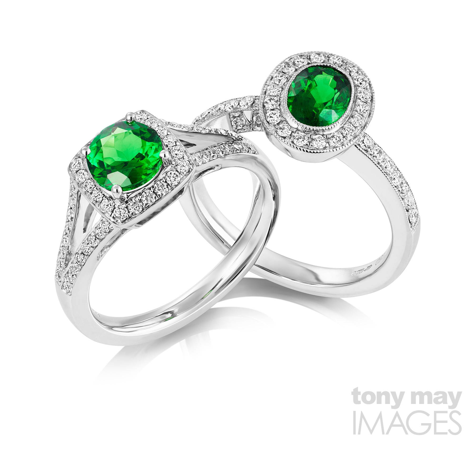
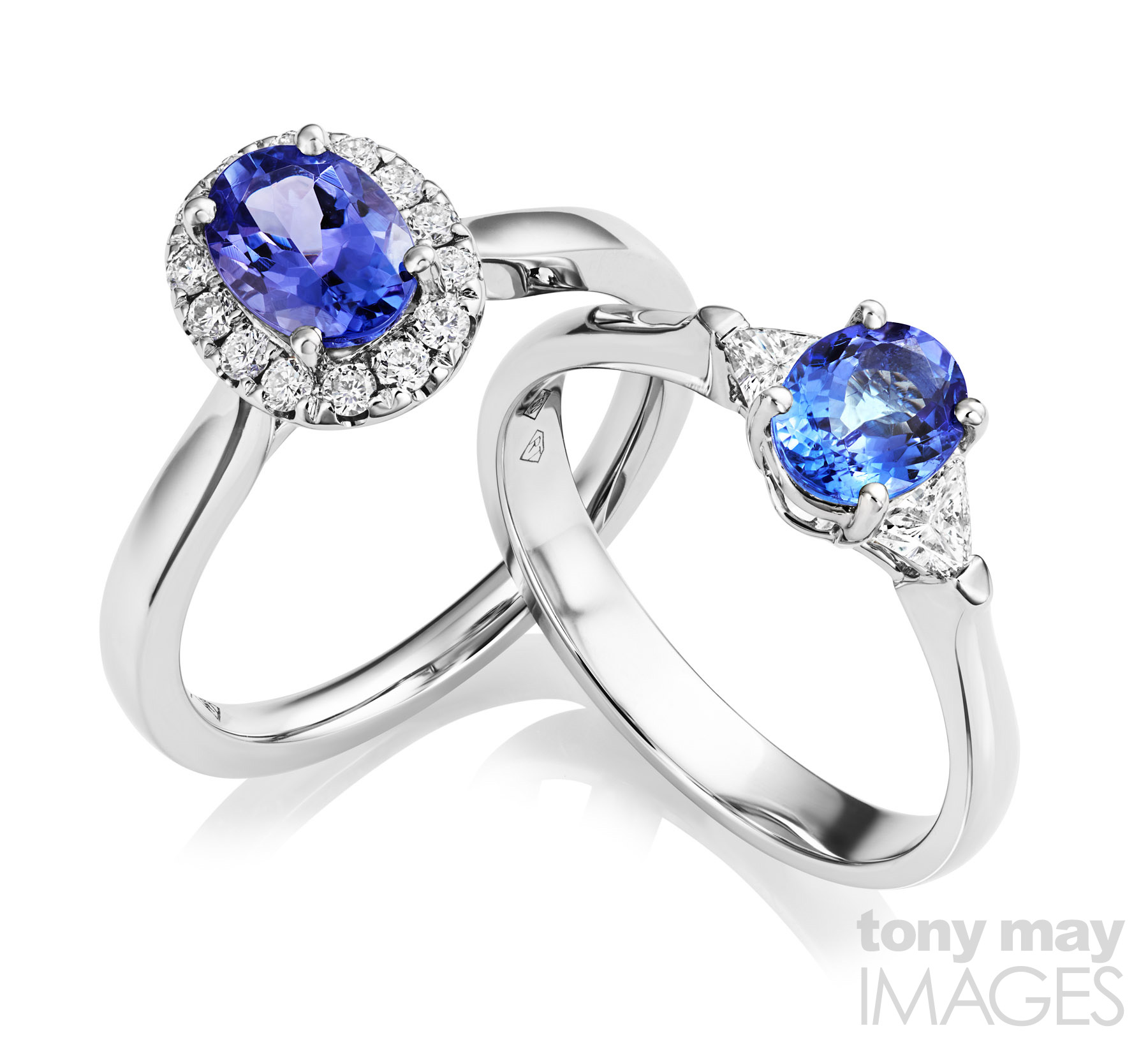 Tanzanite and diamond rings. The stones could be retouched further if required.
I was interested in three potential advantages of the IQ280:
- More resolution. Working distances mean that for pieces like a single ring typically only part of the frame is used. More pixels on the sensor can mean larger repro sizes without upsizing. If reproducing images at smaller sizes, having detail there and then downsizing is likely to give a more naturally detailed result than upsizing and sharpening. For “hero” shots intended for advertising and posters, and for group shots, a bigger image is definitely a plus.
- Greater shooting distances. Pulling further back increases depth of field so less frames should be needed for each stack meaning time savings when shooting volumes of pieces. And for items like hanging pendants which are more two dimensional and are being shot for use at small sizes would there be enough depth of field to capture these in a single shot?
- File quality for post-production. Jewellery photography invariably involves significant post-production and retouching. Retaining detail and smooth tonal gradations across a wide dynamic range when shooting highly reflective subjects, along with good colour depth is vital to allow the kind of selective adjustments performed in post-production.The flexibility of files from medium format backs and their ability to hold together in post-processing is often mentioned as an advantage over files from smaller formats and I have found this in my own work.
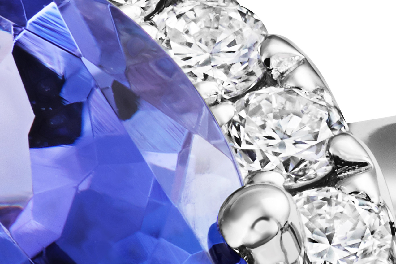 Crop from image above at 100% magnification during retouching and before final sharpening. Each diamond measures approximately 1.7mm in diameter in real life.
The kit
Phase One have two 120mm macro lenses in their range and supplied the MF 120mm f4. It’s quite compact with a relatively small 67mm front element and lens hood which means a smaller opening for the lens in the set and so a smaller black reflection. The camera and lens are well balanced but did then spend all their time here anchored firmly to a studio stand.
The IQ280 digital back has a native ISO 35, a 3.2″ touch screen as well as physical buttons, USB and Firewire connections, wireless connectivity to iPad/iPhone. It was straightforward to fit it into my existing tethered workflow. Once I had worked out that I had to deselect the Auto Alignment feature in Capture One to stop it automatically correcting all my captures based on the data from the accelerometer/orientation sensor in the IQ280 back – a great feature for architecture but makes a shot of ring from a high angle look crazy – I was off.
The Workflow
I used the system with cable release and in mirror up mode, as you would expect, to minimise vibration.
My workflow for jewellery is different from other products where I use the extensive features of Capture One Pro to get as close as possible to the finished image, minimising work in Photoshop or avoiding it altogether if possible.
For me, shooting jewellery means controlling reflections, contrast and dynamic range at the shooting stage. I do all my own post-production and retouching and I want the files that go into post-production to retain maximum information, detail and flexibility so that I can have full control over how I tune the contrast and colour of different elements of the jewellery and how the final image looks.
So when shooting tethered in Capture One I concentrate on good exposure whilst retaining highlight detail and facet definition, especially in stones like diamonds, and ensuring accurate gemstone colour – jewellers quickly pick up inaccurate stone colours. After shooting thousands of pieces of jewellery I can judge what the relatively flat looking image I see on screen might look like at the end of my workflow.
Most of my adjustments are with the White Balance, Exposure, Levels, Highlight and Color Editor tools as well as the extensive tethered shooting and batch processing controls. Many of the adjustments that would be applied to other kinds of image are not used, in order to produce an output file with relatively low contrast that retains maximum colour and tonal information produced by the digital back.
 Burnt out areas on the inside of the band (shank) are simple to deal with in retouching.The Exposure Warning tool provides a very useful way of judging if exposure is maximised when adjusting lights, without losing fine detail in gemstones. With the Exposure slider it’s a quick way of anticipating the effect on highlights of adjustments to the power levels of studio lights, when shooting tethered.
I often use the Exposure slider in conjunction with the Exposure Warning tool when adjusting the lighting for a shot. Jewellery obviously has specular highlights, they are what makes it sparkle, but if they are too strong and uncontrolled you lose the fine detail of gemstone cuts and around the edges of the polished metal castings, as well as reducing the quality of the results from focus stacking. Pulling the Exposure slider across quickly tells me how much I can adjust my lights. Burnt out areas on the inside of the band (shank) I don’t worry about too much as they are simple to deal with in retouching.
In my normal jewellery workflow, I use Capture One’s very powerful Color Editor to fine tune the colour of certain gemstones such as emeralds, which can sometimes render some of the green tones a little towards cyan with my P+ series back. With the IQ280 I found those difficult colours more accurate.
Using the mid-point slider of the Levels tool I can add a little more contrast to images that are too flat, I often use this with diamonds set in white gold or platinum, where I don’t have to worry about coloured tones of stones or metal becoming too dark.
I normally use the Film Standard film curve In Capture One. I find it gives me a starting point with sufficient contrast for me to judge the image on screen and as a starting point for post-production. But dark coloured stones with deep colour, for instance some sapphires, can look almost black in their densest parts with separate facets not distinguished so the Film Extra Shadow curve is useful for pulling out detail in those cases.
Appropriate use of different focus stacking methods helps here too. Some prioritise contrast but can desaturate colour whilst others give better colour and preserve highlight detail better but are more prone to introduce stacking artefacts.
Files are exported from Capture One as 16-bit TIFFs for stacking. Stacked images are pathed to isolate individual elements, cut out, retouched, the different elements adjusted for contrast and saturation, then images are repurposed for various output formats with CMYK conversion if needed and selective sharpening as required depending on output size and medium.
Go Big, or Pull Back
The full frame dimensions of the IQ280 of 10308 x 7445 pixels would allow a print 34″ (87cm) wide without any interpolation. The tanzanite and tsavorite ring pairs pictured above and below would print at 24″ (60cm) across, ideal for shop posters and display materials. That means that image quality will stand up to scrutiny and reflect the quality of the jewellery both at all viewing distances.
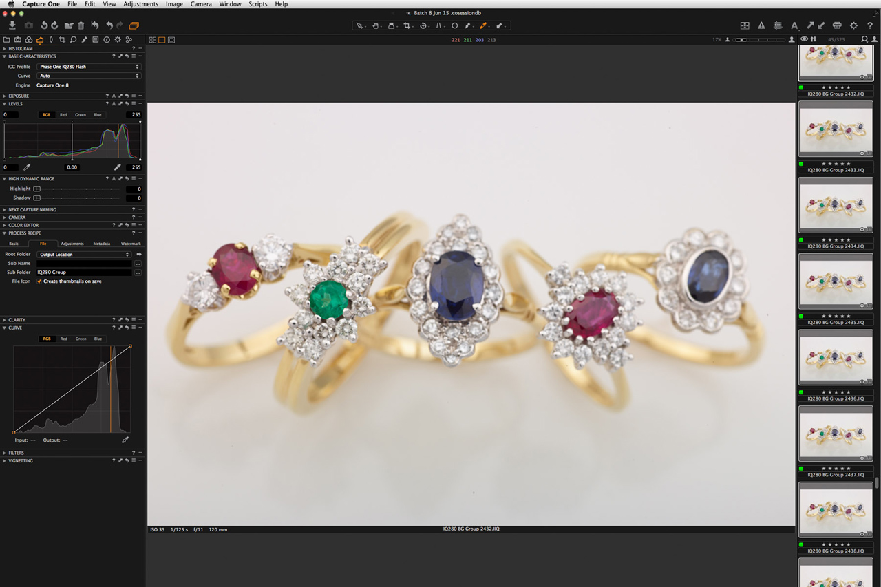 At over 10.000 pixels across, this ring group would print at 34″ wide (86cm) at 300ppi, without interpolation. Image copyright Tony May 2015.
At the other end of the spectrum, I wanted to see how far back I could pull the camera to produce an image that was still large enough to work as a zoomable web image typically used by jewellers in online shops or catalogues. These images are typically used around 1000px square or smaller for items like rings. Going bigger than this for these kinds of volume images means that unless the client has a good budget for retouching or the pieces are immaculately finished there are simply too many imperfections visible.
Pulling back to give a cropped ring image of around 3000px square, required a focus stack of only 14 captures at f11 to get the ring sharp from top to bottom. That’s not very many for an image plenty big enough to fill a full page magazine ad and to retain detail when downsampled to typical web sizes. And it’s about half as many captures as I might typically use for a 2000px crop with a P25+ back.
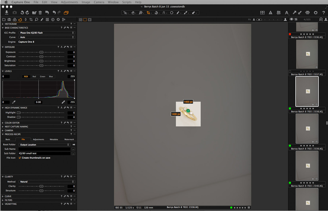 With the camera pulled back, this 1400px crop demonstrates just how many pixels the IQ280 packs and yields an image big enough for many web applications.
Pulling even further back to give a crop of 1400px square meant that only four captures were required to get the ring sharp from the gemstones at the top to the hallmarking near the bottom. Smaller files and less capture mean faster stacking. The only disadvantage on such a small crop is that when the object is so small in the viewfinder judging focus for the first capture in a stack can be tricky. Live View could be used but its not currently part of my workflow when shooting large volumes of pieces as it effectively adds an extra step.
 Pulling right back means a sequence of only four captures yields a stacked image that would be large enough and acceptably sharp and detailed as a web image for many jewellery stores, after post-production.
The Results
My first impressions on seeing captured images appear on-screen were of clean neutral colours and huge files that you just keep zooming into until you get to 100%. I found with the stones I was shooting that I didn’t need to use the Color Editor to tweak any colours in order to render them more naturally like I sometimes need to with some colours such as emeralds when using the P+ back.
My second impression, with images zoomed to 100% when shooting at f8 or f11, its obvious just how shallow the depth of field is and how quickly critical sharpness drops off.
 A screenshot of a single capture zoomed to 100% in Capture One, resized to 50% for this post. The very narrow depth of field at f8 should still be obvious. On screen, its easy to tell whether its the top (table) or the underside of particular diamond that’s in perfect focus.
I normally dial down the default capture sharpening in Capture One as for retouching I don’t want an image that is too sharp. Selective sharpening is done after retouching. Metal needs to look smooth and clean, cut stones need to look sharp. From experience I know what values work best in Capture One for jewellery images with my existing Phase One P+ series back. The difference on-screen between Capture One’s default values and my usual values was quite noticeable with the IQ280 and in the end I decided to go with a value about 40% of the default amount, on the basis that I wanted to be able to compare results with my current setup.
With a 16-bit full frame output of 457MB, output files are huge even when cropping. Shooting and processing focus stacks then working on multi-layered files in Photoshop requires a powerful Mac or PC with plenty of memory and file storage. Fortunately my workflow means some operations can be batched and run overnight.
The huge amount of detail captured at 100% and the fact that you’re always going to be dealing with tiny imperfections and parts of the jewellery reflecting back on itself, makes it feel like you could keep retouching forever.
A pair of Tsavorite and diamond rings. Tsavorite is a member of the garnet family.
New Developments
On the day after I reluctantly despatched the IQ280 kit back to Phase One headquarters in Denmark, Phase One announced the XF modular camera system and IQ3 series backs.
The new IQ3 backs are engineered to work with the modular XF camera system and whilst the IQ350 and IQ360 backs contain the same sensors as the IQ250 and 260 versions the IQ380 uses a brand new sensor that allows long exposures up to an hour, although that’s something for location photographers rather than studio photographers.
Also announced was a new leaf shutter version of the Schneider Kreuznach 120mm f4 macro lens which it would have been interesting to try. But as it was, the new kit was kept quiet until the day of the launch and my schedule dictated when we did the trial………so maybe I should do another test?
Best regards,
Tony May
Tony May Images
 World record slack line shot by Tim Kemple
 Morning in the Dolomites by Drew Altdoerffer