I participated in the Capture One Pro 9 beta testing program and got super excited about a few of its new features. Some of these updates will serve the productivity and quality demands of commercial photographers, but I am looking at them from the standpoint of discerning fine-art photographers and print makers.
In this post I’ll focus on some of the more interesting and powerful features specific to my way of working with digital black and white.
“This is what I measure my inkjet prints against”
My background is as a large format photographer working almost exclusively in black and white. I grew up with my hands in Pyro and Amidol, making contact prints from 8×10 negatives, and spent years working as a darkroom assistant before going on to be a professional printer for other photographers. Those Azo and Amidol prints remain the gold standard for me in the way they render visual clarity, midtone separation, and final print color. They are what I measure my inkjet prints against when printing for myself or for clients.
Most of my personal work still revolves around film, drum scans, and platinum/palladium printing, but digital capture and inkjet printing are taking on a larger role, and I want the prints to be consistent from one format to another. Using Capture One, I incorporate techniques and aesthetics honed in the darkroom, and translate them to a purely digital environment. My blog describes these digital black and white techniques, and I offer in-person and remote lessons that are individually tailored to photographers wanting to get the best from their digital images.
How I use Capture One 9 for Digital Black and White
I use the Exposure and Contrast tools to get a good starting point for making a black and white conversion with Capture One Pro 9. From here, I might do some additional work with the Color Balance and Color Editor, while enabling black and white to fine-tune the conversion. Then I use a variety of Local Adjustment techniques and export a grayscale tiff to Photoshop for any final adjustments before sharpening and printing.
Download free 30-day trial of Capture One Pro 9
“Less of a need to use Photoshop”
As I work more with Capture One Pro 9 and some of the new tools introduced in the update, I’m finding less of a need to use Photoshop for those final adjustments, and I have been testing workflows for printing directly from Capture One. I described my basic workflow with Capture One in this earlier post on my bwmastery.com blog, and this post will go into a little detail about how I use some of the new features in Capture One 9 for working in black and white.
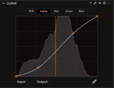
The new Luma Curves
One of the more specialized aspects of image editors like Photoshop is the ability to define the blending mode for an adjustment. For the majority of the adjustment layers in my contrast and color correcting work, I use a “normal”, “color”, or “luminosity” blending mode. The new Curves tool in Capture One 9 offers a similar ability using the Luma option. This might seem like just a nice feature, but here’s a quick example of the difference this can make in the editing process. One of the things that affects hue and saturation is contrast, or the light and darkness of a given color. In the previous version of the Curves tool, you could only adjust the RGB values as a whole, or on a channel by channel basis. You still have that option with Capture One Pro 9, but you also have the ability to change the lightness and darkness without changing the color or saturation.
“Can be a big deal”
Changing contrast and brightness without affecting saturation can be a big deal when working in black and white, because changing saturation can affect your black and white filtration settings—sometimes that is a good thing (it can accentuate dramatic effects), but sometimes it can end up hurting the picture instead.
In the illustration below with the two picture of the barn, one has an RGB Curve adjustment, and the other has a Luma Curve adjustment. The blue sky is made darker about equally with the yellow filtration of the black and white conversion, but the deeper shadows start to block up and you end up losing some of the nice details in the stuff leaning against the barn. You could compensate for this in Capture One 8 (as well as in version 9) by selecting that color in the Color Editor and then changing the hue, saturation, or lightness for the offending color, but the new Curves tool gives a better starting place for your black and white conversion, and finer control over your image.
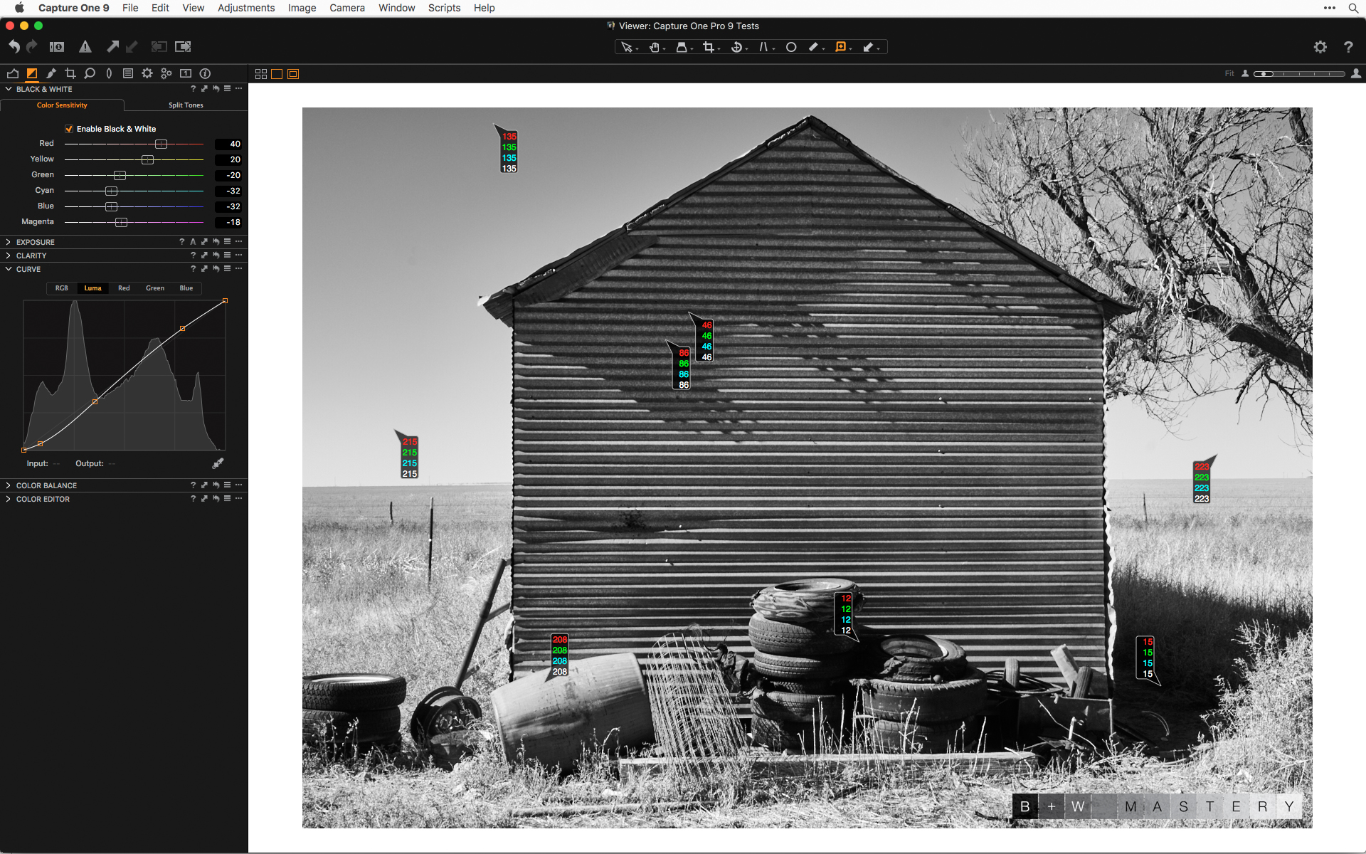 Luma Curve with the same black and white filtration settings
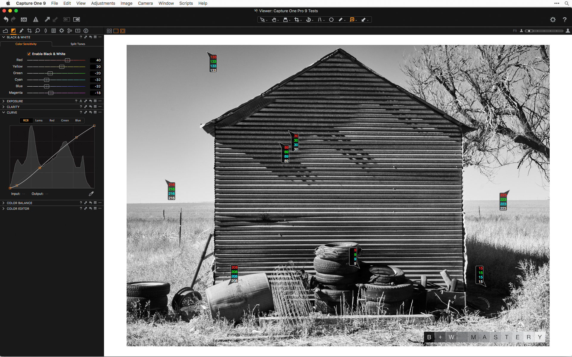 RGB Curve with the same black and white filtration settings
The color read-outs show how different the Luma and RGB options can be with even just a small S-curve. The shadows can block up quickly with a little yellow filtration, and the Luma curve can be a good option for retaining detail, but not hurt the rest of the yellows, reds, and lighter blues through the midtones and highlights.
Curves, now available in Local Adjustments
Maybe the most exciting new feature of Capture One 9 is that it has integrated the Curves tool to work with Local Adjustments using editable masks. I believe this is the first RAW editor to have this capability, and if I were not already a dedicated Capture One user, this would have earned my loyalty.
I am a huge proponent of using curves adjustment layers and layer masks in Photoshop as a means of quickly and intuitively making tonal edits and then using the brush tool to gradually paint in the adjustment. This process is based around the use of curves adjustments and is central to my creative editing work. Until now, the lack of curves has been one of the drawbacks of Capture One’s Local Adjustment controls. I worked around this limitation by using the exposure and high dynamic range controls, but missed the ability to click the color picker, select a tone in the image, and move it lighter or darker by simply dragging it to another point on the curve or using the arrow keys to nudge it up and down. The combination of seeing the tones change in the image, and being able to define the input and output points of different tones, is a powerful editing tool.
Integrating curves into your Local Adjustment workflow
You might want to take a quick read of my few posts on intuitive localized contrast control on my site. This will give you a good understanding of why I think curves and masks are so important.
One thing I talked about in my Black and White Mastery Capture One webinar session from August 2015 is the importance of seeing what the adjustment is doing to the whole image before painting or masking in the adjustment. Most people will make a blind adjustment, begin to paint in the mask, and then go back and readjust the settings afterward. That can be needlessly time-consuming and might not reveal creative possibilities.
My approach is to create a new Local Adjustment, then immediately invert the mask (right-click on the name of the layer to get this option). Now, any adjustment will be visible across the entire image and you can see how different tonalities are affected in proportion to each other. Once you are happy with the adjustment, invert the mask again, select a brush with a low opacity and flow, and gradually paint in the adjustment. The goal for these local adjustments is to use as few layers as possible (but as many as needed), with different layers for different kinds of effects.
Being able to see the maximum effect of the adjustment also allows you to use the same layer for different parts of the image without fear that you might “take it too far” when painting in the adjustment. It allows you to see more possibilities that the picture itself might reveal, and turns image editing into process of creative discovery.
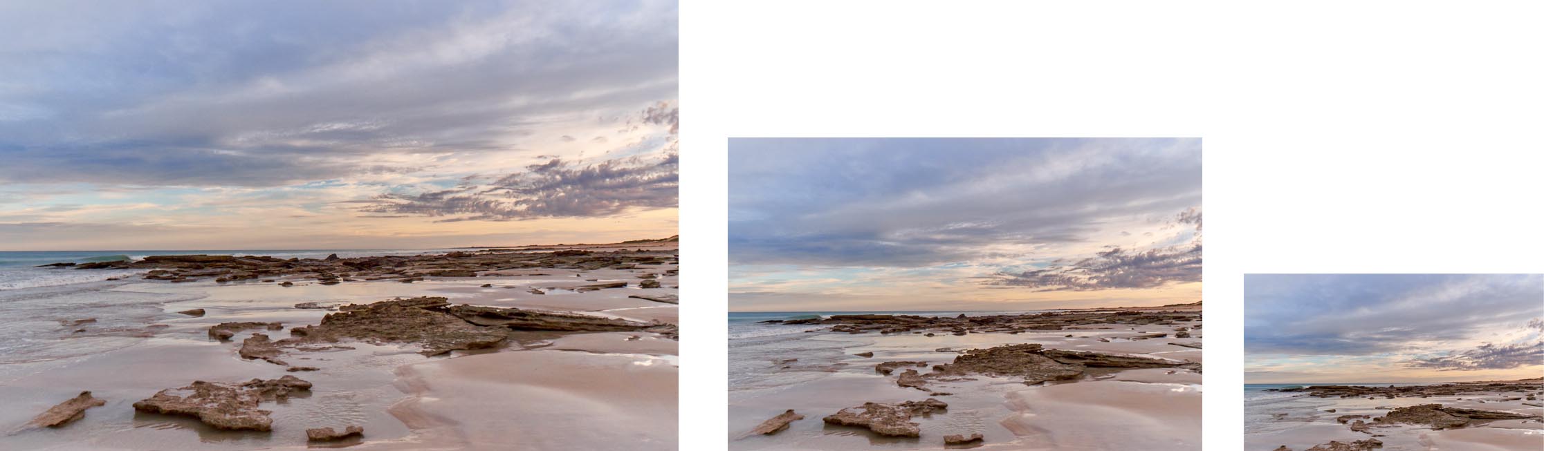
Joshua Tree National Park, 2012
This was made a few years ago after a long day of hiking and photographing. It was hand-held in fast-failing light. I chose this picture for this sequence to demonstrate how well Capture One can bring something like this back to life. These are meant to show an opposite approach to using the RGB curve over a Luma curve.
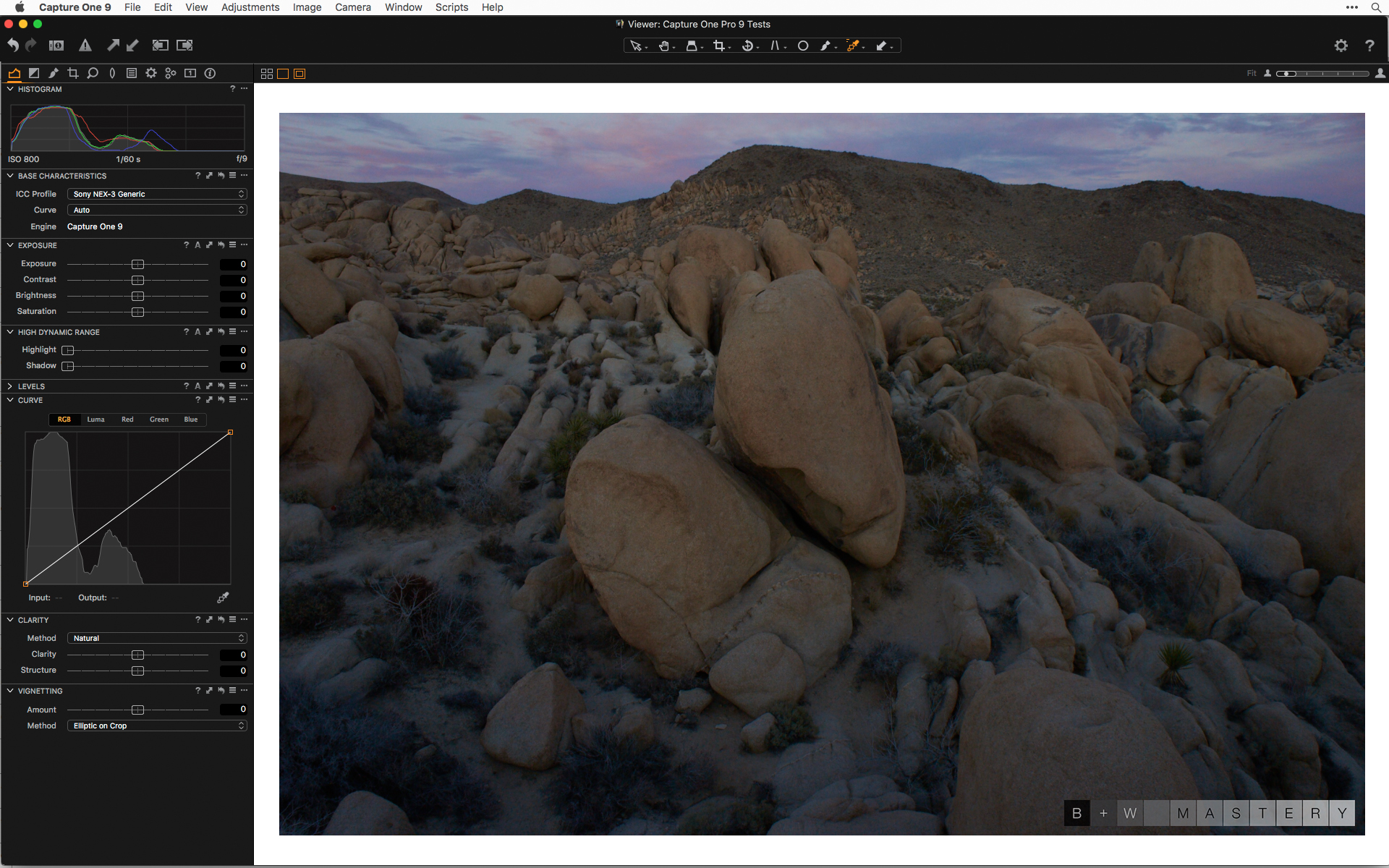 RAW file with no adjustments
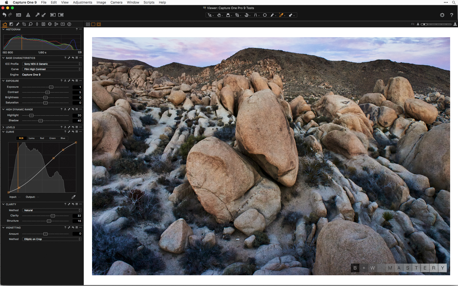 Basic adjustments on the way towards the black and white conversion
This kind of color is too much for my taste, but the goal is a good range of tones for the black and white conversion. I look at this this step as though I’m making sausage.
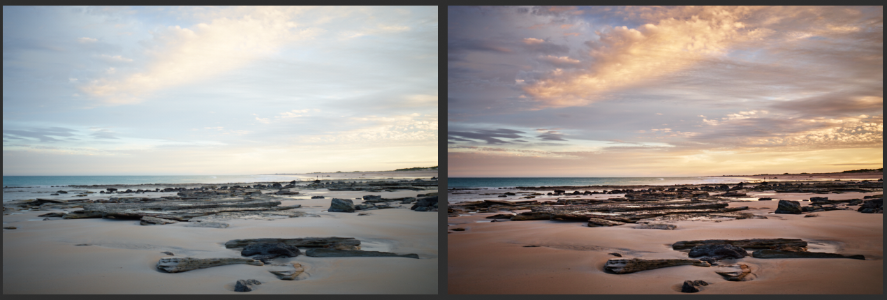
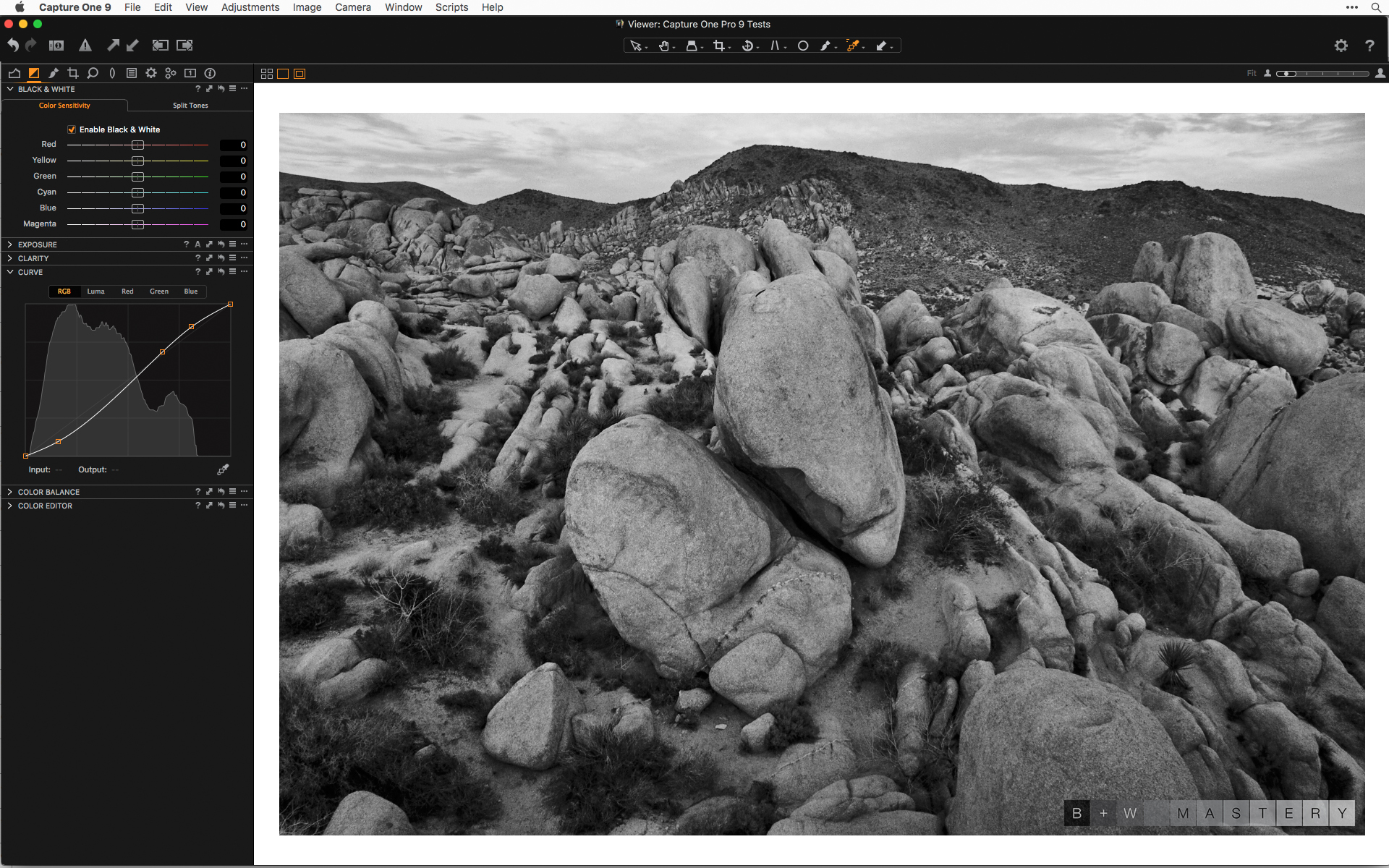 Default color to black and white filtration
The default filtration settings don’t take advantage of the red in the rocks and doesn’t separate the reds and blues in the sky.
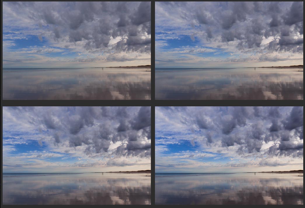
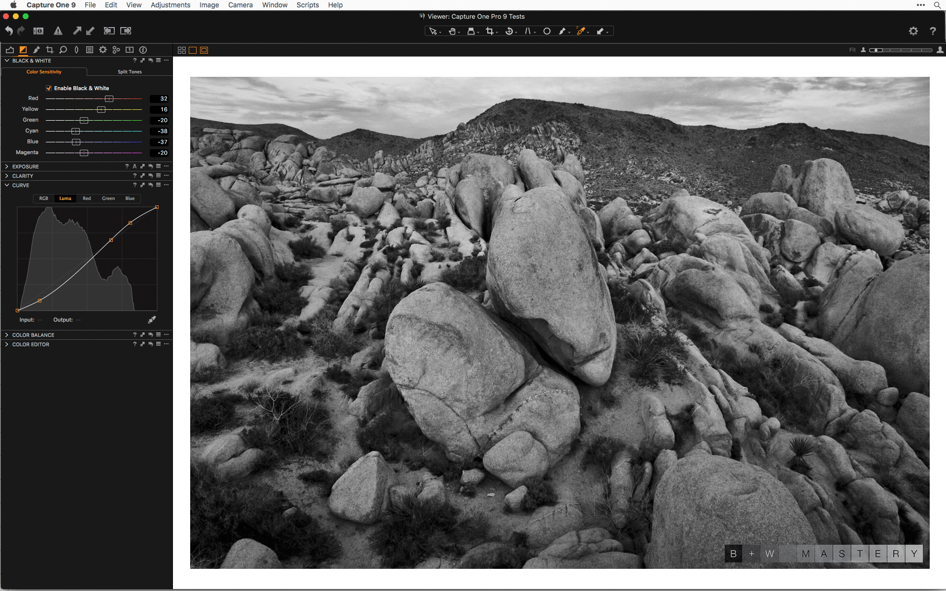 A slight yellow/red filtration with a Luma Curve
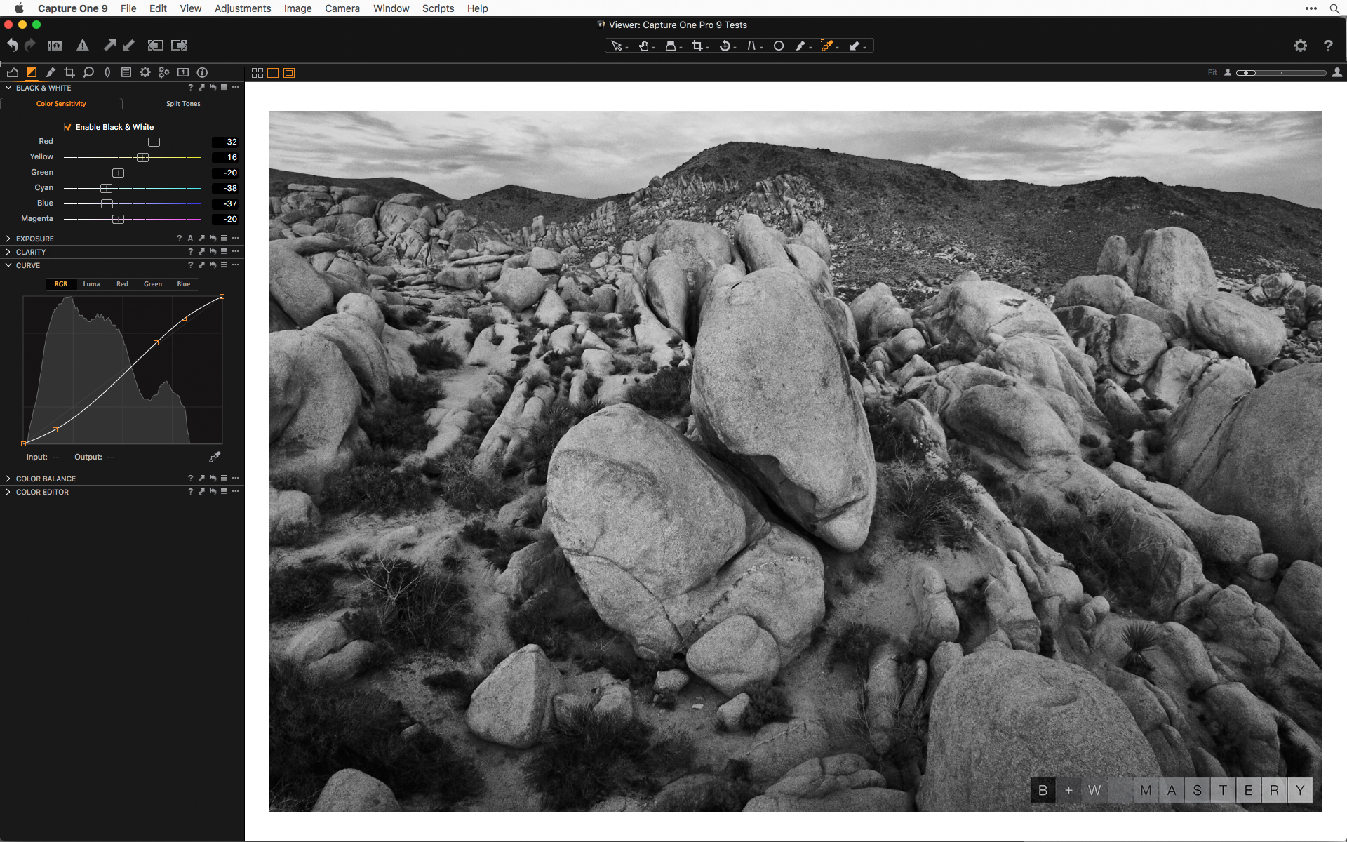 Same yellow/red filtration with a RGB Curve
This step is to test whether the contrast increase with a curve is better done with the new Luma option or the standard RGB option. You can create a cloned variant in this step to see which setting works best for your particular image. In this case, the Luma option didn’t handle the separation in the rocks as nicely as the RGB option did. As the barn pictures showed, each case might be different so it is a good idea to do a quick test first. If you don’t want to test both ways you could just use the Luma curve, and then increase saturation of different colors in the Color Editor afterwards (or the single slider in the Exposure tool).
Curves in Local Adjustments
The following few screenshots illustrate the workflow I detailed above. I don’t detail every setting and brush stroke for each step, but give a few examples of the different ways the Curves can be used working with Local Adjustments.
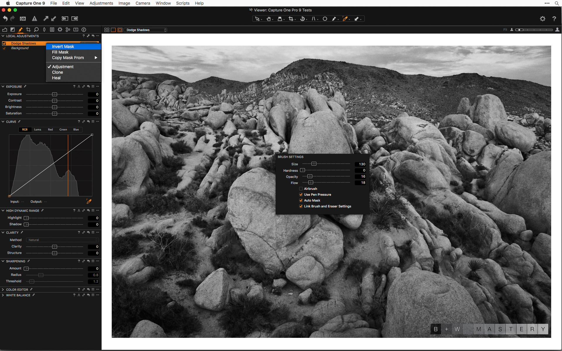 Create a new Local Adjustment, name it, and then right-click (or control+click) for the “Invert Mask” option
Then choose an appropriately sized brush with low “Opacity” and “Flow” settings.
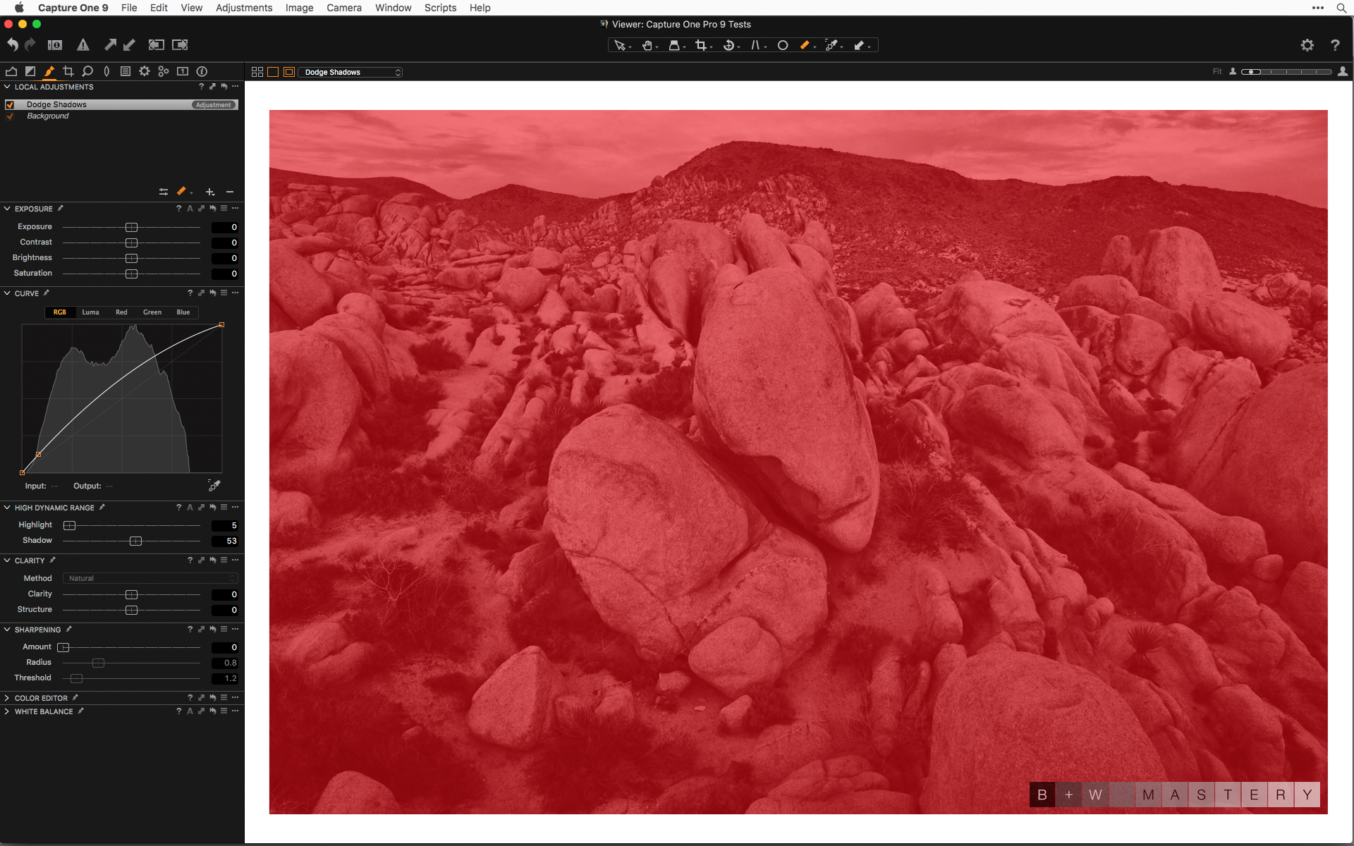 The inverted mask is visible with the overlay color
You can see the mask is inverted by pressing “m” on the keyboard.
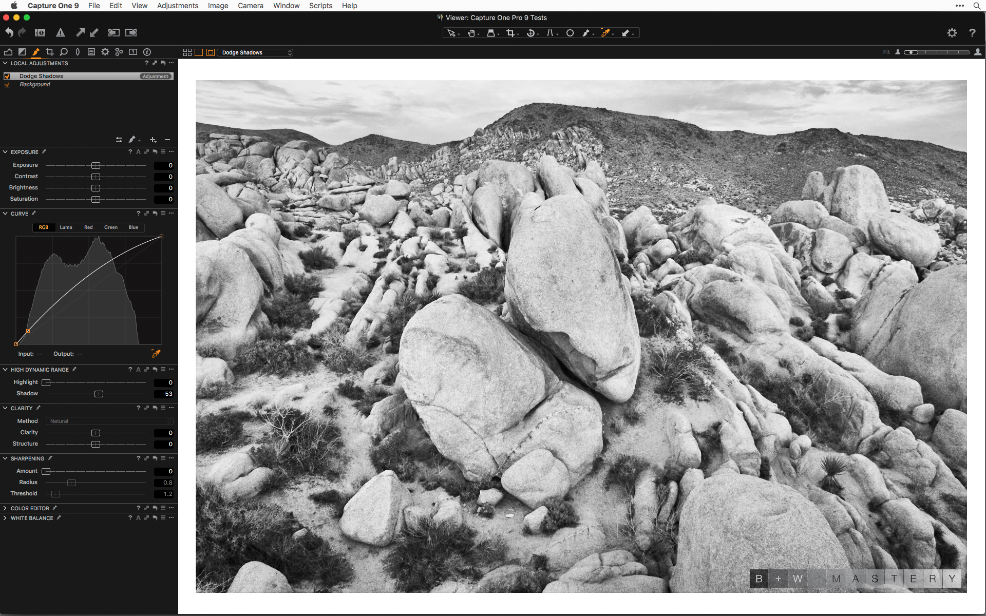 Making the adjustment to the Curve to see the effect on the whole image.
Now you can add a control point to the Curve by clicking on the Curve or using a tool to click within the image for the tone(s) you want to edit. Then you can use the arrow keys to see the read-out of the input and output points. Once you are done you can reinvent the mask and paint in the adjustment.
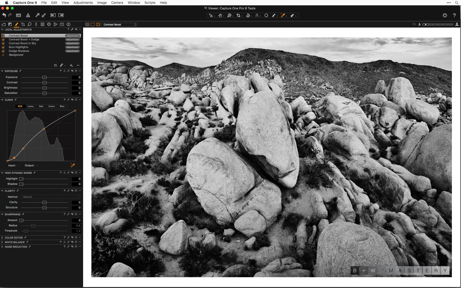
Example of a contrast boost using only a Curve and an inverted mask to see how it affects the structure of the whole picture before. Then reinvert and gradually build up contrast.
Use a similar method for increasing contrast, and using any of the other options available in Local Adjustments. Be aware that any changes to the Curve will be applied after any other adjustments you might make.
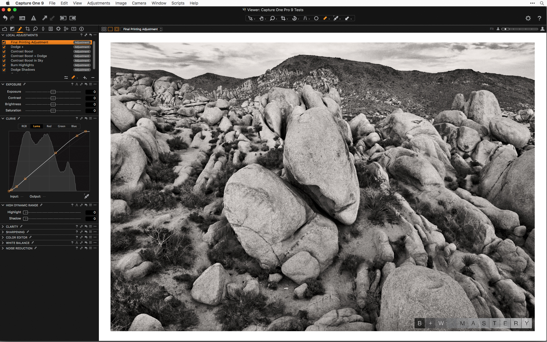
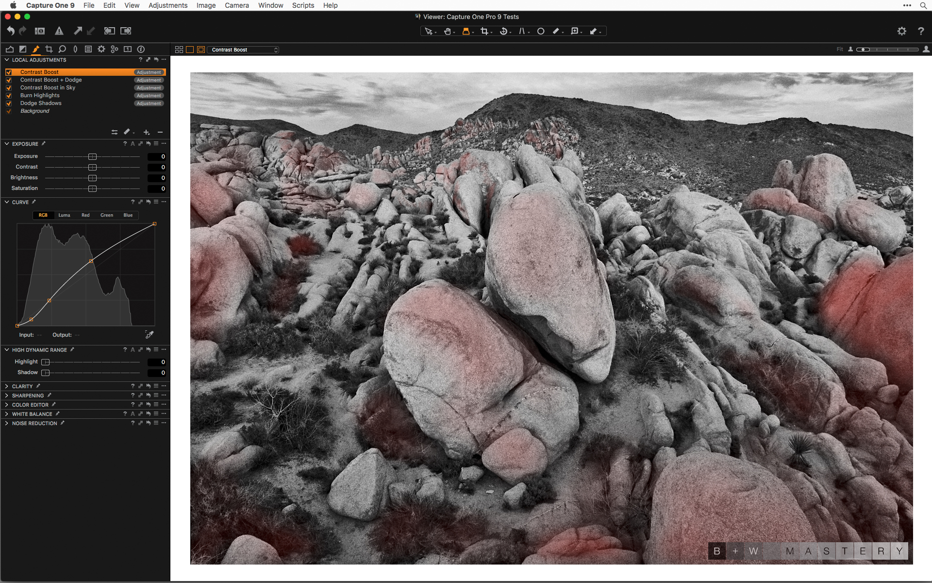 Example of the kind of intuitive localized contrast control gradually with several adjustments
Example of painting in the adjustment for additional contrast. Be sure to paint without the mask visible so you can gauge the degree that the adjustment is coming through. Doing this work gradually allows you to understand the structure of your image and lets you visually balance the composition using tonal adjustments.
You can also use an new Local Adjustment with an inverted mask on the top of the stack for any final adjustments before exporting or printing. I use the Curve similar to a Levels adjustment after doing any local contrast control. You can also use the same layer for any modification during soft proofing for different kinds of process recipes.
Download free 30-day trial of Capture One Pro 9
Best regards,
Richard Boutwell
B&W Mastery


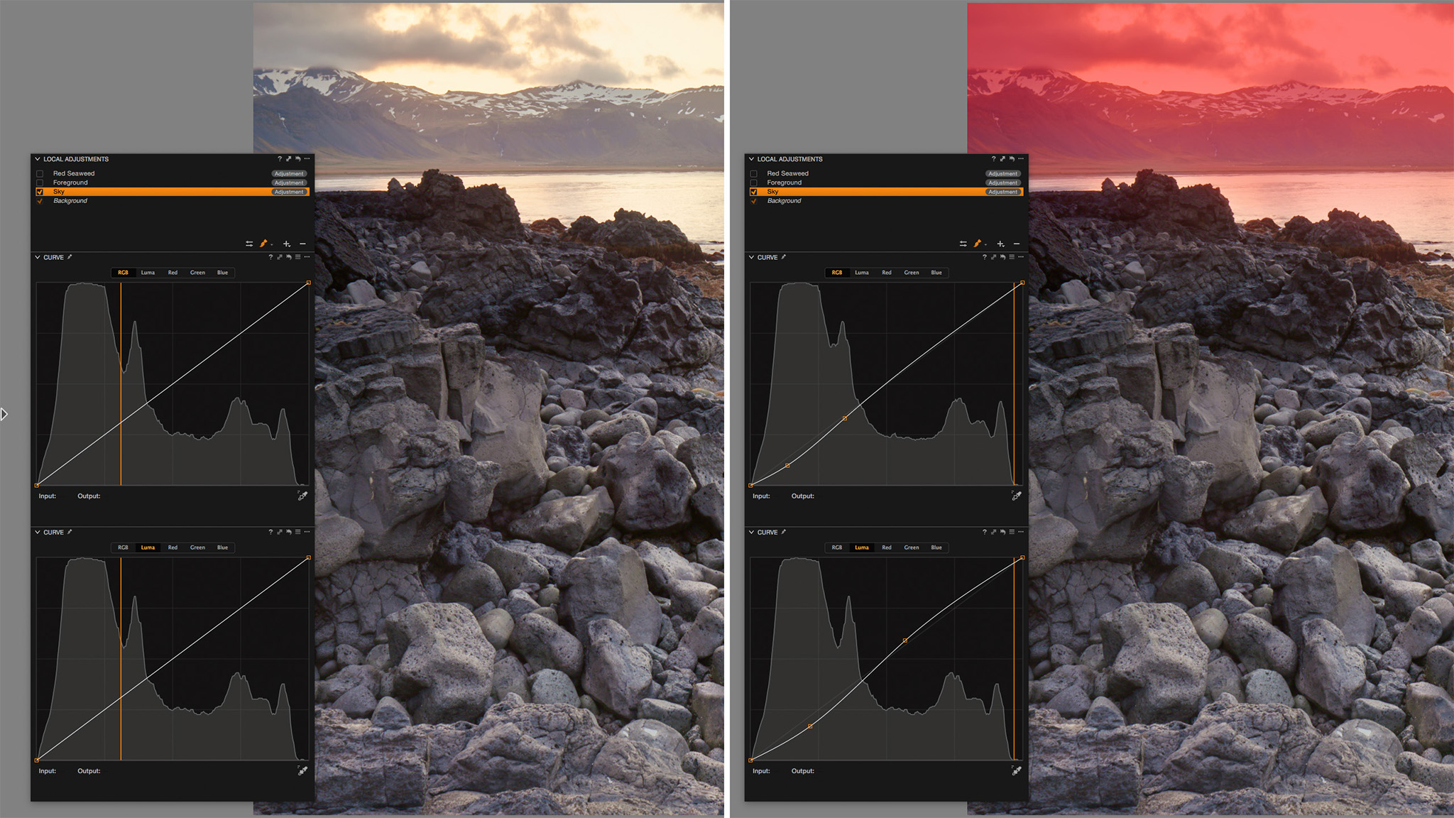

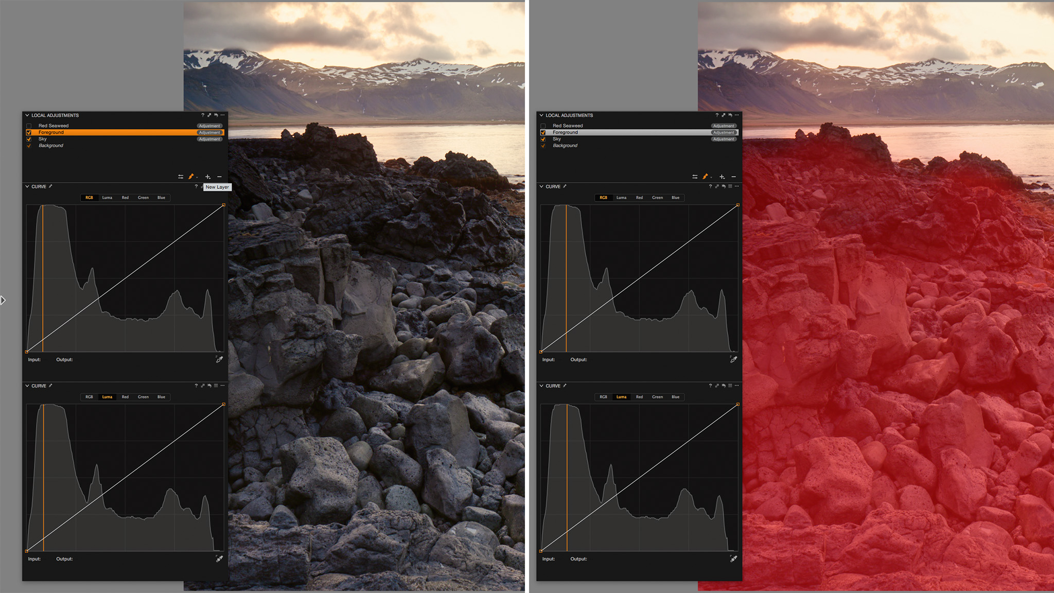
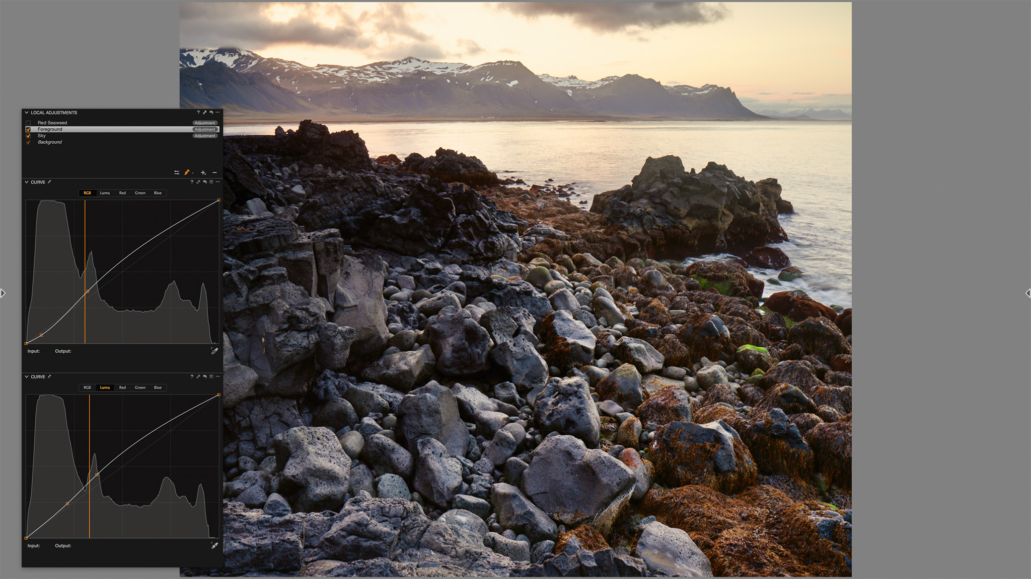
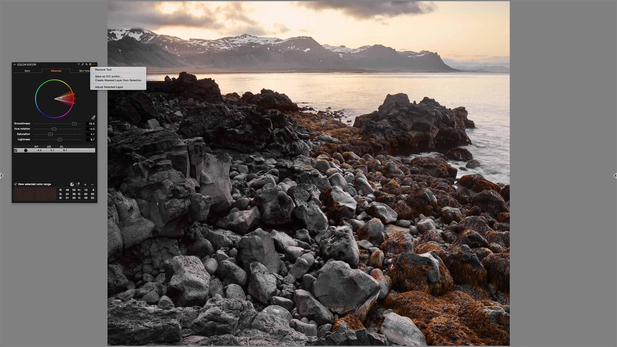
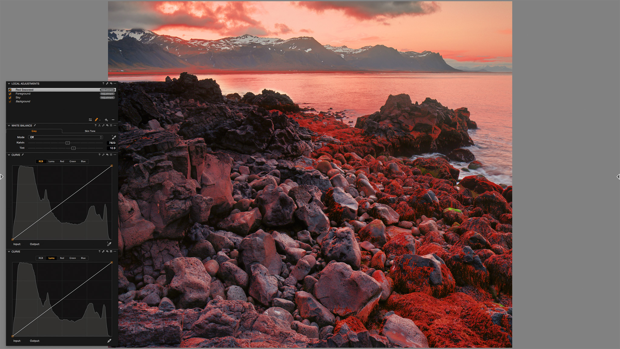
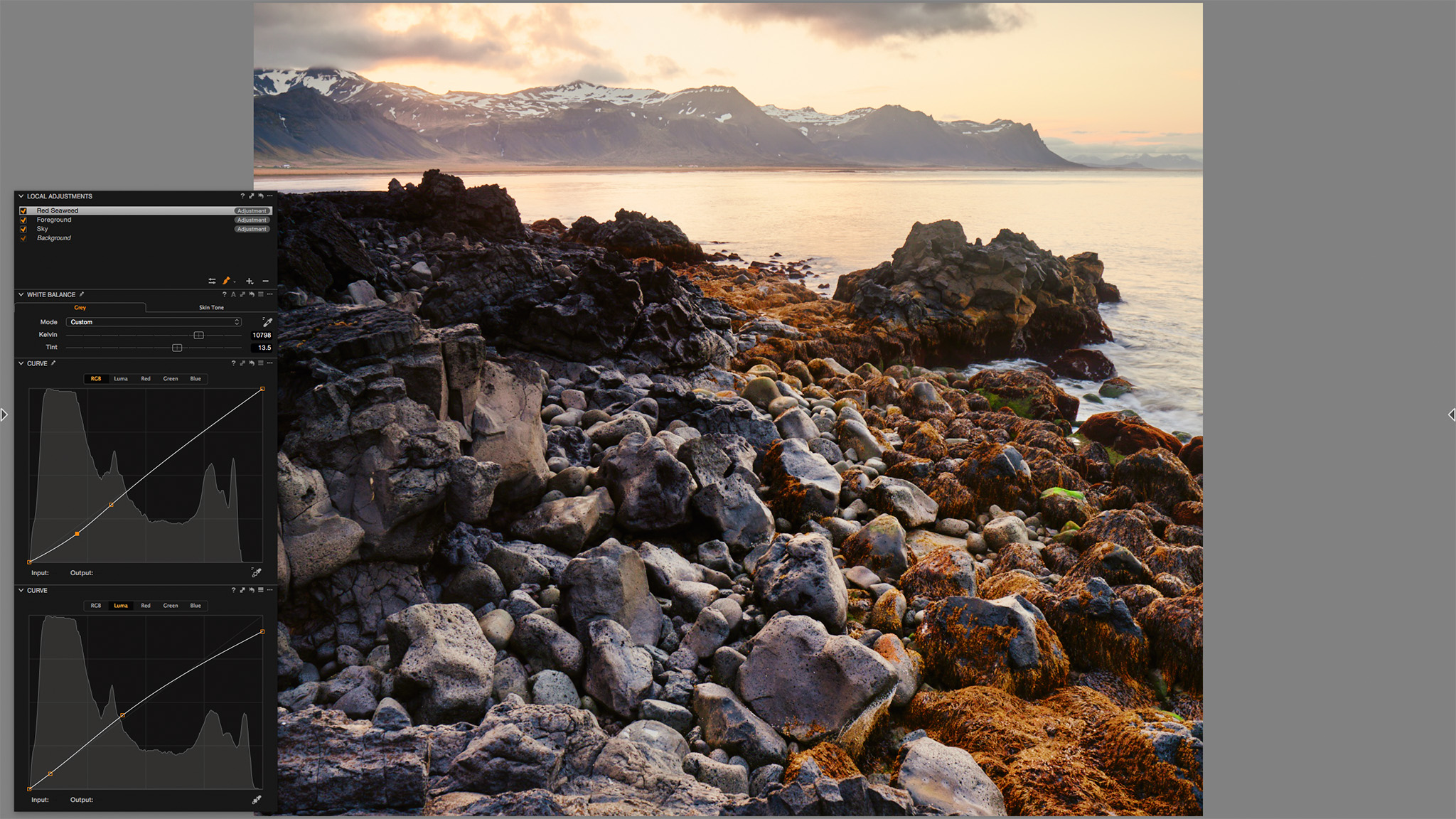


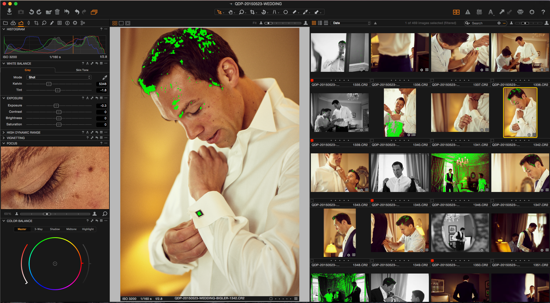
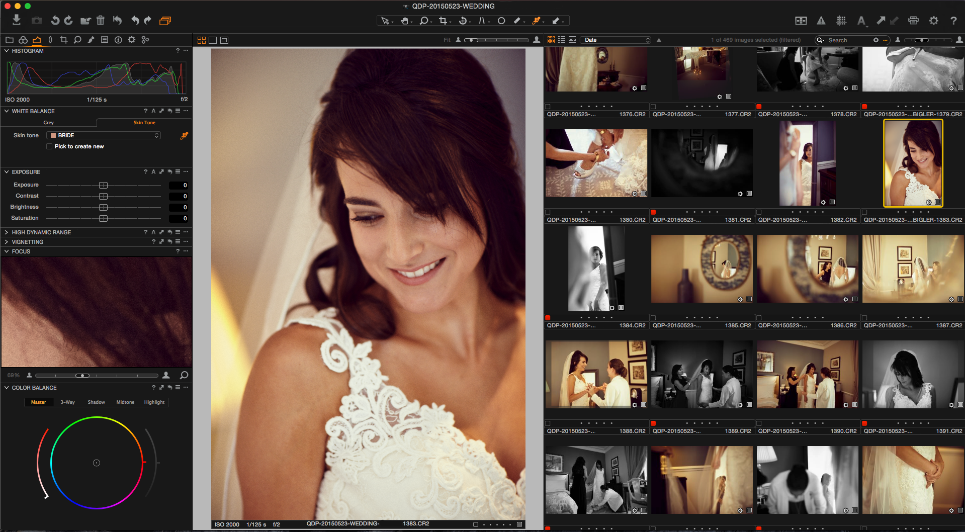
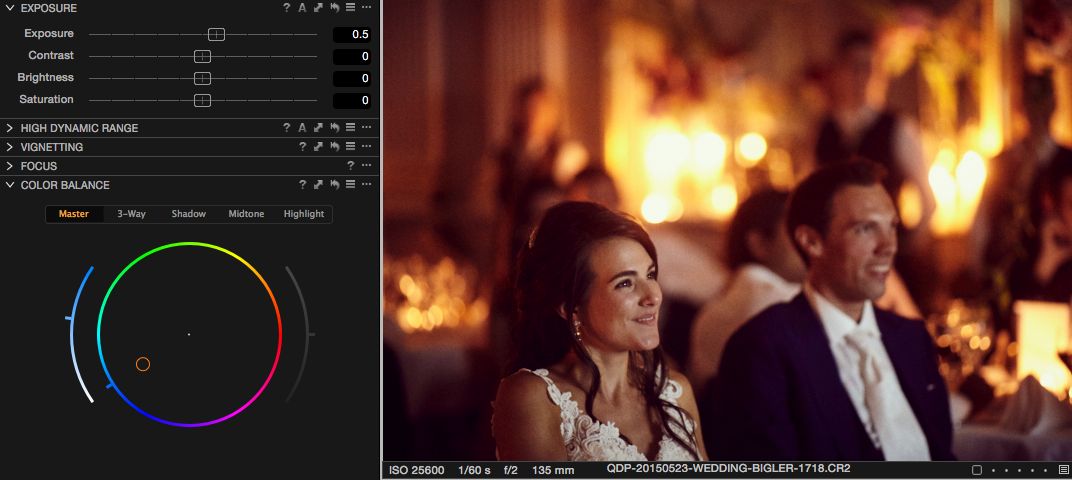
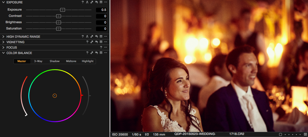 Image before Color Balance correction in Capture One Pro 9