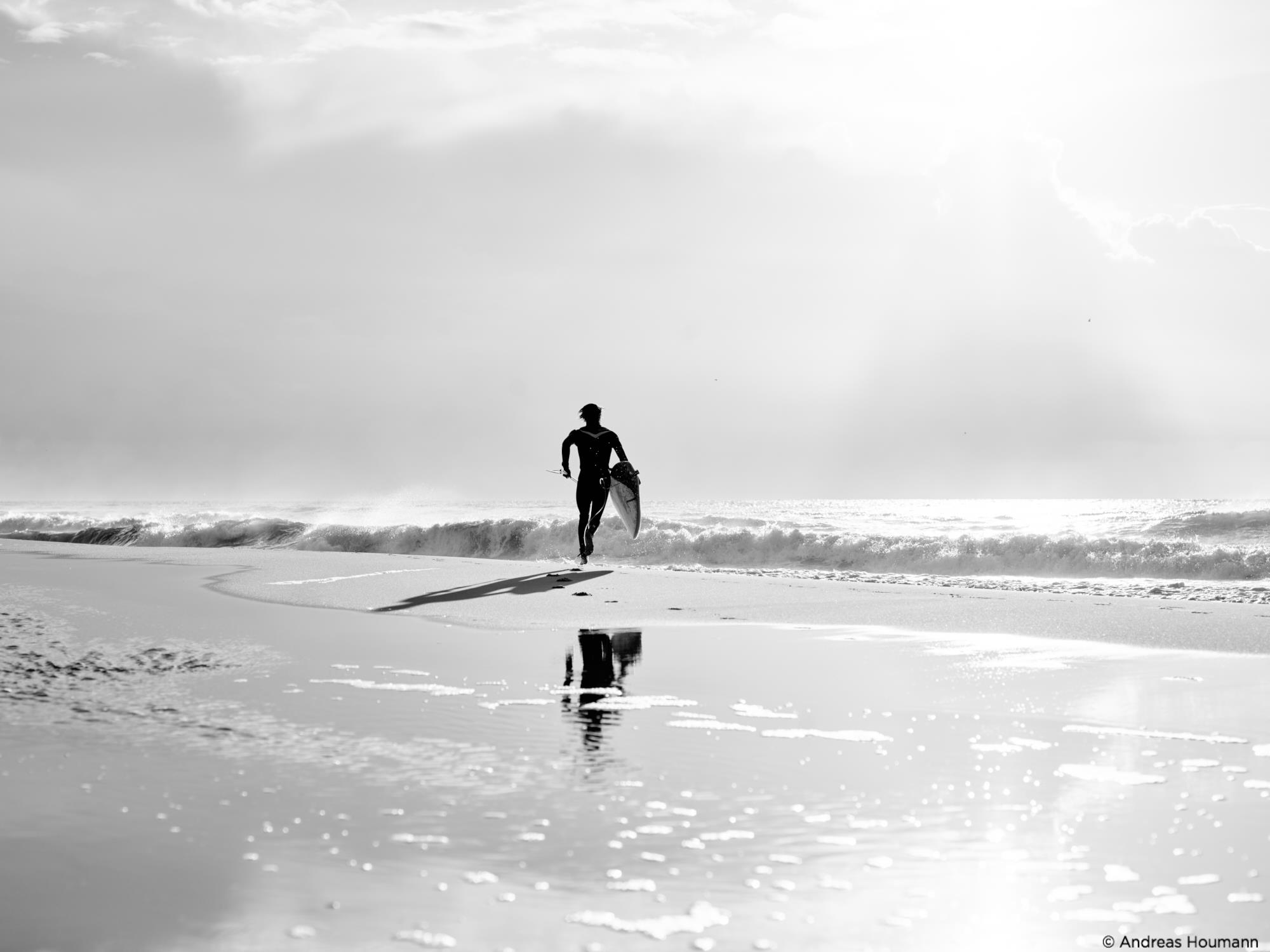
Two years ago when my friend told me that I needed to be careful, that flying would become an addiction, I laughed it off. Sure, hanging out the door of a helicopter was bound to be fun and exciting, but I didn’t think of it in such brusque terms like “addicting.” But like he predicted, much like acquiring my first quality Swiss timepiece, it became much more than just about flying. It became a wholly unique experience that revved my creative engine beyond anything I’d ever experienced. Adrenaline pumping, camera shutter clicking, propellers chopping… the fourth or fifth time I found myself high above the metropolis below, my friend’s words came back to me, putting a defeated grin on my face: I was addicted.

What ensued was focusing my business and efforts towards that which I loved, and feeding that addiction.
Much of what put food on the table and kept a roof over my head was, and continues to be, primarily my work as commercial videographer and filmmaker in San Francisco, CA. I loved my work, though this was much less exciting than being high above it all, I reminded myself that with every job I did that forced me to remain on terra firma, was one step closer to being back in the air again.
As time went on, I would set aside parts of my budget for marketing, and then re-segment that budget to allow for occasional hour-long flights over cities of my choice (wherever I happened to be when the “itch” came back). What I planned to do was technically marketing. Who said marketing couldn’t be fun?
My short term strategy
My short term strategy was to keep shooting from the air to get a rhythm and knack for shooting while airborne. Anyone can take decent photos while in the air, since it’s a perspective few see and therefore it is visually eye-catching even if the images aren’t particularly notable for any other reason. What takes practice, and what makes good images into great images, is communication with the pilot, knowing what settings are idea on your camera so as to assure your shots remain sharp, understanding when the best times to fly are, and predicting when the weather will produce the best quality light on the city of your choice.
My long term strategy
My long-term strategy was twofold. First, I wanted to build a large enough backlog of images so that my personal vault contained more and better options than anything found on the major stock sites. Why? Because in major metropolitan cities that are growing (such as both Seattle and San Francisco right now), Real Estate companies are constantly needing what is known as backplate photography, or images of an area that they can later Photoshop their building into for use on websites and advertising around a construction site. Second, being known as an aerial shooter would land me well-paid gigs to do what I love: photograph from the air.
My strategy has been paying off, with several brands high profile brands feeding us projects thanks to the images that I and my business partner produce through our creative agency, Planet Unicorn.
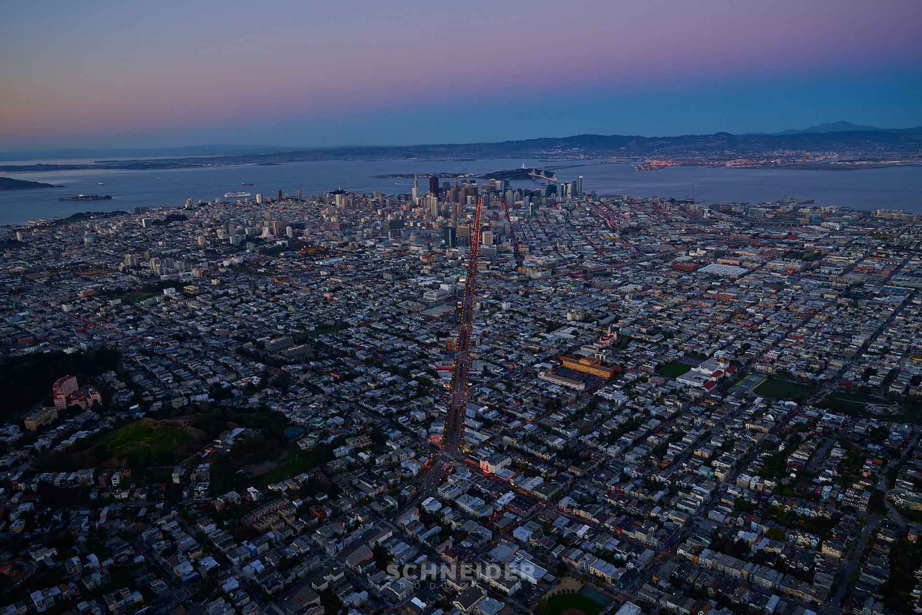
Up in the air with the XF 100MP Camera System
Because I’ve dedicated a lot of time to this, I get to make beautiful images for others, but once in a while I like to make something for myself. That was what I did when I took the XF 100MP Camera System over San Francisco to take the first 100 megapixel images of the city from the air as the sun set behind the Golden Gate.
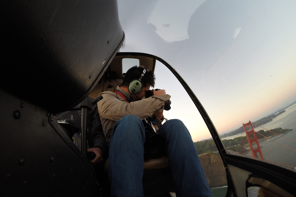
When shooting from a helicopter, you absolutely want the doors off on your side of the chopper so that you have nothing separating you from the world below. That said, flying in general and especially when the doors are off activate some serious cardinal rules you have to follow:
- Everything you bring up needs to be strapped securely to you.
- Do not touch the central control stick, which the pilot is using to control the trajectory of the helicopter. That means you need to be constantly cognizant of where your arms and knees are, especially because of how cramped helicopters are (at least Robinson R44 or R22 helicopters, which are most common for this kind of work).
- It’s cold in a helicopter, even during the summer. Wear a coat.
- The microphone you use to communicate to your pilot is activated by being close to your mouth, so when you lean out the door with the mic pressed up to your lips, the loud whipping sound of the wind blows right into the mic, and therefore right into the ear of your pilot. If you’re going to lean out, move the mic away from your face.
- Communicate constantly with your pilot. If you don’t tell him what you want, he can’t direct the helicopter into position. Odds are, your pilot isn’t a photographer so he’s not going to know what you’re looking for. Talk with him all the time, and even take a few minutes before you take off to go over what you’re looking for, and how you want him to fly. They are capable of going very fast, or hovering nearly motionless over a target.
This time of year, the sun sets very quickly and the light can go from gorgeous golden to dark blue and black, very quickly. San Francisco also doesn’t produce that much light at night, especially when compared to something like Time’s Square in New York, so even high ISO cameras can have a problem shooting once the sun falls behind the horizon. What that meant was that I needed to hit all three of my major targets within an hour, with the 15 minutes of flying between the airport and downtown taken into account.
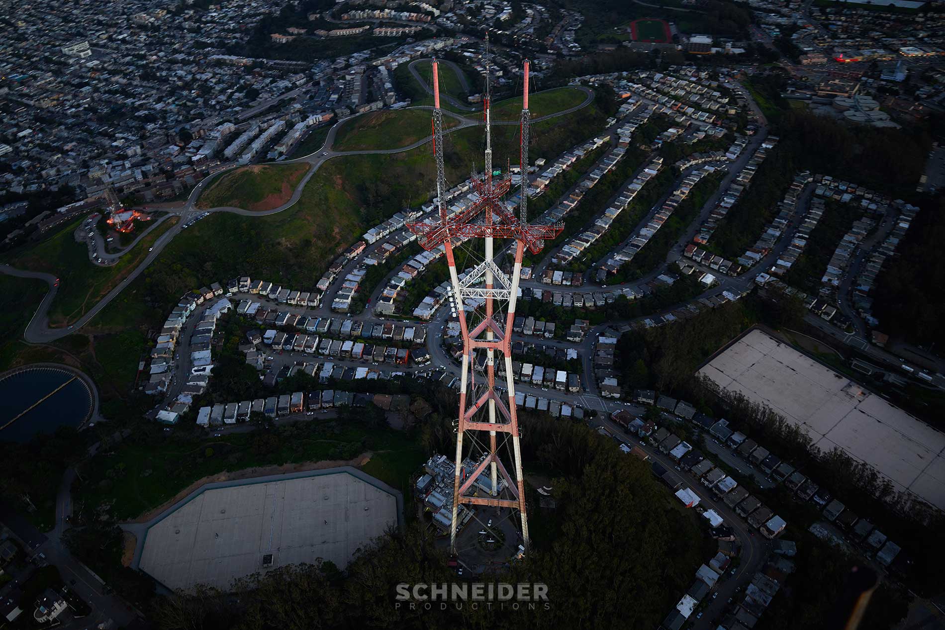
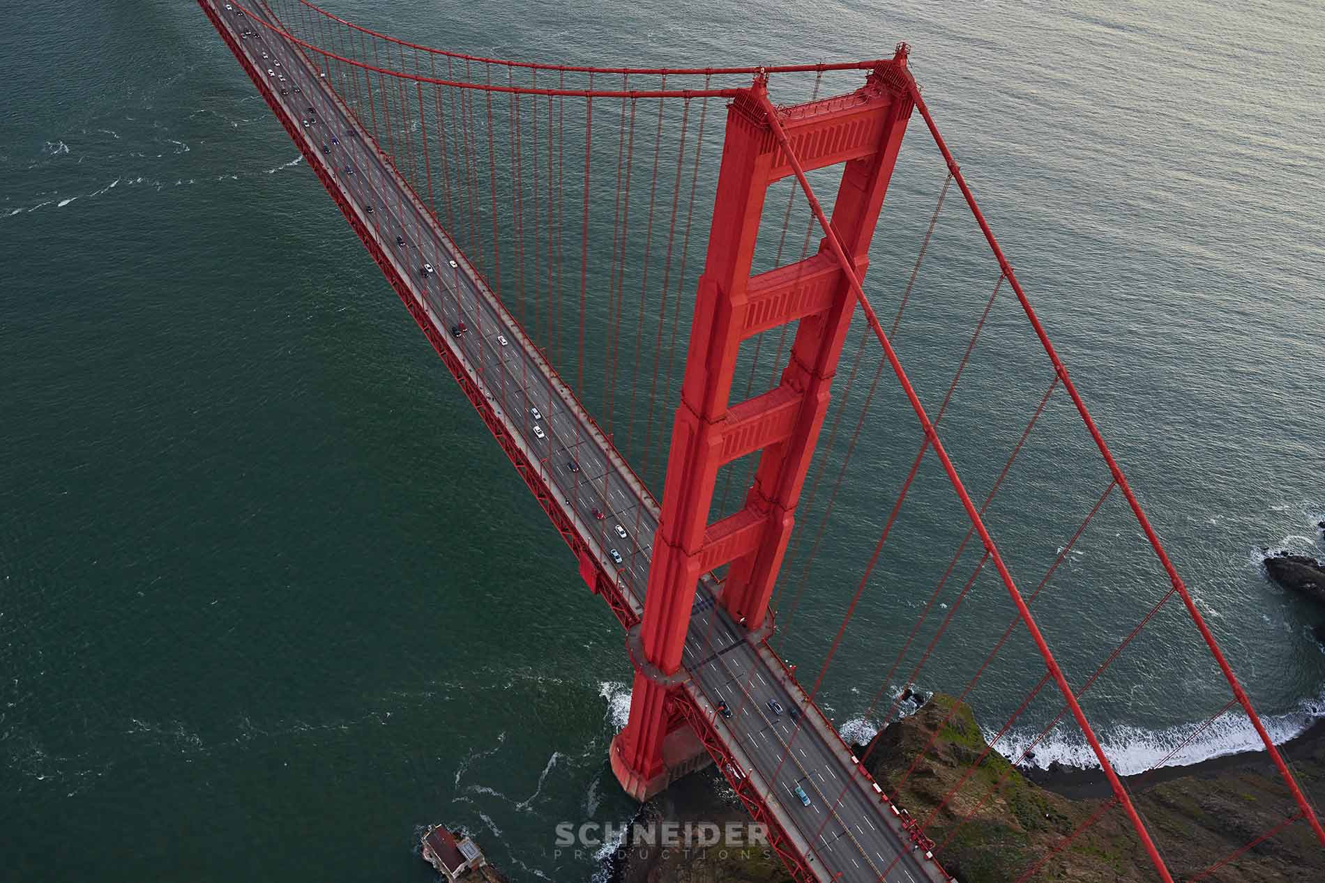
My goals were to get the Golden Gate Bridge, Sutro Tower and the Transamerica Pyramid with the new Bay Bridge as an ancillary goal I would plan to grab on the way towards the Golden Gate.
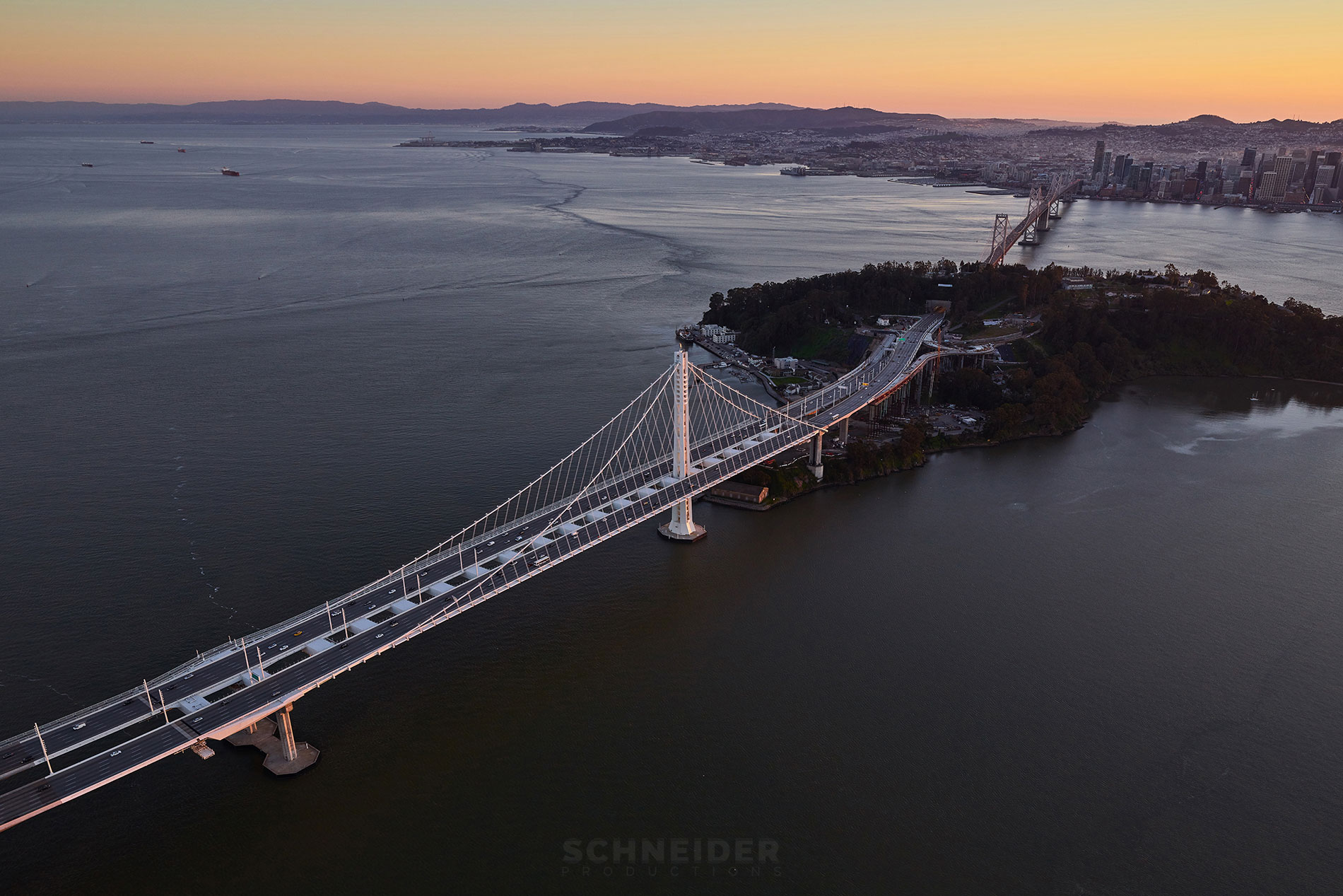
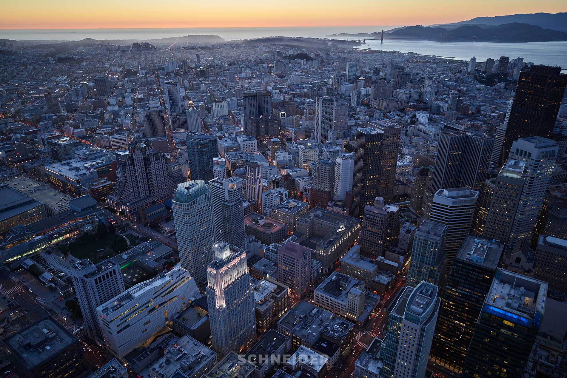
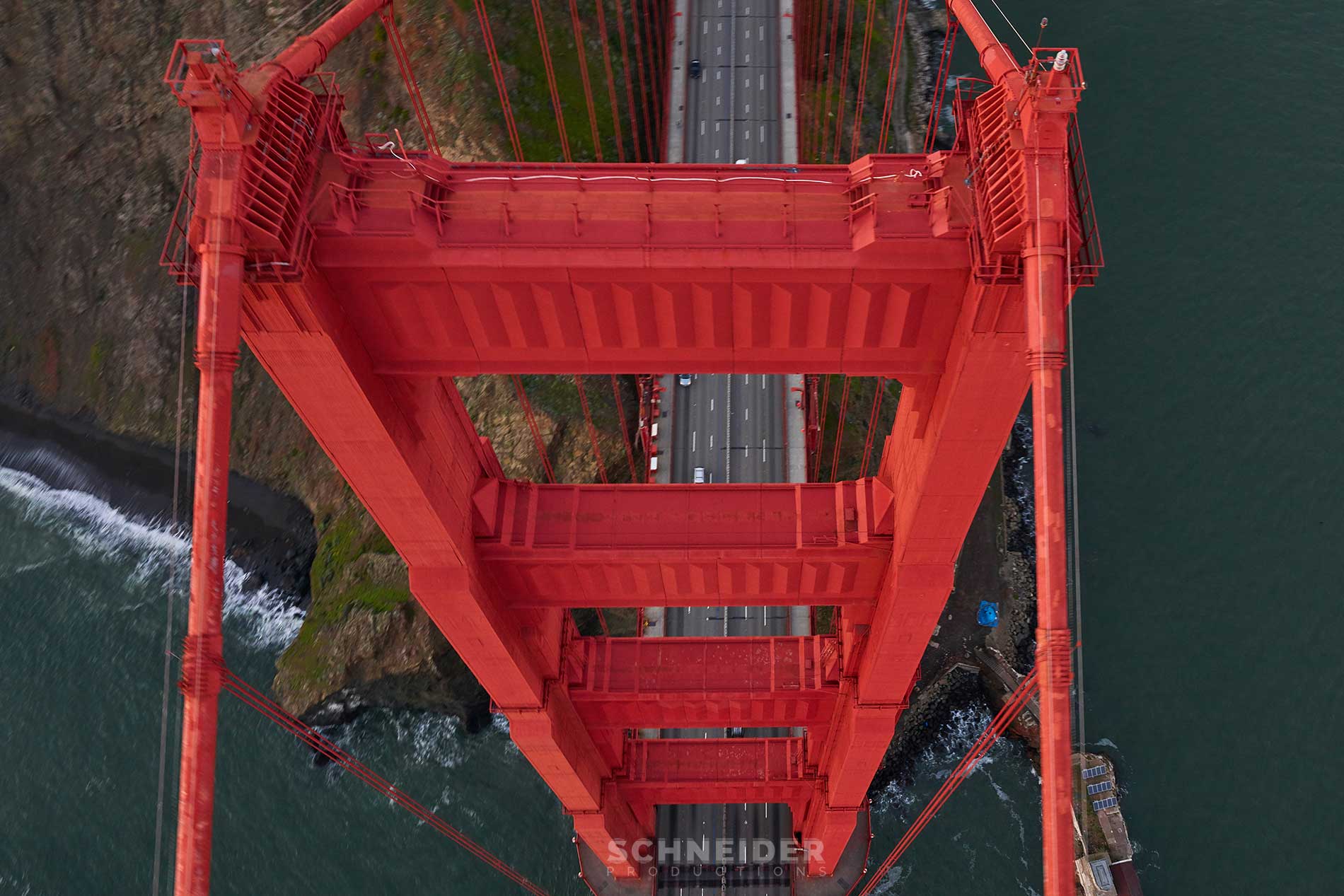
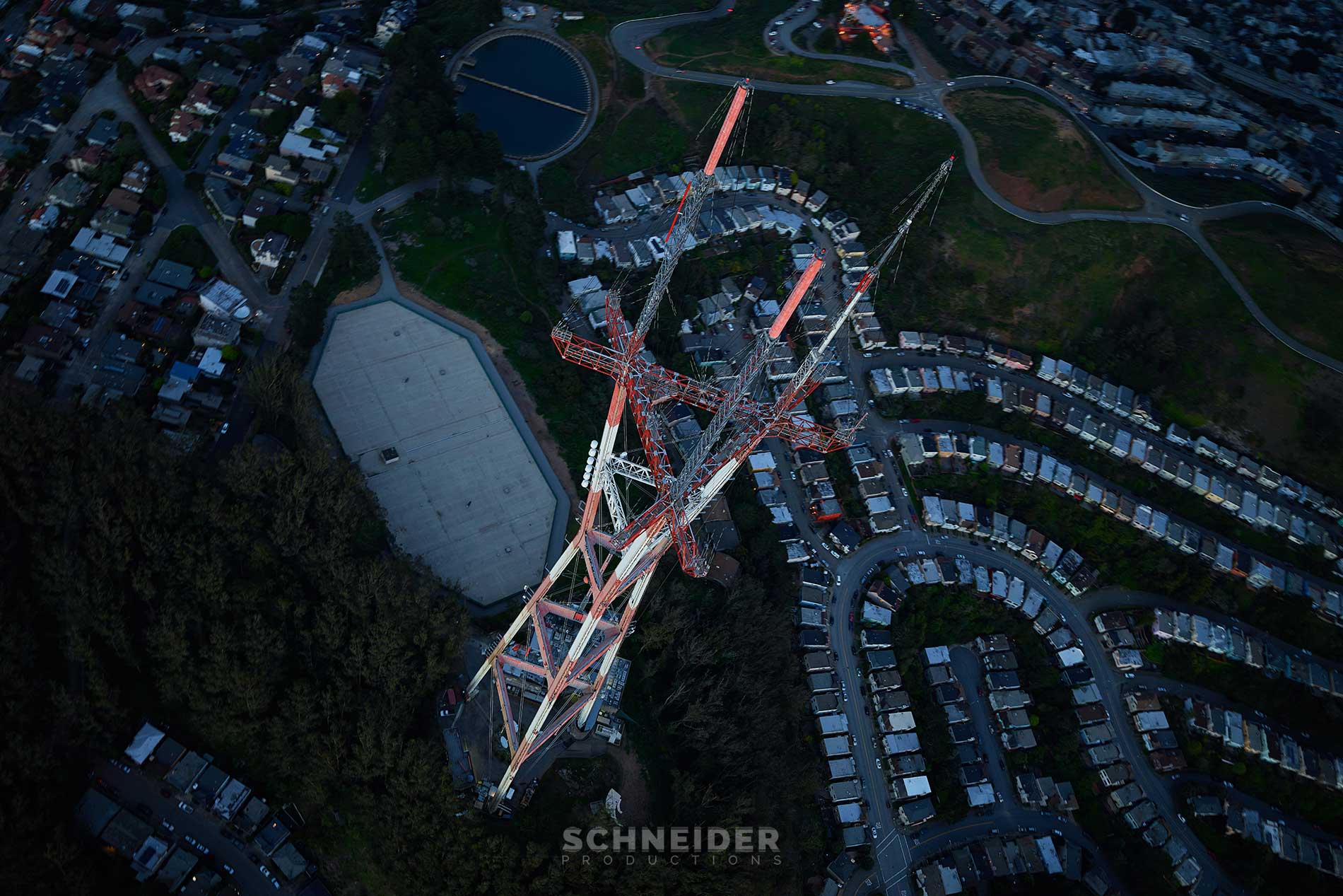
Thanks to careful planning and communication with my pilot, we got all of my goals done and without a hitch.
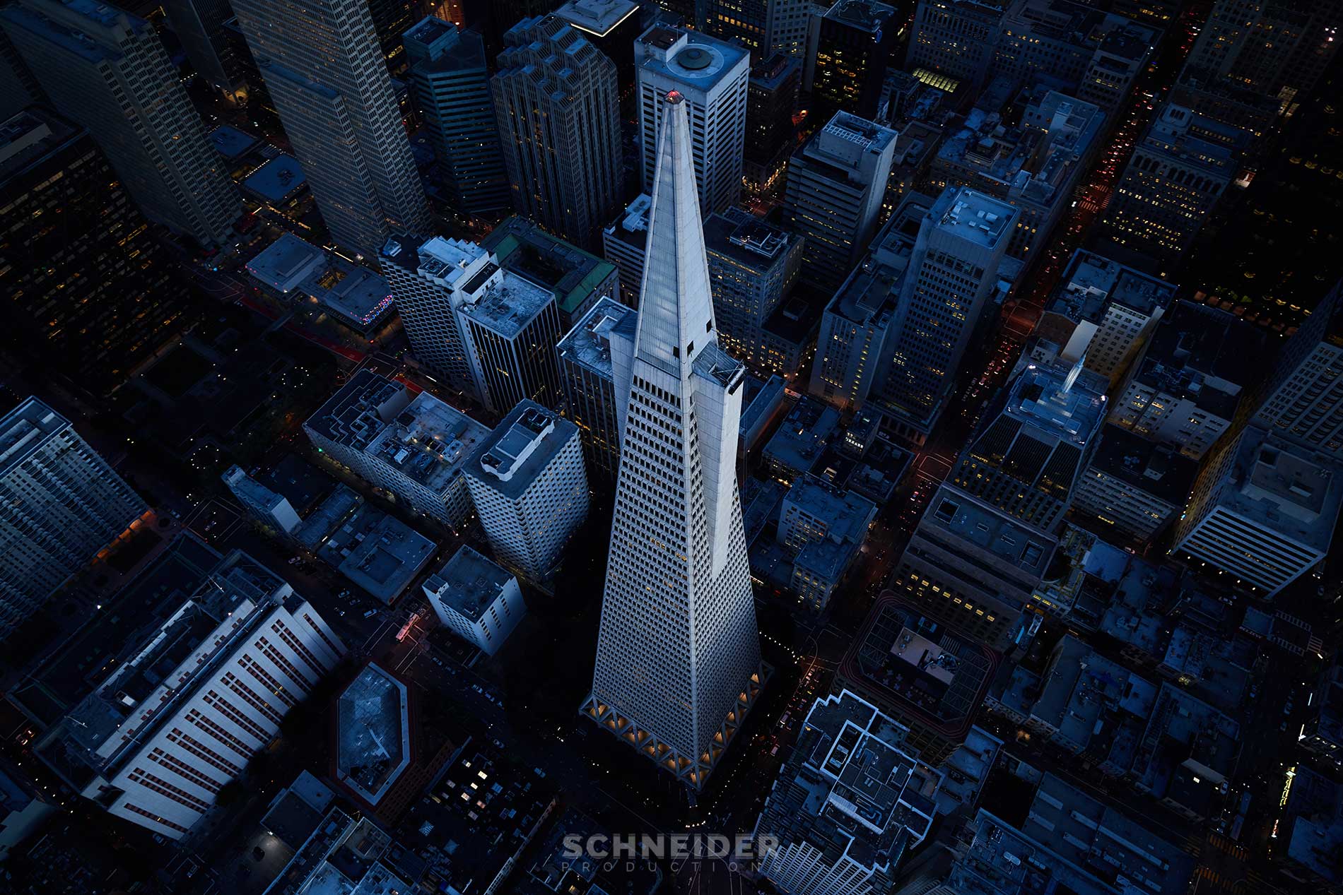
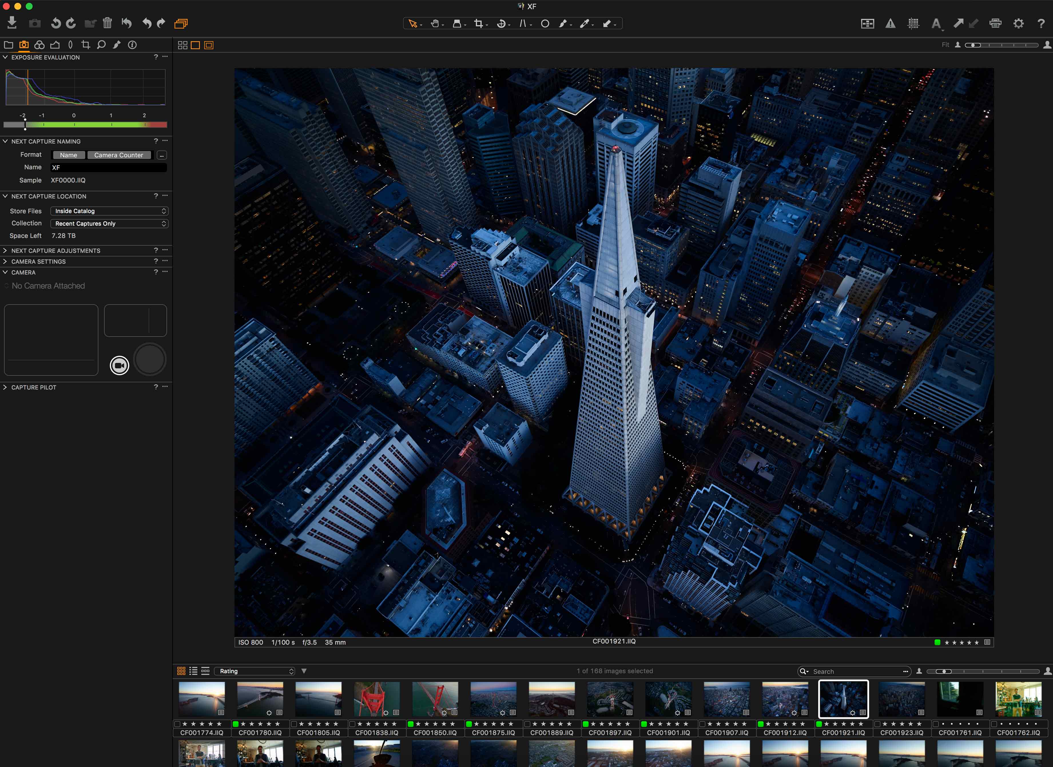
Once I get the images back home, part of my philosophy is to try and maintain as much of how the photo looked when I took it as possible, or at the very most, only accentuate that which it is. My favorite image from this shoot is of the Transamerica Pyramid in an image I call “Too Big to Fail.” The original…
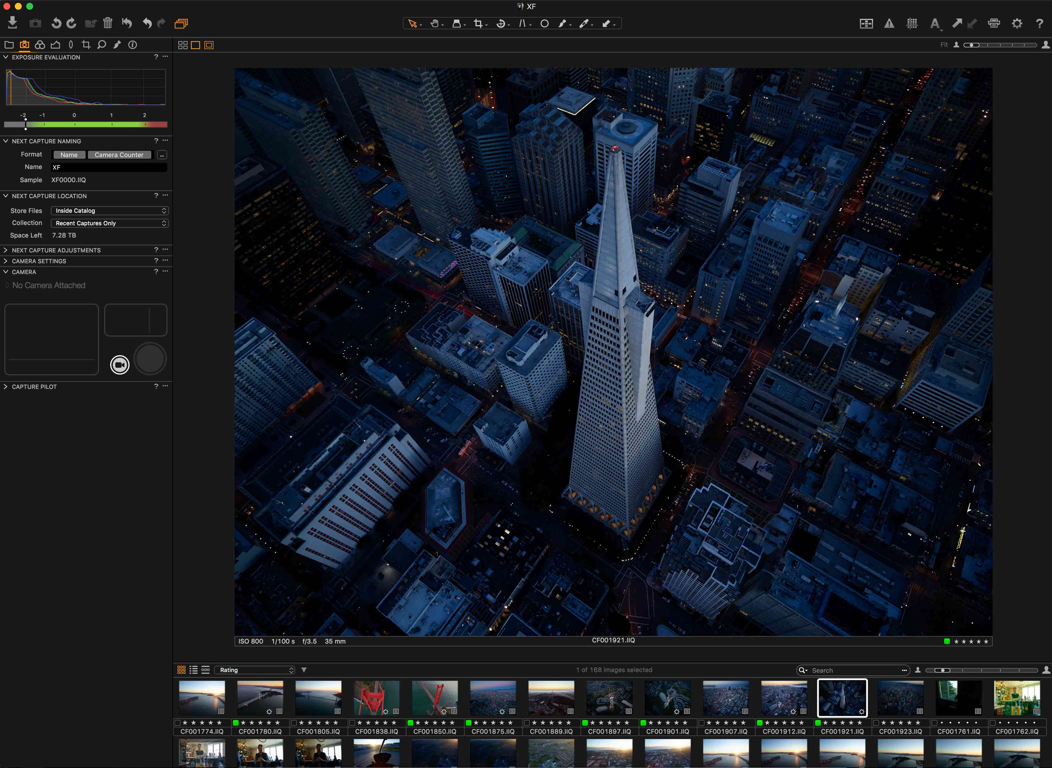
Image in Capture One Pro 9
.. isn’t too different from the finished photo, with what little work I did only served to make the image more of itself. I like the blue, dark and somber tone. I think it adds a lot of power to the image.
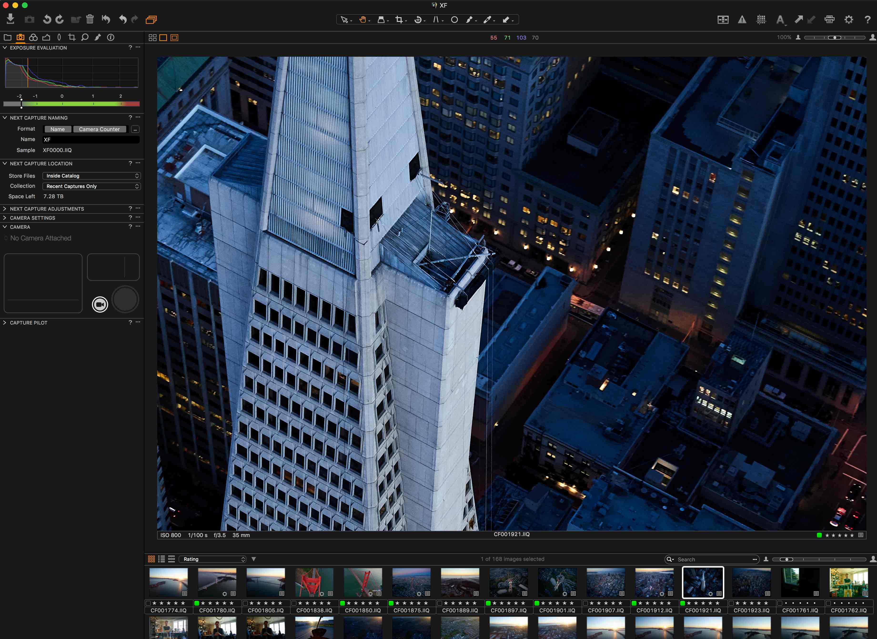
Part of the fun that comes with shooting with 100 megapixels is zooming it to see all the amazing details in a building. For example, in this particular photo you can see how the building maintenance crew attaches and deploys their window washing system. It’s a look that you don’t often get to see, and I think this kind of stuff is fascinating.
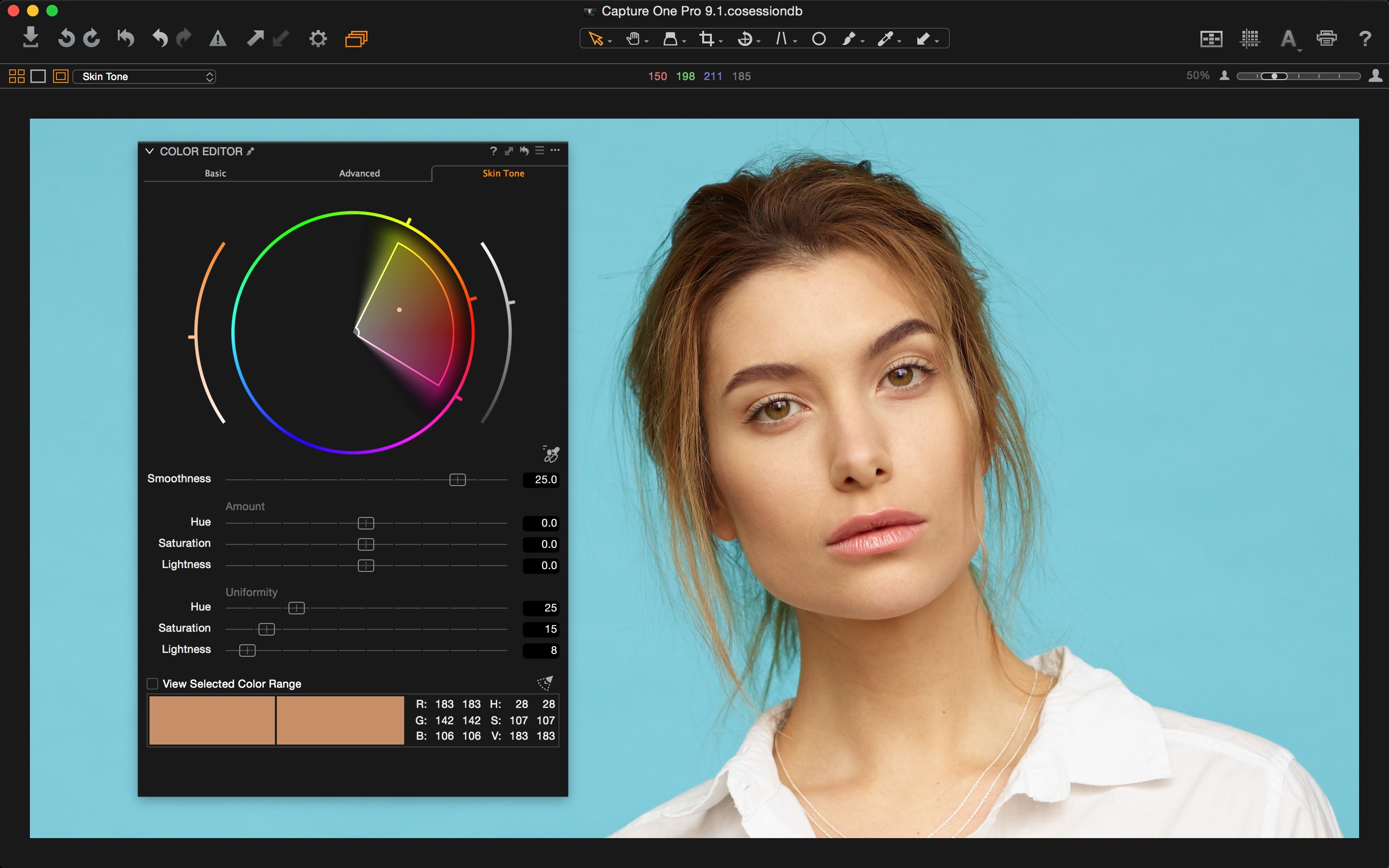
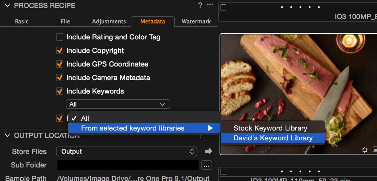
This was my first time really diving into Capture One in some time. I had used it briefly a couple years ago when shooting with Phase on a landscape project, but I can’t say I really “processed” in the program, but spent most of my time in Lightroom and Photoshop. In this instance, Adobe did not allow for the processing of the 100 megapixel raw files, leaving me no choice but to conduct my post production in Capture One Pro 9.
I’m really glad this happened, because I’ve fallen in love with Capture One Pro 9.
The program is of course different to use than what I had come from, but after 10 or so minutes going through menus and reading up on it, I was quickly processing and producing images I was extremely excited to share. It was much easier to use than I remember, and fine tuning these photos was a breeze.
I have to say, I’m really impressed with theXF 100MP Camera System and how it performed up there. I always bring a second camera up when I shoot just in case the first one fails, and sometimes specifically with a longer focal length lens for those close-up shots. In this case, I didn’t want to stop shooting with the XF. The images it was getting were super sharp, and the way the sensor sees the world is really something special. The whole time my backup camera stayed firmly in my lap, unused as I spend the full hour enjoying the XF. Even as the light rapidly faded, the XF 100MP Camera System remained the best camera for what I was shooting. I generally like to shoot wide anyway, and the 35mm f/2.8 did an excellent job of giving me the angle of view I most often seek.
The next time I go up with a Phase One, I want to do it in the early morning. There is some really amazing light that comes up with the rising sun, especially here in the City by the Bay and I want to see how the XF handles my city bathed in morning warmth.
Jaron Schneider,