NOTE: This article discusses an outdated version of Capture One. To learn more about our latest version, click here.
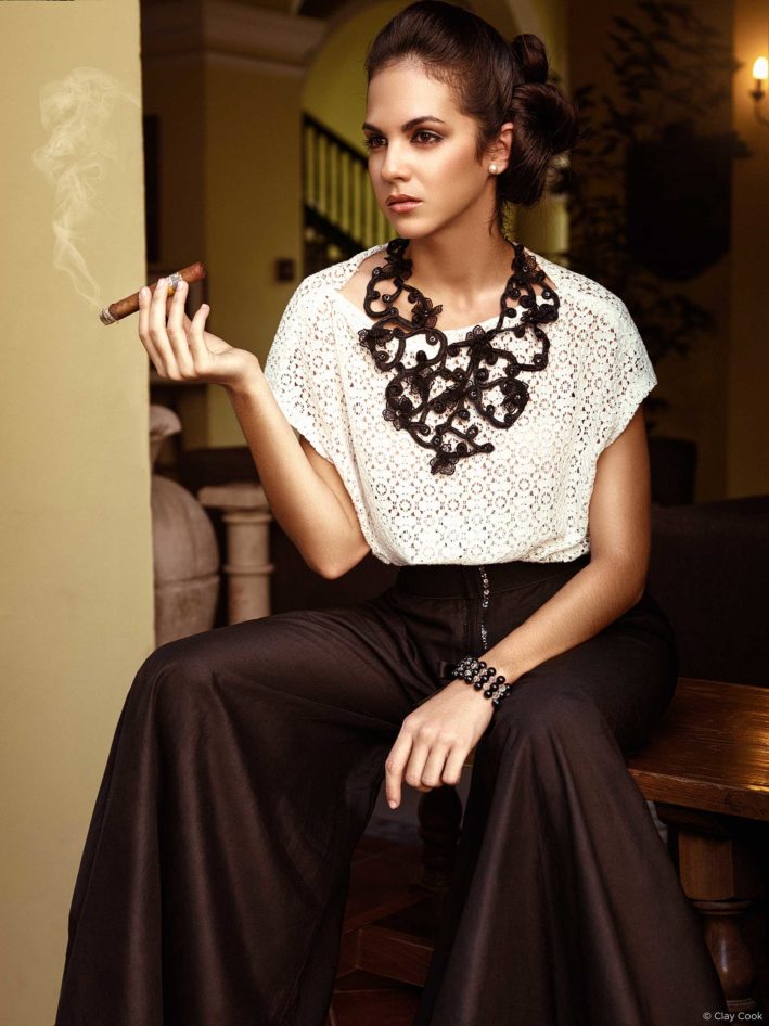
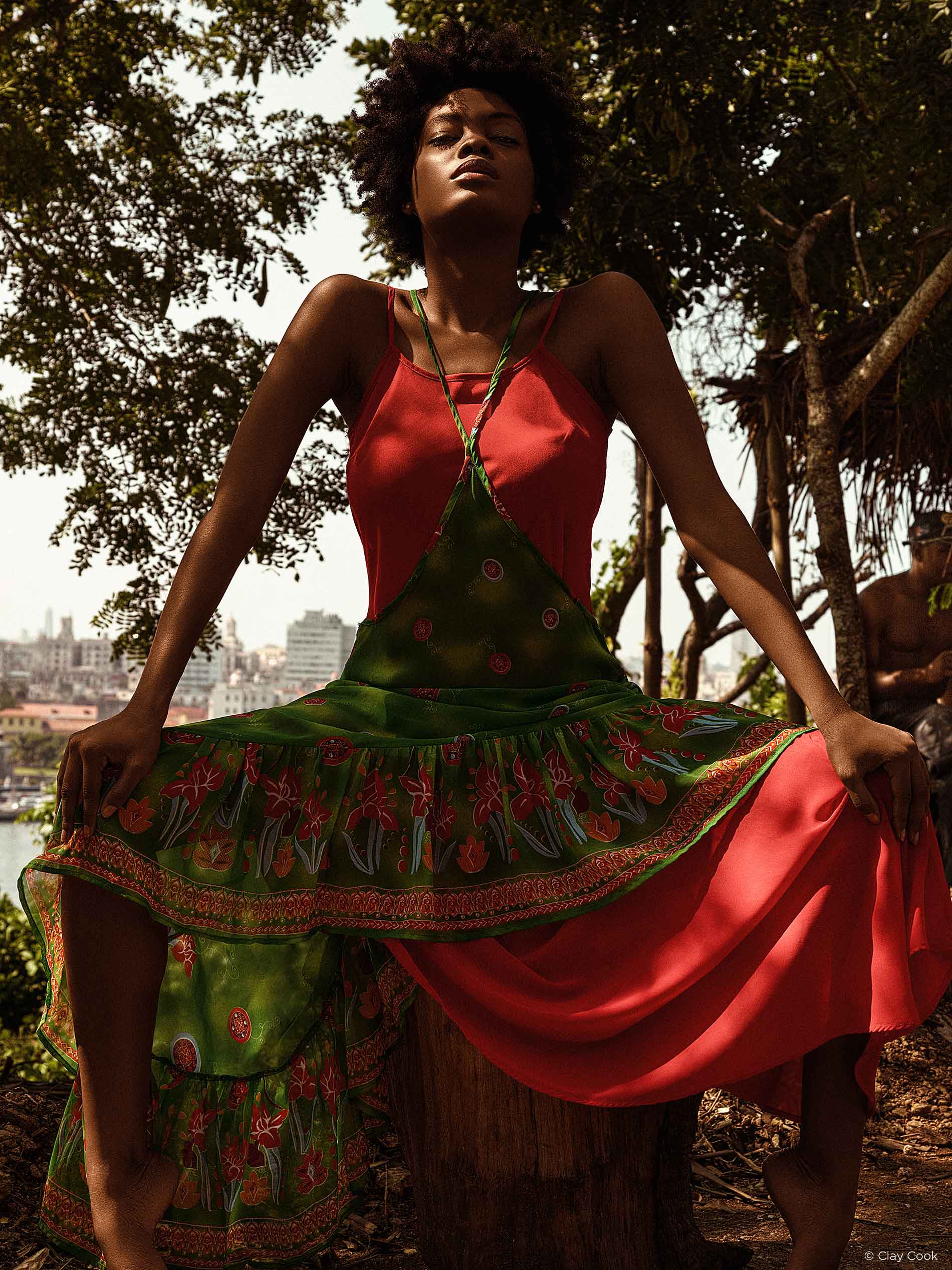
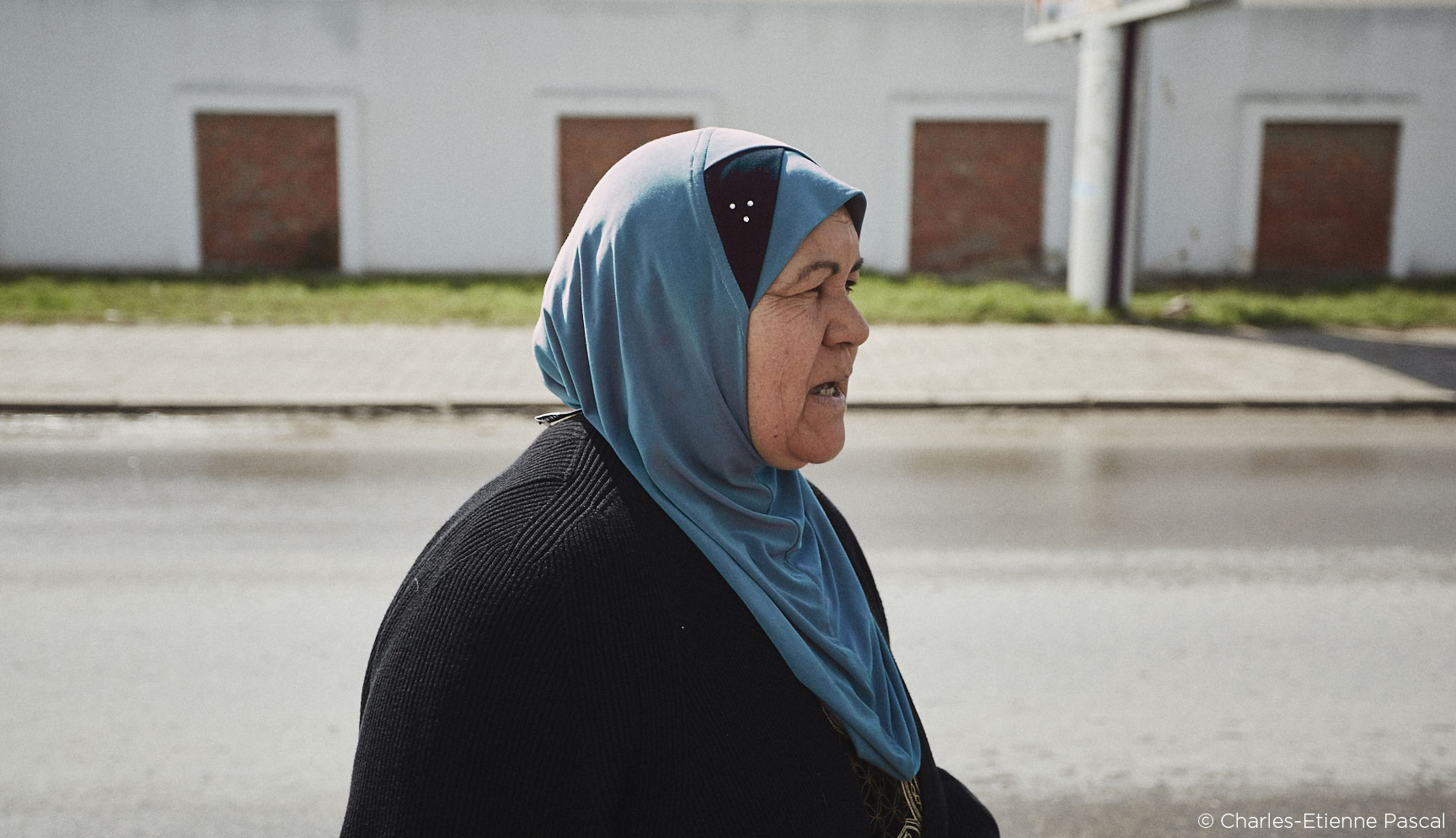
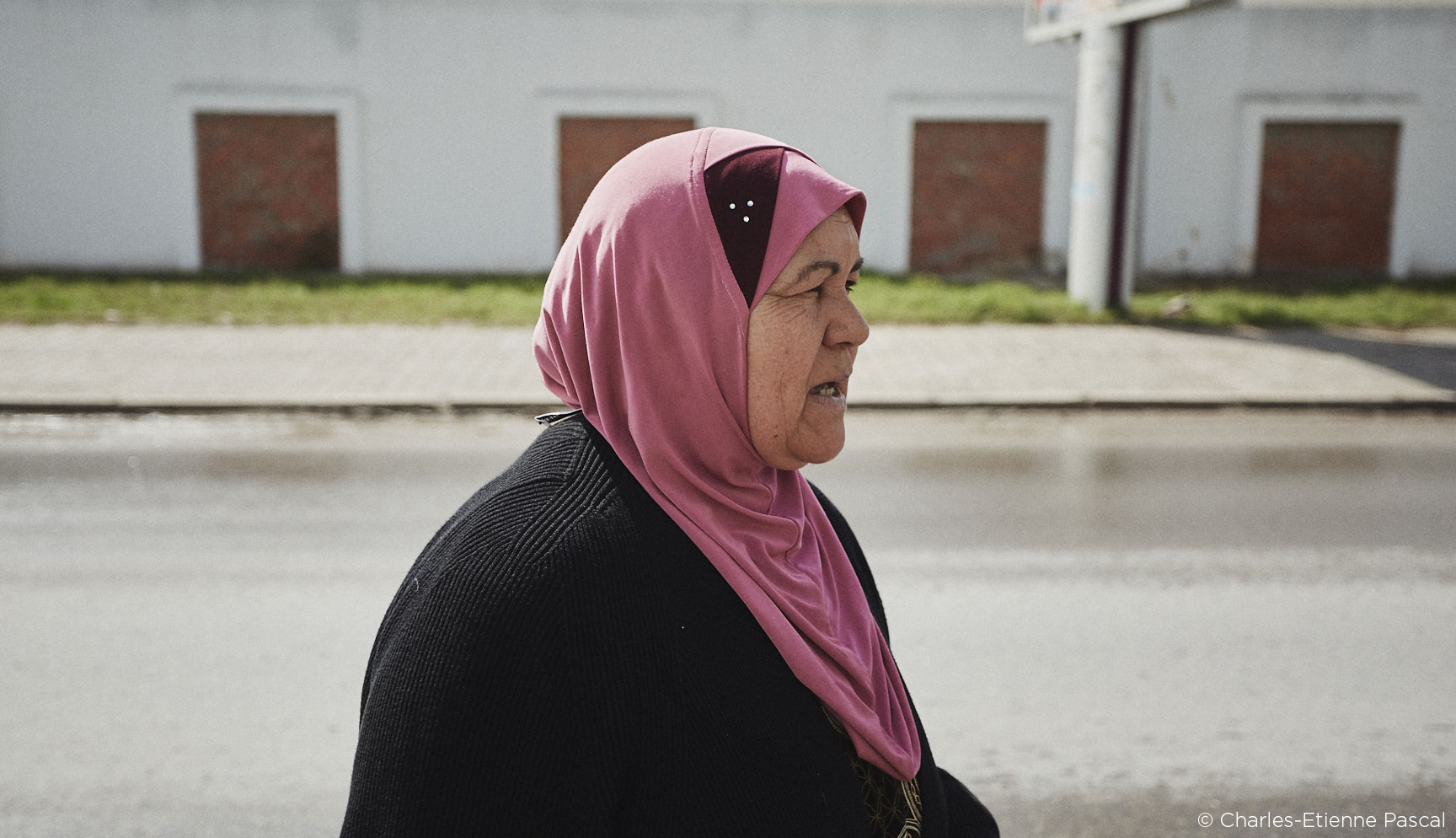
When I’m asked “How was Cuba?”, unlike most countries I’ve visited, it’s pretty simple to explain the cool cars and architecture. What isn’t easy is to explain the people, fashion and culture. It’s an explosion of race, age and color. Upon landing in Cuba for the first time, I didn’t feel a sense of danger or the need for steadfast movement like I had in Africa and India. We were met with open arms and welcomed like superstars. I was instantly enthralled with the untouched Cuban history and culture.
Cuba: A dream coming true
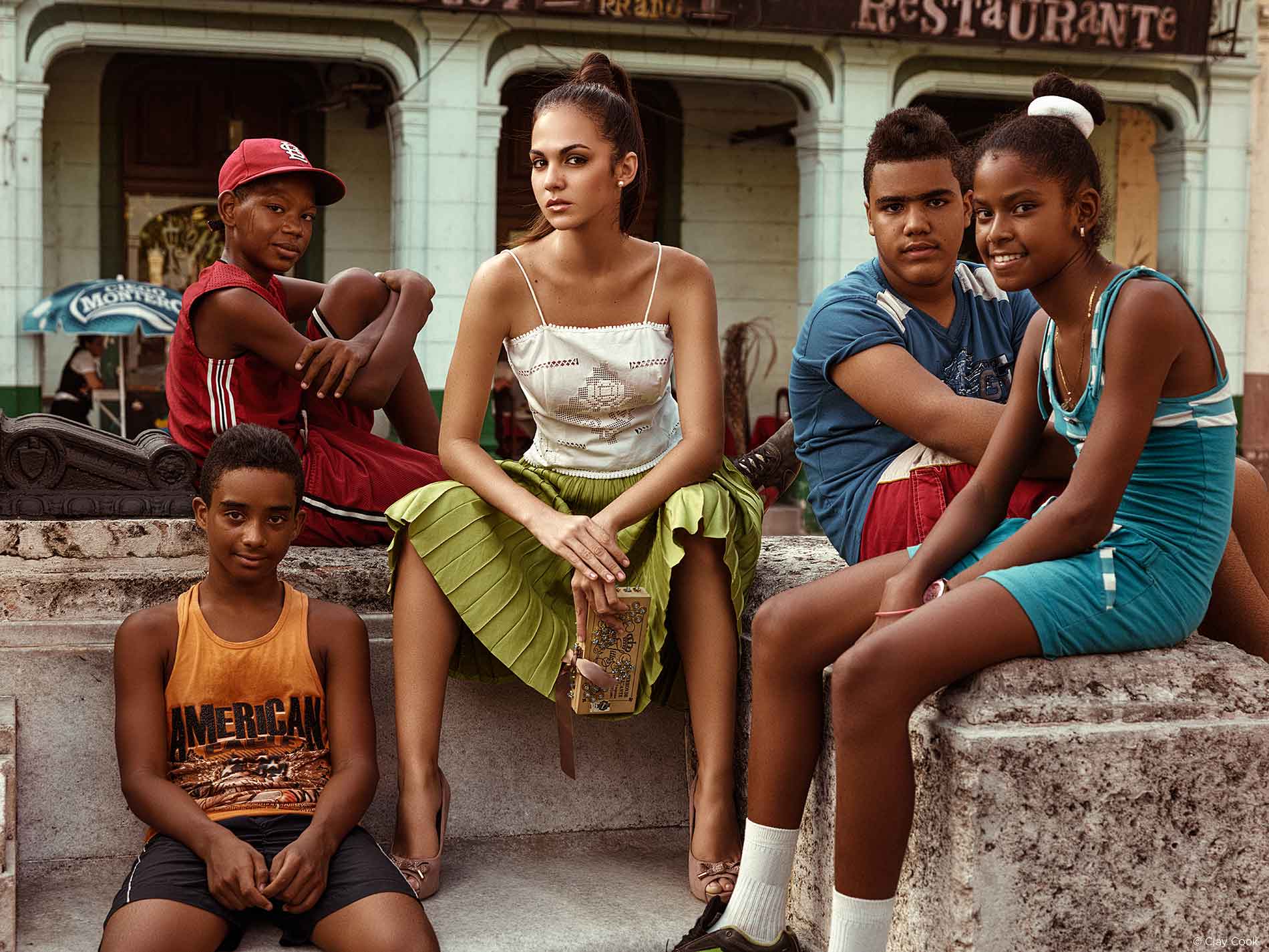
It all started when I got a call from the Publisher of The Voice Of Louisville regarding a project in Havana, Cuba for Blue Equity, LLC who had established some business roots in Havana. The project consisted of capturing a twenty page fashion editorial as well as a large feature on the rich culture, communist government and beautiful society. The production called for two five-day trips. The first mission would be to scout locations, meet and cast talent and lock down hanging details.The second trip would be the actual production; game time. When it comes to these types of travel scenarios, I’m skeptical until the flights are booked, but I knew this was the real deal. This was a dream situation that doesn’t come around often for editorial photographers, if ever.
I was in the dark for much of the time leading up to our first trek down to the island. I usually have a great idea of what the target and end goal was for the production. But, a great deal of trust had been placed in my lap on behalf of The Voice Of Louisville, the Government of Cuba and Blue Equity, LLC. I had to own it, I had to deliver, no matter the obstacles that stood in the way.
Visual paradise
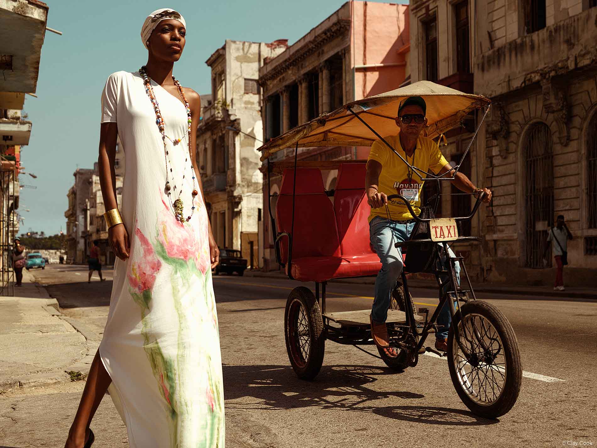
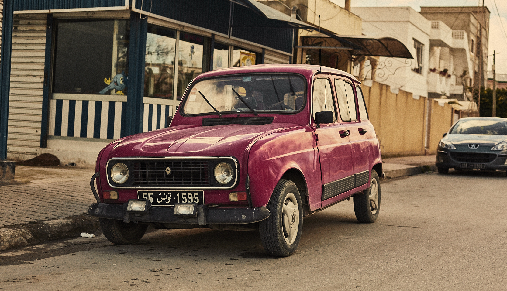
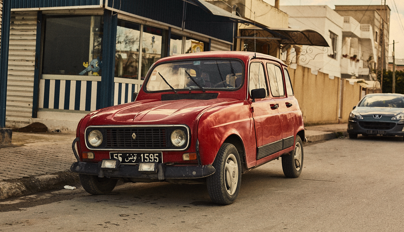
Upon arrival in the Havana airport, we were met with a breath of hot weather, but a bleak overcast sky. I quickly learned that Cuba was a visual paradise. The color, texture, automobiles and landscape was overwhelming, I didn’t know where to focus. The sun began to peak through the clouds and set into the horizon, which covered everything with a red-orange blanket of color.Over the course of the next few days, we worked hard during the day and played hard at night. But, my camera stayed by my side at all hours of the day.
Occasionally, a photo opportunity presented itself and I took advantage of the moment. Other times, it was production meetings and finding the best possible locations to photograph the fashion. I switched back and forth from “production photographer” to “street photojournalist” in an instant to guarantee I gained the proper content and knowledge we needed. Throughout our time in Cuba, I was able to really start building the foundation required to create this piece.
The gear
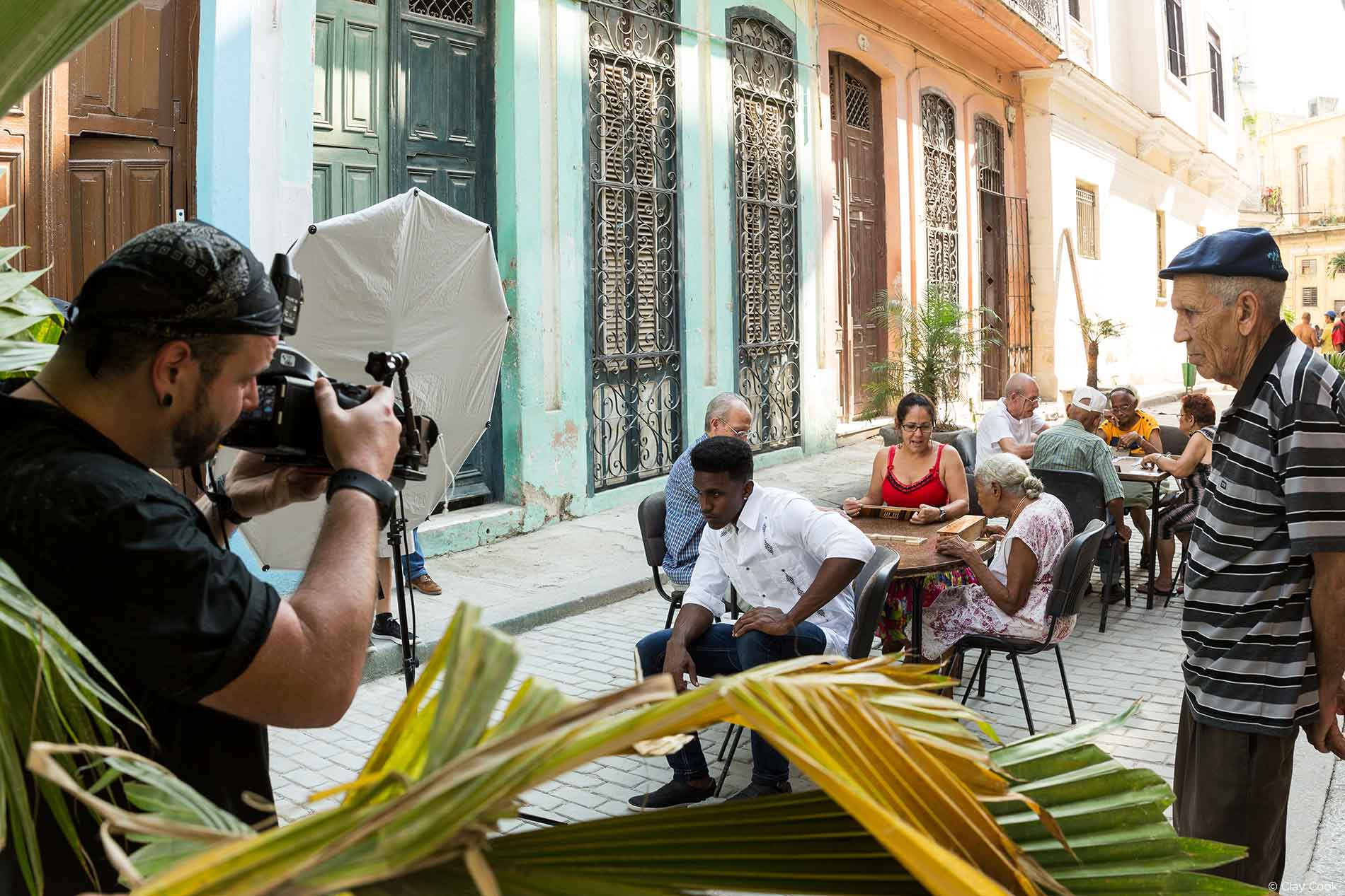
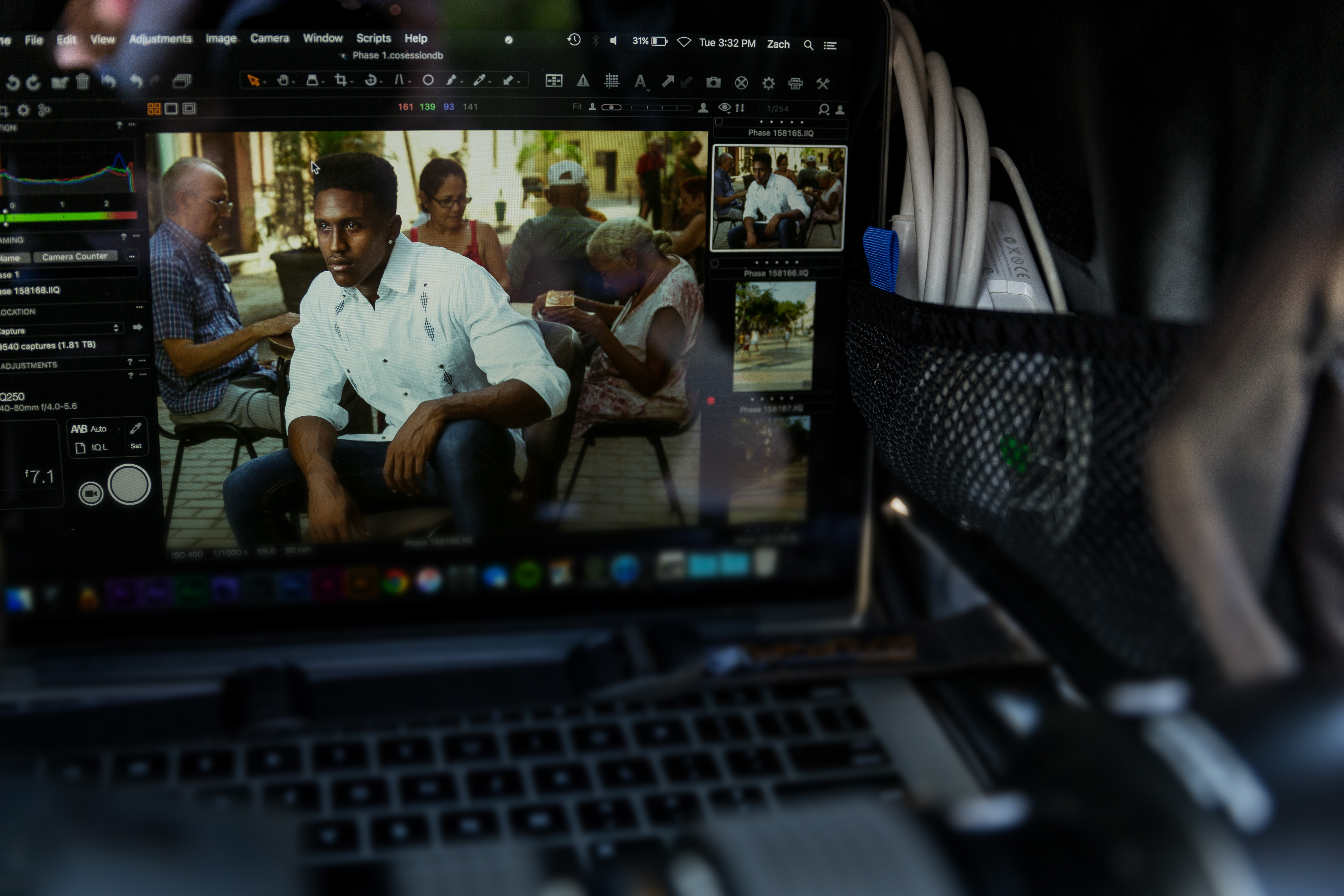
For this shoot I brought a Phase One 645DF with a IQ250 digital back along with a Schneider Kreuznach 40-80mm f/4 zoom lens and a Schneider Kreuznach 110mm f/2.8 static lens.
In consideration of using this setup, we made the executive decision that tethering to Capture One was essential. Thanks to my friends at Tether Tools we created the most mobile, small scale, on location tethering system possible. I knew we would be jumping from location to location and we didn’t have the time for an immense amount of setup.
For the majority of my career, I had been using a device called “CamRanger”, which provides a client preview directly to an iPad. The device was perfect for location shooting, however it didn’t show the initial color vision and didn’t represent the final product. I wanted more, so I ventured into using Lightroom, which I determined to be far too slow for location tethering. It felt clunky and my options were limited. When the project in Havana, Cuba come to fruition, I felt the need to give Capture One a shot, especially since I would be capturing the editorial with a Phase One IQ250 digital back.
The tether was quick, painless and efficient. After numerous tests and experimentation, we felt this was the right software for the job. The color adjustments are clear, clean and easy to use. We needed something that would work for us in a strenuous situation and Capture One soared over all software I’ve used in the past. It was a crucial element for my workflow and more importantly my client who was battling the hot Cuban sun to preview the imagery they had hoped for.
This shoot was a heavy burden on my back. I had a lot to deliver and a lot of hype to live up to. I mentally prepared for a tough few days and made sure Zach was briefed on the logistics of the production. Zach had to work twice as hard as anyone else. Not only was he responsible for the equipment, he was also responsible for language translation and behind the scenes.
The next morning, we hit the ground running. The sun began to soak the city like a warm bath, which designed beautiful lines and shapes on the city streets. Despite a few last minute audibles by the Government Of Cuba and their choice of locations, we adapted to the scenario and landed at our first location, right in the heart of a military base whom had not been advised of our production. We were left to setup, while the rest of the team made sure the hair, makeup, designers and models were moving. Within twenty minutes of setup, we were faced with a series of guards who shut it all down. Fortunately, Zach was able to speak some broken Spanish and make sure everyone remained calm.
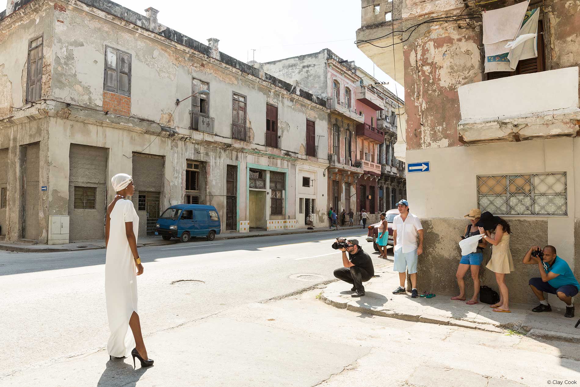
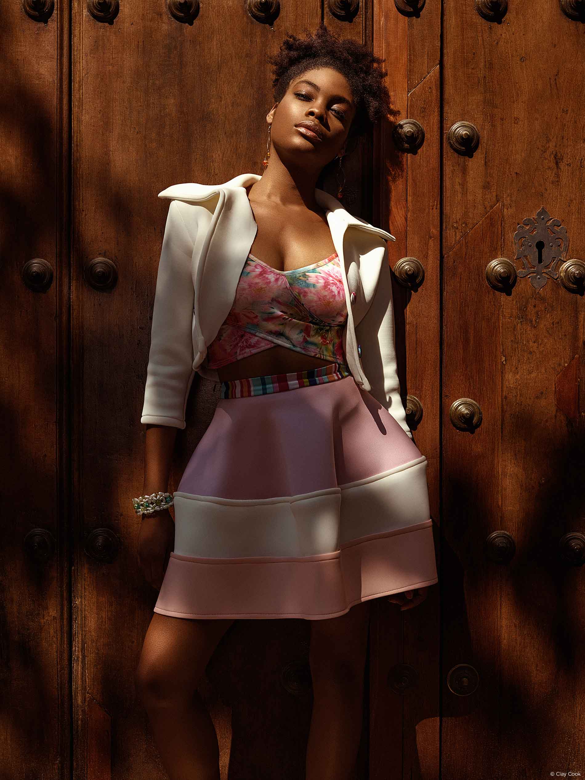
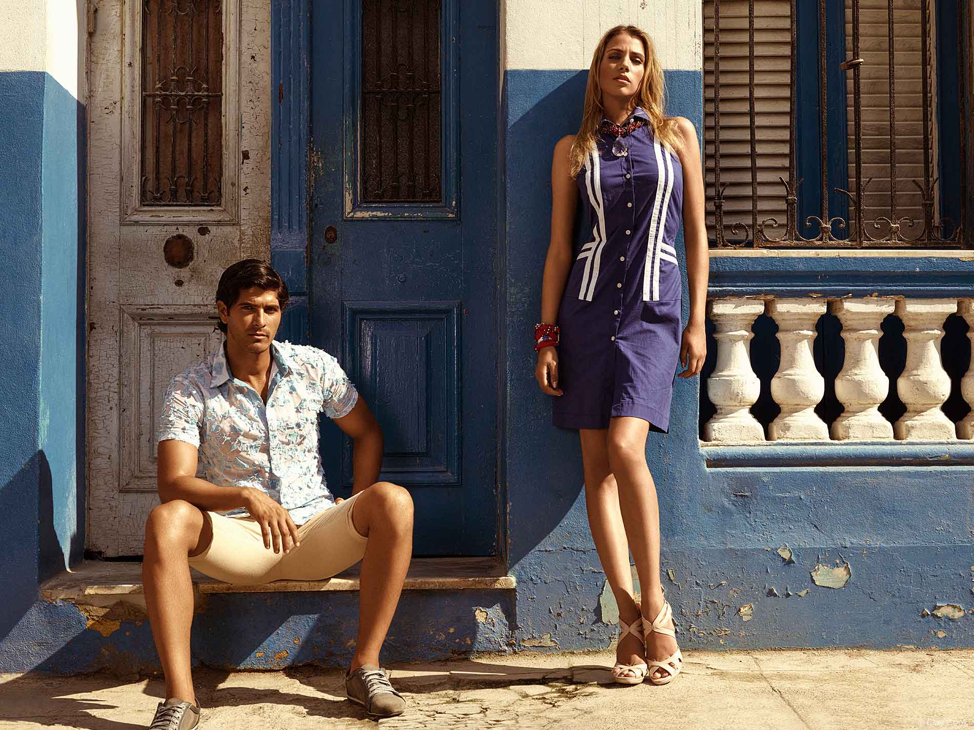
By late-afternoon I was pretty beat and my forearm felt like rubber. The sun was record-breaking hot and my camera was heavy. With all the accessories, it was close to fifteen pounds, which can add up after ten hours of lifting and holding. Although the team stopped for lunch, we decided to keep moving. Each set required about thirty minutes of time with setup and pre-lighting. The models were rolled out like products on a conveyor belt, it was an extremely productive process and very essential. But, it was a challenge to capture models in the right lighting and include the surrounding environment. We wanted the people, we wanted the bustle and we wanted the noise. Sometimes, that required the right amount of patience. We waited for the right moment and the right timing for the story to form.
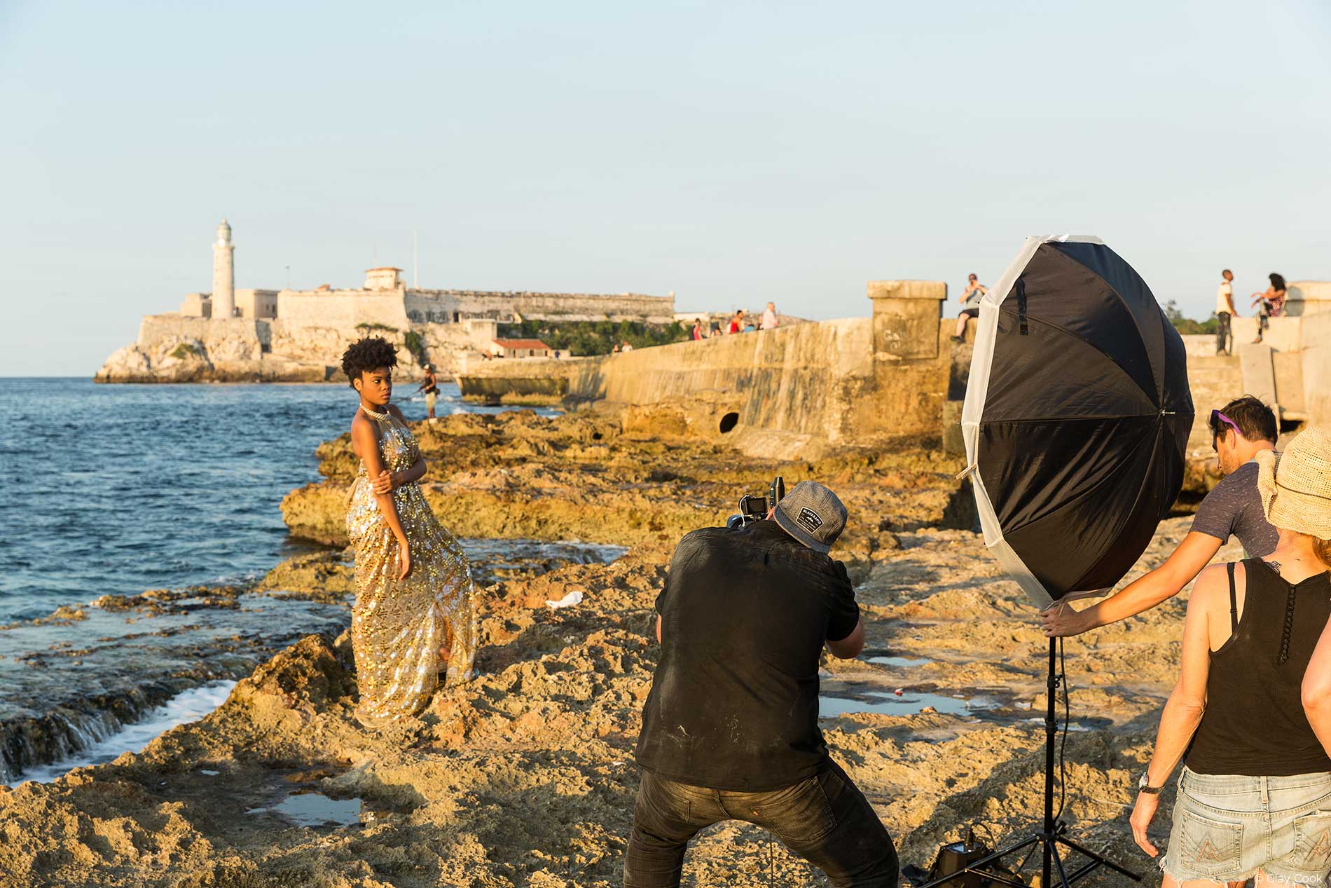
And, fifteen looks later; we were still shooting and I was completely bushed. We wrapped the day on the rocky shoreline with our backs to the Malecón and a crowd of people. I was excited, confident and ready for a cocktail.
Partner of choice: Digital Transitions


