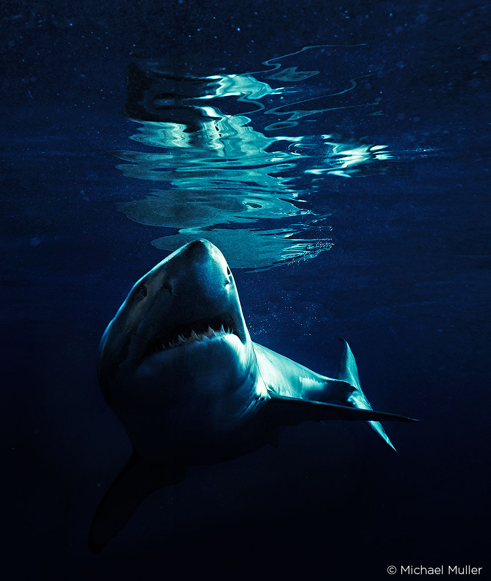
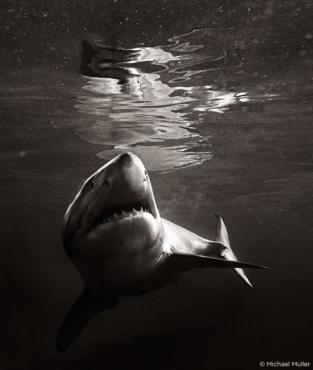
Ever since I first swam with sharks, I wanted to share that experience through my photography. And since I couldn’t bring the sharks into the studio, I brought the studio to the sharks. Watch a BTS video from my trip to South Africa below:
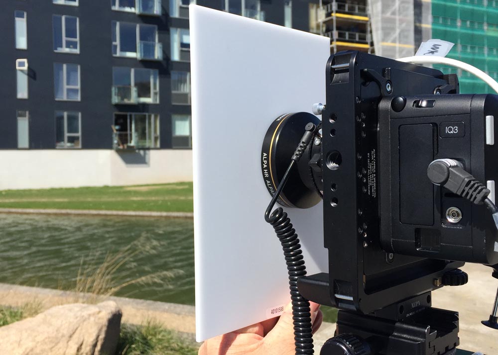
A couple of things made this possible: A solid underwater housing for my camera and the right lights. The housing was developed by a Japanese company. And I invented an underwater strobe system for which I now have four patents. It’s the most powerful underwater lighting setup in the world. I just went out and made it. All my assistants have gotten certified as divers, the same team, and they’ve followed me into the deep. We were all very glad that the sharks couldn’t care less about the lighting.
Today I’m shooting with the Phase One XF IQ3 80 MP system. I’ve now been shooting with Phase One camera systems for about eight or nine years, and over that time there have been a lot of changes – the camera body, the grip, the number of megapixels, the file sizes and speeds of autofocus. It’s great every time they release a new system. I love it. The gear keeps getting better, sharper and faster.
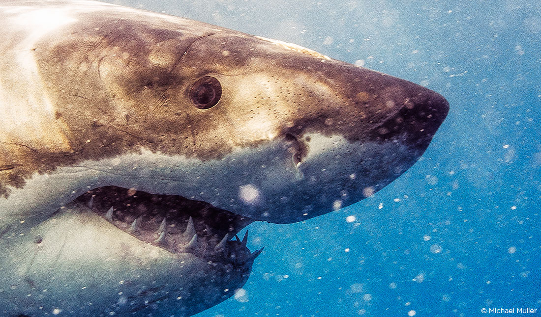
A great example of why using medium format is key: With sharks, everyone’s used to seeing that black eye, it personifies the monster, something that looks so soulless from far away. But recently when I zoomed into the images I’d taken, I was amazed. I could literally see the shark’s iris, see the eye in all its specificity – the same view that I see when I dive with them. It creates this connection, because you can see how almost human they are as they look at you. But no camera ever revealed that until I shot with the 80MP system. Maybe it was the light that was hitting it in a certain way, but it was like, ‘wow, there you go!’ A huge “wow moment.” The technology just delivered the experience in its true form. Something DSLR camera systems simply can’t do.
To get a great image, you need all the elements – lighting, detail, direction, color, composition, shadows … it’s how you use each of them that separates you from the next guy …
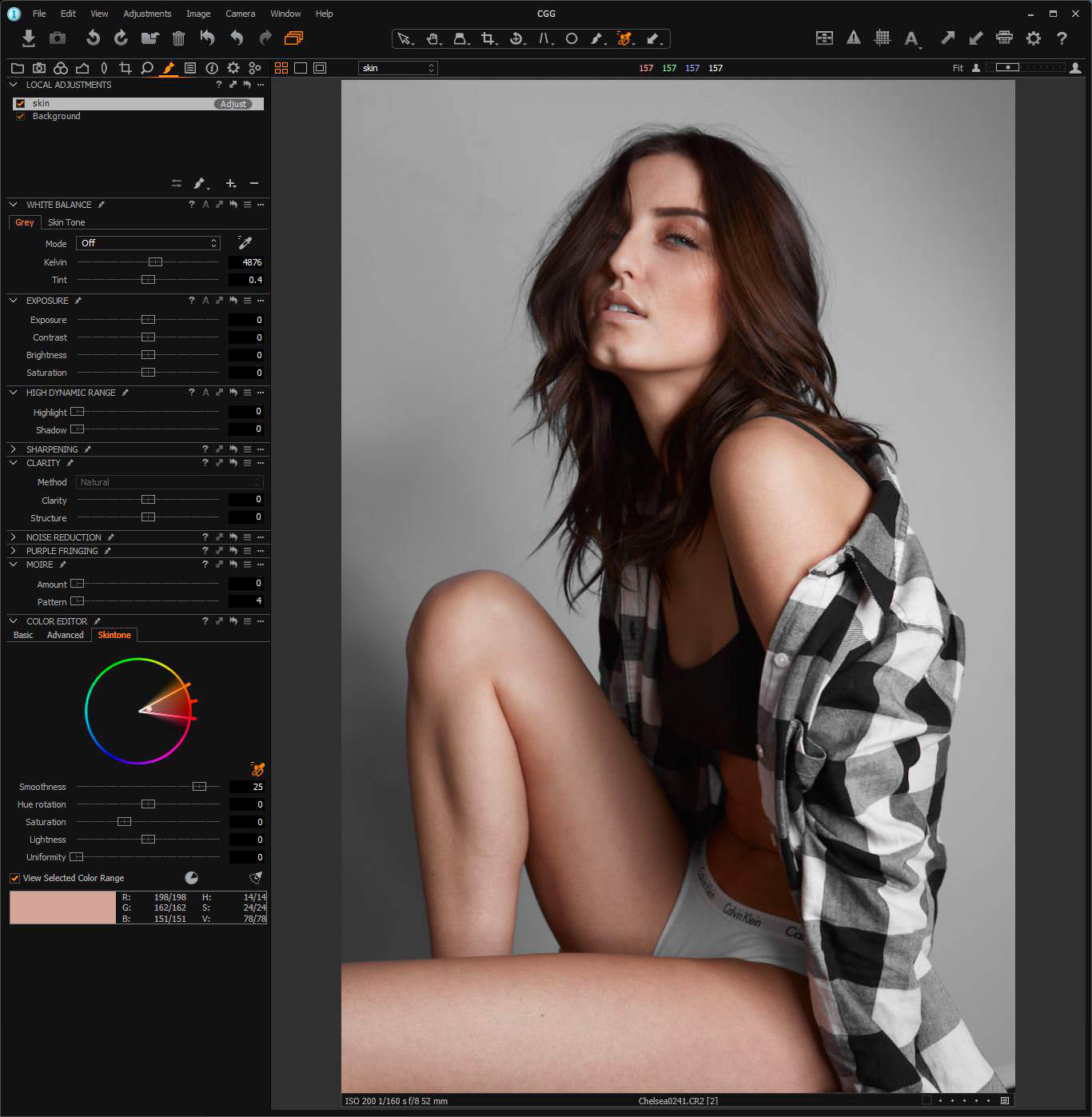
One of the big differences between my peers and me is that I do all my own post-production, and I don’t hand stuff off to retouchers – I never have, from the film days, right through when I jumped with both feet into digital around 2002. I love looking deeply into the image. Having that knowledge of post is a huge advantage because I know where I can take it.
I love Capture One Pro 9. Every tech I know uses it because of its workflow and speed. Plus, obviously if you’re working with Phase One gear, it’s the program designed to work with that camera system. I honestly don’t like shooting tethered, it’s like being a dog on a leash, but it is great to be able to look at the images on the screen; you can zoom in and make changes on the fly.
Converting the raw file is the foundation of the look – it’s how I put my fingerprint on the image. Later, I might spend two minutes in Photoshop. It comes down to the kind of detail you can get with Capture One Pro 9, detail in the blacks that you won’t get with Bridge, for example.
Commercial work is great, and I enjoy it, but there’s nothing that compares to working on your own projects. A lot of commercial photographers can forget that and get old and stale just chasing a check. It’s important to do want you love, essential to at least sometimes follow your passion. I wasn’t hired or paid to do the shark project. It was my own project that I was passionate about. It was very fulfilling.
For me, I’d say 90 percent of the time I’m shooting with Phase One; eight percent with my DLSR and two percent with my iPhone. For all my commercial jobs, I’m using Phase One gear. My clients are expecting the biggest file size they can get so they can crop in, or use the images for huge billboards with no loss of quality. When they see the camera, they’re often, like “woah, what is that?” So I spend some time explaining.
If I were to offer any advice to other photographers, I’d say that the most important thing is to shoot. Some people say, “Well, I’m a music photographer or a car photographer, so that’s what I shoot.” But I say, ‘If you’re a photographer, you’re a photographer – you shoot everything!’
Shoot constantly and hone your craft. Shoot things outside your usual subject matter and look back to how that might help you with your usual focus – you might discover ways to translate shooting something new with something you’ve always done. The only way to become a master is to have a camera in your hands on a daily basis.
Bottom line, I’d say, ‘Listen to your own gut.’
Michael Muller’s Sharks. Face-to-Face with the Ocean’s Endangered Predator, has just been published by Taschen. It’s a 334 page hardcover book with two amazing foldouts, filled with hundreds of images that show another side of an awesome creature — one that many have vilified and few have taken time to understand. Readers report being blown away by the details in these images, and we wanted to hear from Michael about this project, about his photography in general and what his advice to photographers seeking to master the craft.
Check out Michael’s website and Instagram:
https://www.instagram.com/michaelmuller7/
Phase One Partner of choice Samy’s Camera