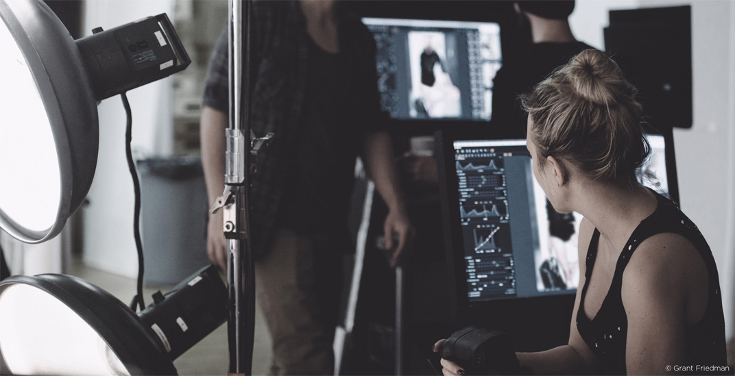
Still not convinced that Capture One Pro 9 is right for you? Read on and check out my top 5 reasons for why you should make the switch to Capture One.
5. Levels
Photographers with a wide Photoshop background are usually quite skeptical about Levels tool. In Photoshop, Levels is truly not the main tool, you can do almost all the same actions in Curves.
In Capture One, Levels is a much more important tool.
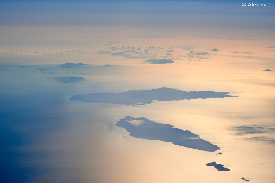
The main purpose of Levels is to edit black and white points – if you have a faded image, Levels may improve it dramatically.
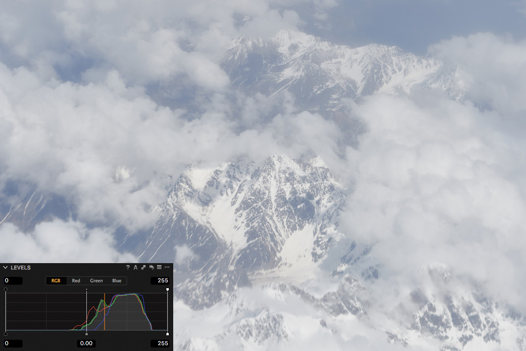
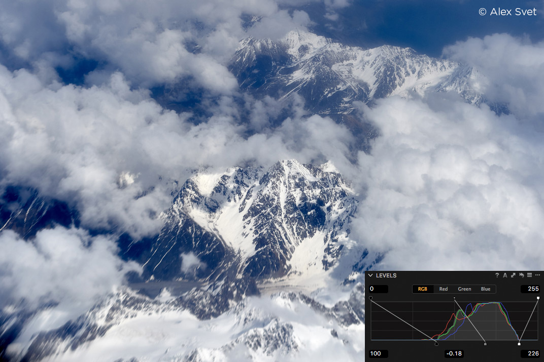
You will also have all the control over Output black and white points, it’s really useful for pre-print editing.
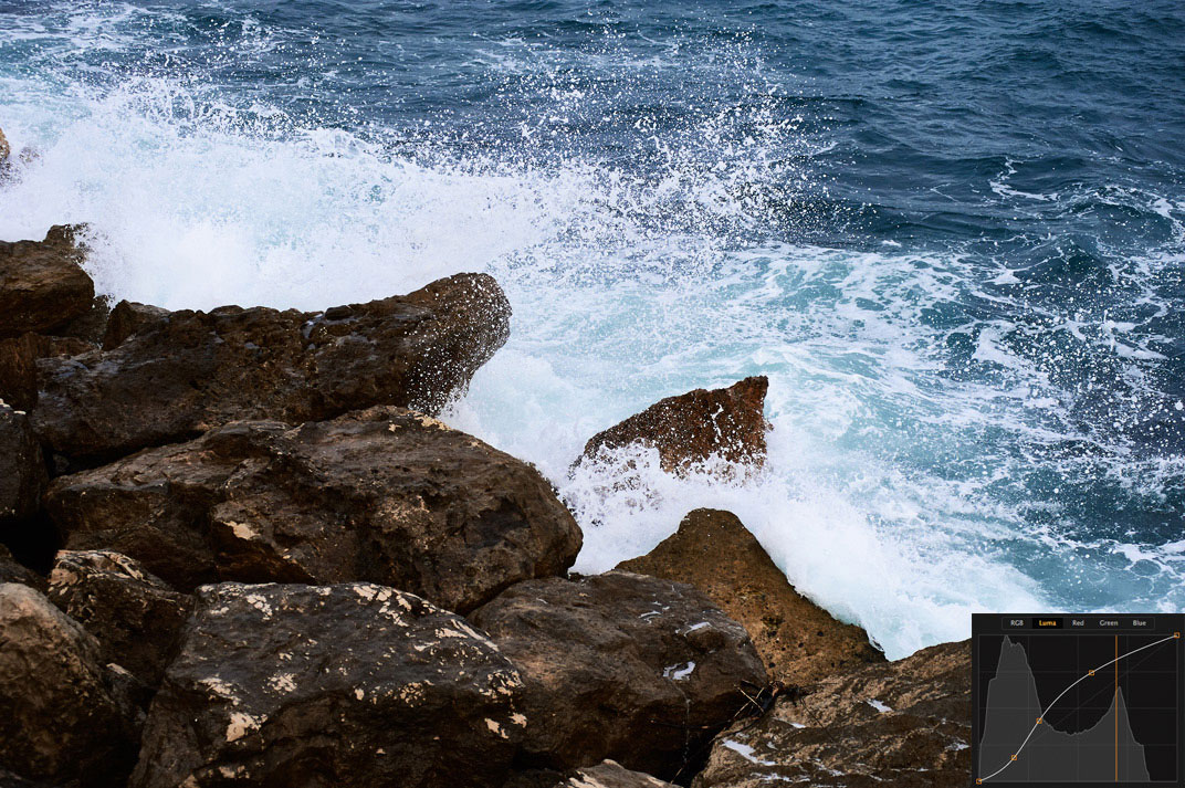
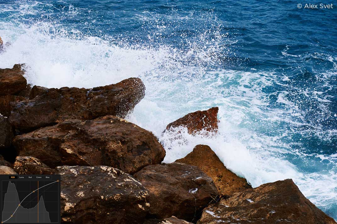
Moreover, Levels has one not so obvious, but absolutely amazing feature which is level corrections of Red, Green and Blue channels.
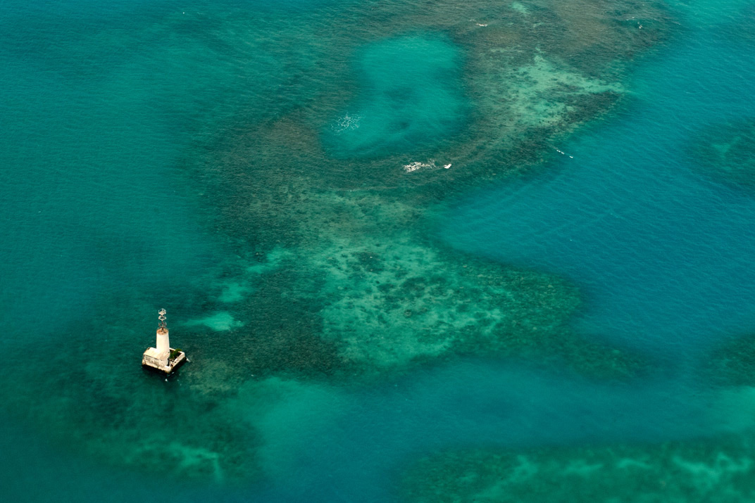
Have you ever seen an image with a strong color cast, which couldn’t be fixed with any of the regular tools?
Then it’s a turn for the correction of R, G and B channels. With those tools, you can set black and white points for each color channel separately.
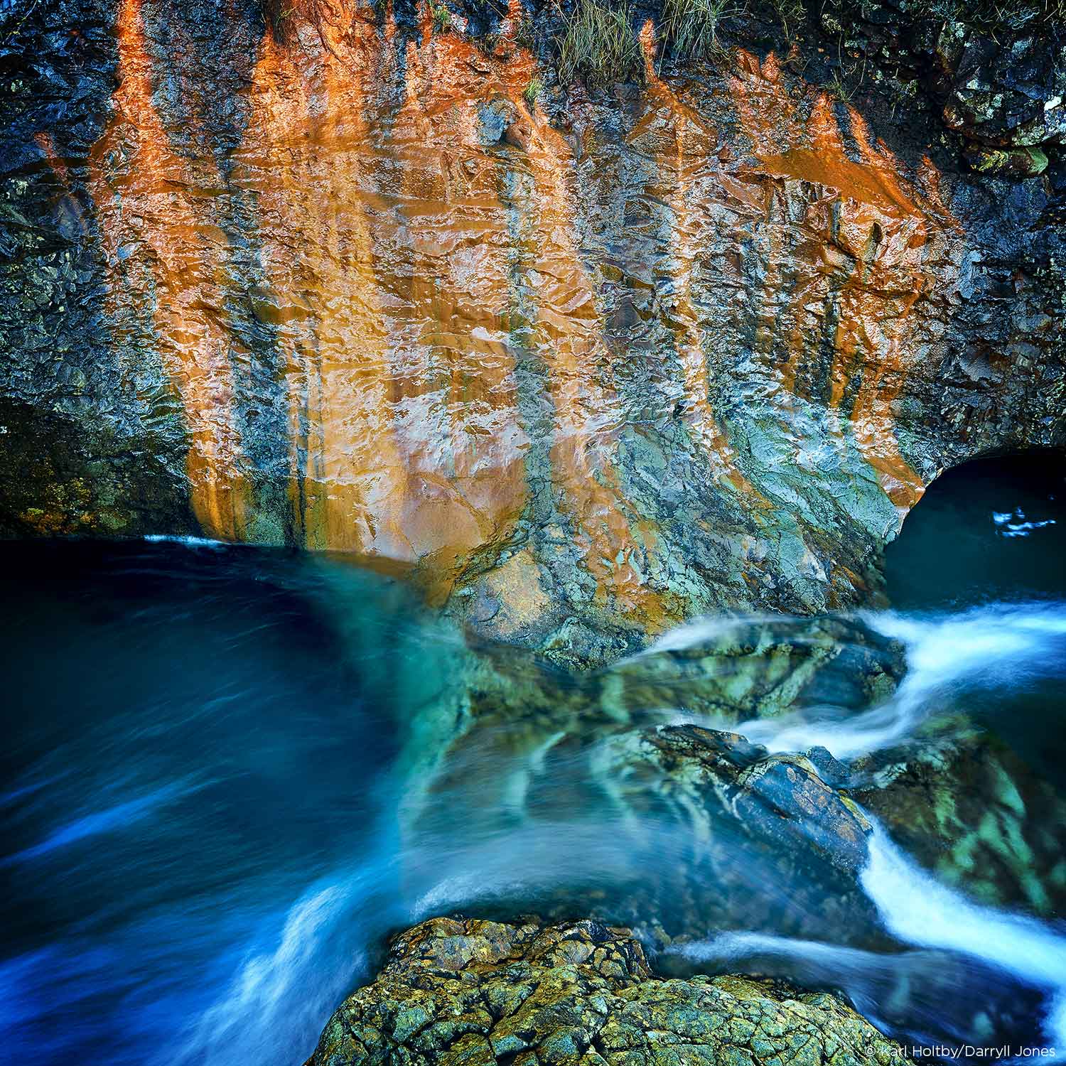
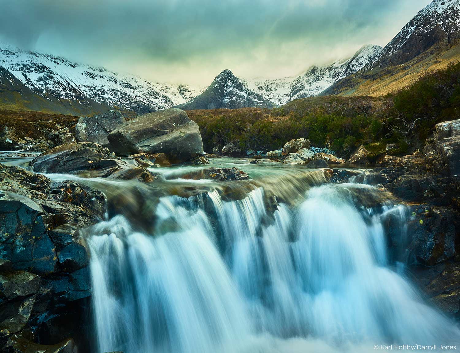
In that case, you’ll get the most accurate and correct color, which may completely change your image:
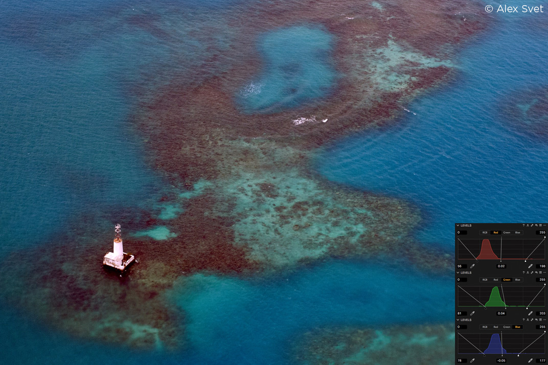
And the best thing is that Capture One can process it automatically!
Channel level correction allows you to get the true and realistic color at the first RAW-editing stage.
Viewing professional portfolios, have you ever thought: “How did they achieve such a clear color?”. Well, that’s how they do it.
And it’s only one of the tools from Capture One’s armory.
4. HDR, Color Balance and Clarity
All of these tools, in one form or another, are available on the most popular RAW-converters. The difference is that in Capture One they work much more accurately and smarter.
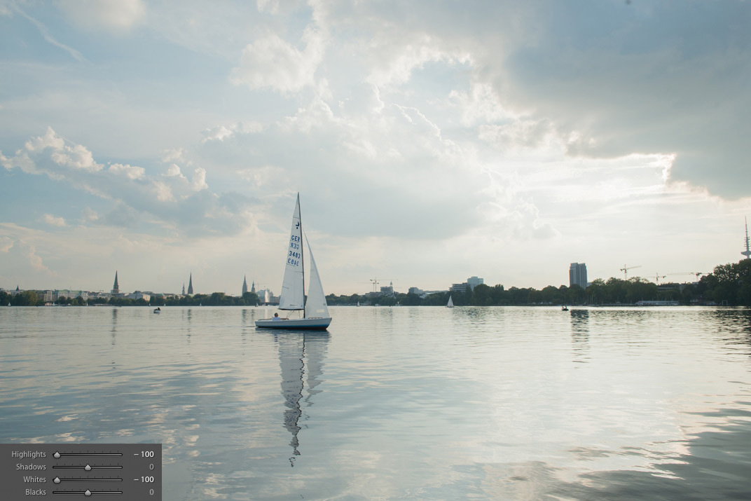
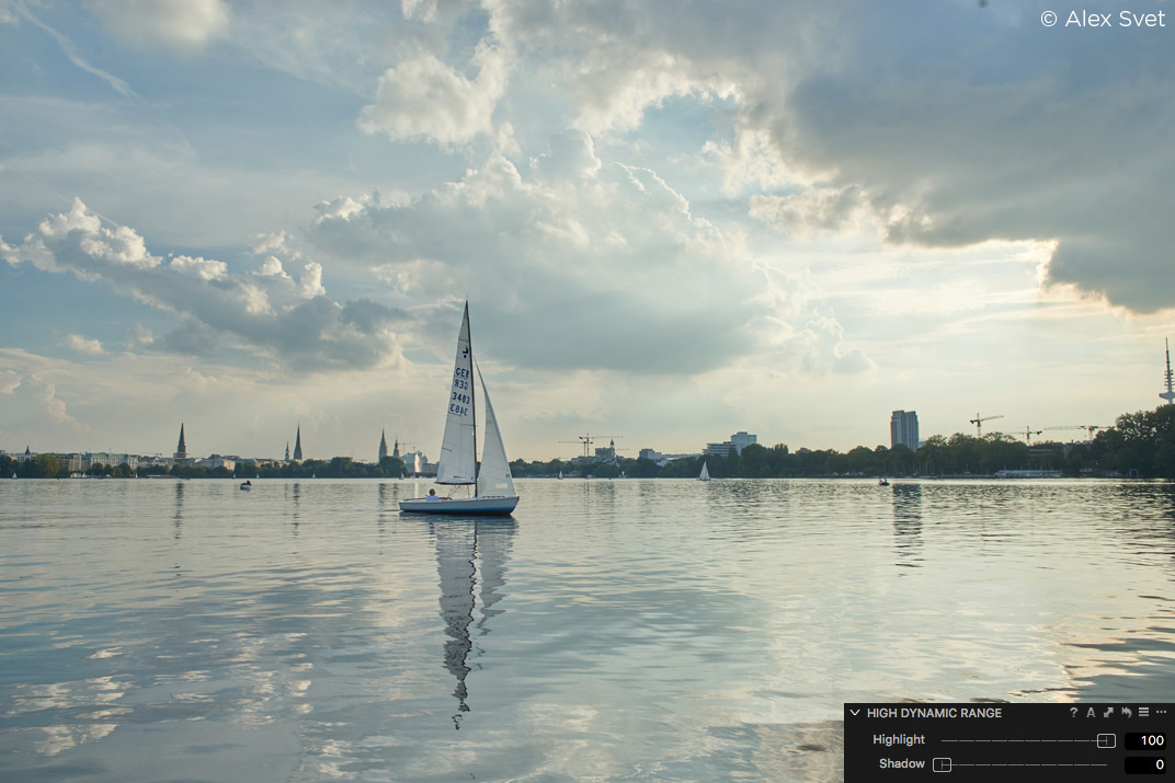
HDR:
![rtspic021[1]](https://learn.captureone.com/wp-content/uploads/sites/2/rtspic0211.jpg)
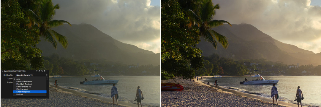
Since its first release in Capture One 6, High Dynamic Range tool was drastically updated several times. Today it provides an amazing quality of Shadows/Highlights zones correction.
Here are some examples: Capture One 9 High Dynamic Range on max and Lightroom CC (2015.5.1) Shadows/Highlights on max for the same images.
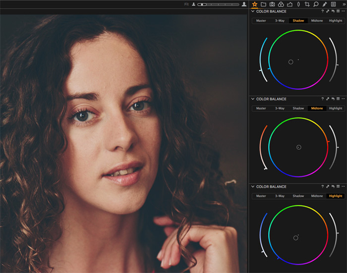
Color Balance:
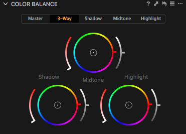
Color Balance is all about color toning, a great tool to gain some atmosphere or to set the mood for your image.
It works equally well for portraits, landscapes and sometimes even for technical color corrections.
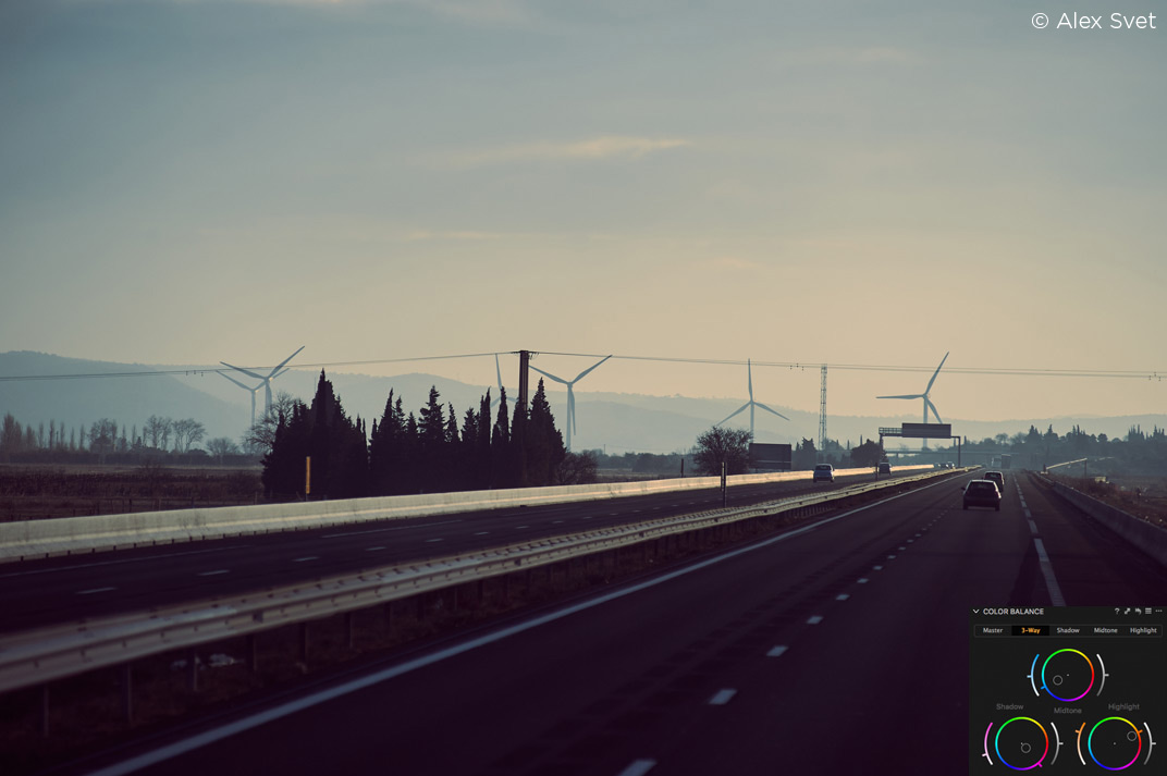
The main advantage of Capture One’s color toning is that Color Balance works not only with Highlights and Shadows but with Midtones as well. It gives you many more editing possibilities.
By the way, with workspace customizations, you may create a separate tab and place different Color Balance modes on the same screen.
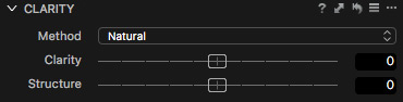
Clarity:
When I was talking to my colleagues, I noticed that many of them really enjoy Clarity tool, but at the same time, they are a little bit wary of its effects.
The reason is that in most popular RAW-converters Clarity tool is just a single slider without any additional settings.
That’s why sometimes it may work great, or it may ruin your image as well.
In Capture One, Clarity tool has four different modes, and each of them provides a unique effect.
For example, Punch mode works harder and seriously affects color. On the contrary – Natural mode is very accurate with your image and almost doesn’t touch color.
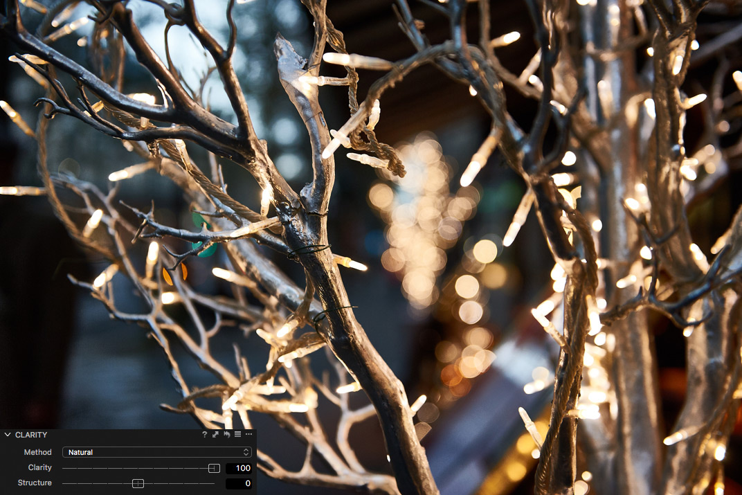
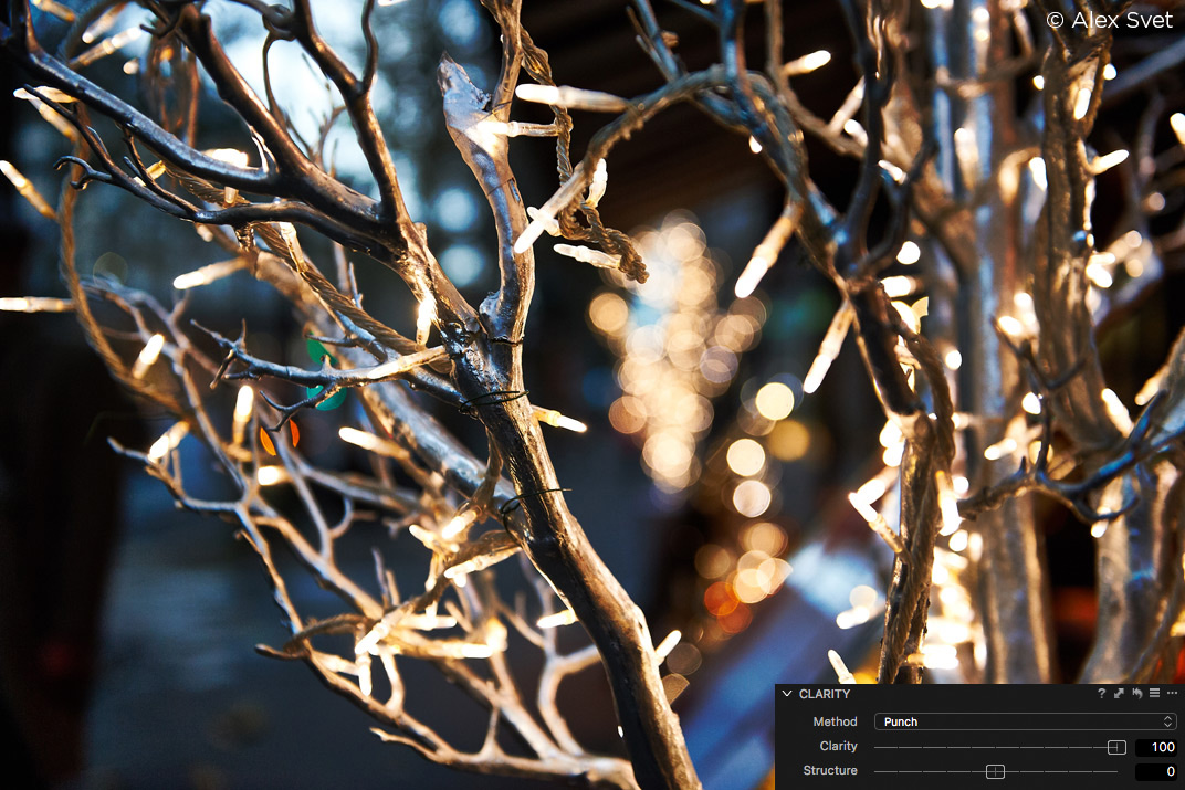
Capture One’s Clarity tool also has one additional slider – Structure.
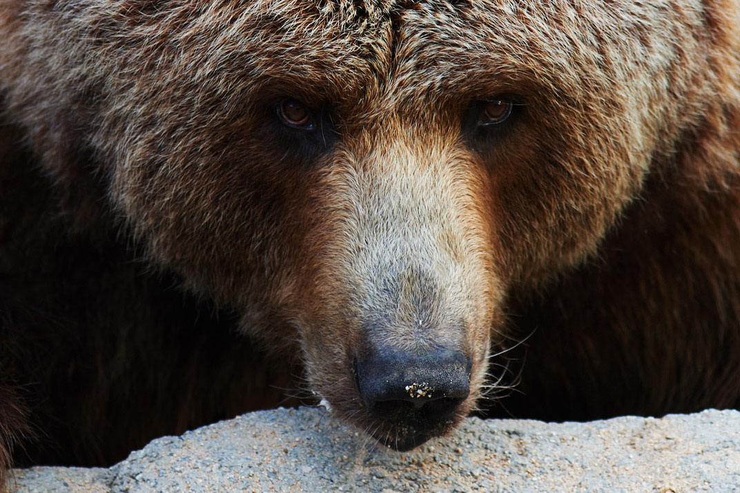
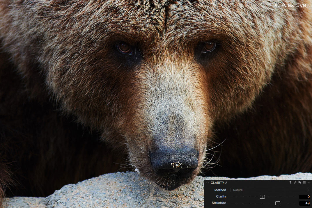
It’s a really useful tool when you’re editing images with stone, wood or any other texture materials.
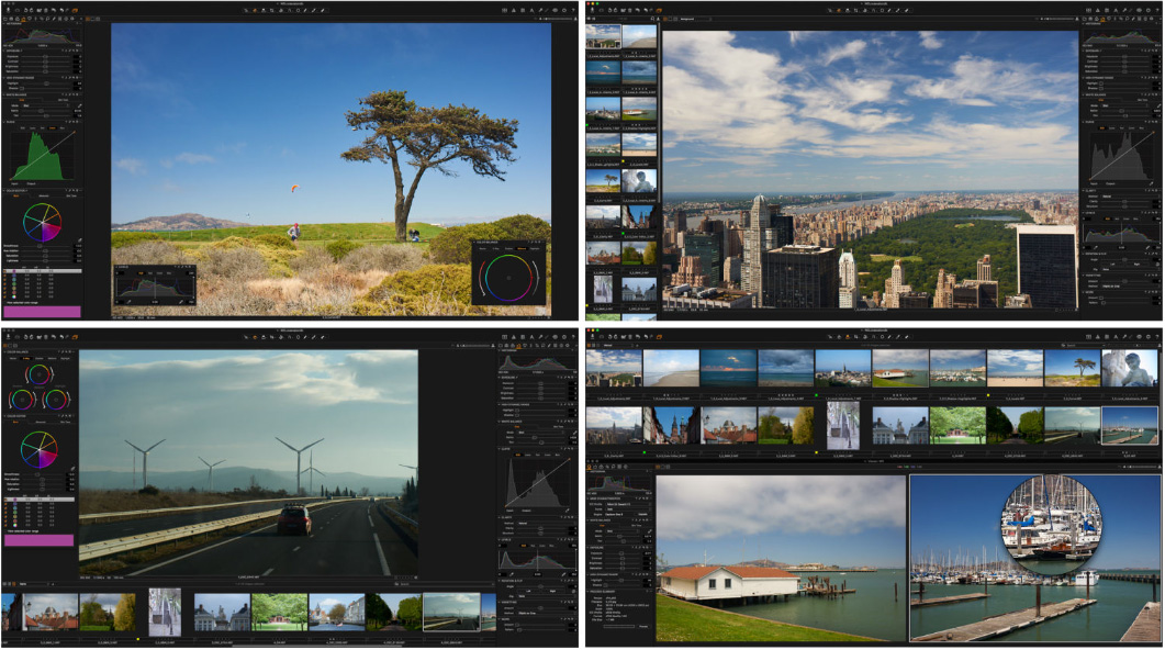
3. Local Adjustments and Retouch tools
Local Adjustments is a quite common feature for modern RAW-software, but Capture One’s approach has a number of strong advantages.
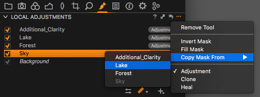
First of all – Local Adjustments in Capture One is a separate tool with easy-to-use layer management system.
You can name layers, quickly switch between them, copy and invert layer masks.
Of course, there are all the regular tools: Brush, Eraser, Gradient, and Auto Mask. You can also set mask’s Opacity, Hardness, and Flow. If you’re working with a pen tablet, there is a pen pressure option available.
But what is really important, is that almost all the Capture One tools are able to work with layers : Curves, Color Editor, White Balance, Exposure, Contrast, Saturation, Brightness, HDR, Clarity, Sharpening and Noise Reduction, Purple Fringing and Moiré.
In practice, that will completely change your editing process: after a few weeks in Capture One, you will think layers.
Layers in Capture One are not an add-on to the main workflow – they are an inseparable part of the workflow.
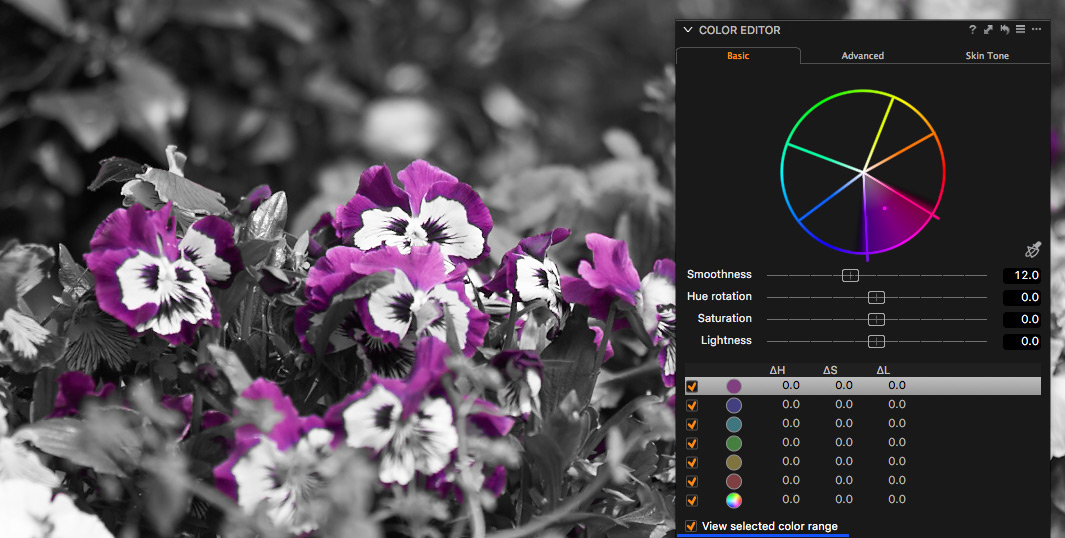
Another amazing feature is creating masks from Color Editor selection.
In Capture One, you can select any color on the image and create a mask from it in just one click.
Create a mask of the model’s skin color or clothes, mask the sky on your image – all these tasks will only take a few seconds. No more meticulous work with the brush and eraser.
Yes, that’s how professional gear works – it saves your time.
In Capture One, you will also find excellent tools for image retouching: Heal and Clone layers.
Clone layer works like a Clone Stamp tool in Photoshop, it simply copies the selected area. Heal layer is smarter, it also changes saturation and lightness to blend images more smoothly and accurately.
With those tools, you can easily remove and replace objects in the frame and perform quite a complex retouch.
2. Curves
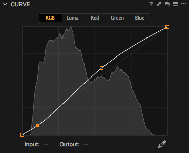
Curves are one of the main tools for professional image editing. It allows you to get the full manual control over image’s contrast and color.
Besides all the common features like per-channel work, Capture One’s Curve tool also has several amazing unique features:
A) Layers support
Curves in Layers open a whole new dimension of image processing possibilities.
First of all – using Curves with masks from Color Editor you would be able to change any color of the image completely:
The second useful case is a local color correction, it’s absolutely irreplaceable for wedding and portrait photography.
Third unique feature – black and white points correction in layers. It’s not quite evident, but you can set local black and white points for each layer with Curves.
If you’re a landscape photographer, I’m pretty sure you’ll love this tool.
B) Luma Curve
RGB Curve correction has some limitations, and the most common problem is that it also affects image saturation.
To avoid that issue, Capture One has created an additional type of Curve called Luma. It affects only luminance of the image and works the same way as L-channel in LAB does.
For example, Luma Curve is an excellent tool to add some contrast to, without ruining image colors.
C) User-friendly interface
Curve is a considerably complicated tool in itself and it is really important to have a convenient interface to use it.
In Capture One, you can change the size of your Curve tool or create separate tools for each channel:
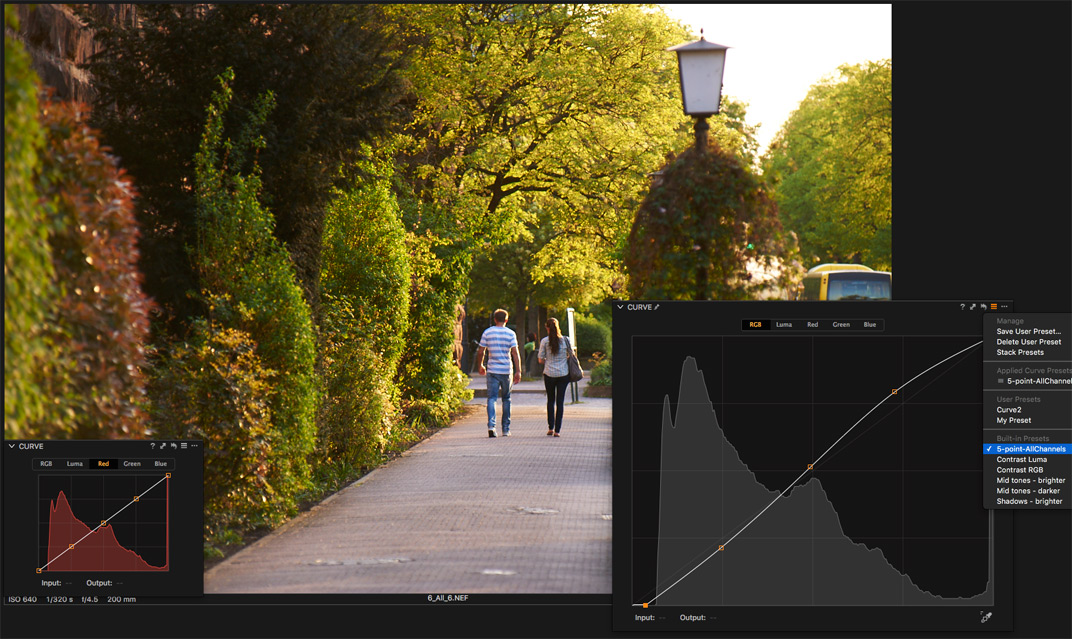
And don’t forget to use a handy built-in preset with 5 standard points on the Curve.
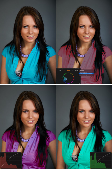
1. Color Editor
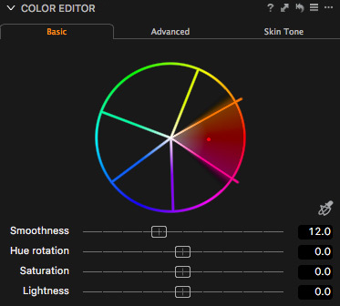
Above the great color rendering, Curve and Levels tools stands Color Editor – the main tool for color correction in Capture One.
It’s a real game-changer that makes professional work with color at times easier and faster.
Color Editor allows you to select and to work with any color on the image. What is really convenient is that you may see where on the image the selected color is located.
For example on that image, I would like to correct shirt’s color hue without affecting the skin tone.
It’s tough because skin and shirt colors are quite close, however, in Capture One, you can easily select only the necessary color.
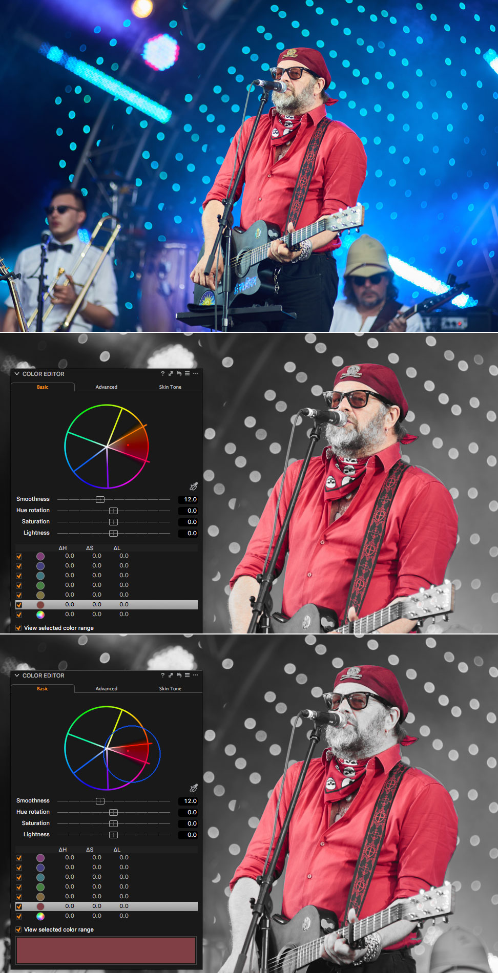
But what do you do, when few objects in the frame are absolutely the same in color? Turn on the layers!
Color Editor works great with masks, it allows you to process local color correction of any object in the image.
Now you see, why I put Color Editor on the first place, it’s a really amazing tool. But it has one more feature that every portrait photographer would love.
Color Editor has a special Skin Tone mode for detailed portrait color correction. In Skin Tone, you can select a color and unify its hue, saturation, and lightness to a chosen color.
In the end
As you’re reading this article, you might think, that I’m quite blind to limitations of Capture One. This is not true: I totally agree that it would be great to add some sort of History tool and radial gradient to Capture One and to make dozens of other small improvements.
But I have seen how everything was changing. The first time I tried Capture One version 3, it was a completely different application. Year after year, update after update it became better and stronger.
I would understand if you have tried Capture One 6 or 7 and didn’t find enough reasons to switch. 5-6 years ago Capture One’s main advantage was a clear color rendering and tethered shooting capabilities.
Things have changed and after many years of evolution Capture One can beat any other software not only in color but with a mass of unique editing features.
Today there is only one reason not to try a new gear – admit to yourself that your old 18-200mm lens was and will always be good enough.
Best regards,
Alex Svet

![rtspic2[1]](https://learn.captureone.com/wp-content/uploads/sites/2/rtspic21.jpg)
![rtspic5[1]](https://learn.captureone.com/wp-content/uploads/sites/2/rtspic51.jpg)
![rtspic8[1]](https://learn.captureone.com/wp-content/uploads/sites/2/rtspic81.jpg)
![rtspic9[1]](https://learn.captureone.com/wp-content/uploads/sites/2/rtspic91.jpg)
![rtspic11[1]](https://learn.captureone.com/wp-content/uploads/sites/2/rtspic111.jpg)
![rtspic12[1]](https://learn.captureone.com/wp-content/uploads/sites/2/rtspic121.jpg)
![rtspic14[1]](https://learn.captureone.com/wp-content/uploads/sites/2/rtspic141.jpg)
![rtspic15[1]](https://learn.captureone.com/wp-content/uploads/sites/2/rtspic151.jpg)