NOTE: This article discusses an outdated version of Capture One. To learn more about our latest version, click here.
Capture One Pro is a powerful RAW image processing converter that supports the digital workflow from importing to exporting images. In this post we will look at the many ways in which you can export your images from Capture One Pro, including printing.
Exporting Original Format Images

Export Originals to Finals Folder
If you need to export your original RAW files, or any other image format from your catalog, you can do this simple. I do it to make a copy of my final selects to my Finals folder, which is covered in details here.
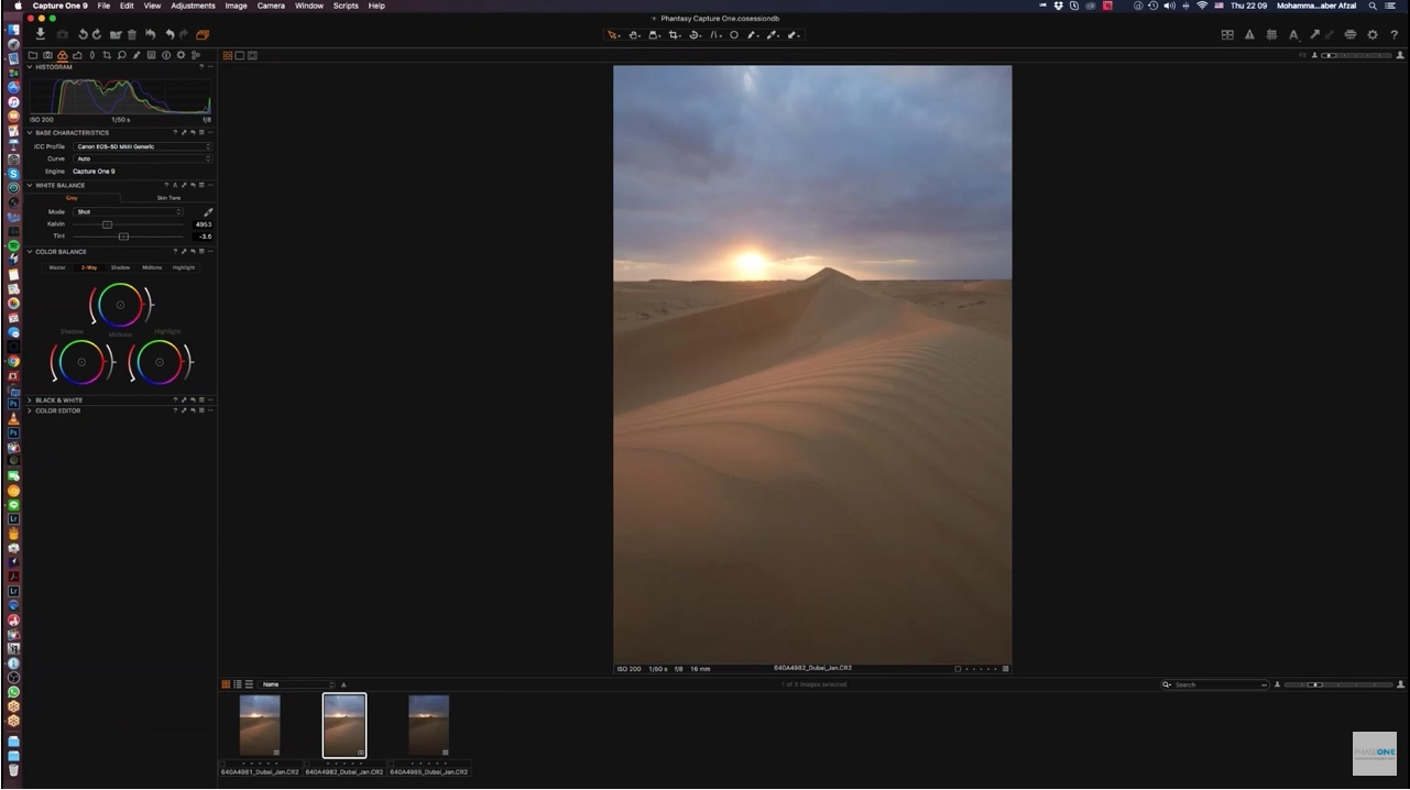
To do so, select the images you want to export, and right click one of the thumbnails. From the shortcut menu, select Export, then select Originals. You can also get to this option from the File menu.
I don’t change the image name on export, since I changed it on import. After checking the destination etc., click the Export button, as you see in the screenshot to your right.
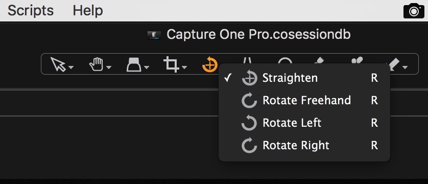
Output – Process Recipes
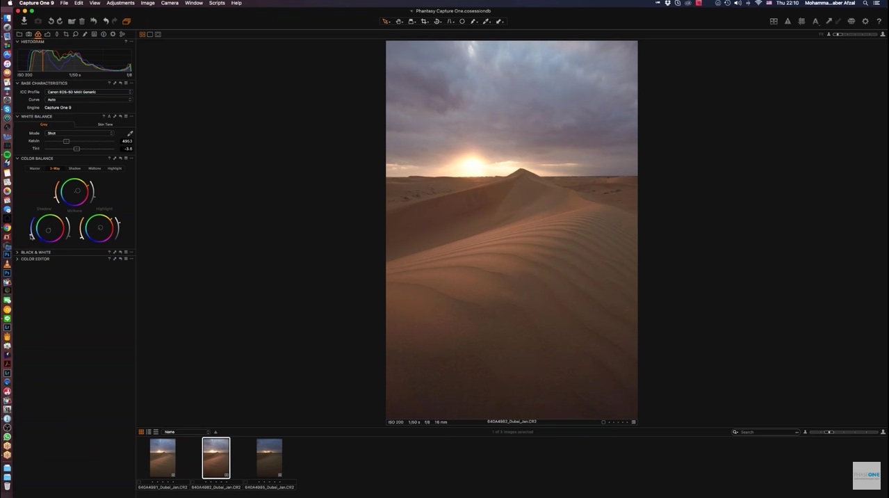
For most other file export operations, you’ll first jump to the Output tab in Capture One Pro. This is the single, orange cogwheel icon in the top left corner of the below screenshot. If you can’t see the details, try to click on the image to make it larger.
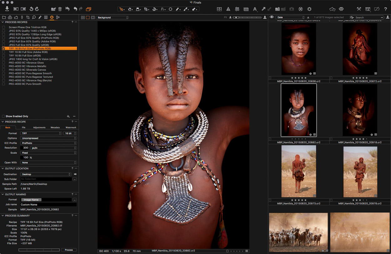
Capture One Pro Output Process Recipes
In the Output screen you can create and select Process Recipes, which are used to export your images into various formats and sizes. When you first install Capture One there are a number of Recipes, but I created most of the above.
Export Formats
Capture One Pro supports images in JPEG, JPEG QuickProof, JPEG XR, JPEG 2000, TIFF, DNG, PNG and PSD file formats. Therefore, if you intend to import your images back into Capture One, avoid Photoshop PSD files. I use TIFF format for all images that I bring back into Capture One if I, for example, went to Photoshop to do some extensive cloning.
You can change the file format from the Format pulldown under the Process Recipe > Basic section. If you’re going to output that format more than once, save yourself some time by creating a Process Recipe preset.
Process Recipe Presets
To create a new Recipe, click the + button at the bottom of the Process Recipes panel. An Untitled Recipe will be added to the list, with the name ready for you to change it. You might enter something like “TIFF 16 Bit Full Size (ProPhoto RGB)”, which would be good for exporting images to Photoshop.
Export for Web
During export you can resize images and add watermarks. Let’s have a look at how you might create an Export for Web Process Recipe.
Note that if you start changing the settings under the Process Recipe section before creating a new Recipe, it’ll only change the currently selected Recipe. Let’s hit the + button at the bottom of the Process Recipes section first, and give our Recipe a name, fx “Export for Web”.
Although you can export as PNG, the JPEG format is more suitable for photographs for the Web. I usually select 92 for the Quality, because it halves the size of the file but leaves no visible artifacts.

Export for Web Process Recipe
Resolution is good at 72 pixels per inch for the Web, and I’m going to set the Height to 960 pixels. I like my landscape orientation images to be 1440 pixels wide and 960 pixels high. Though, to stop my portrait orientation images from getting too tall, I also resize those to 960 pixels high. Selecting 960 pixels high resizes both orientations correctly.
I’d like to be able to open my images in Finder after they’re all created. However, Finder isn’t actually listed as an Application on the Mac OS, so I leave Open With set to None.
Select an Output location, and if you want to change the file name, select a preset for that too. You can see a summary of your settings in the Process Summary area.
Before we click the Process button, let’s check a few other things.
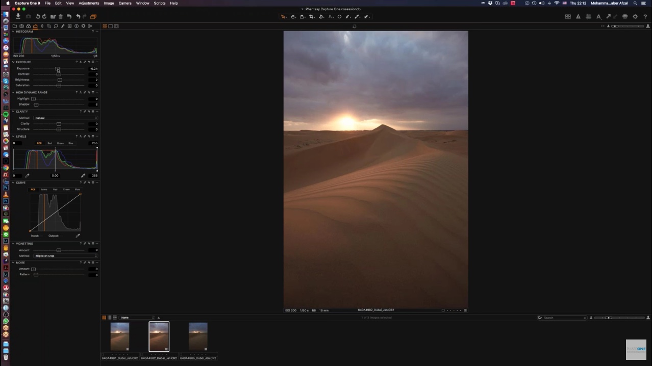
As you generally want your resized images to be sharpened, uncheck Disable Sharpening under the Adjustments tab.
Under Metadata, select your required options. It’s best to keep your Copyright information in tact, but you may want to remove GPS coordinates, especially if you’re going to share images from your home. Camera Metadata is usually OK to include, and actually better if you’re sharing your images in an education centric environment. Keywords are usually a good idea too.
Watermarking Images

Add a Watermark
If you like to watermark your images, you can do that under the Watermark tab. This is illustrated in the screenshot to the right.
I just use my logo in black with a white drop shadow, and reduce the Opacity to 77%. This makes it somewhat transparent, but can be seen on most colored backgrounds. That way I don’t have to mess around selecting a different colored logo depending on the background.
The Horizontal and Vertical positions shown here will place the watermark in the bottom left hand corner. To adjust the position, click on the little hand icon at the top right corner of the Watermark panel.
Once this is set, click the Process button, and your selected images will be output to the specified Output folder. Resized, watermarked and ready for the Web.
Export to Multiple Formats simultaneously
One of the other great things about Capture One Pro’s Output tab is that you can turn on the checkbox for multiple Process Recipes. Once you press the Process button, you’ll get a copy in all of the selected file formats and sizes.
If you want to specify an output location for certain image types, you can select a different location under the File tab. This is saved in your Process Recipe, which is very useful.
Round Trip Editing
To send a selected photograph to another application for editing, you can right click a thumbnail and select Open With. Here you can select the third party application, such as Photoshop, from the submenu. Keep in mind that this method will open the original file without any of the changes from Capture One.
If you want to keep your changes, a better option is to send the image straight to the other program. To do so, right click the image and select Edit With. This opens a dialog for you to select the format and color space etc., as you can see in this screenshot. Note also that this will create a copy of the image that it sends to Photoshop.

Edit With Dialog
Moreover, note that under the Adjustments tab of this dialog, there is a Disable Sharpening option. Most of the time, RAW files need some sharpening to make them look normal again. Keep this option in mind, and uncheck it to enable sharpening when necessary.
The great thing about this Edit With method is that the copy is automatically added to your Catalog. So, when you’re done editing in the third party program, it’s right there waiting for you in Capture One Pro.
Always Soft Proofing
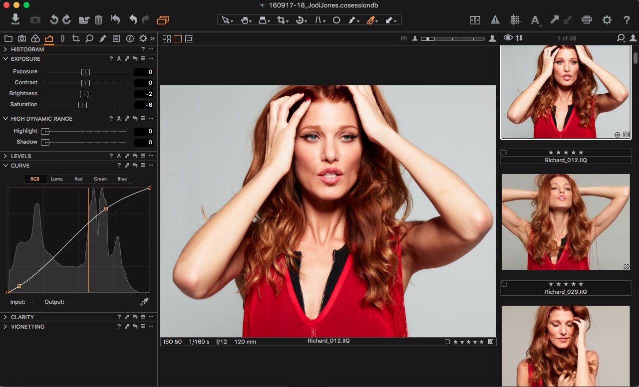
One of the coolest things about Capture One Pro is that you are pretty much always in soft proof mode. This means you get to see the selected Color Space or ICC Profile’s affect on your images as you edit and output them.
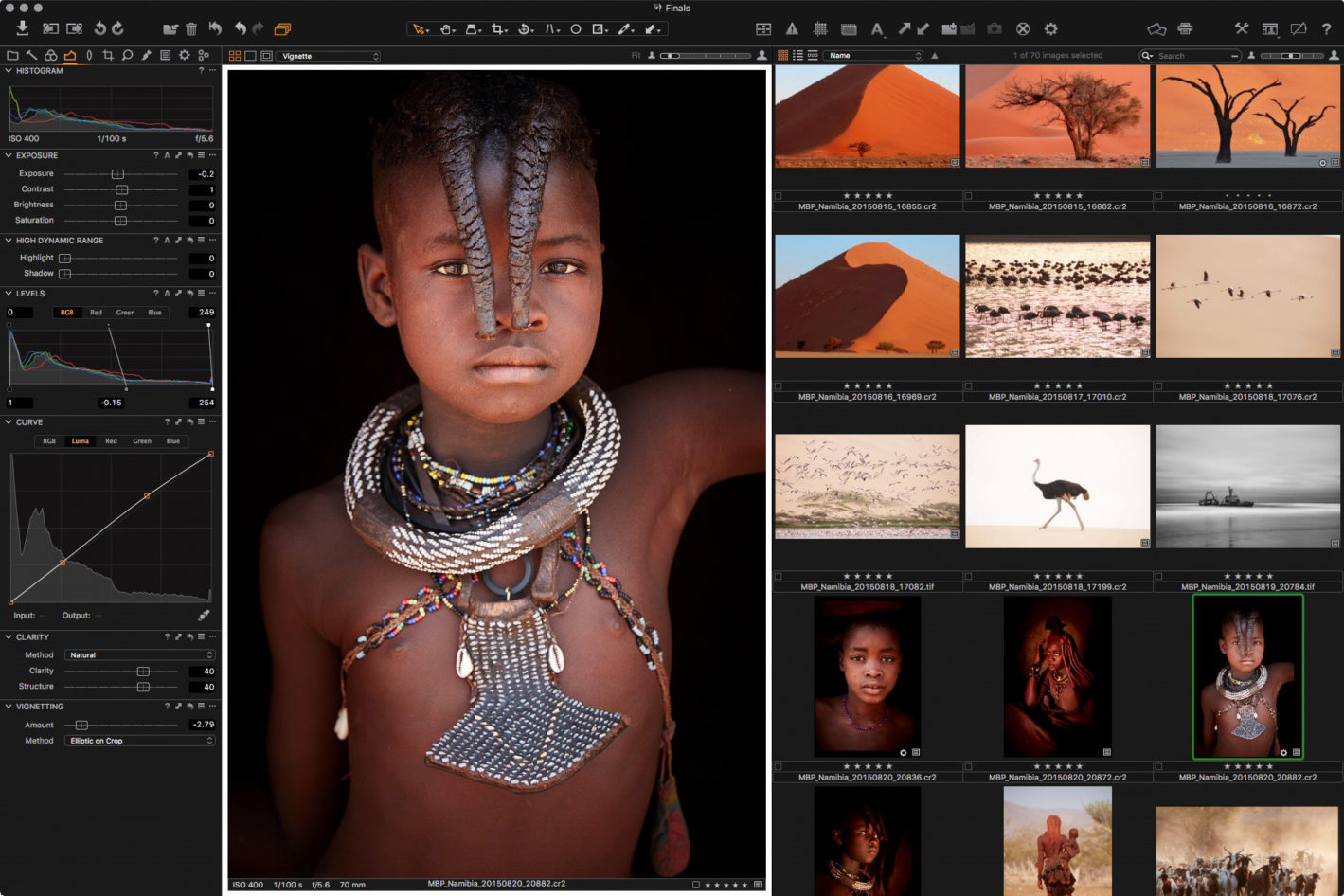
In the earlier screenshots with the Himba Girl, I had a 16 bit TIFF Process Recipe selected, which was using the ProPhoto RGB color space. This gives me the most wiggle room when editing my images. I also have an Adobe RGB and an sRGB color space TIFF Process Recipe, so I can easily compare all three color spaces.
Most of the time, as I switch between these various sized color spaces, the software correctly converts them. Therefore, it’s difficult to see any difference.
I have a few black and white images processed in Capture One Pro, that change slightly in the Capture One Pro interface. However, when I export them, they all look the same, so I actually think that’s a problem with the software rendition of the image on screen.
A very import application of this soft proofing feature is that you can choose to view your images using either a specific profile, or always use the profile that you have selected from the Process Recipes list, regardless of where you are in the user interface. To make Capture One always use the selected Process Recipe ICC profile, choose Selected Recipe from the Proof Profile submenu (Under the View menu).
Soft Proofing for Print
With Capture One set up to always use the Selected Recipe’s ICC profile for preview, you can create a Recipe and select one of your print ICC profiles. This is an advantage in order to get a soft proofing view of your images before printing them. I selected a 16 bit TIFF, and selected my printer ICC profile while creating a number of printer soft proofing profiles:

Soft Proofing for Print
Note that when soft proofing for print, it’s generally a good idea to change the background to white. This way you simulate the white borders or matte around your print. If you view the print with a dark background, it makes the paper simulation look too harsh, and it’s difficult to really gauge what your printed image will look like.
To change the background color, change the Color for the Viewer under the Appearance tab in your Capture One Preferences. Also, while you are in the preferences, set a widish Proof Margin, say of around 30 pixels. With that set you can easily turn on the Proof Margin with the button at the top left corner of the viewing area, next to where it says Background in this screenshot.
Finally, if you have Viewer Labels turned on, showing shooting information and the filename below the large preview of your photo, turn that off by selecting Hide Viewer Labels, under the View menu. By this point, you’ll have a photo totally surrounded by white.
Adjusting for Print
You can see in the above screenshot, selecting a matte media type, like Breathing Color’s Pura Bagasse Smooth, can make the image look pale and lack contrast. I find that the reality is better than this in print, but it’s a good guide, as matte prints are never as punchy as gloss prints.
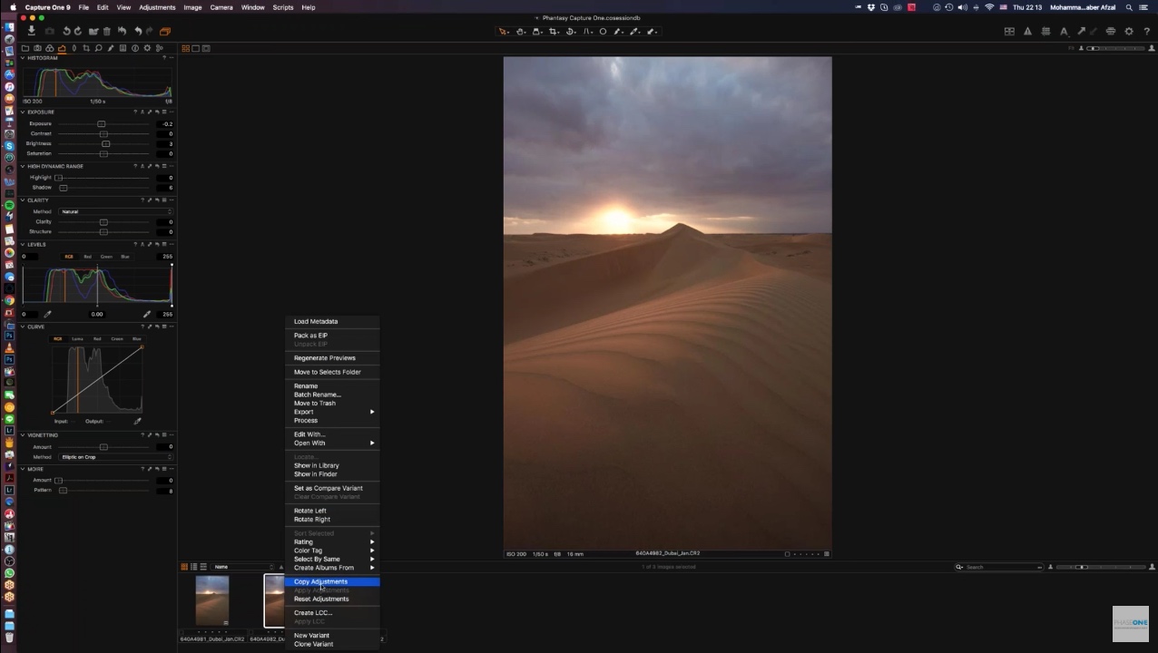
If you want to change only your print image, it’s a good idea to make a Variant, which is a virtual copy of the original. When you right click a thumbnail and select New Variant, you get a copy of your image without any of the changes you’ve made to the image. Assuming you want to keep those changes and make further adjustments for your print, select Clone Variant from the shortcut menu.
Using Color Readouts
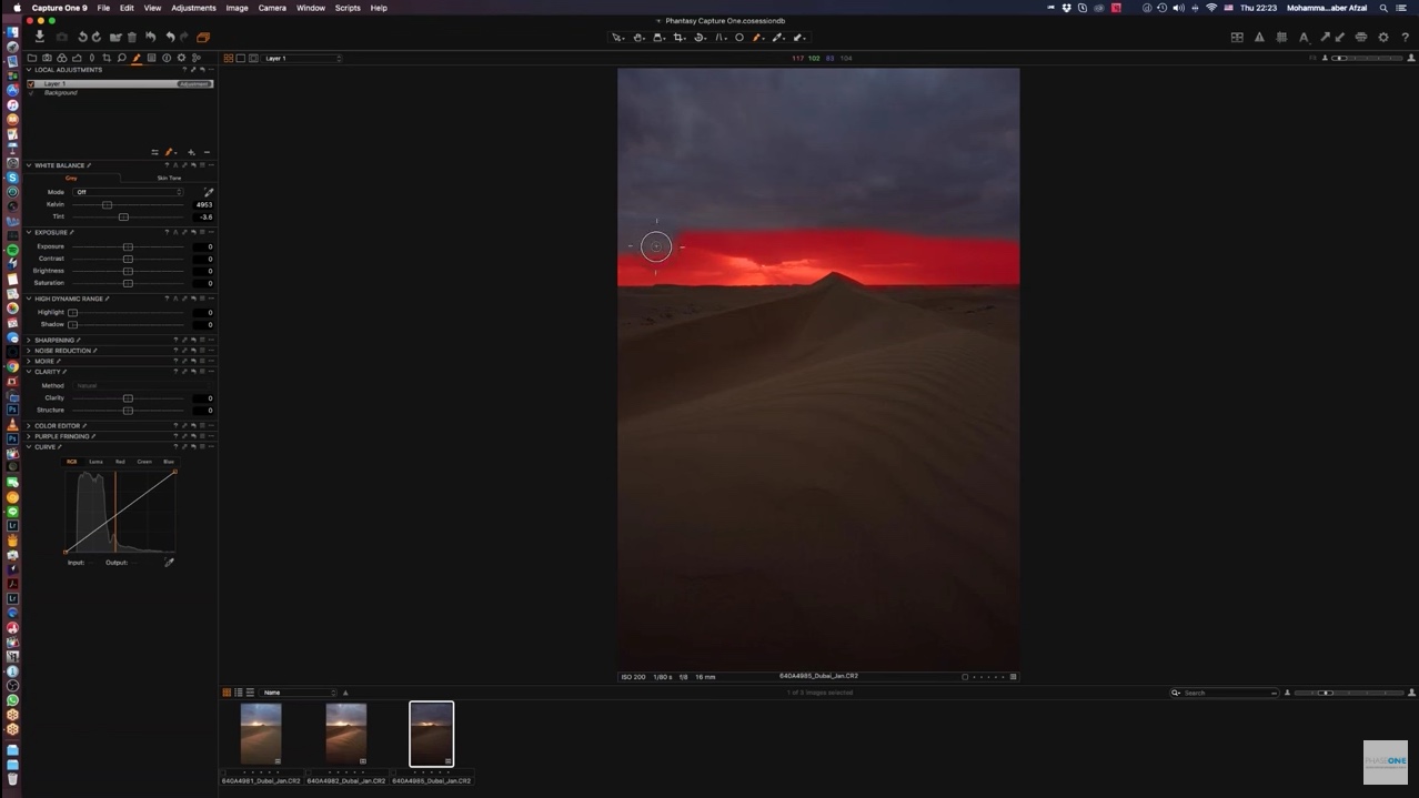
Another very useful feature in Capture One, especially when it comes to preparing to print, is the Color Readouts. Generally, when printing, you want to avoid total black and total white. I often don’t head this advice myself when it comes to blacks. I’ll go to 100% black and my printers usually handle it fine, but it’s worth understanding this theory, and generally worth trying to avoid pure white.
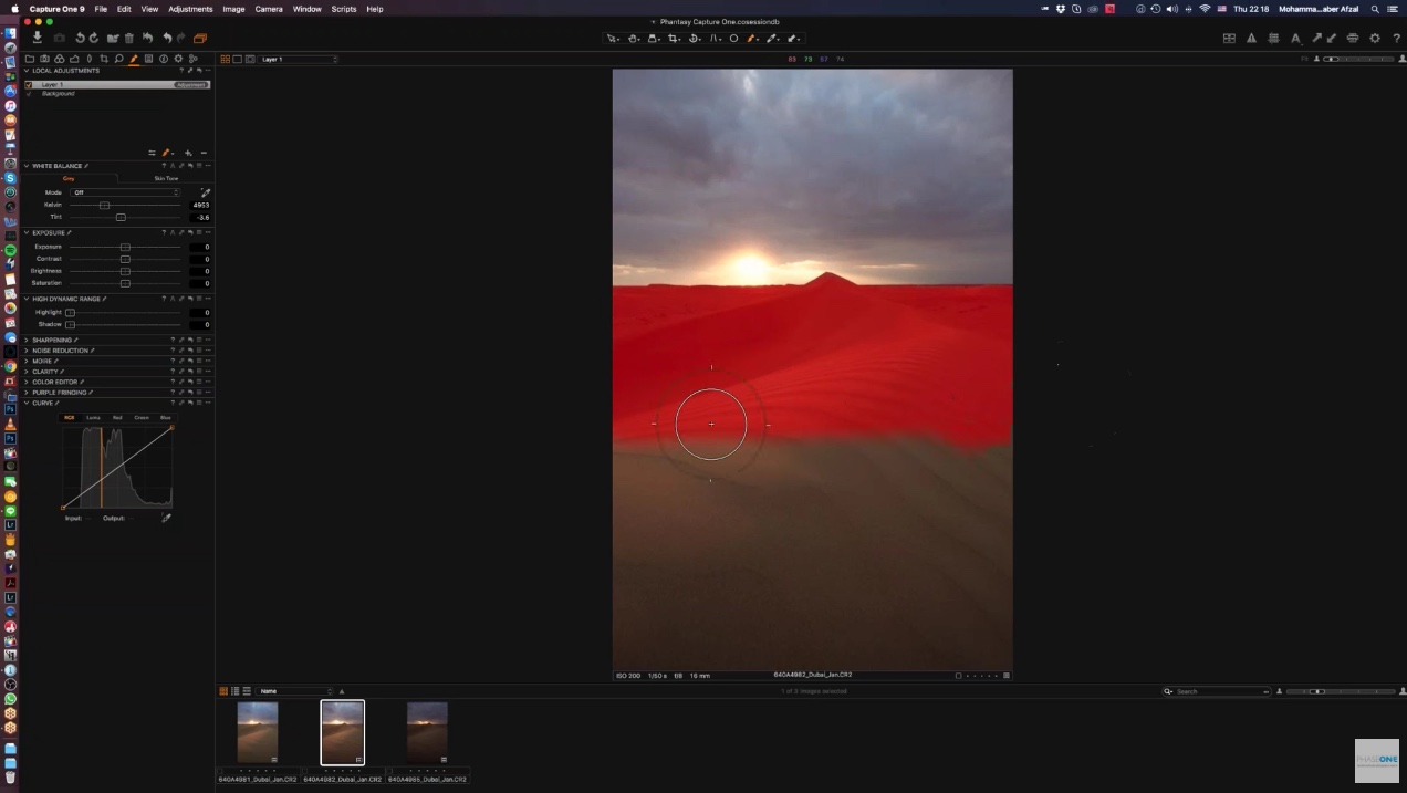
Select Add Color Readout from the bottom of the Picker tools, which is second from the right in the toolbar above the viewer in the below screenshot. Then, click on some of the key areas of your photograph. I like to check the darkest area, the brightest highlight, and a mid tone.
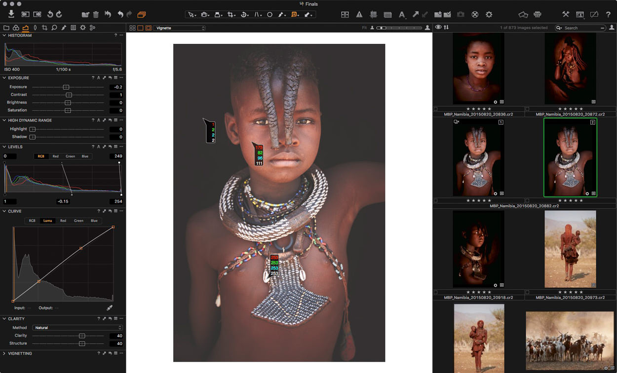
Using Color Readouts
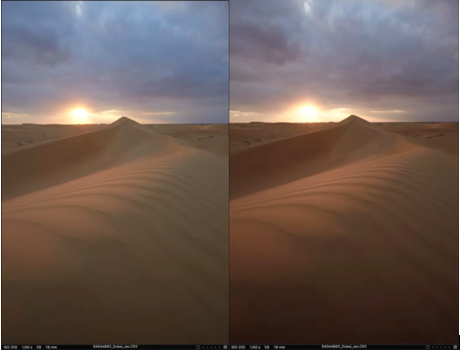
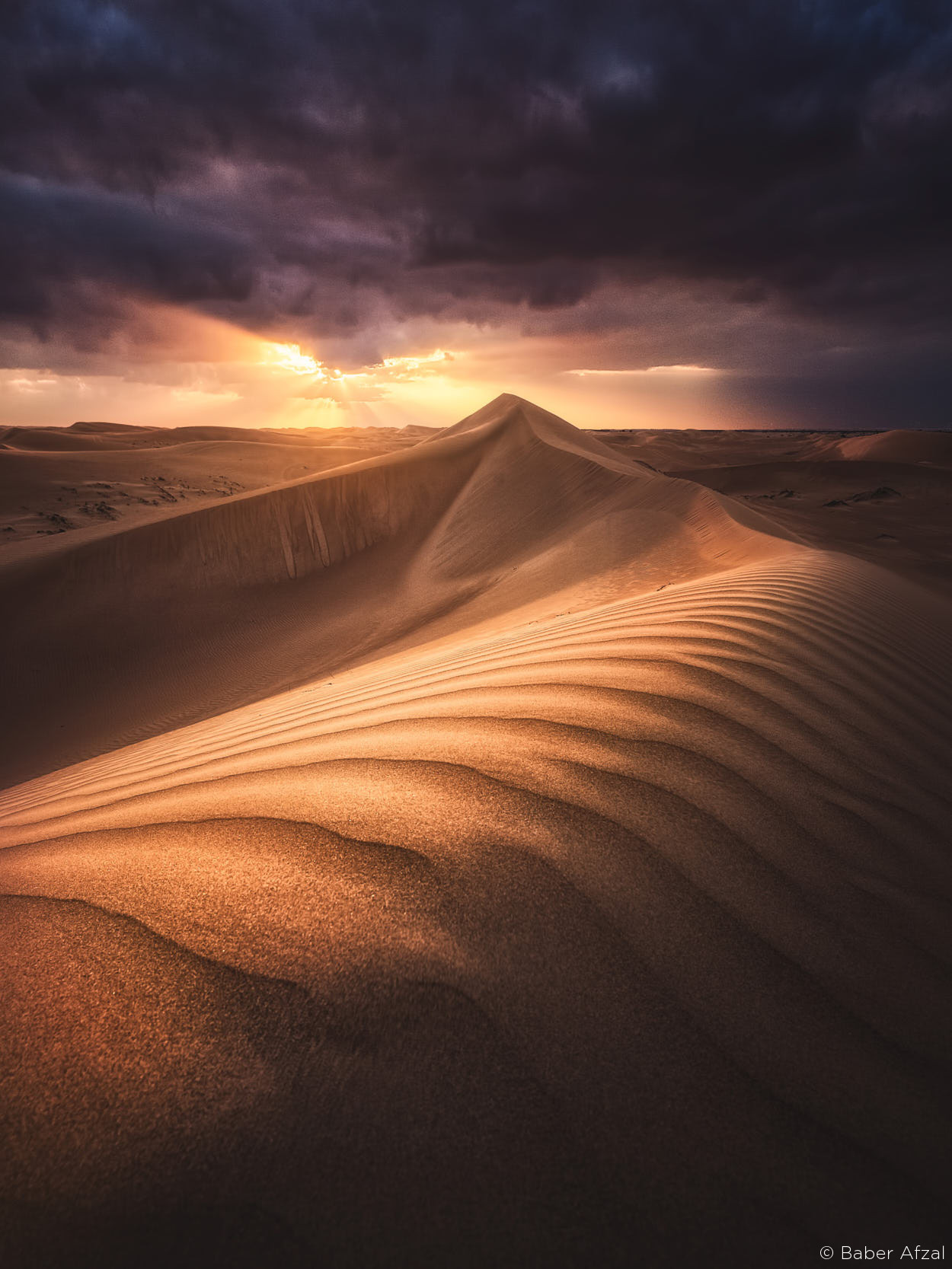
When I placed these Color Readouts on my original, the background was 0, total black, and the shell was 255, which is pure white. So, I created a Clone Variant, and adjusted my Levels, to bring these values in just a little, which would be good printing practice. You can see that now, in my resulting image, my darkest background has a luminance of 2. My brightest highlight, the shells on this Himba Girls traditional necklace, is 253. Her face is 111.
Exposure Warnings
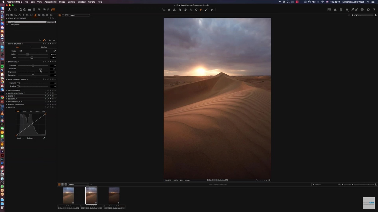
Another option for checking the darkest and brightest areas of your print image, are the Exposure Warnings. These can be turned on with the warning triangle icon. I set my highlight warnings at 253 and my shadow warning at 2. The background is mostly 2 or darker, but I intentionally darkened that, and I’m fine with printing this image with just a little tweak.

Exposure Warnings
If you want to make any other modifications for print, increasing contrast, changing the colors to stop them going out of gamut, now would be the time to do it. Unfortunately, I haven’t found a way to display gamut warnings in Capture One Pro, so unless it’s really well hidden, I don’t think it’s supported. I’m hoping this is something that will change at some point.
Printing
Just as I always printed from Lightroom, I love to be able to print right in my processing and workflow tool. Plus, I hate printing from Photoshop, so I’ve been printing quite happily from Capture One Pro for the last few weeks.
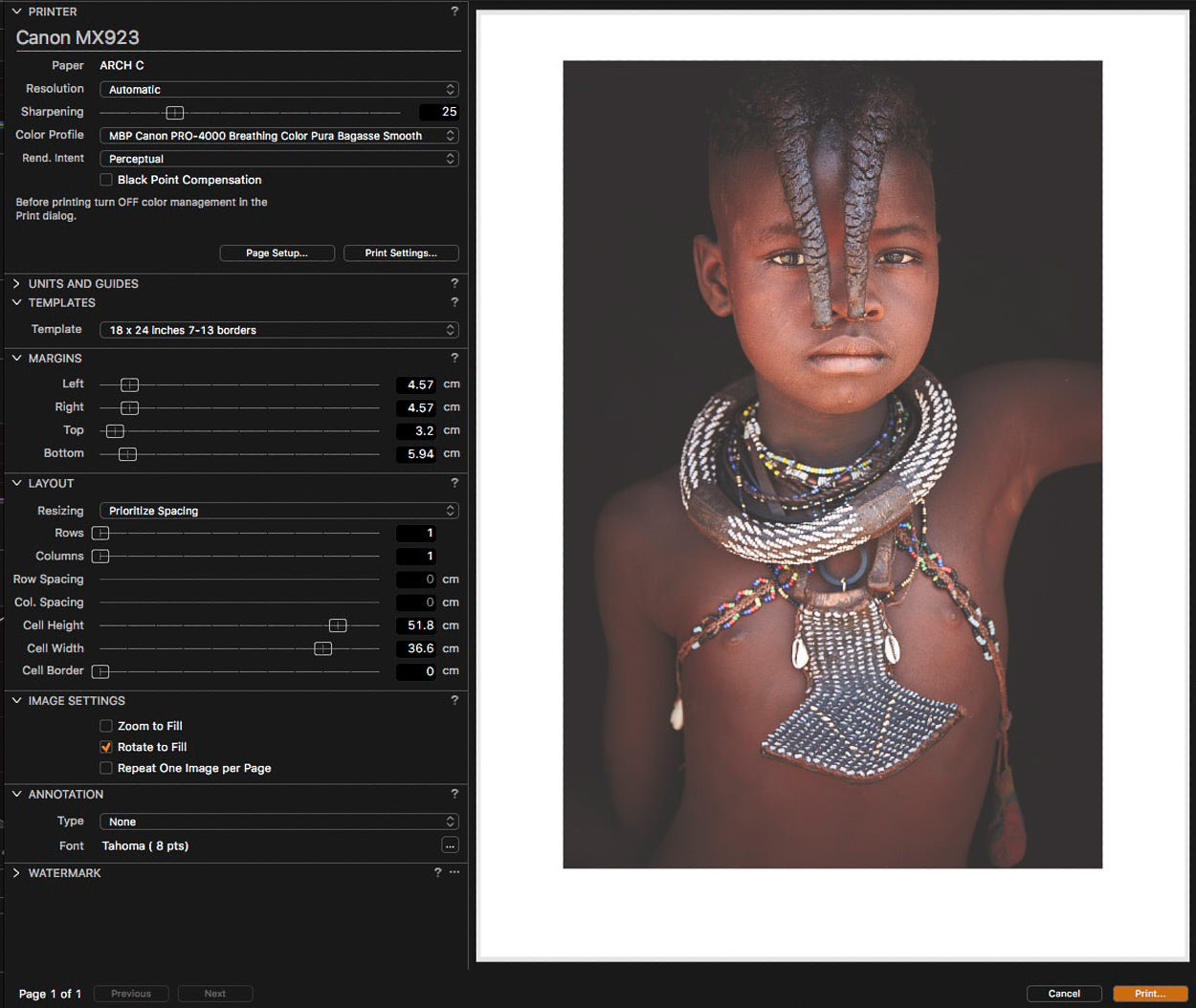
In Capture One Pro, you can hit the Print button from the top menu at any time, regardless of where you are in the program. The print window opens, and you get to select your settings. This is unlike Lightroom, where you go to the Print module to print.
We can create templates in Capture One Pro to save margin and layout information. However, it forgets about page size and ICC profiles whenever you close the program. Fortunately, these are quick settings to change, so select your paper size and the ICC profile for your printer and media combination from the Color Profile menu.
Printing from Capture One
From what I’ve seen so far, Capture One’s print Sharpening is enough for my images when set at 25. You may need to change this, depending on how sharp your original image is. Also, it may need to be increased for larger prints too.
You can set your margins depending on how much border you want. I use my 7:13% offset border to raise the image up slightly. You can see the dimensions I use in my Print Borders spreadsheet, which you can download here. Once you have entered your border dimensions, click the Templates pulldown, and select Save User Template. In the above screenshot you can see that I called this one 18 x 24 inches 7-13 borders.
So, now I can quickly recall my margin sizes and I’m ready to hit the Print button.
Another cool thing about Capture One is when you switch from Landscape to Portrait orientation, the borders automatically switches. Consequently, I no longer have to save a separate template for each orientation.
That was all for now. If you have any questions or advice for this topic, please let me know in the comments.
If you want to see or read more from me, feel free to visit my website: www.martinbaileyphotography.com
Best regards,
Martin Bailey