Working with natural light is often challenging as you have less control over the outcome, especially if you want to get that shot there and then. Thankfully, with Capture One’s suite of tools and in particular targeting those adjustments in Layers, the potential for achieving your vision is greater than you think!
Join award-winning fine art photographer and filmmaker Baber Afzal as he demonstrates the process in this step-by-step guide. Remember that you can download a free Capture One trial here.
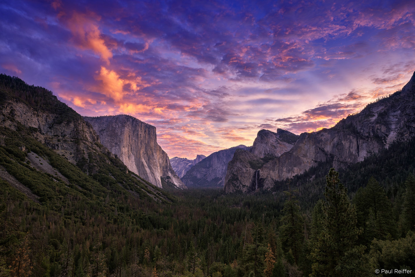
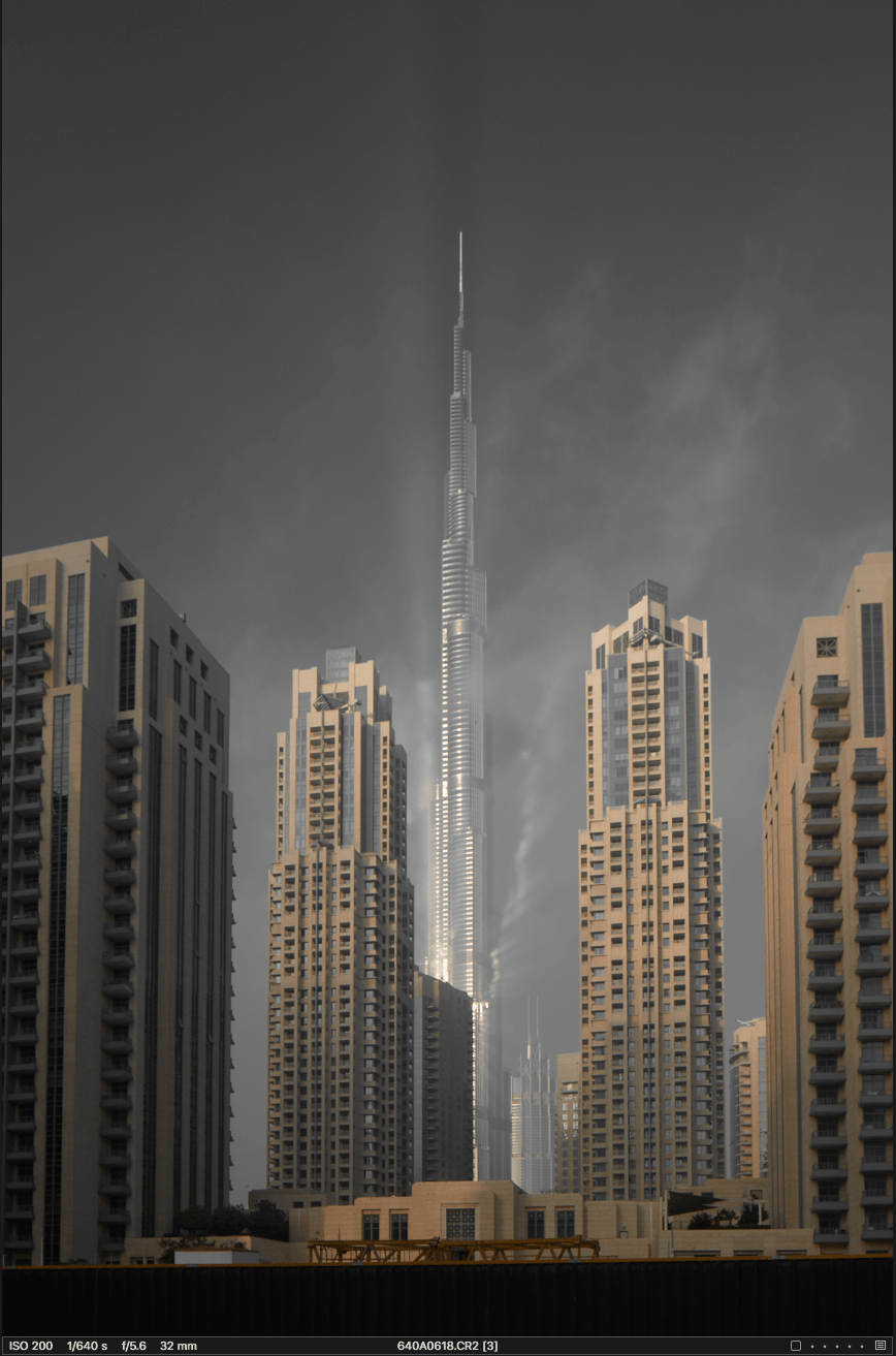
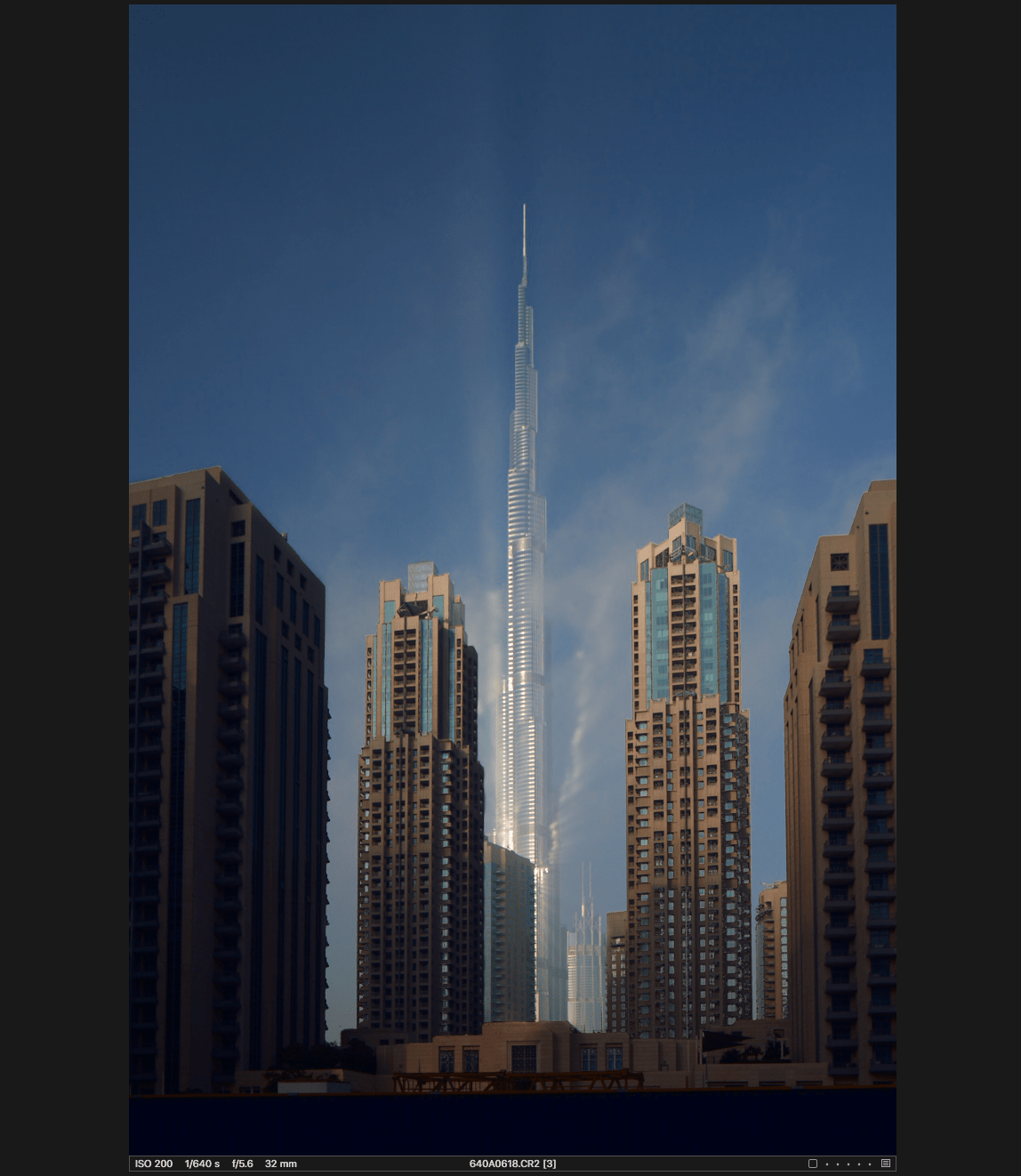
The following image was shot towards the end of December of last year, 2017. We had the most amazing conditions come to life when fog started rolling in during the afternoon in Dubai which is really rare. This shot was taken while we were crossing downtown and I noticed this unreal reflection on Burj Khalifa that we just couldn’t miss as the low flying fog was making its way through.
Now let’s talk about the process of how I edited this image in Capture One. Below is a step by step breakdown with screenshots of the tools I used.
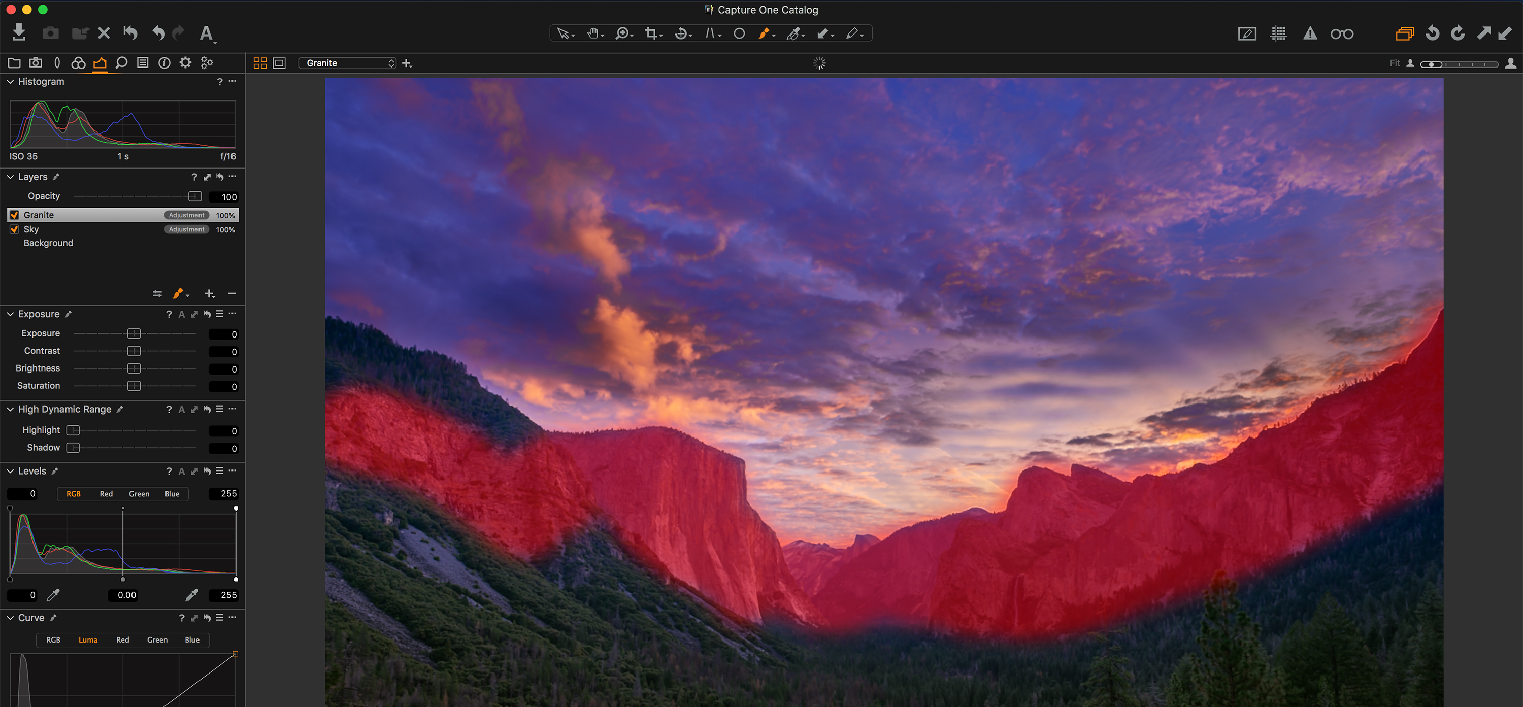
Global Adjustments
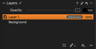
I’m going to use both layers and global adjustments for this image. Global adjustments form the base layer by affecting the entire image. In the Layers Tool, this is the Background layer.
Exposure
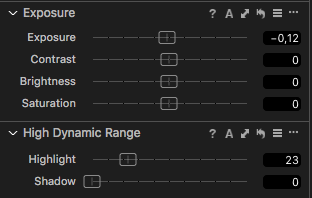
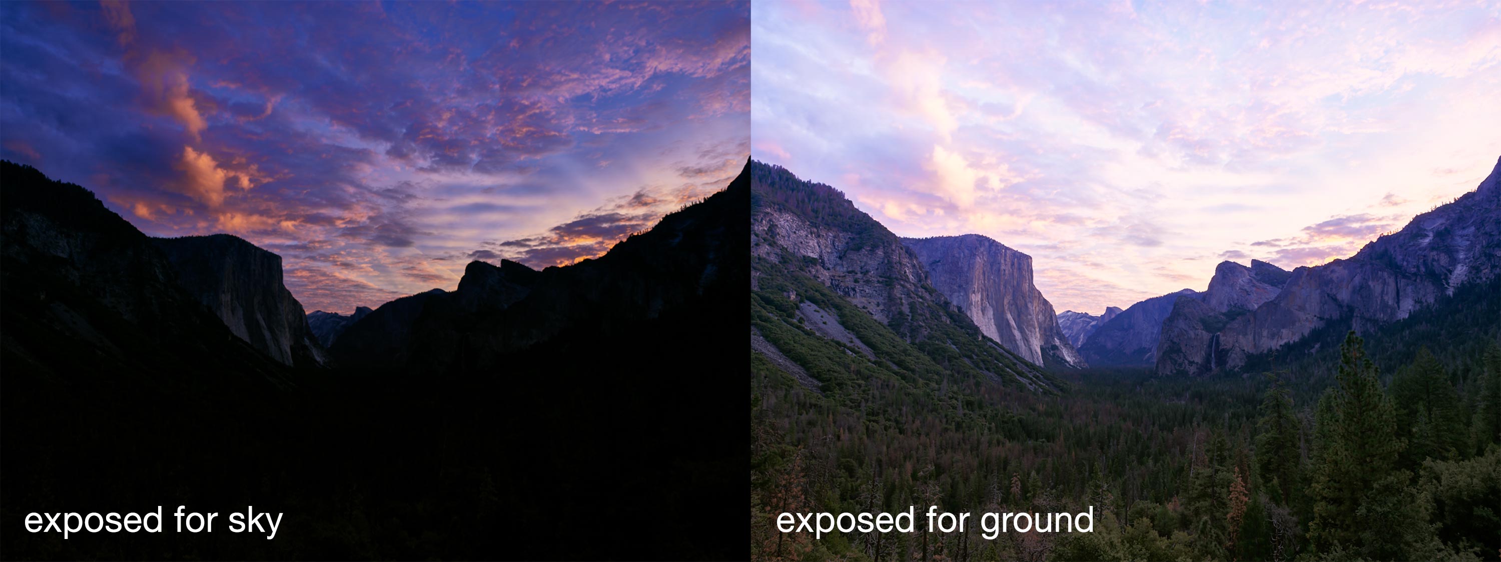
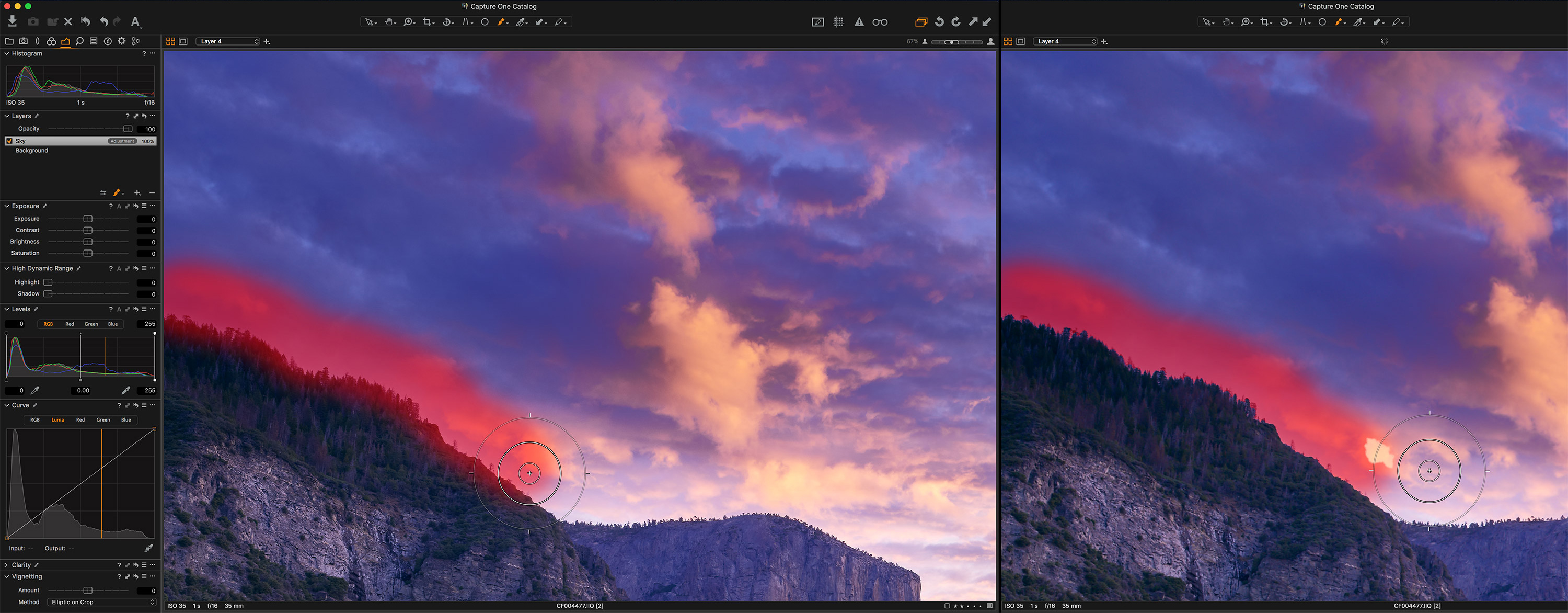
Looking at the histogram, it’s clear that the image is underexposed. To compensate for this, I added some slight exposure and brightness. Mixing the two gives better control of the overall lightness of the image, as brightness will preserve the highlights better.

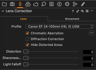
Checking for chromatic aberrations and purple fringing
Next up is checking for chromatic aberrations and purple fringing. This is a pretty common phenomenon when shooting architecture and landscape. Chromatic Aberration is ticked as default within Lens Correction, and luckily this image didn’t suffer from purple fringing. No further actions required.
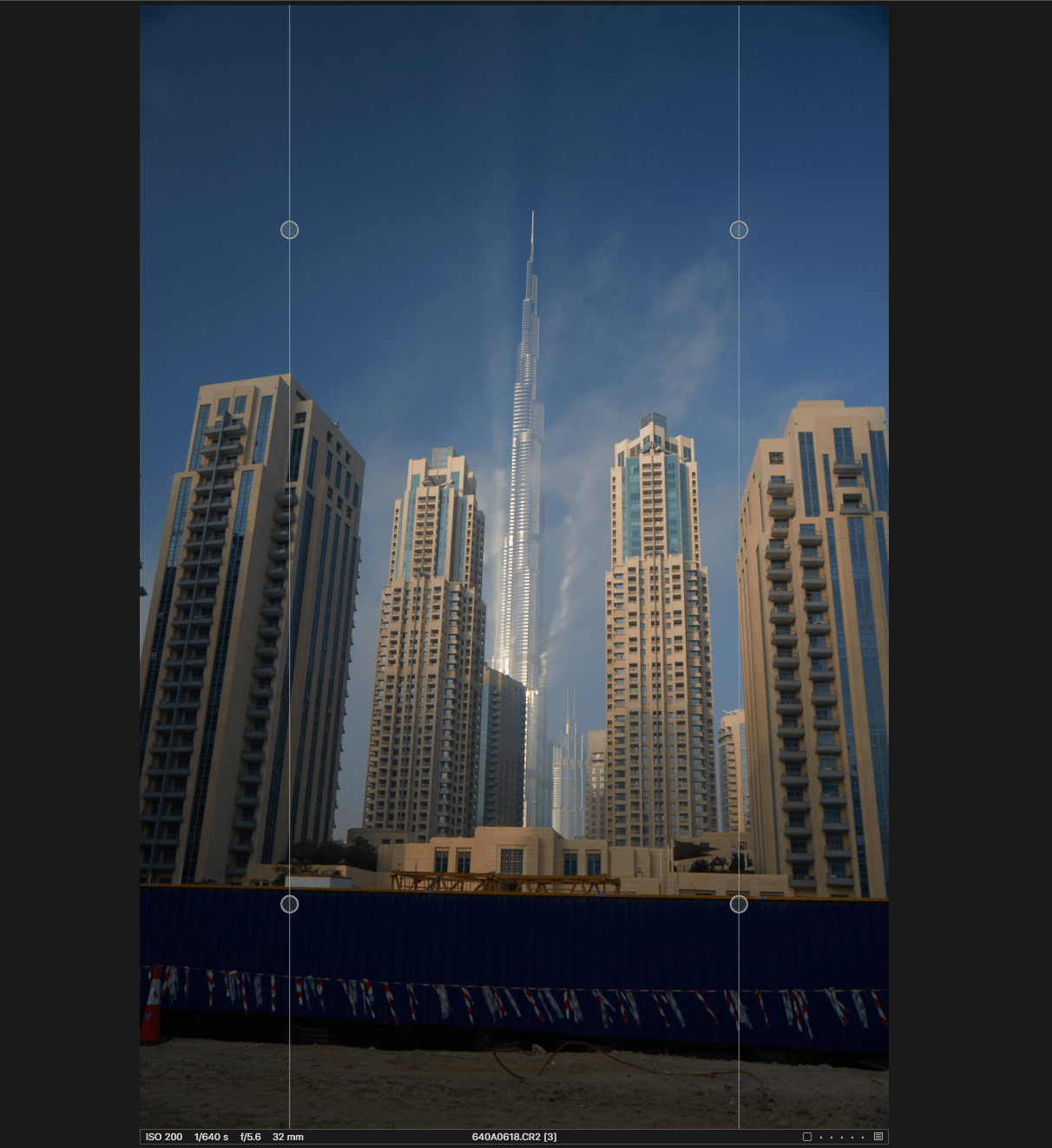
Straightening vertical lines
Shooting buildings upwards like this image will always produce tilted vertical lines unless you use a technical camera. This is fixable using Keystone Vertical in Capture One.
I simply dragged the round handles on the two lines to make them align with vertical lines in the image, like so:
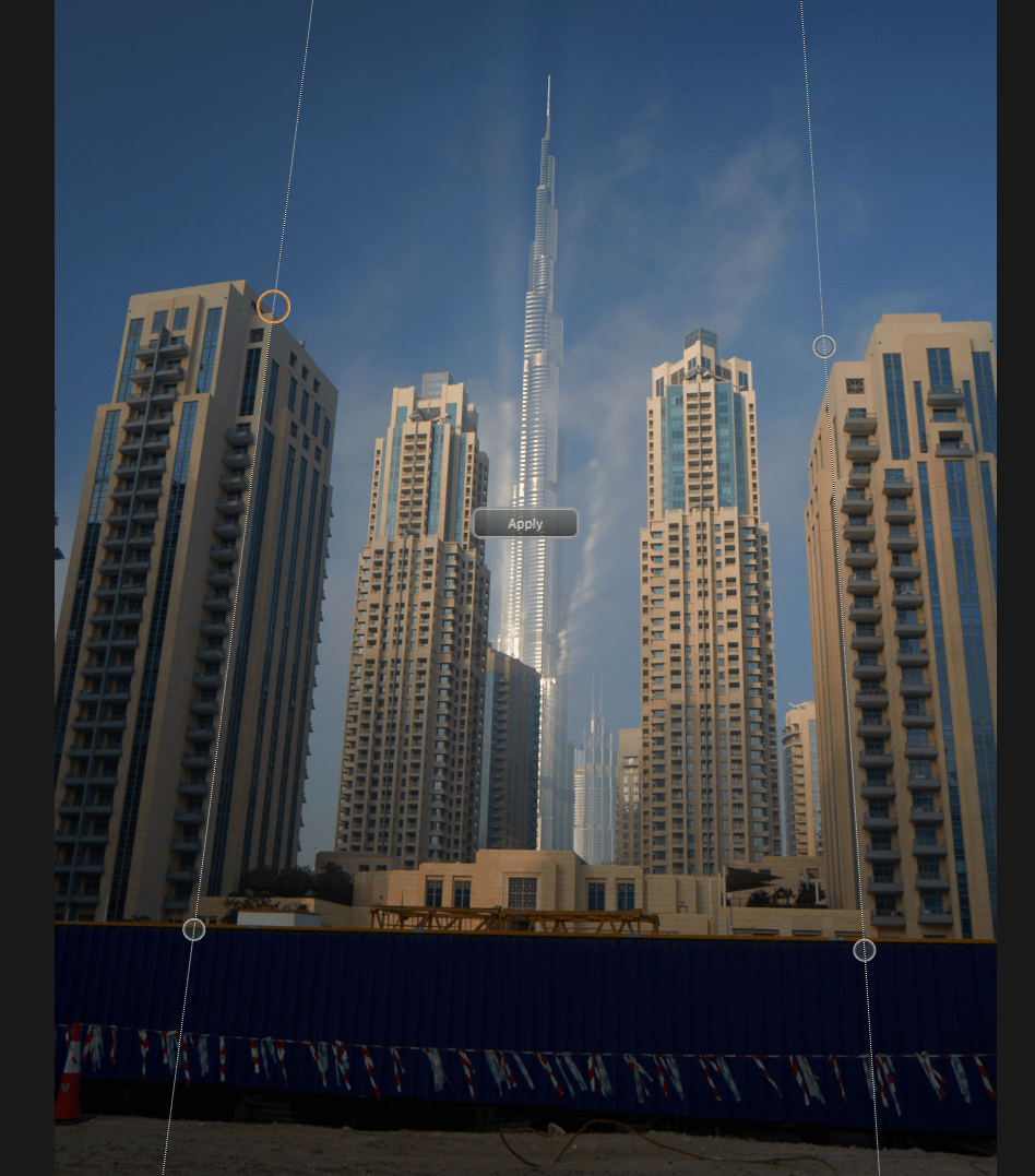
After clicking Apply in the middle, the image looked like so:

The keystone correction was now applied, and I simply needed to switch to another cursor tool, for example, V (Select), to see the actual image.

Making local adjustments to the foreground buildings
The first step towards muting these buildings is by masking them out first.
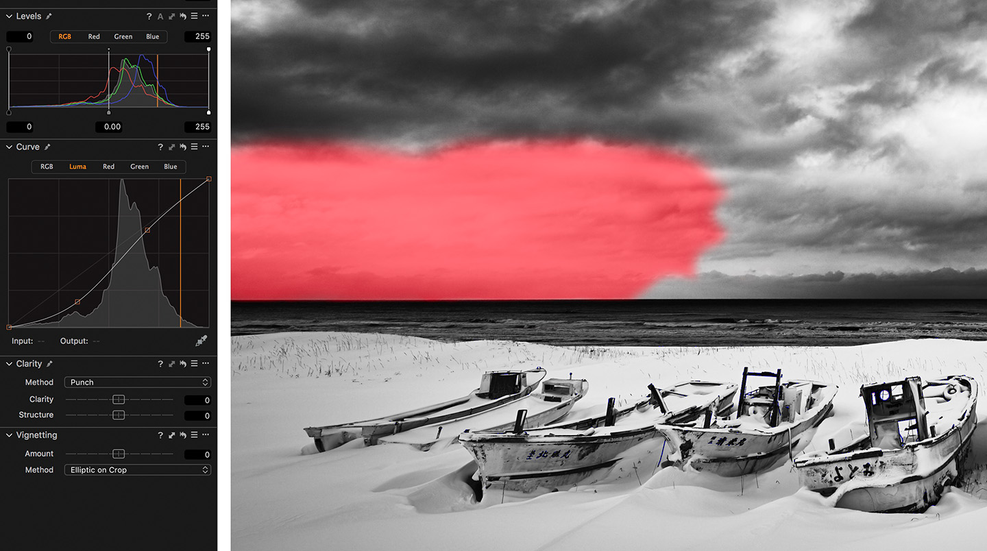
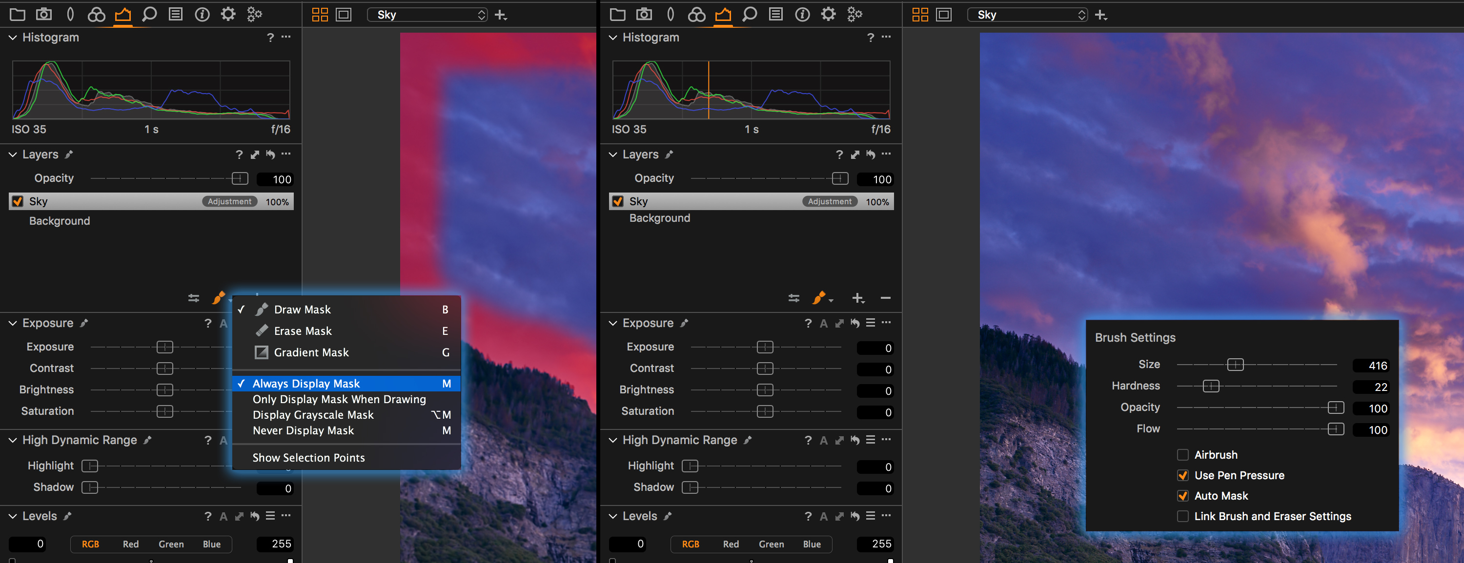
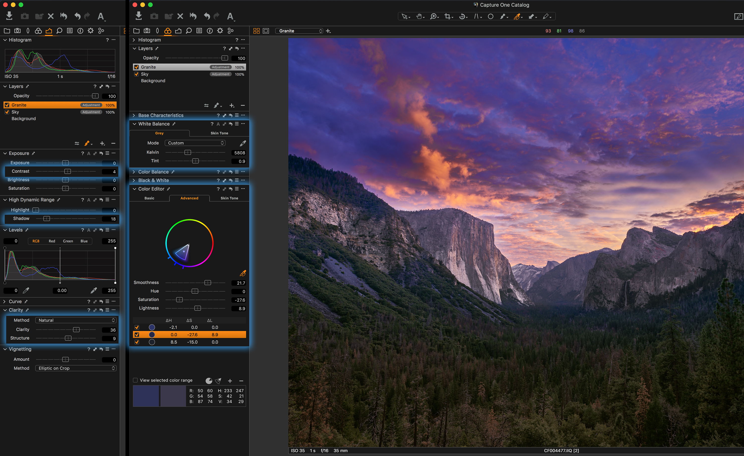
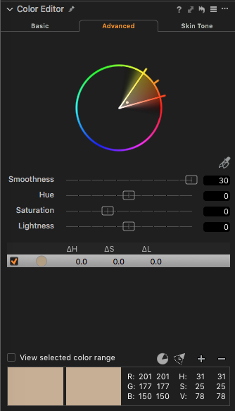
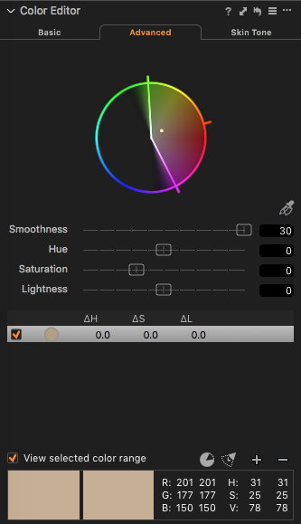
The best way for us to create our mask is by using the Advanced tab in the Color Editor Tool.

The Color Picker, highlighted in Orange, is used to pick the brown color of the building, shown below.

The resulting color wheel will look like this.

Now we need to stretch out the radius so that we can affect the full spectrum of that color. Also increase the Smoothness value too. The resulting wheel will look as below.
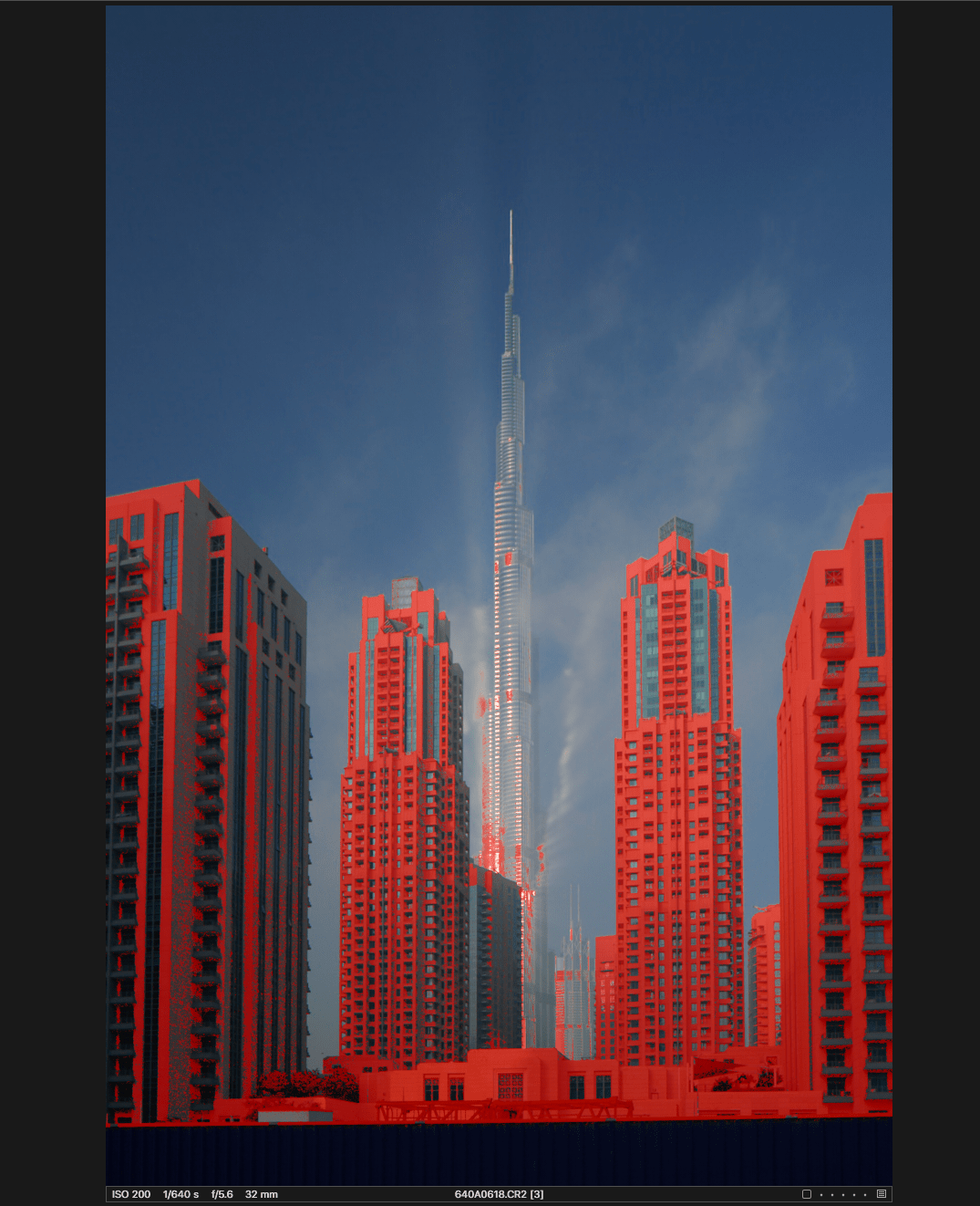
Next, click on View selected color range to see which areas of the image are selected. Any color not part of the selection will show as monochrome in the image. Gradually keep widening the handles in the color wheel to make sure we cover all the colors available in the building except for aqua and blue since we don’t wish to select the sky.
The resulting wheel will look like the one above and the resulting image will look as follows with View selected color range checked.
We can be confident enough that we have managed to cover most of the colors available in the foreground building. The windows won’t be selected since they match the color of the sky or almost share similar color space.
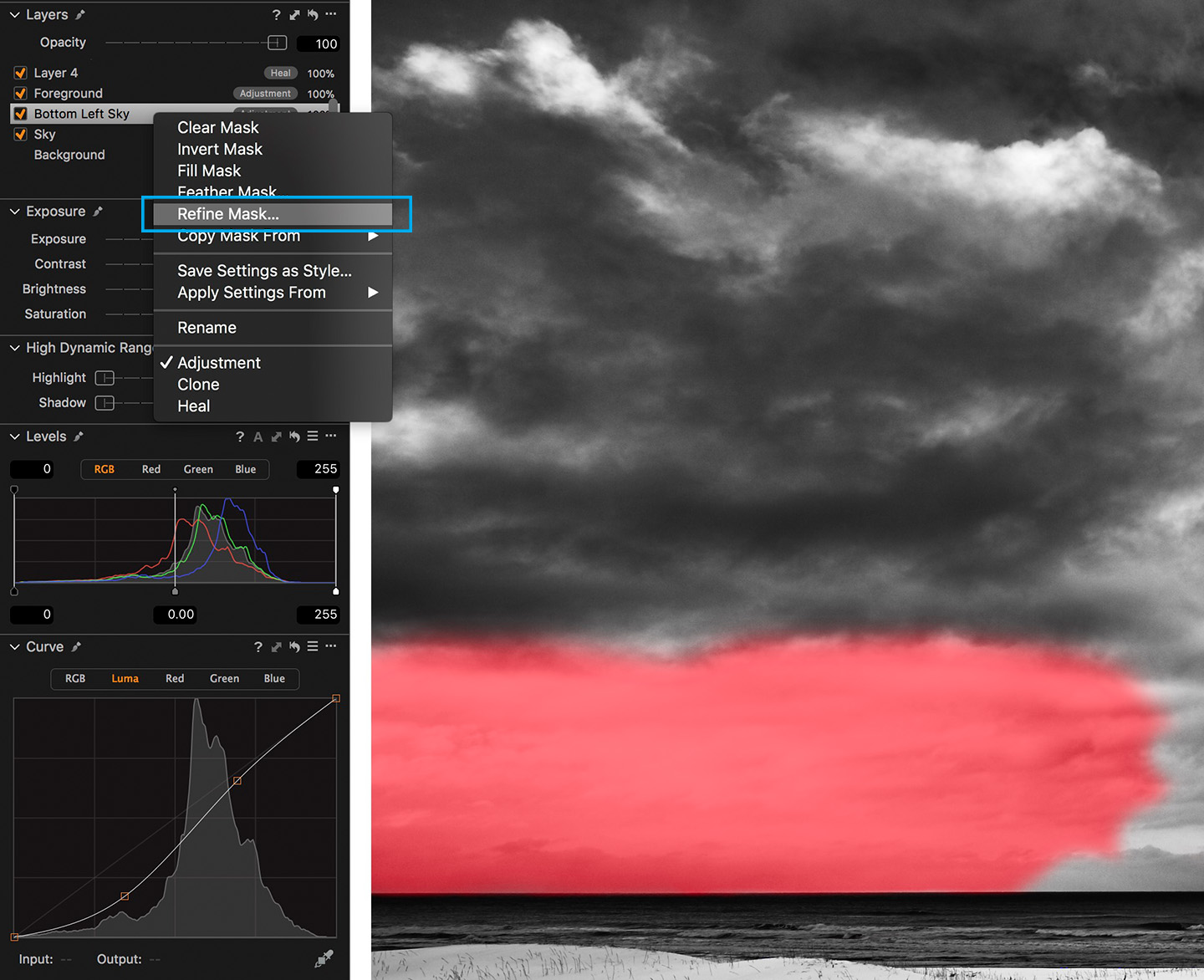
The next step is to convert this color range selection into a layer mask. As shown below, simply click on the three dotted lines on the extreme right side of Color Editor and click on Create Masked Layer from Selection.

This will create a new Layer.
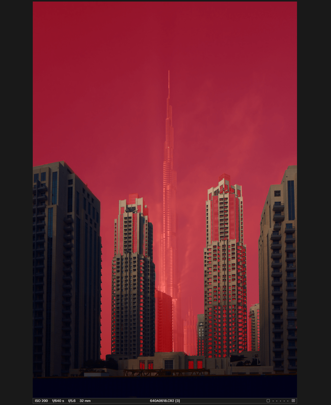
The Masked Layer is shown in red on the image. Toggle M to turn the mask on and off.
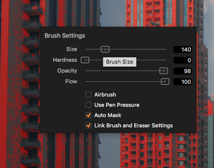
Capture One has done a pretty incredible job with the selection, but now it’s time to fine-tune the mask by using the brush cursor tool. Click B to select the brush and right-click to set the brush size to 140 and keep the Auto Mask feature ON, so that when we brush along the side of the building, it doesn’t bleed into the sky.
The leftmost building and the second building from the left need help in fine-tuning.
Below is the final mask we managed to make in 5 minutes with the brush tool. Now we have successfully made a mask for the foreground buildings as we discussed.

Next, I will make the necessary adjustments to this layer in order to give a mute feeling to those buildings. I have used the below panels and adjustments.
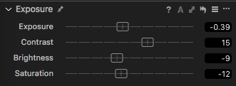
I increased the Contrast slider in the Exposure panel to give a bit of pop to the top parts of the two middle buildings. This slider is smart in the sense that already saturated colors receive less of an increase than those colors that are not. Also, highlights are protected to a certain extent.
Now the image looks like this:
We managed to get a pretty decent muted feel of the buildings in the front. The reason for us to give this muted feeling is so that we can bring focus to the building in the back, the Burj Khalifa.
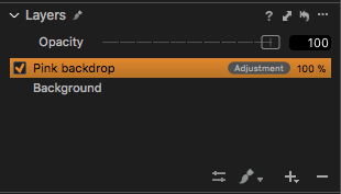
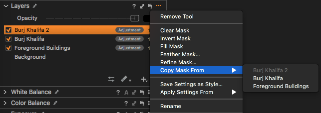
Now let’s create a new empty layer and rename it to ‘Burj Khalifa.’ Click on the three dots in the top right corner of the Layer panel and click on Copy Mask From – Foreground Buildings.
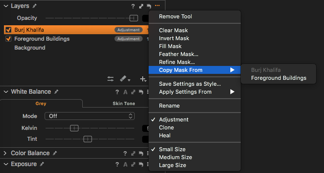
This will copy the mask that exists on the Foreground Buildings layer we made onto the new Burj Khalifa layer.
After doing this, enter the same menu and click on INVERT Mask.
Now you have successfully created a background layer simply by inverting the layer as shown below.
Making Adjustments to the Burj Khalifa Layer
It’s time to divert the viewer’s attention to the main subject – the Burj Khalifa.
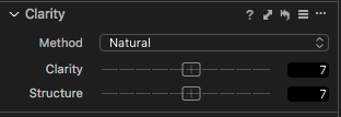
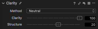
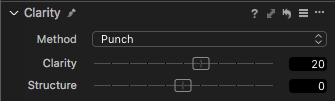
The best way for this image is to use the Clarity tool. The beauty of the Clarity tool is its ability to adjust the mid-tone contrast without potentially losing highlight or shadow detail.
As you can see below, I adjusted Clarity to the maximum value and set the structure to 20 to bring out the edges of Burj Khalifa a little.
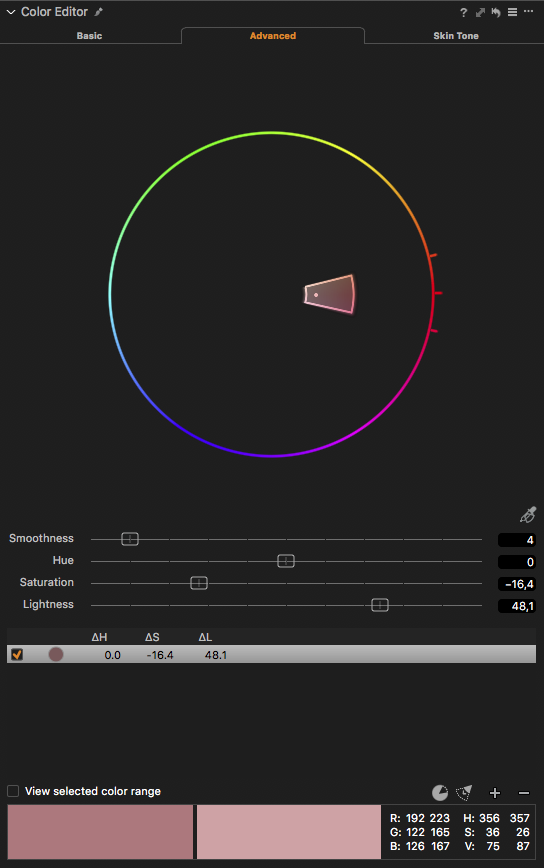
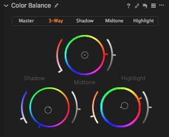
I made some additional changes to this Layer too. To give the layer a bit more punch, I used the Advanced tab of the Color Editor again and this time selected the blues (referring to the sky in this case).
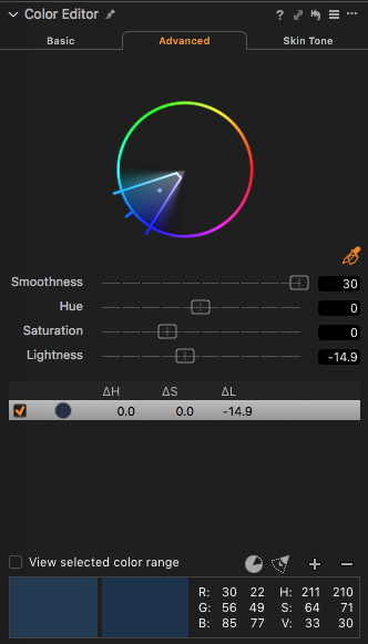
I reduced the lightness by around -15 so that the sky can become a bit darker and at the same time not affecting the luminosity values of the fog where the reflection is happening, giving it a nice pop.
Below is the image so far.

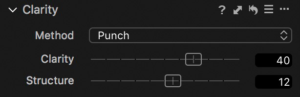
I still believe we have a bit more room to add extra Clarity to the Burj Khalifa, so let’s create a new layer again and name it ‘Burj Khalifa 2’.
As we did earlier, simply copy the same mask again of the Burj Khalifa. Now we can use this layer to add a bit more Clarity to it, so it makes the reflection look more refined.
This time I used Punch for the Clarity mode so that it adds a bit of vibrancy and contrast to the mid-tones.
Again – the image so far.

Adding the finishing touches
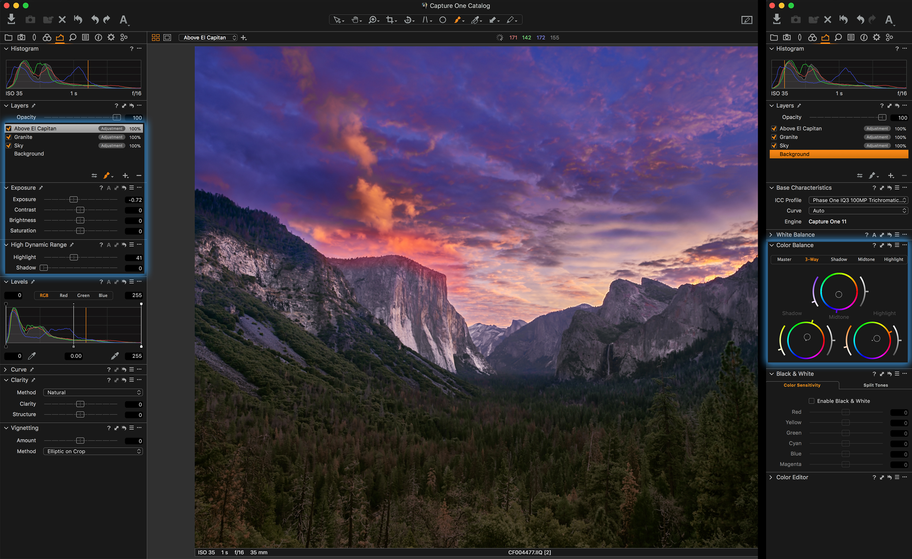
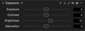
After reviewing the image, I just need to add a few finishing touches to the “Background.” This will affect the whole image.
I decided to bring up the brightness a bit since the image became a bit too dark due to the changes we made.
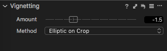
I’ve also added a little Vignetting.
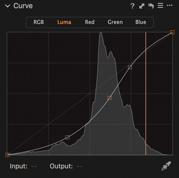
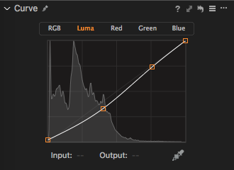
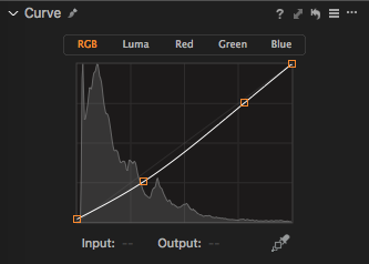
And finally, a Curve adjustment by bringing up the blacks by 5 points and lowered the midtones while I left the highlights the way they are.
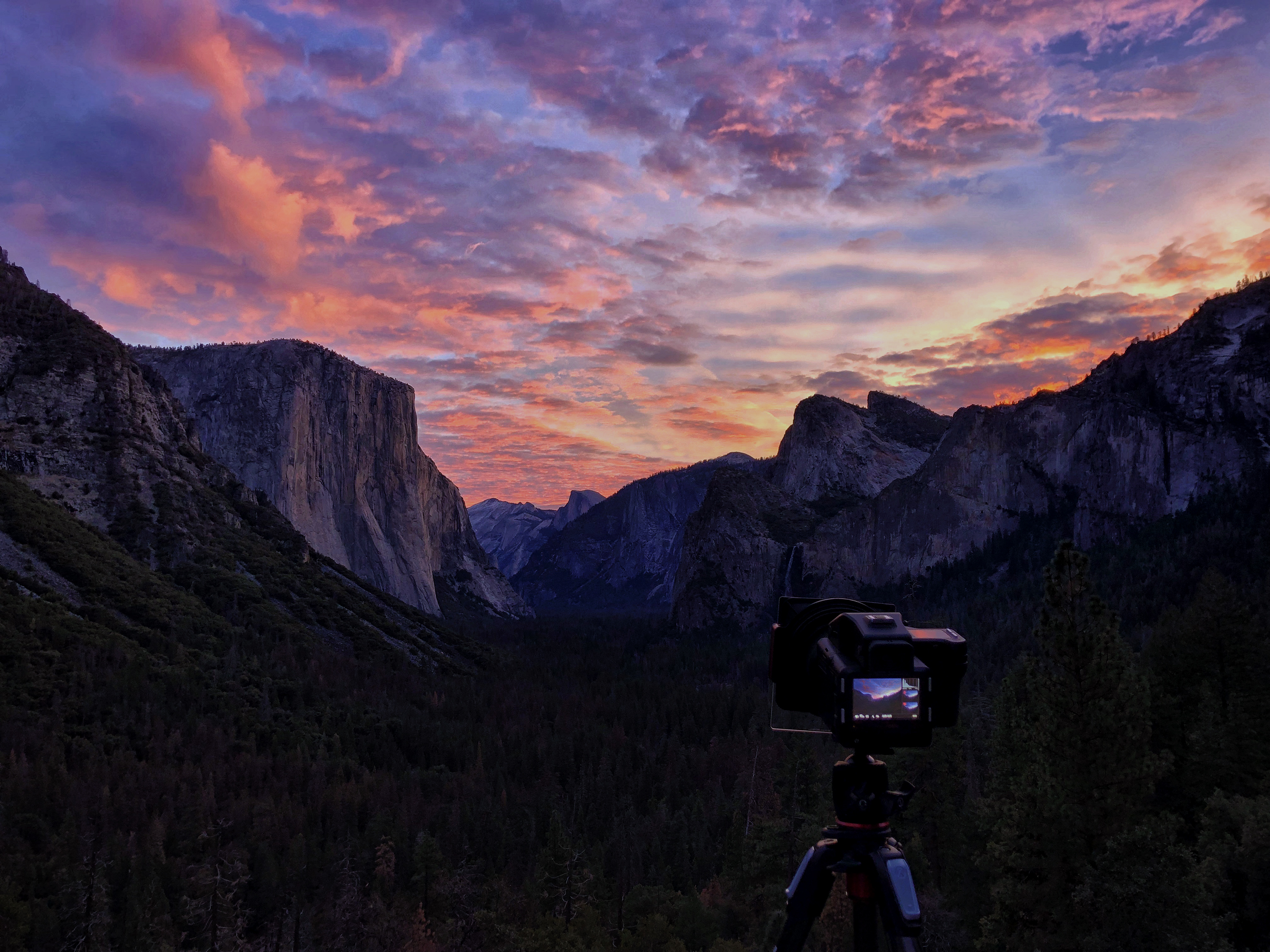
 Below is the final image we have managed to achieve.
I hope you all enjoyed this blog post. Feel free to now apply these techniques to your images, and experiment!
I would love to see the images you create with what I have taught here. Good luck!