One of the many strong features of the Advanced Color Editor is the ability to define exactly which color you wish to edit, even down to the saturation range. It is a far more accurate system than just moving arbitrary named sliders, for example.
How to make sure the right colors are selected
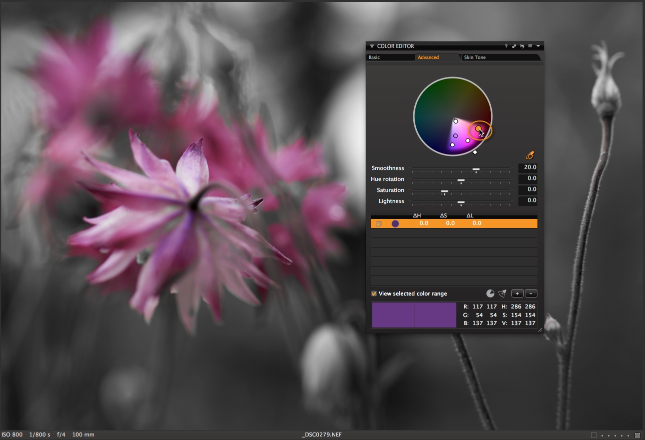
To assist you in seeing exactly what colors have been selected, there is an option in the editor named “View selected color range”. With this option selected, any color that is not going to be affected will be displayed as greyscale.
The Advanced Color Editor is a really simple way to nail down that exact color correction!
Examples
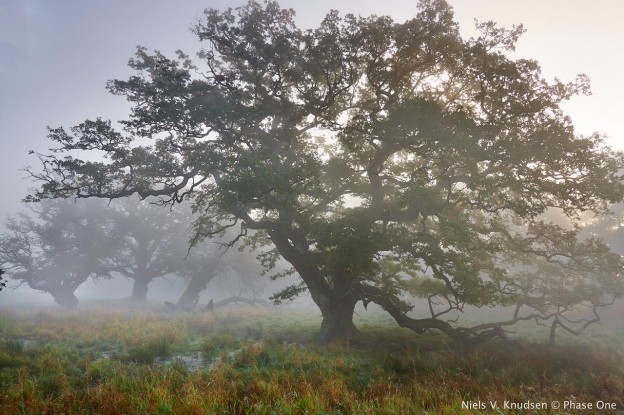
In our sample image I have used the Pick Color Correction cursor to select the bluebell flowers. I have subsequently raised the saturation and dropped the luminosity of the blue slightly. This darkens up the bluebells closer to what I remember them looking like. They are always a tricky subject to catch!
To see exactly which areas of the image are going to be affected, I can check the “View selected color range” box, indicated by the orange circle. The preview will now look like this:
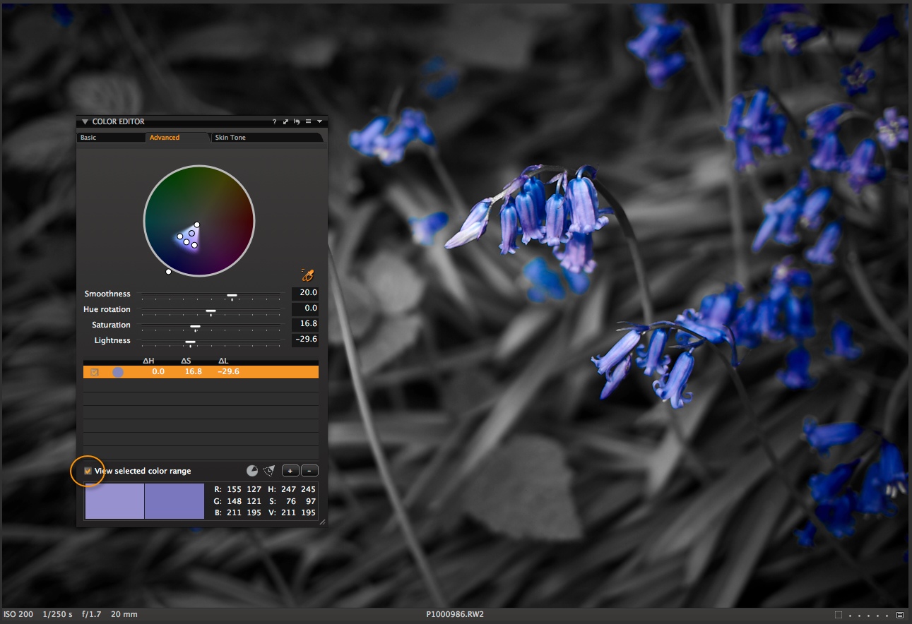
It is very clear to see what tones are going to be adjusted in the Color Editor.
This is a really useful feature if you have a number of color tones that are close to each other and you want to carefully define what is going to be changed. In my example, it will be more obvious of course, but this image shows exactly how the color range option works.
The parameters of the selected color can always be edited, even with the “View selected color range” option left on.
In this example with the current selection in the Color Editor, I would be able to make a very precise color edit.
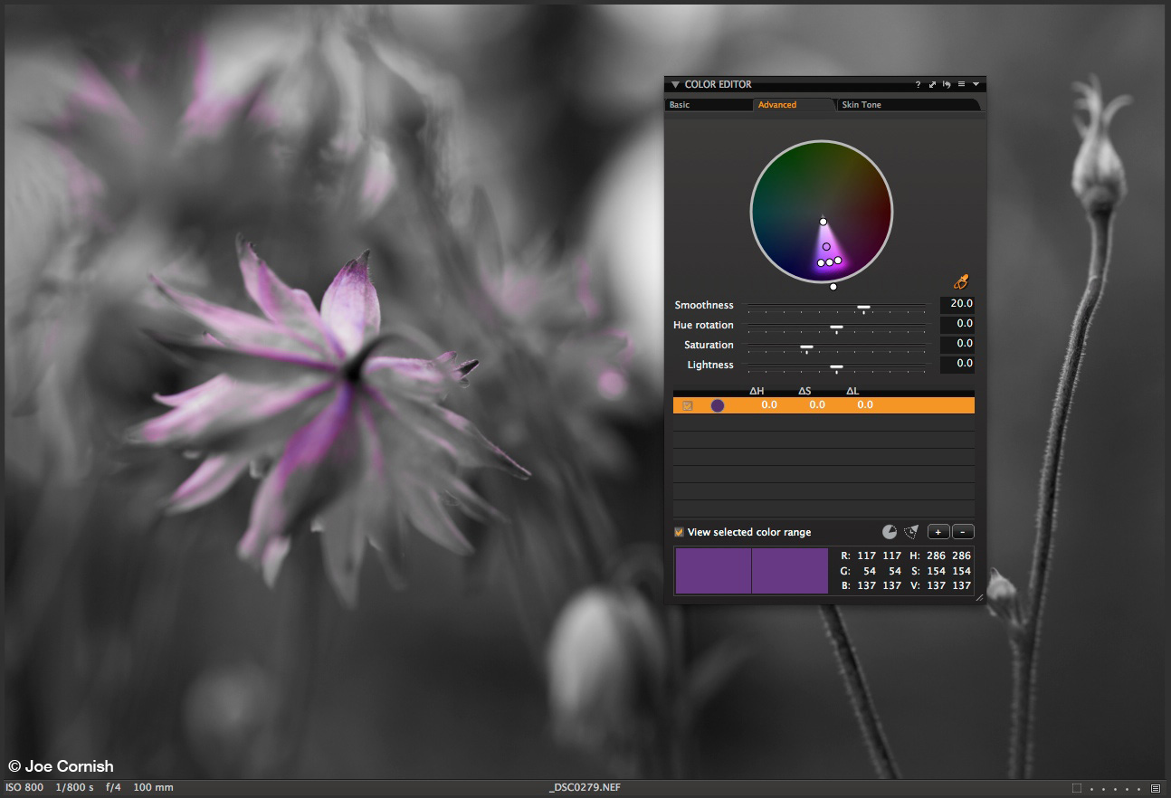
If I leave the “View selected color range” option on and simply expand out my selection in the Color Editor wheel, I begin to see more of the color range that will be affected by any future edit applied.
Try to get in the habit of making a quick check with the color range option, to accurately see what your color edits are doing.
Best regards,
David