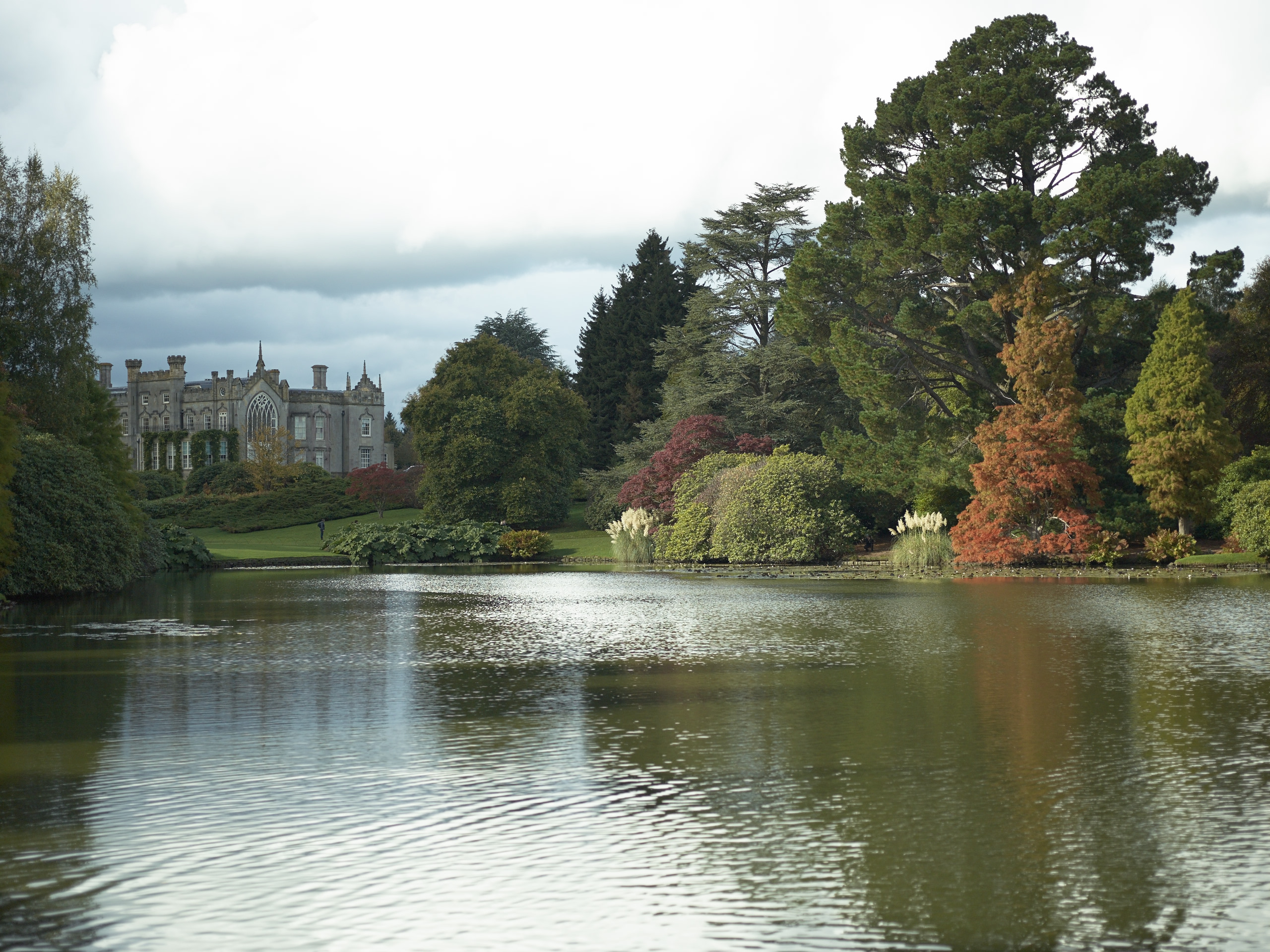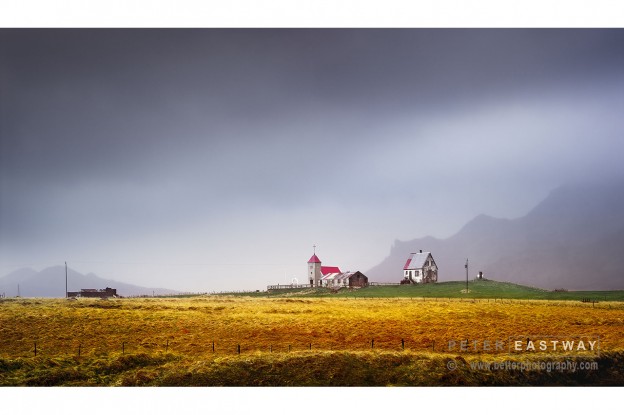
I had to plead with the driver and the guide to let me stop for this photograph.
Well, let’s face it, when you look at the starting point (see later in this article), it was a drab afternoon. It was also my second day in Iceland, so I had no idea whether there was just one or two quaint churches sitting forlorn on remote hills, or hundreds.
As it turns out, there are hundreds and many of them are incredibly photogenic. I think I could spend months travelling around Iceland and never get sick of the landscape and its structures.
So, confession time…….
I was on a PODAS with Kevin Raber, Steve Gosling and our Icelandic guide Daniel Bergmann. Daniel was looking at me funny when I asked if he could pull over. Kevin was looking at his watch and wondering when we’d get to the hotel for dinner. I was looking at this scene and thinking how amazing it looked with the misty rain, the warm grasses and the hint of the hills in the background behind.
Australian eyes discover Icelandic beauty
That’s what makes photography such an individual pursuit. I was putting my Australian eyes over a foreign landscape and loving it. Daniel had driven along this road thousands of times before and no longer saw it. I am the same in Australia. People come to my place in Sydney and marvel at the coastline and how great it looks, but for me, it’s just home.
However, one thing that Kevin and Daniel are is fair. They could see I was serious, so they pulled over and I jumped out. A couple of the other photographers followed, but I think the general consensus was I was a bit mad.
So, in the interests of regaining a small amount of my reputation, I’m presenting the finished work, what I saw out of the van window.
The edge to set you apart
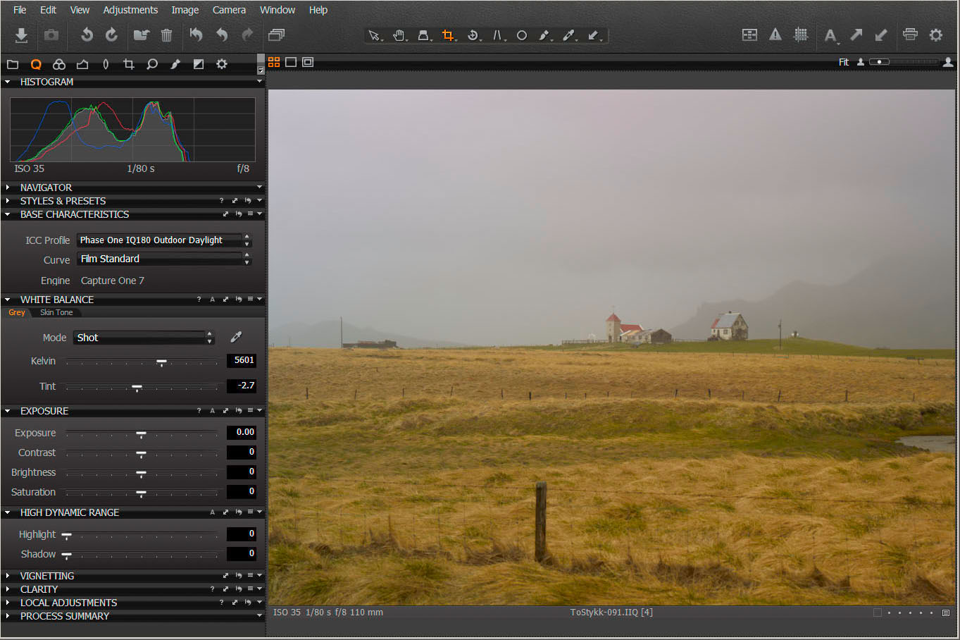
The original file was processed in Capture One Pro 7, naturally. There is no other raw file processor that gives me the same file quality; so all my files go through it whether photographed on a Phase One, a Canon, Fujifilm or Nikon. And while I finish most of my art prints in Photoshop, there is a lot you can do to set up the file in Capture One. In fact, while travelling or on a job, I use Capture One Pro 7 to proof my work and very often this is all that’s required.
In this case, the final image has a few further embellishments in the sky that I did in Photoshop, but the basic starting steps were made in Capture One Pro 7 as follows.
 Click on the images to enlarge
The unprocessed raw file is quite warm, but not what I remember. Perhaps it was the tinting on the van window, but I saw a cooler, silvery light with the red of the church’s roof really sparkling.
You’ll also see that my composition is a little on the wide side. It was raining and the longest lens I had was the 110mm. A 150mm would have been better, but I had promised Kevin I’d only be two minutes! Still, plenty of pixels on the IQ180 and cropping wouldn’t be a problem.
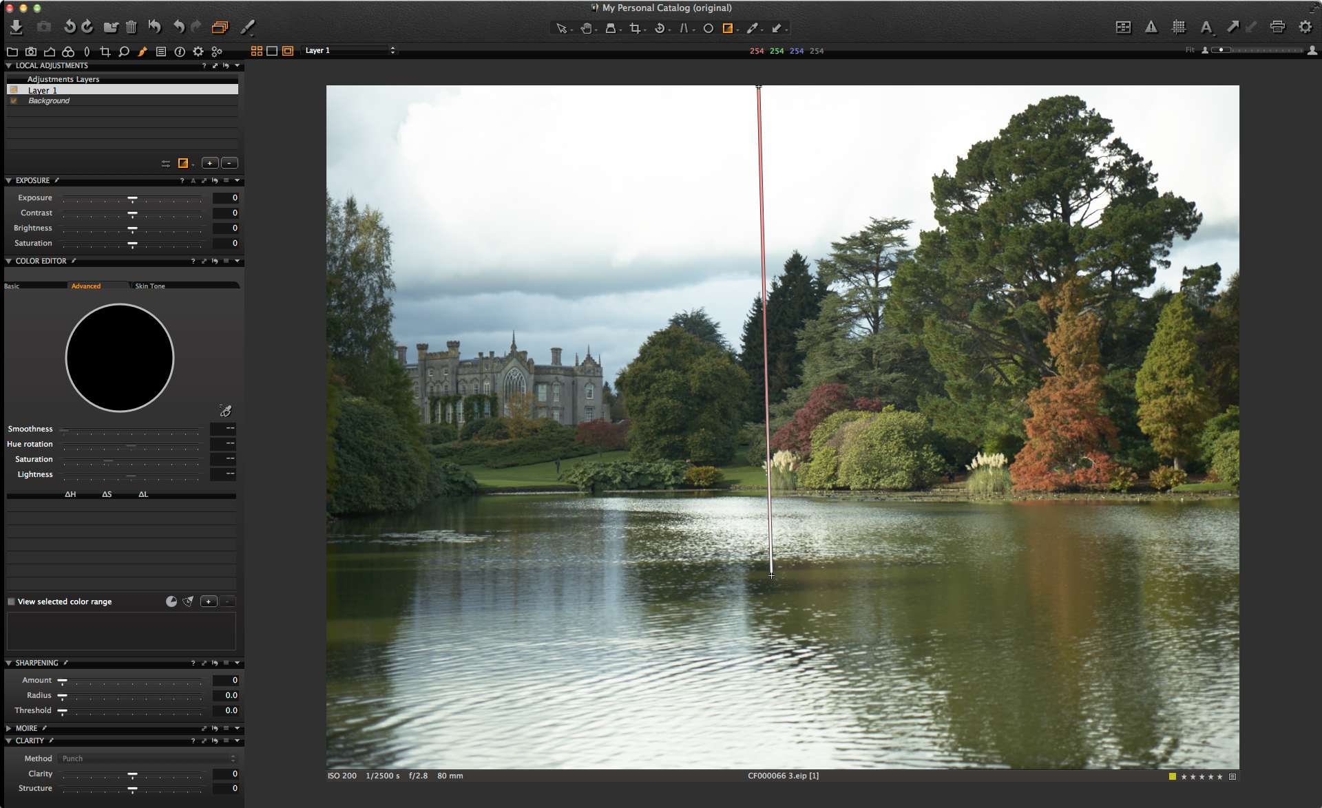
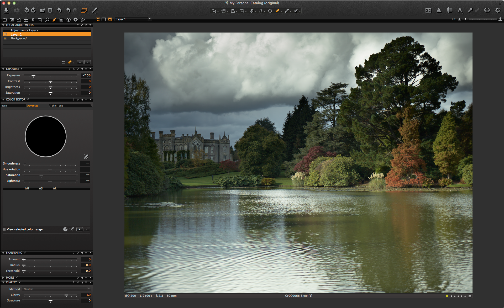
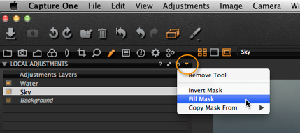
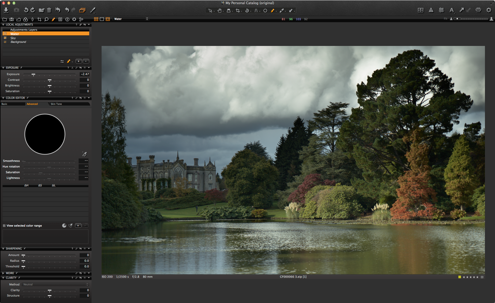
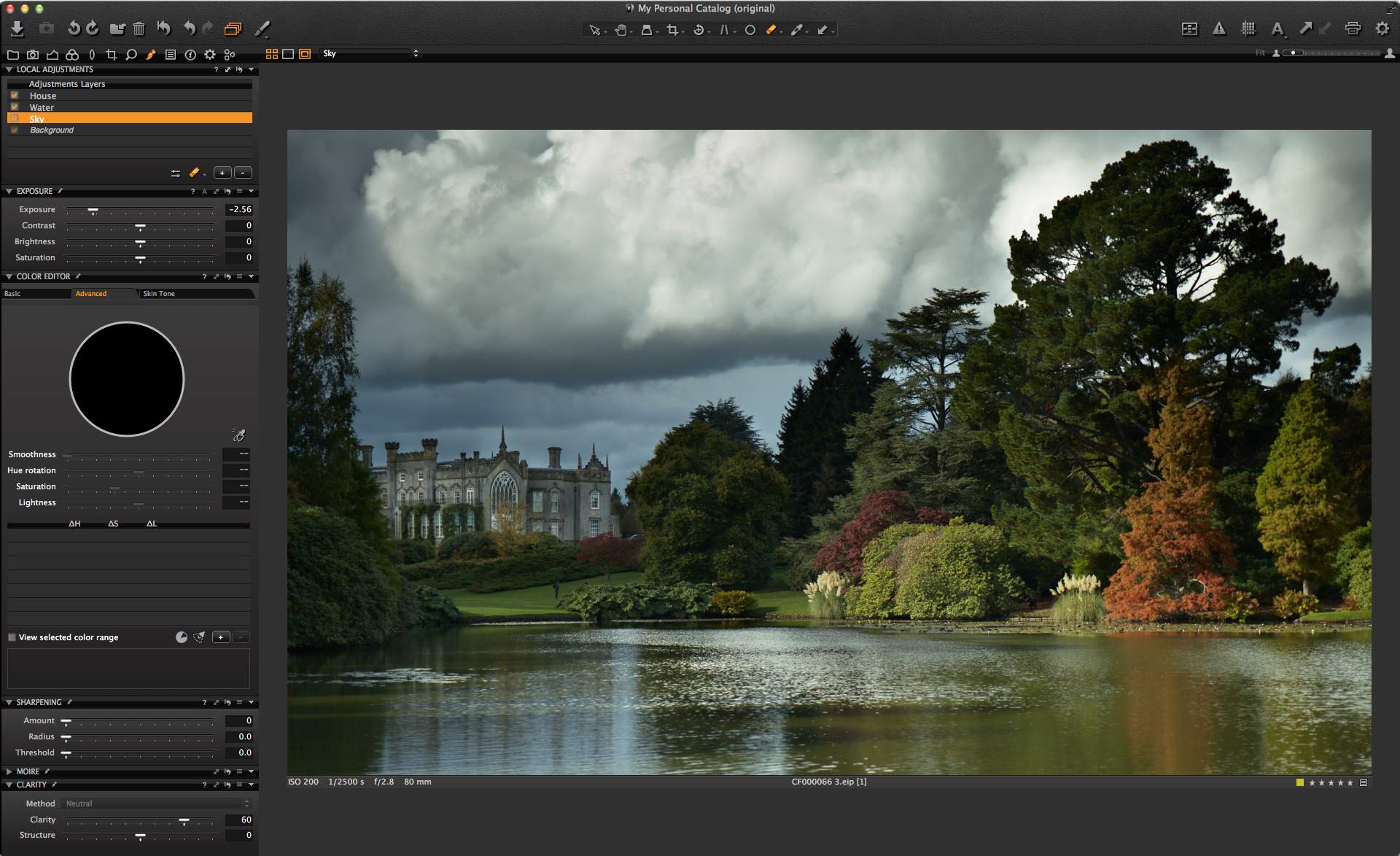
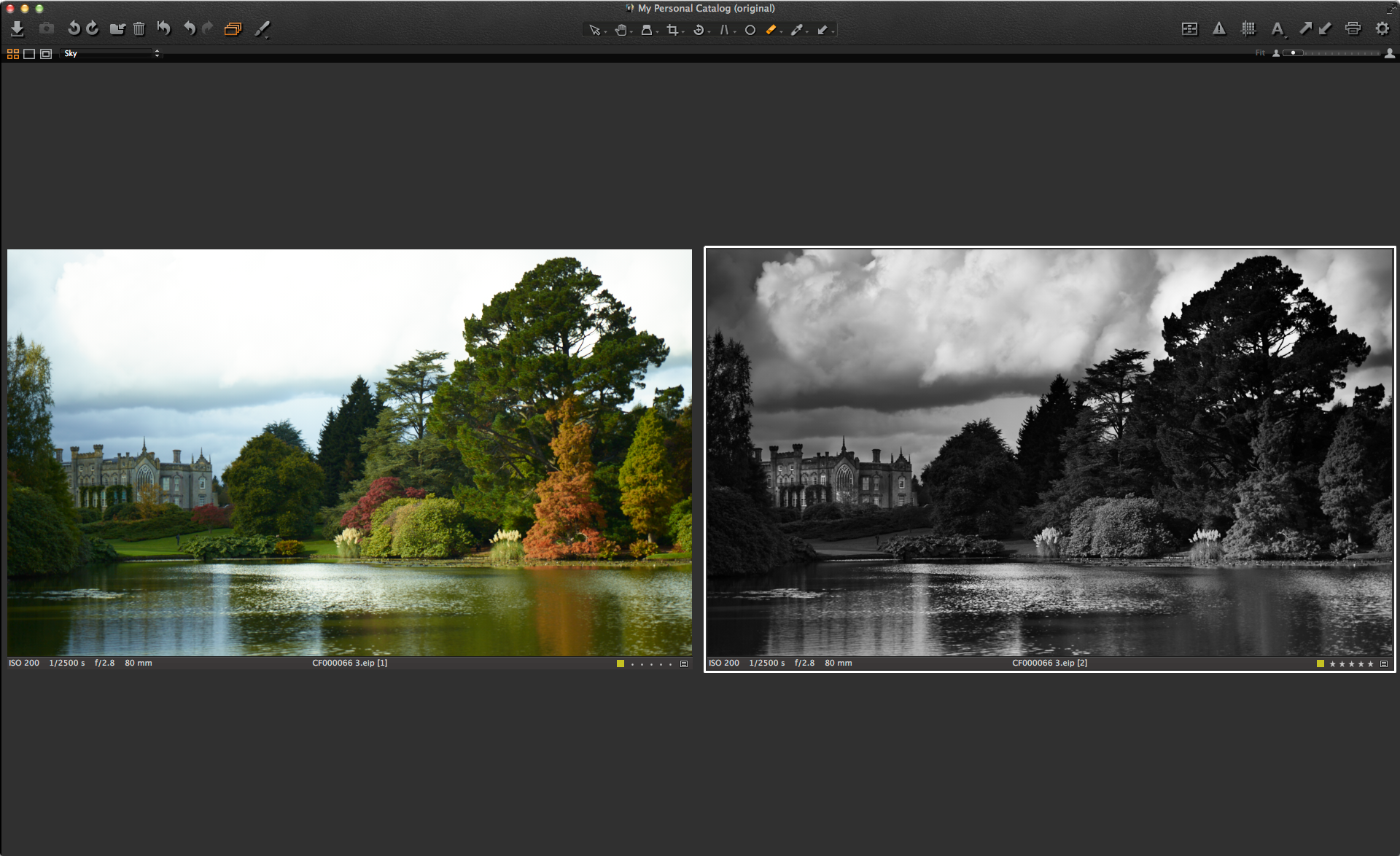
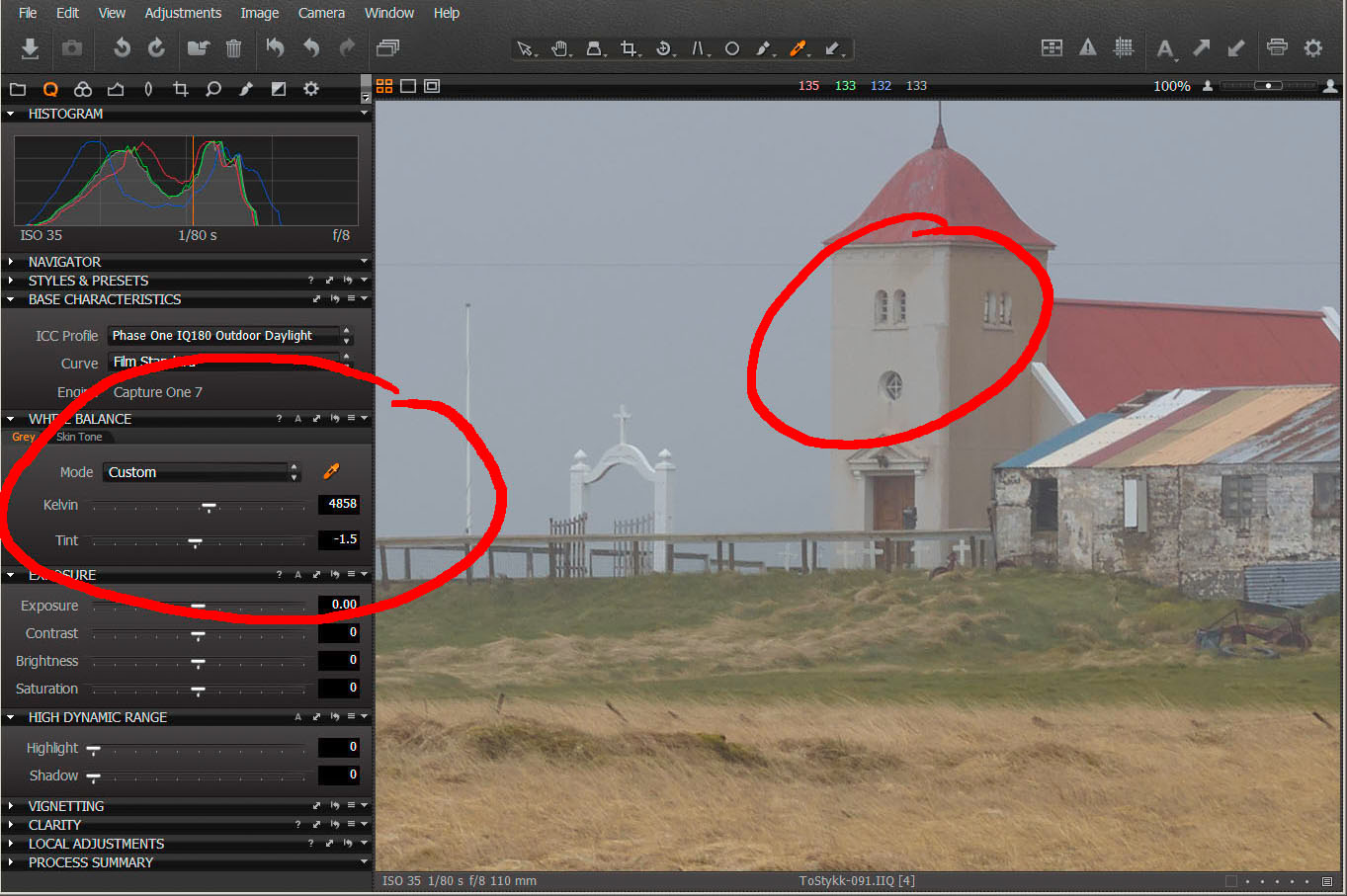 First step was to create the cooler, bluer light. I enlarged the image and used the Pick White Balance Tool, clicking on the wall of the church. In fact, I used the tool to click around on the sky, the roof and even the white entrance arch, but the colour balance I liked the best was when I clicked on the front façade of the church’s tower. This setting gave me the blues in the sky that I wanted.
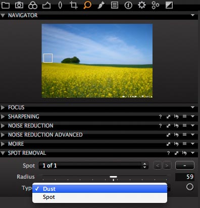
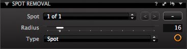
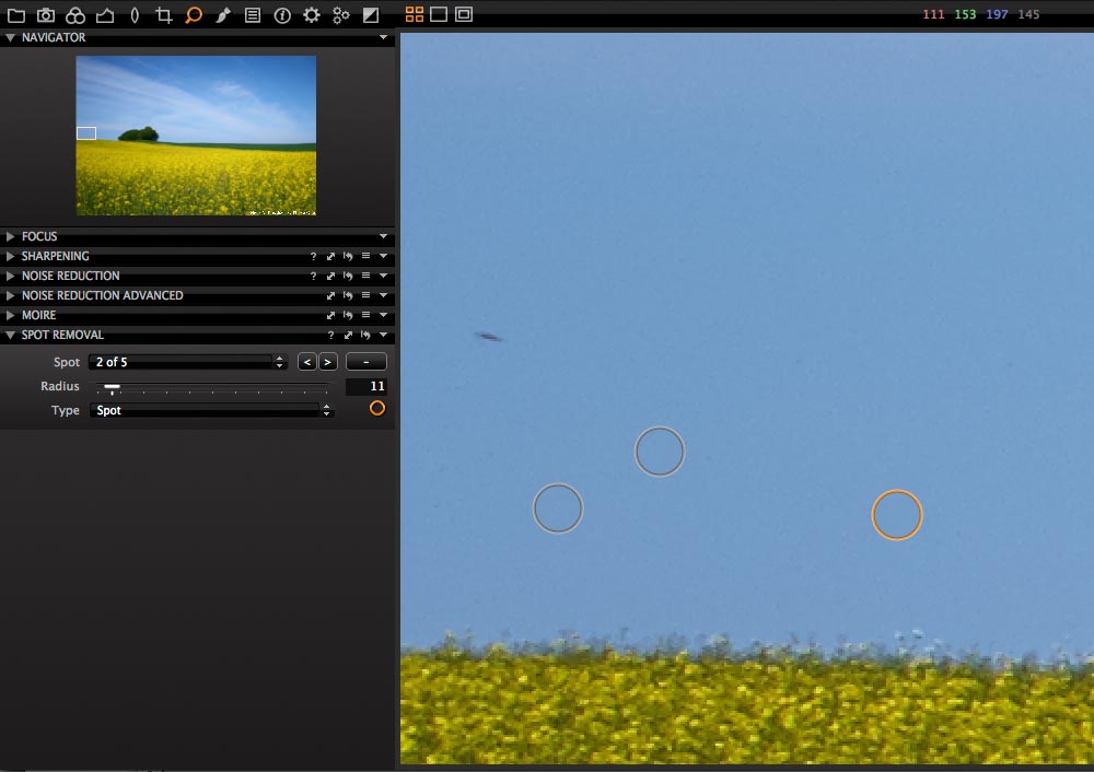
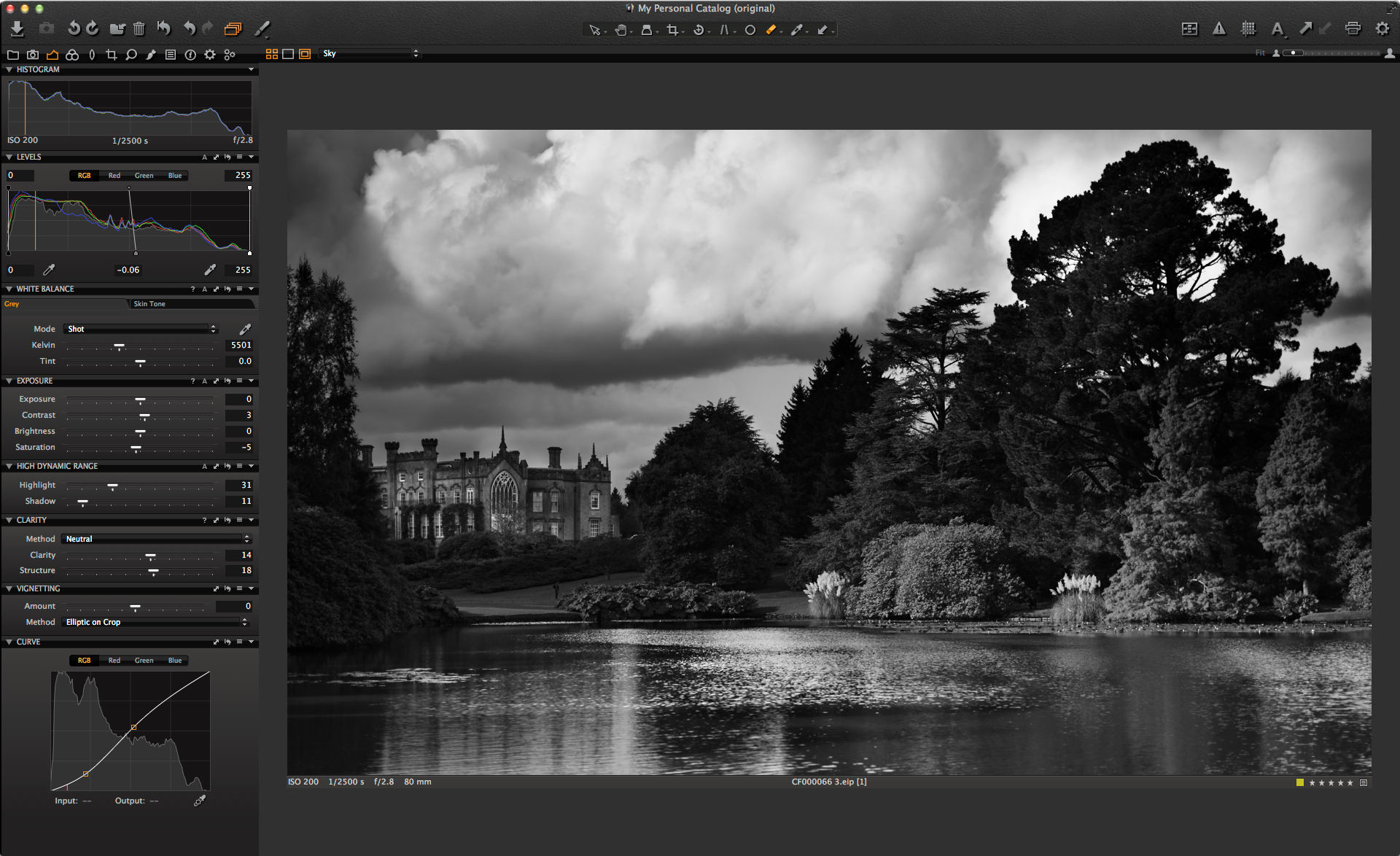
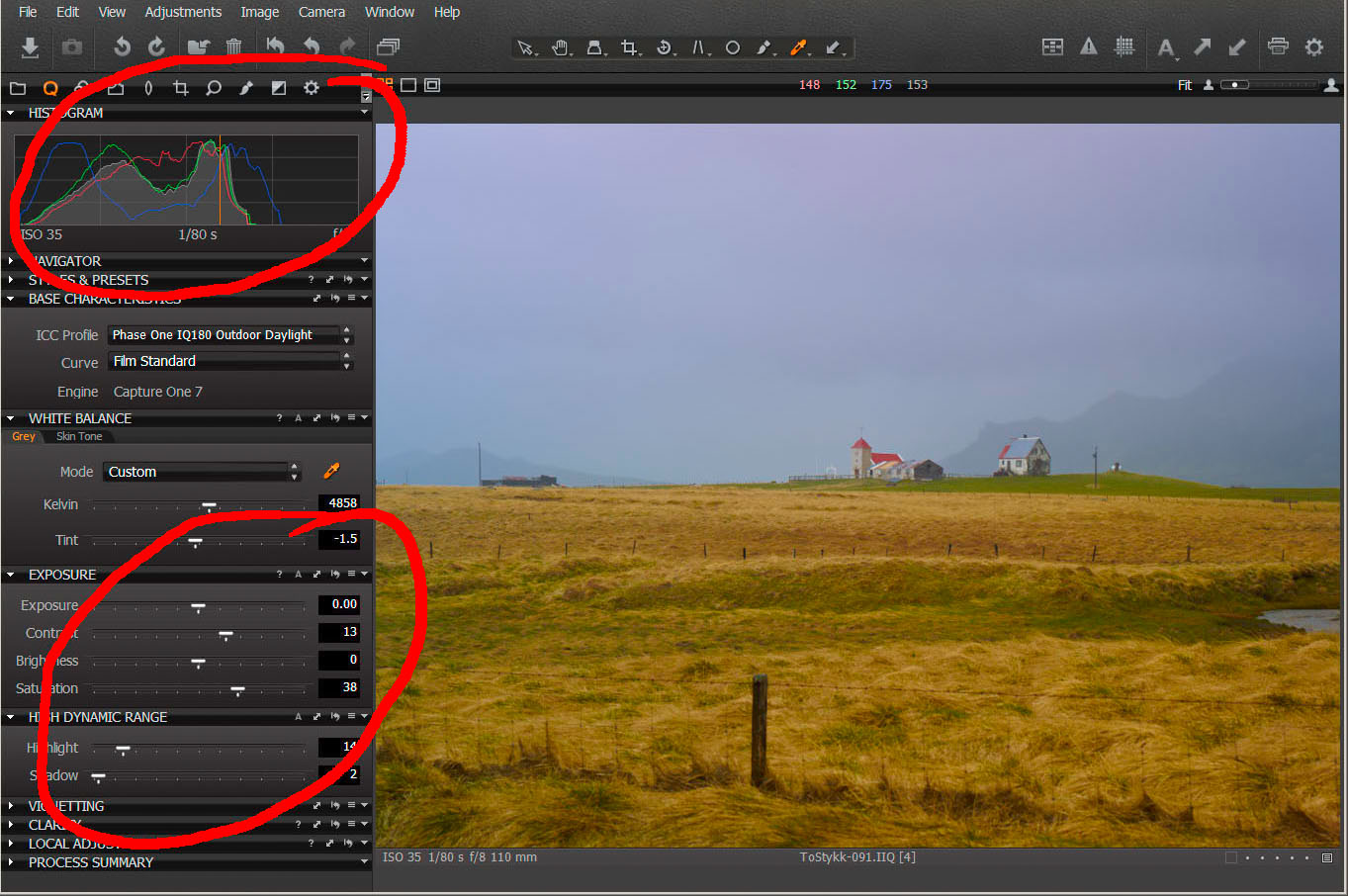 Given the overcast light, the scene was pretty flat. You can see from the histogram that there is plenty of room for movement. I used the Exposure tools to increase the contrast and the color saturation, plus I used the High Dynamic Range Highlight for a reason that escapes me just now. I know I am paranoid about paper whites in the sky, but they simply don’t seem likely as I look at the file now!
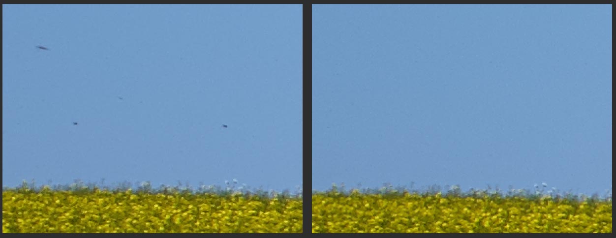
 I cropped the image next, removing the foreground fencepost. This simplified the composition and although the small pond on the right remains, this will change in the next step.
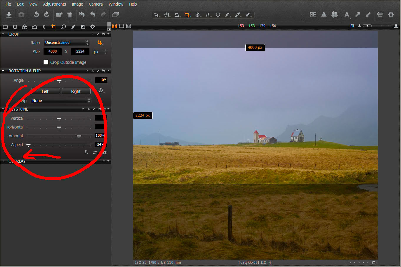 Although I’m sure the developers in Copenhagen didn’t design the Keystone Tool for me, it’s amazing how often I use the Aspect slider to either squish things together or stretch them out.
As we struggle to find ways to make our photographs look ‘different’ from what everyone else is posting on Instagram, adjusting the aspect ratio can create an edge. In this case, by reducing the Aspect slider, I have made the buildings look taller. Note also how the cropping has changed. I find I use the Keystone and Crop Tools in tandem.
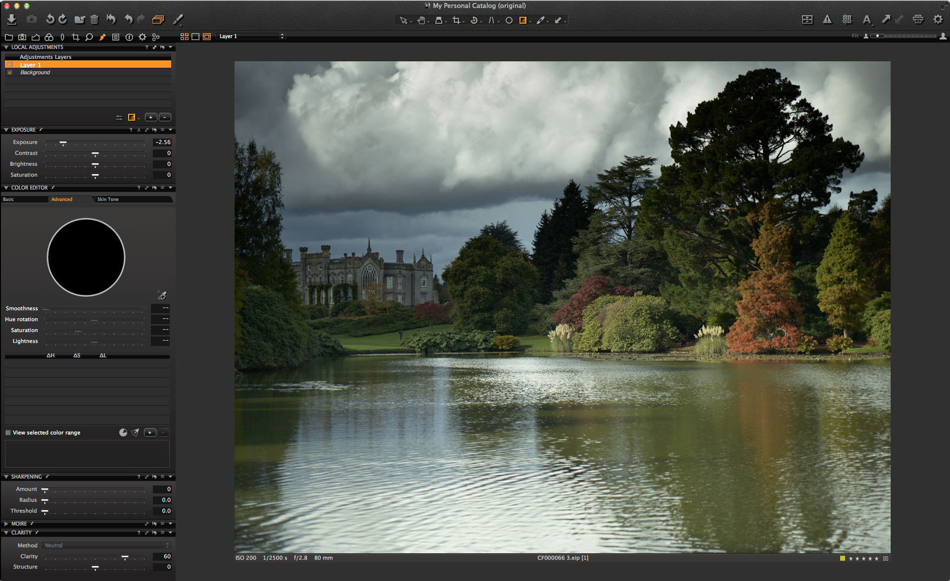
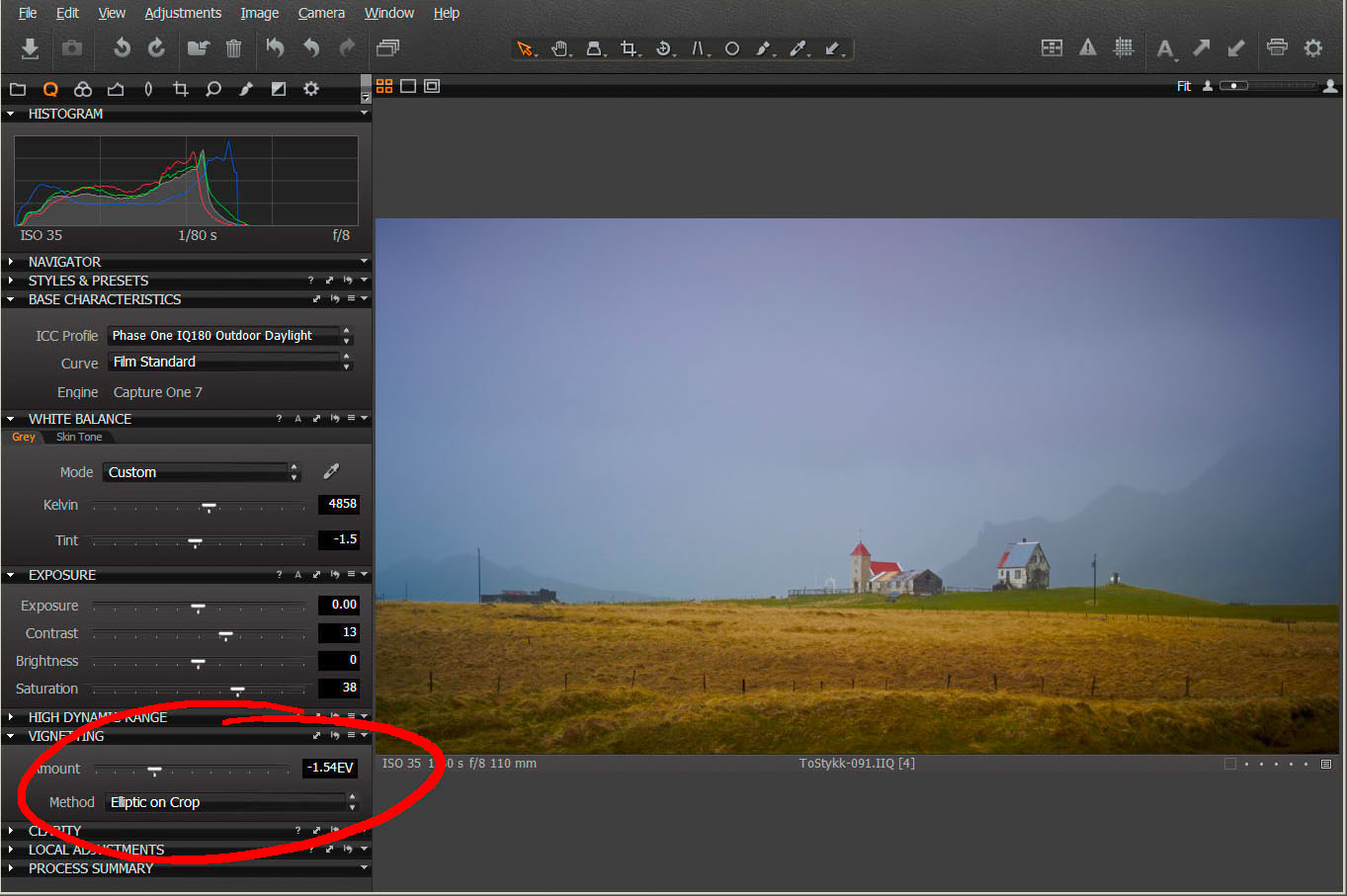 Moving back to my Quick Tool tab, which I have set up with all my most used tools, I adjusted the Vignette slider to darken down the edges of the frame. However, the image looks a little flat. The Exposure sliders are great, but sometimes I find using the Levels or Curves Tools makes more sense.
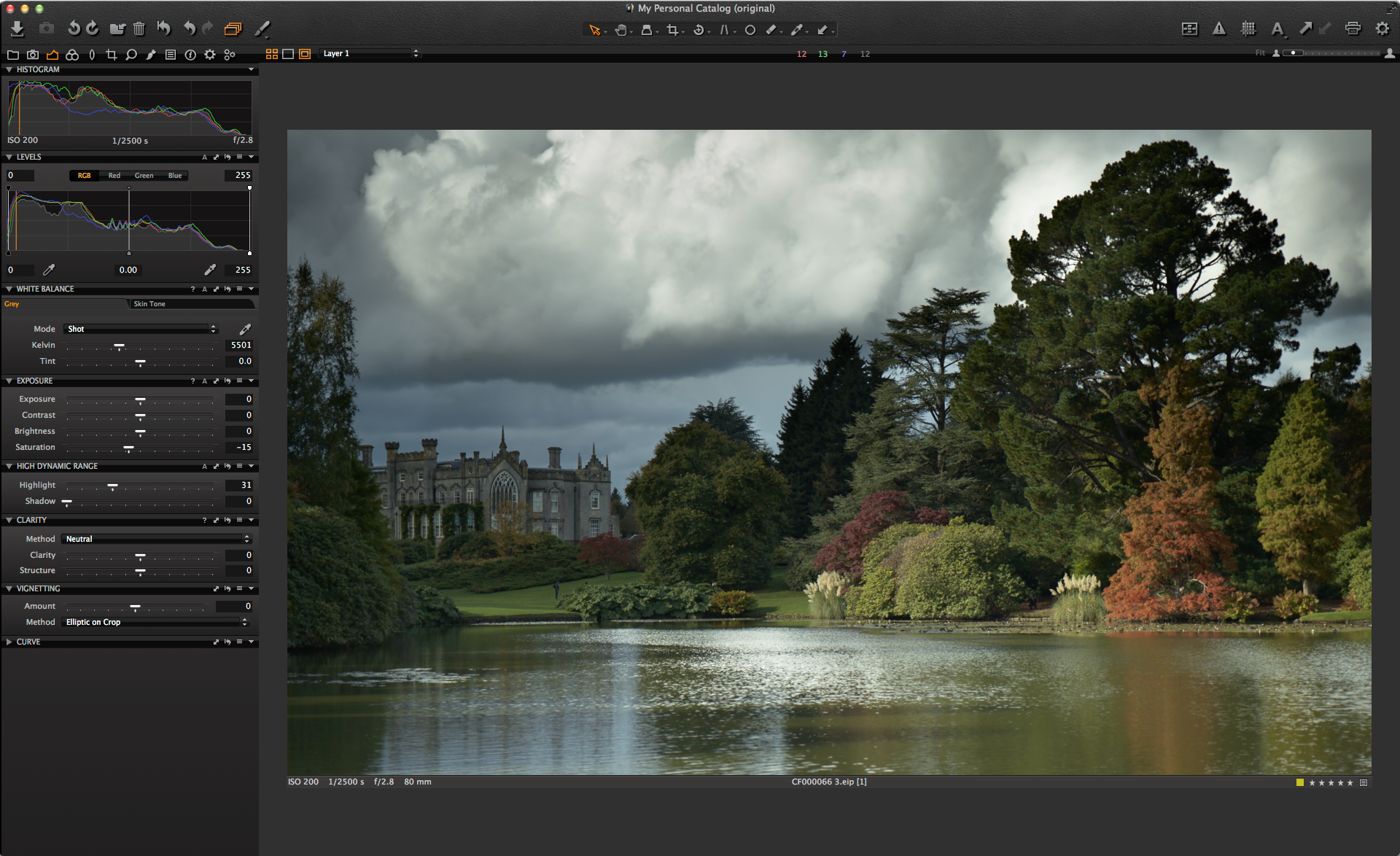
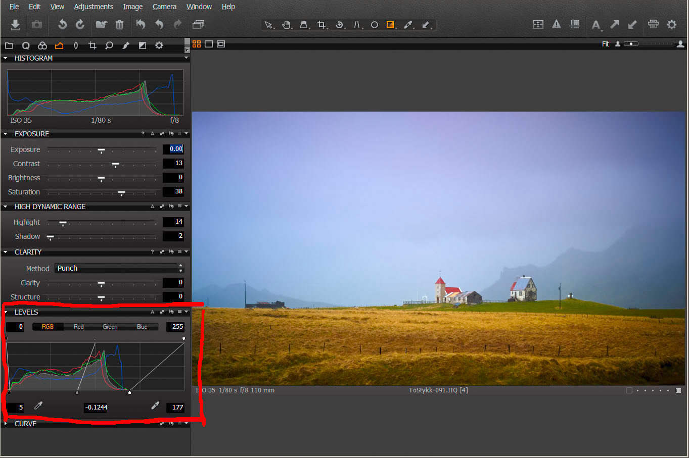 Moving to the Exposure Tool tab and the Levels Tool, I have grabbed the White point and dragged it left to the edge of the histogram, effectively lightening up the image and producing some highlights. This has made a big change.
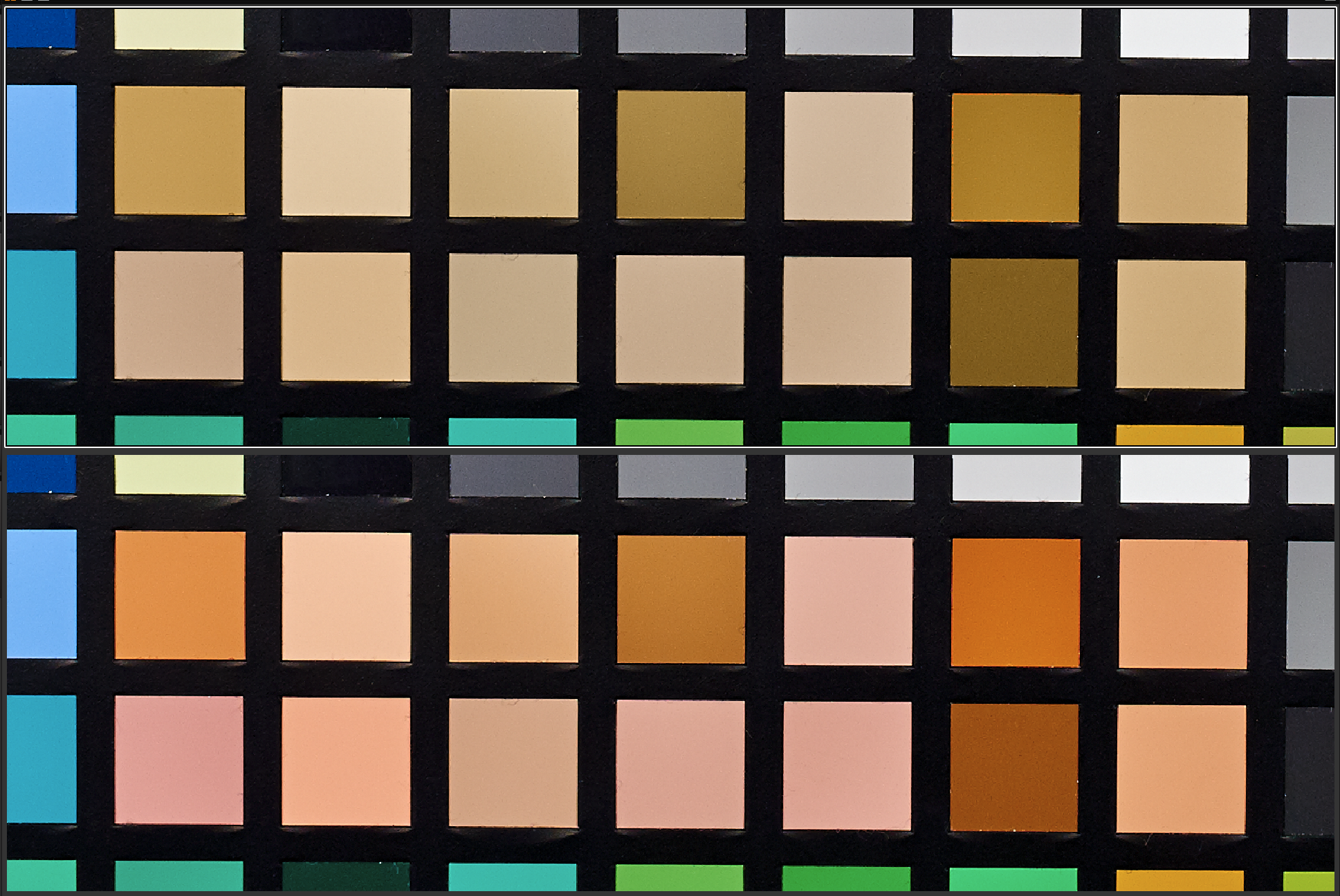
I also tweaked the Black point just a little and moved the Gamma slider until the image looked to my liking. It is essential to do this with good quality monitors that have been correctly calibrated and profiled. I use an Eizo ColorEdge CG275W and the Wacom Cintiq 24HD touch for my work and both produce excellent image quality for editing.
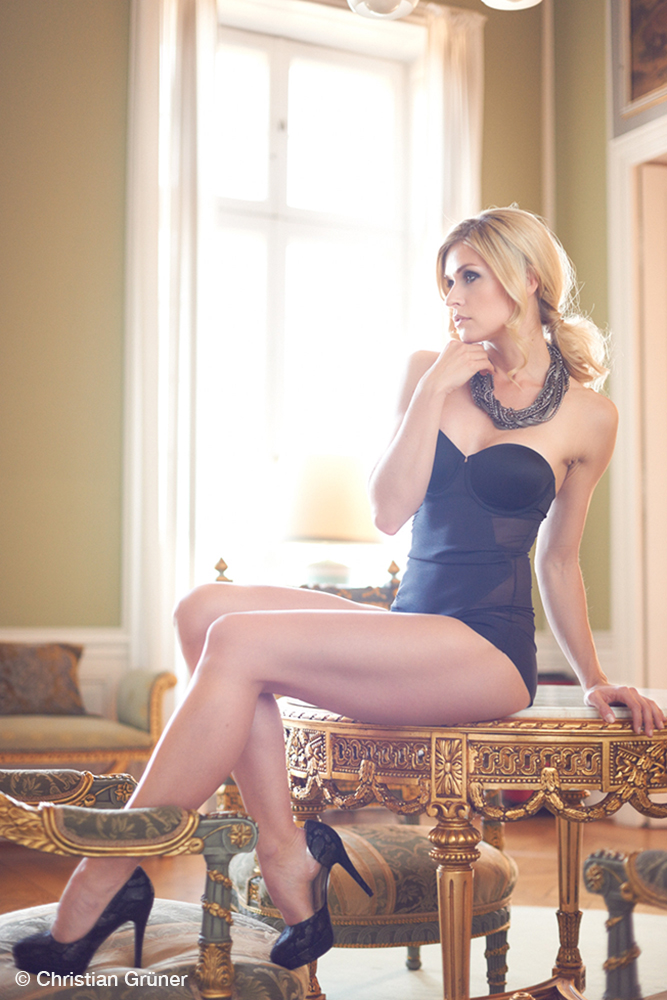
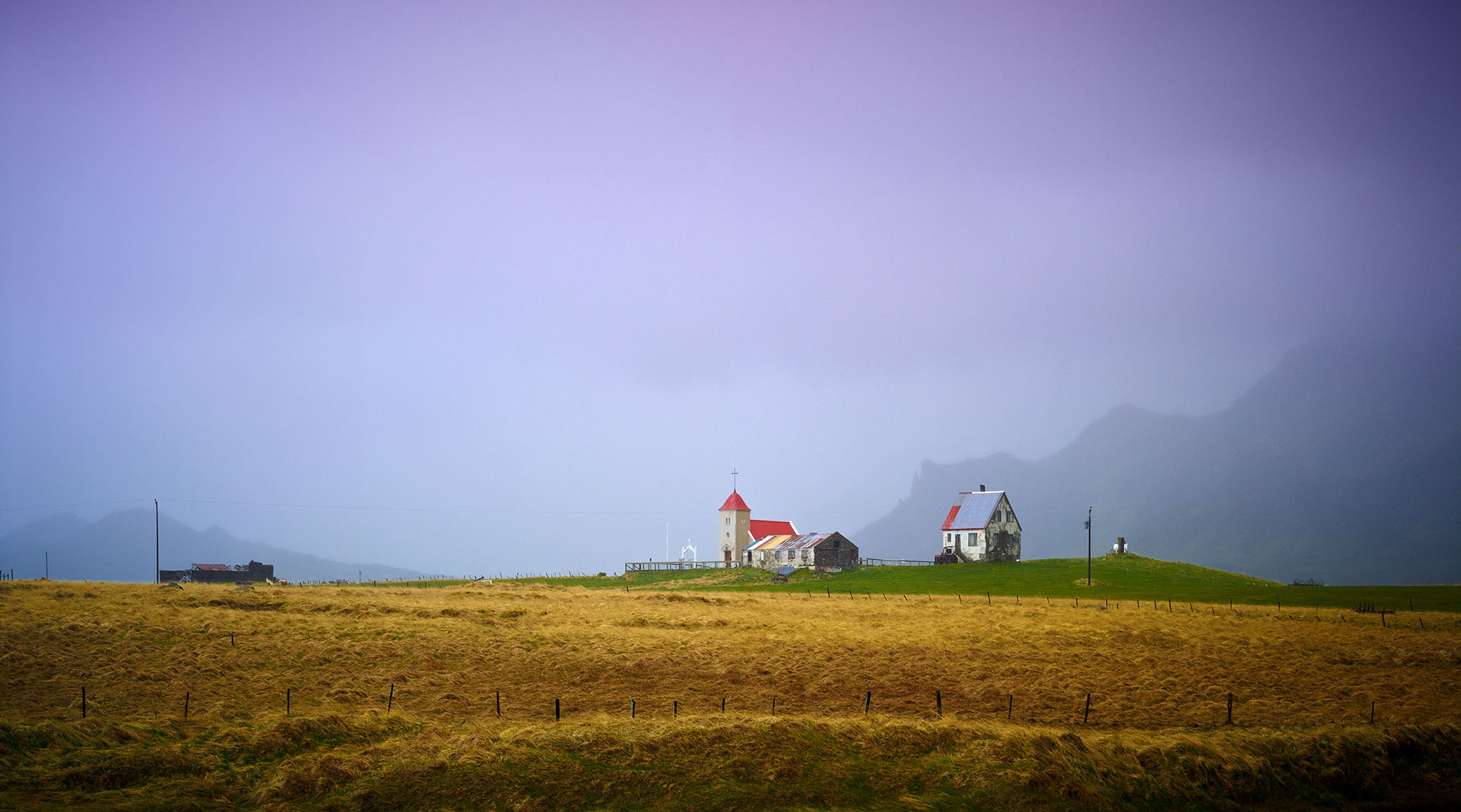 This is the final result from Capture One, at which stage the image was transferred to my ‘working’ folder to await my attention and, much to my embarrassment; it is 18 months later that I finally finished the file.
Capture One Pro 7 provides so much control over the raw file that I find I need to do less and less in Photoshop to finish the image. In this case, a couple of colour overlays with a soft light blend mode were added to finesse the final colour palette.
This photograph has always in the back of my mind and I’m so glad they stopped the bus.
Thank you, Kevin. Thank you, Daniel.
Best regards,
Peter
Check out Peter’s work here and check out his PDF video publications on his Better Photography website