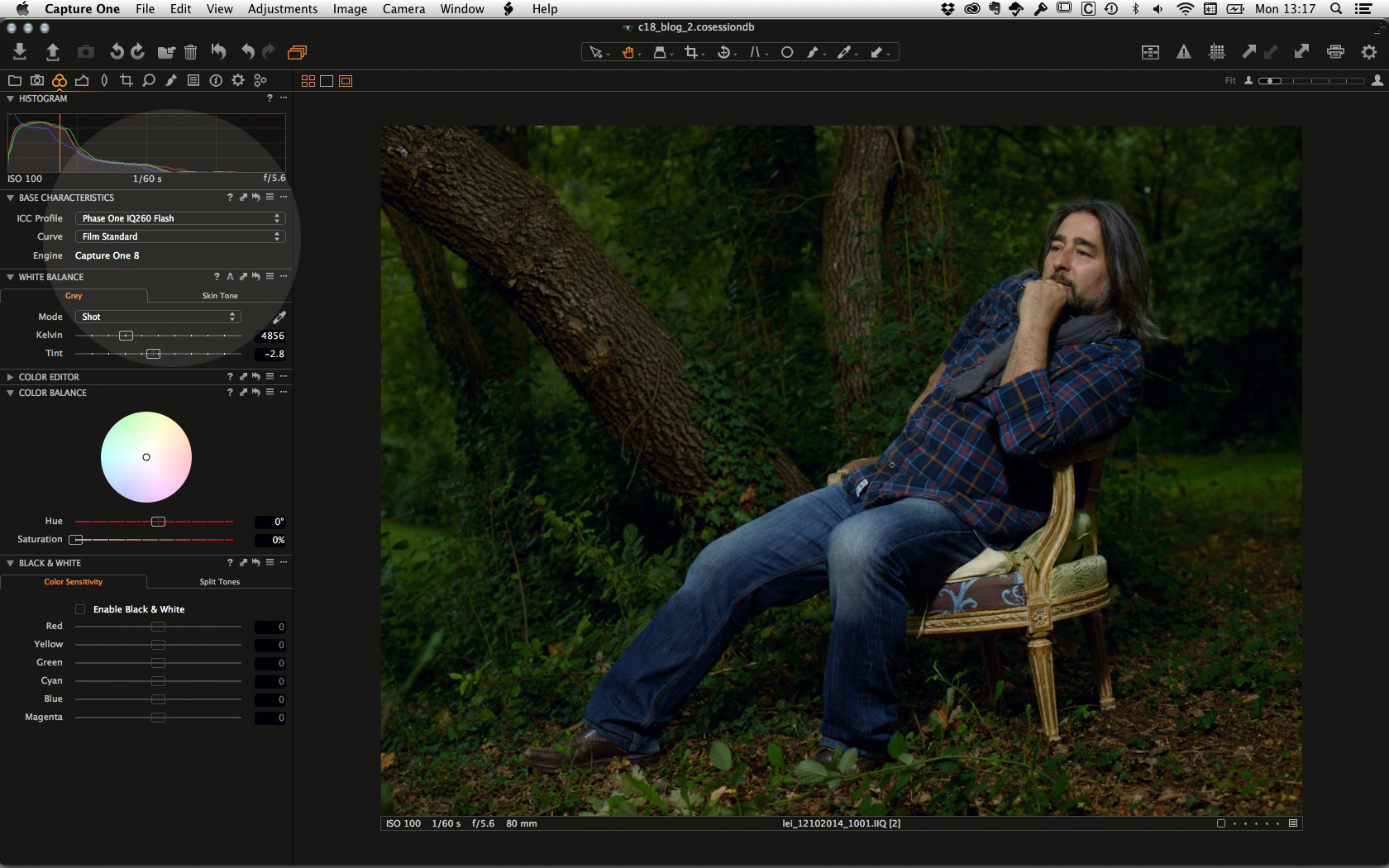
Capture One Pro 8 has introduced a new Film Grain tool. With this tool you can add film grain to your images in an extremely realistic way, giving the same look and feel you see in prints created from film (you remember film right?).
You can also use the tool to add texture to the surfaces in your images however you like without having any preconceived notion about emulating a film “look”.
Mimics the behavior of traditional silver halide films
The film grain options you can apply in Capture One Pro 8 are generated by an algorithm. This process mimics the behavior of different traditional silver halide films and maintains a natural feel rather than simply stamping a mask over the image as some softwares do.
The Capture One Film Grain will add texture to your images while still preserving the all-important detail and structure in the image, just like film does.
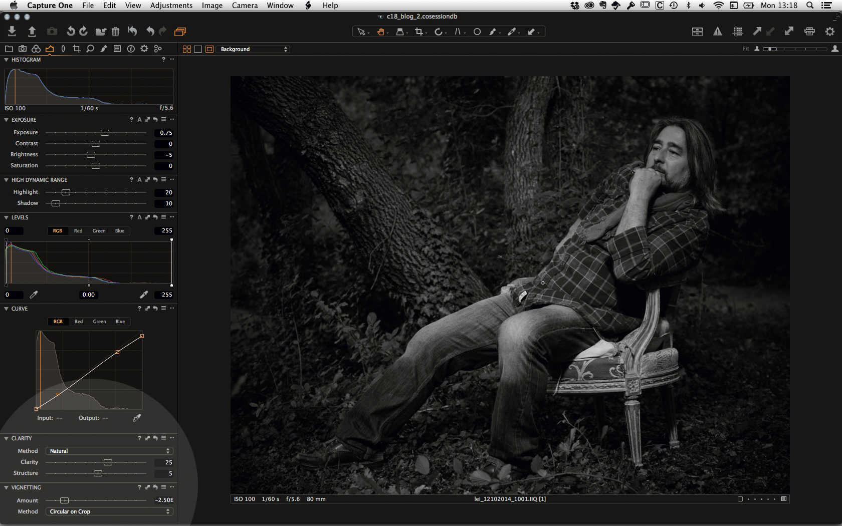
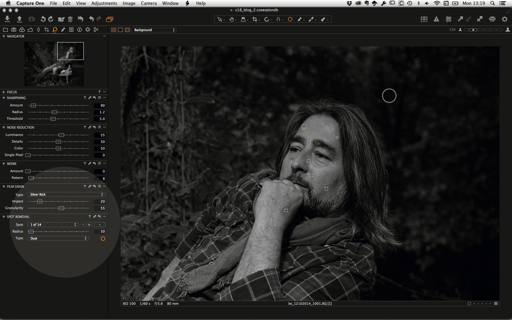
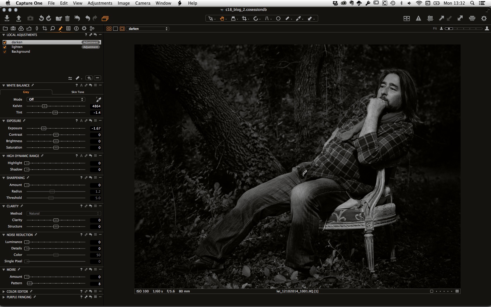
You can find the Film Grain tool in the Details Tool tab of Capture One 8.
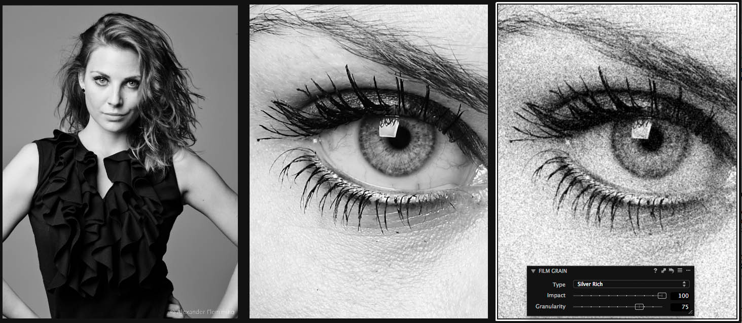
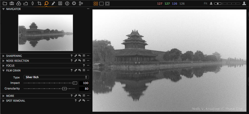 The Film Grain tool in its default location of the Details Tool Tab. Here the type “Silver Rich” has been selected with an Impact of 100% and a Granularity of 80%.
There are three different controls for the Film Grain tool, Type, Impact and Granularity:
Type: When choosing ‘Type’ you are selecting the “technology” of the film you want to simulate. The Fine Grain option is not actually a film grain but the standard “grain” that you may have used in previous versions of Capture One. So to successfully emulate a film look you should choose among the following methods:
- Silver Rich
- Soft Grain
- Cubic Grains
- Tabular Grains
- Harsh Grain
The Type that you choose will change the look of the grains by having different properties applied, which will change the shape, distribution and size of the grains.
Silver Rich is a very good starting Type when it comes to exploring the Film Grain tool.
Impact: With the Impact slider you can determine how strong you would like the effect of the film grain to show on your image. In a way it is similar to determining the opacity of the grain. If you want to simulate real film you should use maximum Impact of 100%.
Granularity: With the Granularity slider you determine the amount of grain per pixel. So to simulate a fine grain film, use low values of Granularity between 0 and 30. If you want a real strong visible effect, use values up to 100%. This adjustment can be thought of similar to the speed of the film used, when comparing the adjustment to the use of Film.
Viewing the grains:
The best way to see the Film Grain effect is to zoom into the image 100%. Only at these resolutions will you see the actual effect of the adjustment. If you zoom out, for instance, Capture One Pro 8 will simulate the grain look in an approximate manner but be aware that this is primarily used for you to see that grains have been added. You should not judge the film grain adjustment when zoomed to “Fit” as the results may not be 100% accurate to your final processed file.
100% zoom
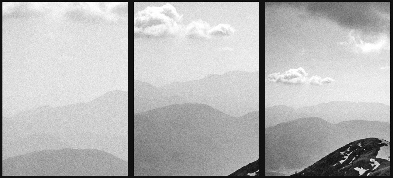
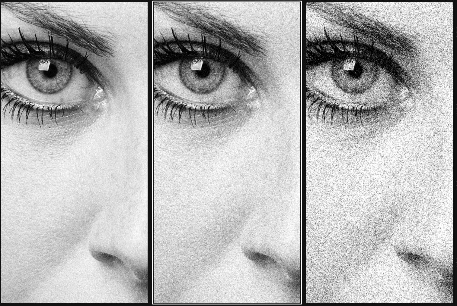 Granularity =20 Granularity =30 Granularity =60
For all three images the Type “Silver Rich” with an Impact of 100 have been used.
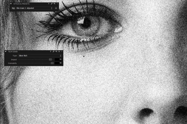
Preserving details:
 Full image 100% zoom – No Film Grains 100% – With Film Grains
In the third image above I’ve added a Film Grain with relatively strong Impact. Still you can easily see all the important details in the image that are present without the Film Grain adjustment.
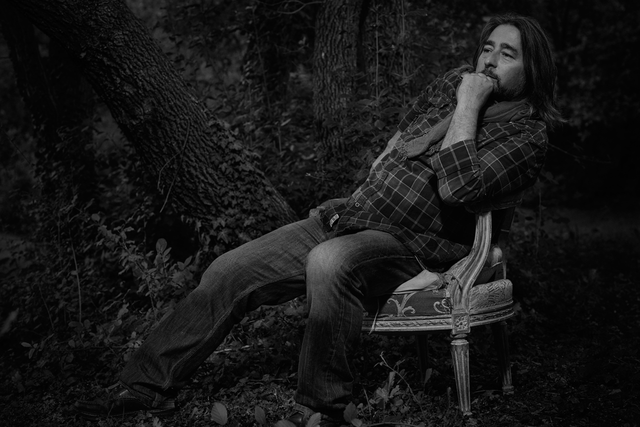
The Film realistic look of the Phase One Film Grain
In the silver halide film process, a single grain would turn black after the film is developed, should it have been exposed to a proper amount of light. This means that the more light a film was exposed to, the more film grains would turn black after developing.
This kind of behavior can also be seen when using the Film Grain tool in Capture One Pro 8. Due of this film like behavior of the tool you will see pure blacks and pure whites without Grains and a super realistic tonality in between. Remember, fully exposed grains would be pure black on the negative and thus pure white on the print, and vice versa.
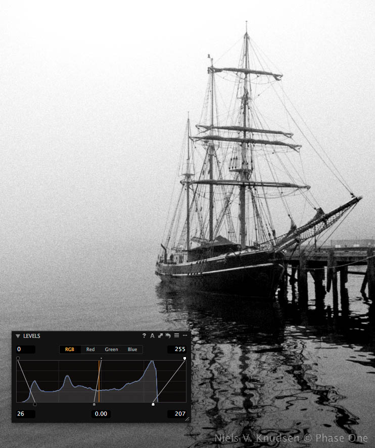
In this image I have clipped the histogram to ensure that I get real deep blacks and pure whites. The results meant to properly emulate a “film” look.
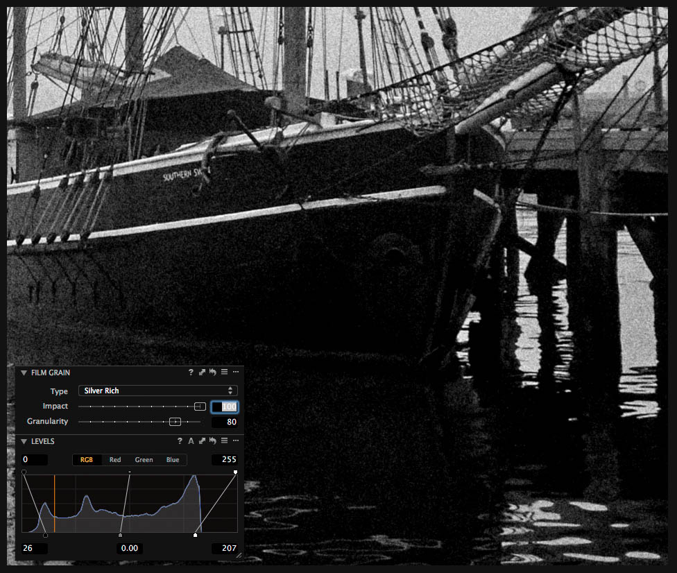
A 100% zoom into the deep black areas of the image. Notice that the clipped deep black appears without Grain. Just as film would.
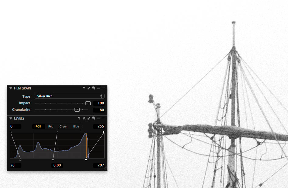
A 100% zoom into the bright part of the image. Notice that the image goes totally white simulating that all the film grains have been exposed. Again, just as we would find in film.
The Film Grain in Capture One Pro 8 will adapt to any adjustment change you do to your image ensuring beautiful and realistic Film Grain effects.
Grain designed for print
The Film Grain tool is designed very cleverly to generate Film Grain that, in print, will give the same look whether you use an image from a high-resolution camera or a low-resolution camera, as long as you print the image at the same size. As a consequence a 100% zoom into for instance a 80M pixel Phase One IQ280 image with Film Grain added will look a little different compared to a 100% zoom into for instance a Canon 5DMKII image.
Determining the right Granularity for a print
How visible the grain will appear in the final printed image depends on how large you print your image – exactly like using real film. So it is strongly recommended that you do some test print at your normal print sizes with different values of Granularity, but with fixed Method and Impact.
Once you have a clear idea of what settings you prefer for different print sizes it’s a good idea to create your own Film Grain Presets for instance:
- Medium Grain A3
- Medium Grain A4
- Medium Grain A5
Scaling an image with Film Grain:
The film grain in Capture One Pro 8 is added to the image at the full size of the images. So if you process the image to a size different from 100% you should be aware that the grain will be scaled accordingly and thus it will look different. As a rule of thumb you should increase the Granularity by approximately 30 points if you downsize the image by 50%. This should be followed in order to achieve the same size grain-look seen at 100% in Capture One.
100 % zoom
 Size = 100 % Size = 50 % Size = 25 %
Granularity = 30 Granularity = 60 Granularity = 90
The same image is processed to different sizes using the Film Grain tool. To achieve the same visual effect of the Film Grain when viewed at a 100% zoom rate, I’ve compensated with an extra 30 points of Granularity every time I reduce the image size by 50%.
Adding Grain after retouching in Photoshop
If your workflow normally involves retouching in Photoshop, you can still use the Film Grain tool in Capture One Pro 8 as it works the same when applied to Tiff and Jpg files. In this case you start processing the RAW file without using the Film Grain tool and then add the Film Grain to the resulting Tiff file after you have finished the retouching.
All the best,
Niels