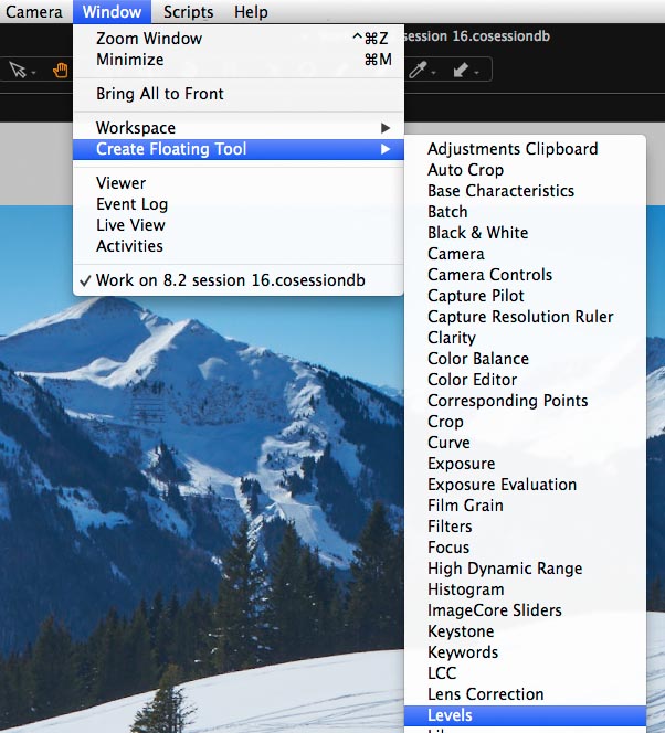
NOTE: This article discusses an outdated version of Capture One. To learn more about our latest version, click here.
A popular question line in many of our webinars on Capture One often concerns cropping. For example, “How do I crop to specific dimensions?’ or “How do I crop to a certain width in Cm/Inches/Pixels”.
In this blog post I will run through a couple of examples and golden rules, which you can apply to your own workflow.
A golden rule
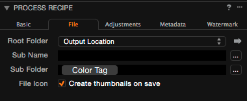
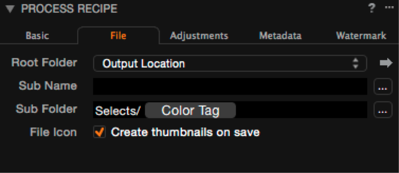
When cropping, it is worth keeping in mind that cropping dimensions and other factors are directly related to the currently selected recipe, in the Process Recipes tool.
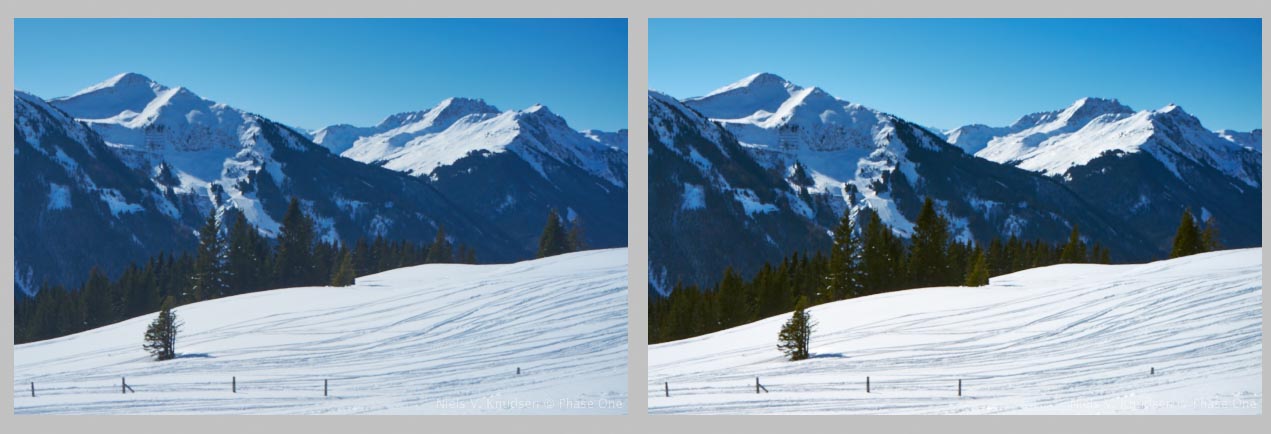
In the first example below, the recipe ‘TIFF 8 Bit Full Size (Adobe RGB)’ is selected. Notice that the Scale option in the Basic tab of the Process Recipe tool is set to Fixed and 100%.
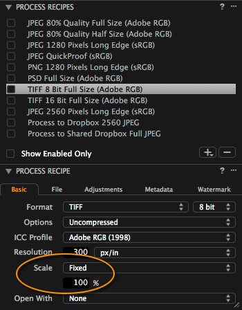
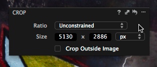
Then, if we look at our cropping values in the Capture One viewer, the pixel dimensions show that Capture One is simply cropping to the maximum possible resolution. (These cropping Labels can be disabled in the Capture One Preferences if you would prefer not to see them, but they are useful!)

Now, if I choose recipe where the scale is somehow changed, in this case limiting the number of pixels to a certain value on an edge, then the pixel values in the crop will reflect that also.
So, hopefully you will consider this as a clue as to how we can crop to specific dimensions by linking the Crop tool to the Process Recipe. But more on that later, let’s start simple.
Often the most you need to do when cropping is to honor a certain aspect ratio. This is very simple to achieve. With the new quick cursor tools in Capture One 8.1, this is even simpler – with the Crop tool selected, simply right- or control-click.
Then choose the aspect ration in the Ratio drop down menu.
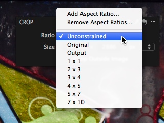
So, for example, if we needed a 2×3 output we would choose it accordingly. Usefully, it is not necessary to have a portrait or landscape aspect ratio. The crop will ‘snap’ to either if you choose to give priority to a landscape or portrait crop.
New Aspect Ratios can be created by choosing the first option in the same menu.
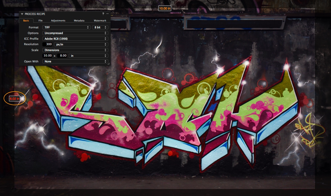
This method can be used for creating outputs that fit into an aspect ratio. For example, you can make an aspect ratio set to ’10 x 8’ for producing 10 inch by 8 inch prints, knowing that it will be the right ratio to print to that size, if you are prepared to let the print engine resize to the actual dimensions. There is nothing wrong with that method, especially if you may want to print larger at a point in time, but if that is not the case, then you are creating too large an output for the task at hand.
If you want to link the Crop tool to the currently selected Process Recipe, then it’s very simple. In the available options in the above Ratio menu, choose Output.
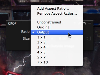
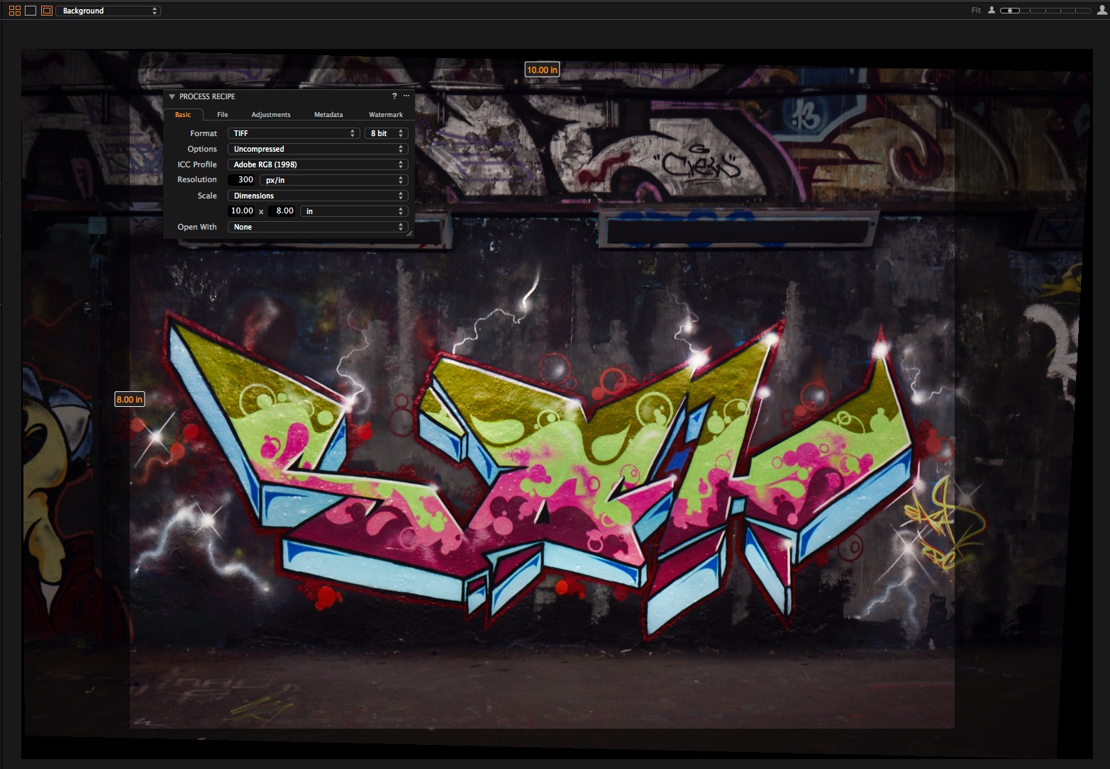
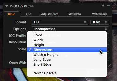
The next part is to change the scaling options in the Process Recipe tool to specific dimensions.
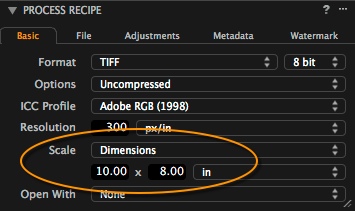
Now, when the Crop tool is used, with that Recipe selected the Crop tool will always crop to the correct aspect ratio and output to the correct dimensions.
If you have ever seen that one of the crop labels is marked in red, this usually means that the Crop tool aspect ratio has not be set to Output, and therefore mismatches the Recipe, or the required output is not possible in terms of available resolution or Capture One’s scaling restraints.
The possibilities of cropping in this method are not limited to exact dimensions. If you take a look in the Scale drop down menu, several other options are possible. For example, limiting the long or short edge to a certain number of pixels has lots of uses in web size requirements.
This is another reason why it is worth exercising the full possibilities in a Process Recipe. It can save you huge amounts of time and improve the quality of output.
Best regards,
David Grover