Usually, I carry little when I am on a job – only cameras, lenses, memory cards, pen and paper, and that’s about it. I’m not required to lug around a notebook, I edit RAW files on my workstation and deliver images and text the next day or so.
From time to time, though, I get assignments, which require overnight stays, and delivering images on-site. Capture One Pro’s Session mode really makes my life easier, both during an assignment, and afterwards.
Why Sessions?
First of all, Sessions are what I’m used to working with. I’ve been working with Capture One for years now, and once a “workflow” works for me, I’m not inclined to change it. I started using Capture One Catalogs on my workstation a while ago, but on notebooks? It’s definitely Session time.
Apart from force of habit, Sessions make it easier for me to cull images, back up files via FTP or Dropbox, and move photos, and settings, to my main Catalog once I am back from a job.
On-site
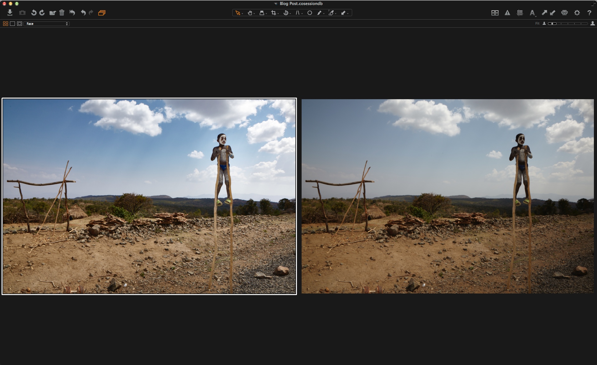
I create a fresh Session in Capture One Pro 8 using a pretty basic workspace template. I don’t usually shoot tethered, so I don’t need the “Capture” tool tab, for example. I then import the day’s images, rename files and add metadata such as copyright with tokens and templates.
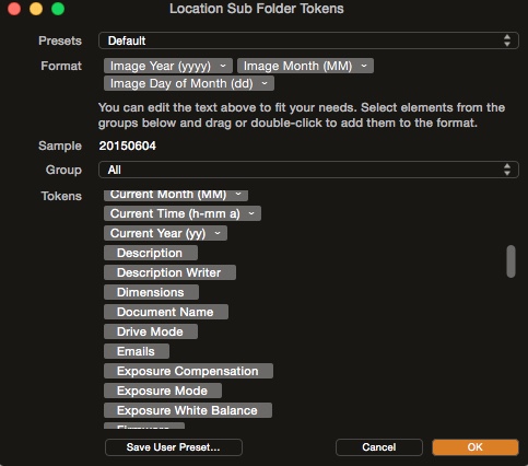 Tokens make it easy to dynamically create structure and rename files.
Next, culling. One thing I never do while on a job is to delete images directly on a camera or memory card. Things can get pretty hectic, and the risk would be too high, that I accidentally delete the wrong file(s). So, I often end up with a couple hundred images within a few hours.
For culling, I disable the Viewer with CMD+ALT(option)+V, and use the red color tag by hitting the “minus” (-) key. I filter out images tagged Red in the browser. They’re still on the work drive, but won’t get in my way.
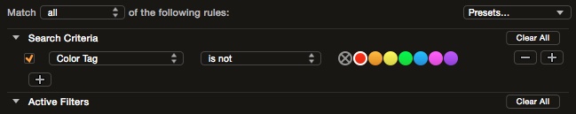 Keeps your browser tidy: The minus key can tag images as a “reject” button.
Sometimes, clients need printouts or JPEGs the same day – say, as a present to speakers or for a wrap-up at the end of a conference. So, while culling, I also move key images to the Session’s “Selects” folder by pressing CMD-J (PC users hit Ctrl-J). Culling and selecting is completely keyboard-driven for me, and I can go through hundreds of images very quickly. If I DO need to take a closer look, I switch to the Loupe tool (P key) and magnify portions of an image right inside the browser.
Why not just use another color tag, e.g. green, for key images? Networked backup, that’s why. With hundreds and hundreds of images, and wonky internet connectivity at some venues, it’s just not practical to upload the complete session to e.g. an FTP server. If I end up with two dozen or so key images, backing up the most important files by dragging-and-dropping the “Selects” folder, as appose to the entire Session, it’s more feasible.
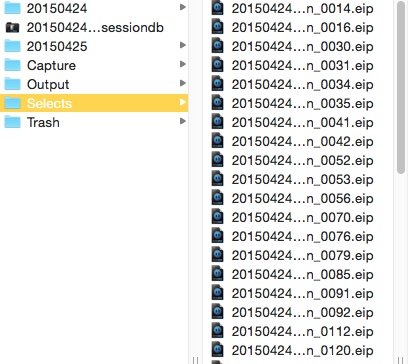 A Session’s folder structure makes networked backups a bit more bearable.
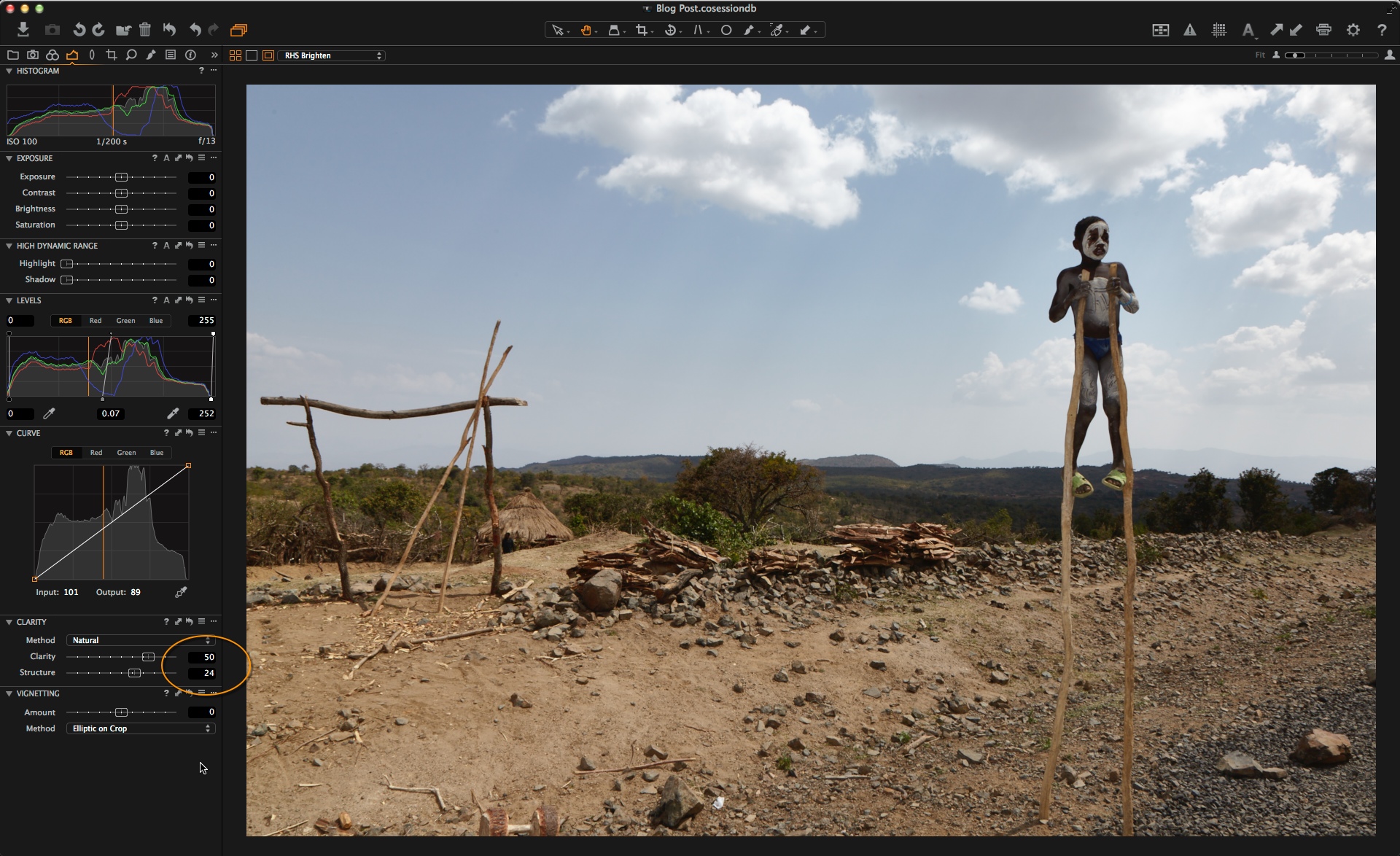
Next, I switch to the “Selects” folder and edit my key images. Thanks to Capture One’s Copy/Apply Settings tool, I can easily transfer basic development settings to the rest of the day’s shoot. Afterwards, I process the key images for the client’s needs, as specified prior to the shoot.
Usually, I don’t add much more metadata at this stage. Everything is contained inside the Session’s folder structure, so I don’t need to differentiate between clients, jobs or topics. Also, I might not have all names of speakers, artists, guests etc. yet, so keywording doesn’t make much sense at this stage.
There and back again
Once I’m back in my office, it’s time to move the images to the workstation for the heavy lifting (say, the client also wants files for a print ad) and archiving. Sessions make this step very easy: In the workstation’s Capture One Catalog, I hit the import button and navigate to the notebook’s Session folder in my LAN. I make sure to check the boxes “Include Subfolders” and “Include Existing Adjustments”, hit “Import All”, and have some coffee.
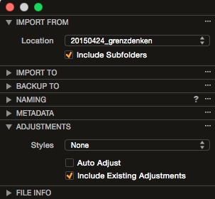 Don’t forget to include your adjustments when importing images to the main Catalog.
Using Sessions on the notebook, rather than Catalogs, saves me the step of either exporting all images, then importing them, or moving the notebook Catalog to the workstation and merge with my main Catalog. Merging the Catalogs would require a clean-up to get file naming, file location, keywording etc., so it’s less than ideal for my workflow. Importing images, using my usual import templates, is easier and leads to more consistency.
“Easier” is the key word here. With Sessions on notebooks, and Catalogs on the workstation, I have a robust workflow that is easy to maintain. If it’s too complicated, I tend to avoid going through all the necessary steps, especially when I’m a bit tired after travelling for a day’s shooting. Using the best of both worlds – Sessions on the road, Catalogs in the office – helps me minimise potential mistakes, while it is also saving me time.
A word on EIP
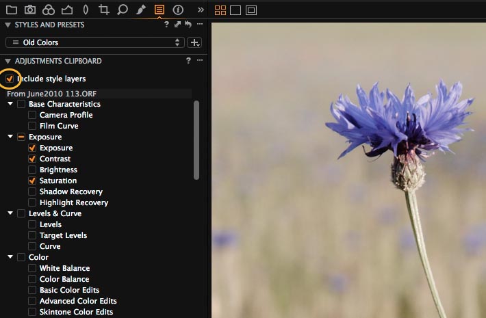
You might have noticed in the screenshots that I use EIP while in Session mode.
I do this due to my obsession with back-ups. On slow networks, uploading a single EIP file rather than the original RAW file plus Capture One sidecars, shaves a couple of minutes waiting for a large backup to finish. It’s not much, but if you’re using your mobile as a WiFi hotspot it can be something to consider.
It’s not a perfect solution, but for the time being it’s how I do things. As mentioned above, I don’t like to change tools that work for me – but naturally, your mileage may vary. Will I stick with EIP? As Capture One’s Catalogs grow more powerful, sooner or later it won’t make much sense to do so. Thankfully, opting out of EIP is easy with Capture One: Either use the “Unpack” option in Session mode, or import your EIP files into a Catalog.
Best regards,
Sascha
www.saschaerni.com