If you are an architectural or interior photographer using a technical camera, the LCC Tool in Capture One 7 is a tool you wouldn’t want to miss.
LCC is an acronym for Lens Cast Correction and this tool will help you correct common issues that arise when using wide angle lenses and movements on these types of cameras. In fact, users of any camera may benefit from this tool too.
Fixes color casts and uneven exposure swiftly
There are many kinds of technical cameras available particularly suited to architectural and interior photography.
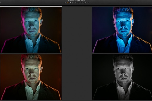
Lenses for technical cameras are typically designed as non retro focus lenses, which means that they behave according to the classical lens equation. This equation says that if you for instance have a 35mm lens and you focus at infinity then the distance between the lens and the sensor will be 35mm, which is actually very close the sensor. If you also use movements then the light exposing the sensor will be arriving at an extreme angle . This can cause color casts and uneven exposure across the whole image.
An LCC file can be used to swiftly correct this, along with the additional bonus of detecting and removing dust spots in the image. The dust removal feature can be applied to any kind of camera, not just technical cameras.
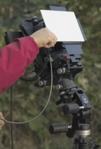
The only additional piece of equipment you need is a semi opaque piece of perspex, available from most photographic outlets. The opaque filter allows for some light to enter through the lens, while still providing a uniform surface accentuating the image created by only what happens when light passes through the lens.
How to create LCC files
Creating and applying LCC files is a simple process and does not require much time, especially as they can be created and applied as a batch in Capture One Pro 7.
Out in the field, remember to capture a LCC reference image with the same conditions as the capture you wish to correct. I.e, don’t change any settings on the camera with respect to movements, position or aperture. If you need to add a bit more exposure to prevent the LCC reference image being too dark, do so by increasing the shutter speed as opposed to changing the aperture.
Also try to keep the same order for capturing LCC reference images compared to the actual image as this makes batch correction much easier, for example:
Image – Image – Image – LCC reference image. Image Image – LCC reference image.
So, in this case I capture the actual images before capturing our LCC reference images under the same conditions.
Capturing an LCC reference image can look something like this. Note the kind of semi opaque filter the photographer is using.
Applying LCC files in Capture One 7
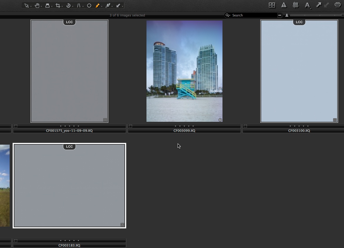
Before we can use the corrections to improve our images, we first have to create the LCC file. In Capture One 7 this process has been optimized so we now can calculate the LCC correction files and later apply them to the real images in a batch process. Below we have a sequence of captures and LCC reference images in Capture One 7. Note the uneven exposure and color casts on the LCC reference images.
 In this case the photographer has chosen to capture his LCC reference image after the capture itself. If your captures have become out of sequence, manually sort them by dragging them into the right sequence.
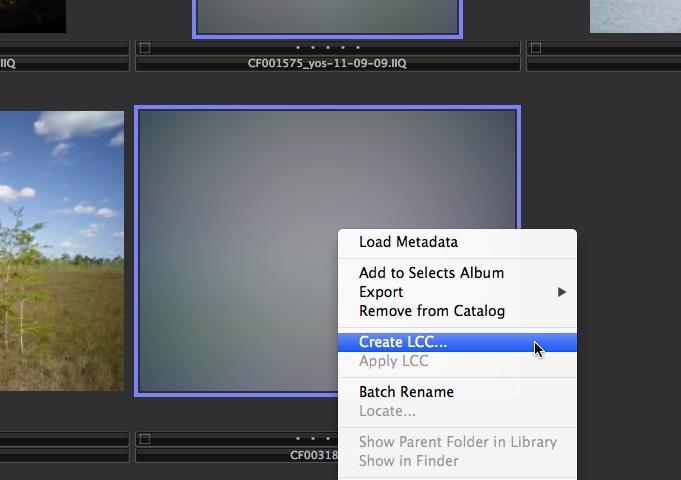
 Now, simply select all the LCC reference images, right-click on one of them, and
choose Create LCC. A small dialog box will appear at the top of the screen to set the parameters for the LCC correction.
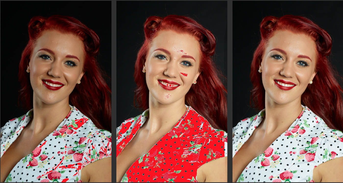
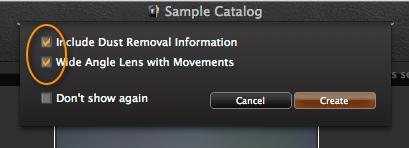
 The first check box includes dust removal information in the LCC file. This is very useful for correcting a large batch of images with the same dust spots. This option could be beneficial for any camera not just technical cameras!
The second option will create a better LCC file if you are using a very wide angle lens coupled with movements. If you are not sure if you need to check this box, then the safe option is to check it anyway. It does not mean that the LCC will be unsuitable; it just takes a little longer to create.
Capture One 7 will then proceed to analyze the LCC reference image. When the operation has completed, the LCC reference images will be marked with a LCC label at the top of the images.
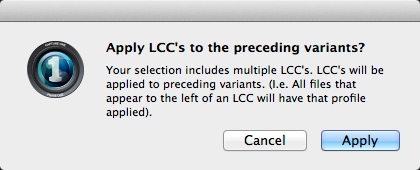
 You can already see that the color cast and exposure variations have been removed on all the LCC reference images. We now need to apply this correction to our real images captured under the same conditions. Now select all the images both the LCC reference images and the real images, right-click on one and choose Apply LCC. The following dialog box will appear.
 Remember, you could have captured the LCC reference images after the images, just keep the format the same for a collection of images. Click Apply and the LCC correction will be applied.
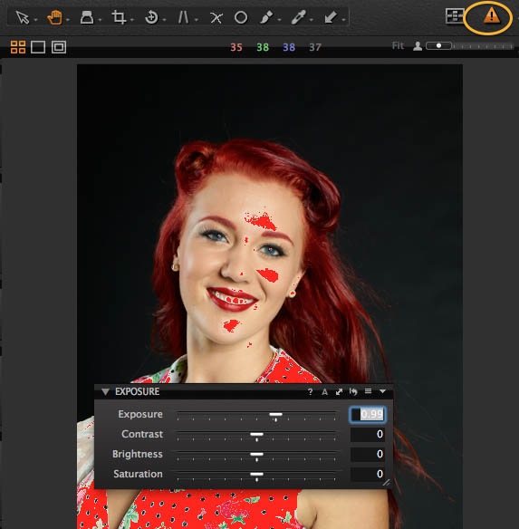
Let’s look at the options in the LCC Tool (by default in the Lens tool tab) for a particular image.
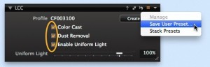
 In the LCC tool the “Profile” shows us the name of the LCC reference image we are using for the LCC correction. It is a simple matter of choosing which parameters of the LCC correction you wish to use – Color Cast correction, Dust Removal and Uniform Light.
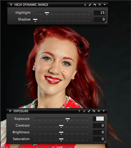
When the Uniform Light correction is set at 100%, then all the lens introduced light variations will be evened out. Sometimes you will get a more photographic pleasing image if you only partly compensate for the light variation by selecting for instance 70 % Uniform Light.
Now the images are ready for further adjustments as you would normally do with images from a non technical camera.
If I place a cloned variant of the image next to the original you can see that the Dust Removal option is working well.
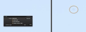
Now that we have checked the Dust Removal option you can see it has removed the dust spot that is visible on our original image, shown on the right in the orange circle. Again, this feature of the LCC Tool could be used for any camera, not just technical cameras.
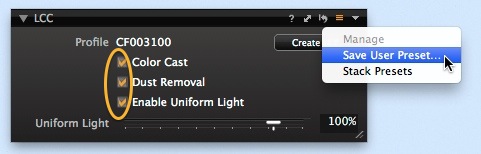
As I have stated earlier on in this blog post, for the best results it’s best to capture the LCC reference image in exactly the same conditions as the image is to be captured. However, if you are unlucky enough to forget to do this, you could consider saving a library of LCC Presets. For example, each of your lenses at a variety of your common working apertures. You could include movements as well.
Simply save them as a Tool Preset.
If you have a stubborn dust spot on your sensor that you cannot remove by cleaning it or don’t want to risk it, then you can also consider including an LCC dust removal as part of a Capture One style applied on import or capture.
LCC reference images can be created and used in a Catalog or Session and are also cross compatible between Mac and PC.
Best regards,
David