
NOTE: This article discusses an outdated version of Capture One. To learn more about our latest version, click here.
Today’s monitors have improved a lot during the last few years. Many of the new ones provide nearly 100% of the Adobe RGB (1998) workspace and have a pretty reasonable default calibration.
On a Mac system, where color management have always been an important part of the Mac experience, it may even look acceptable. However, as soon as you really need to rely on what you see on the monitor, you will need to create a monitor ICC profile for it and make sure that your operating system is using it correctly.
Today, ICC Color Management is an integrated part of the operating systems on both Mac and PC’s, and all serious image applications are using ICC Color Management when displaying images on a monitor.
The easy way with EIZO
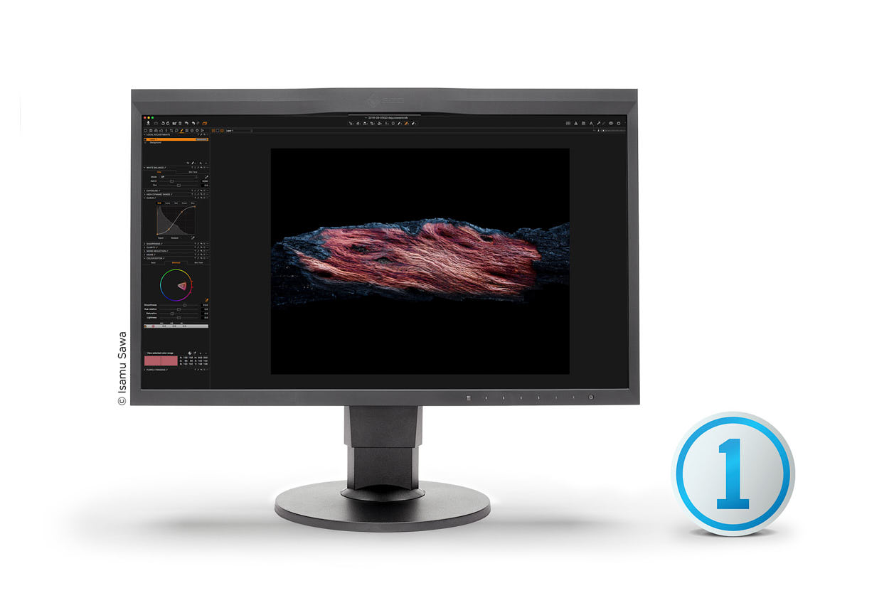
With the release of Capture One Pro 9.3, we have completed a long on-going collaboration with EIZO. This has resulted in a one-click solution for calibrating the high-end EIZO monitors with integrated calibration sensors.
This feature is a great solution for all of those who do not want to be an expert in monitoring profiling and just want a proven, trustworthy solution setting up for a target of gamma 2.2, 5000K White Point and a brightness of 120 candele/m2.
If you would like to try out this solution, you need to open Preferences, open Color Tab and push the One-click calibrate button. As long as you have a supporting monitor tab, sit back and watch the magic happen.
Profiling a monitor
For those who like to be hands-on or are interested in getting to know the work that lies behind profiling a monitor, we have provided you with an explanation. Profiling a monitor basically consist of 3 steps:
- Calibrating the monitor
- Measuring the color and tonal response
- Creating a monitor ICC profile
To profile a monitor, you will need a specialized monitor calibration solution which includes an application and a color measuring device, typical connected via USB. There are at least a couple of solutions available on the market.
First part of the Profiling process is about bringing the monitor as close as possible to a standardized setup. To describe such a setup we typically specify 3 parameters:
- Gamma response = 2.2
- White Point = 5000K
- Brightness = 120 candela/m2
Gamma Response
The gamma number refers to the mathematical gamma function and it is used to describe the un-linear response of the monitor, which originates from the days with CRT tube monitors.
Historically, Mac computers were using Gamma 1.8 and Window computers 2.2. Mac chose the gamma 1.8 as it was easier for them to match images on a monitor and a printer when using gamma 1.8. In those days, the ICC color manage system was not invented.
With today’s ICC Color Management workflow you will get equally good results whether you use gamma 1.8 or 2.2. However, as the most often used workspaces for images (The Adobe RGB (1998) and the sRGB workspace) use gamma 2.2, it has become the default standard to use gamma 2.2 for the monitor setup.
White Point
Any color displayed on a monitor is created by a mix of the monitor’s pure primary colors: The pure Red, pure Green and pure Blue. The White Point basically describes the balance of Red, Green and Blue light when a white color is displayed in the monitor.
A White Point of 5000K, which is practically the same as D50, gives a neutral daylight white. For critical viewing of prints it is recommended to use a 5000K light source. A number of print viewing booths with 5000K light sources are available, as well as general lighting solutions for room illumination at 5000K.
A modern quality monitor has no problem using a White Point of 5000K while still being able to be bright enough. It has not been like that always. Earlier monitors were very bluish by default, and when you tried to set it up for 5000K it would often be too dark, which forced you to make a compromise and use D6500 instead.
Brightness
The Brightness of the monitor is the last parameter to setup. There is an ISO standard that specifies a brightness of 160 candela/m2 for critical inspections of color prints. So, ideally you could set your monitor for a brightness of 160 candela/m2 and having a viewing booth matching that brightness level but running a monitor at this brightness may reduce its live time. A very good compromise is then 120 candela/m2. Most viewing booths can easily be dimmed to match that brightness level and it is fairly bright for critical color judging.
Calibrating a Monitor
As the first step of profiling a monitor, you need to set it up as close as possible to the target values. Depending on the calibration solution and your monitor, this first part can be done either pure manually or automatic. These two methods will be further explained in the up-coming sections.
Manual setup
On your monitor there will be a menu system where you should be able to select the target values:
- Gamma 2.2
- White point D50 /5000K
- A brightness level
When you start the monitor profiling application you will have to specify the target values for the monitor. The profiling application will now be able to measure the monitor setup and guide you to optimize it in order to get it closer to your target values if the monitor menu system allows you to do so.

Calibration colorimeter on EIZO monitor
Now that the monitor is correctly set, it is time for measuring how it performs.
Typically, this requires at least measuring the monitor’s primary colors the pure Red, pure Green and pure Blue and the linearity of the monitor. These measurements are then used for generating the monitor ICC profile.
In this manual calibration case the ICC profile will contain a linearization tables for the Red, Green and the Blue Channel that will be used by the graphic display card to insure the correct white point and a perfect linearity.


If you double-click on a monitor ICC profile on a Mac it will be opened in the Color Sync Utility application. Here you can inspect the “Vcgt” tag, which contains the lookup tables for the graphical card. In this case we can see that the Red and Blue lookup table are a little different as these curves compensate for a non-perfect White Point setup at the monitor and for some un-linearity.
Automatic setup
In some high-end monitors the profiling application will be able to communicate directly with the monitor via USB connection. If this is the case, the profiling application is able to set the monitor for the target values in closed loop calibration.
For some monitors it is even possible to load the measured linearization tables into the monitor’s hardware where they can be using a 10 bit resolution. If so, the ICC profile will still have lookup tables for the Red, Green and Blue channel but they will all be perfect linear as any un-linearity compensation has been moved into the monitor hardware.
This way of calibrating a monitor is, of course, the preferred solution, as lookup tables in the graphic card only works in 8 bit and can cause visual banding in very smooth tone transitions if the needed corrections are too big.
At the end of the profiling process, a monitor ICC is generated. As I work with laptops and with different external monitors (studio, office, home), I name the ICC profile by a model name/location and a data. This way it is easy for me to identify the different ICC profiles if I want to inspect it in, for instance, ColorSync Utility.
Just Viewer Booth
Quality control
Now you should have a perfect calibrated monitor and the monitor ICC profile has been setup for the ICC Color management system on your operating system. But something may have gone wrong, so you are recommended to do some kind of validation of your new profile.
For years, I have been using the same reference file that I almost know by heart how is supposed to look, and I have reference prints of that file that I can bring up in my viewing booth next to the monitor. Over the years, I have tried many different monitor profiling solutions and many times I have ended up with something not looking right.
How often do you need to profile you monitor?
High-end monitors do not change much over time. Working with a rather new monitor, I only profile every 12 months. It is important that you make sure that you do not start to calibrate the monitor before it has warmed up. Depending on the manufacture, this can be done as fast as in 7 minutes.
My experience also tells me that my monitor is in fact very stable. However, if I profile it with different applications and/or color measuring devices I will get more or less different results, so it is also very important to use the same tools every time.
All the best,
Niels

The Image Quality Professor
The digital pioneer, Niels V. Knudsen, is Phase One’s Image Quality Professor and founder of the IQP blog. Moreover, he is responsible for breakthrough advancements in image quality both in Phase One’s medium format camera systems and in Capture One Pro.


Hi Niels,
For fashion photography work would you recommend D50 or D65 white point? I see most of the calibration tools like the X-Rite stuff seem to default to D65.
Mind you, I won’t be comparing prints to screen in viewing booths, but I’ll just be using the screen (NEC PA Screens) for shooting tethered into and for retouching.
Many thanks.
Hi Diego,
This is a good point and after speaking to a colour management professional, I learnt that Adobe RGB and sRGB base their colours on a white point reference of 6500K (D65). I also found out a few years ago that MAC OS colours use a white reference point of 6500K (D65), although I am not sure if this is still the case with regards OSX 10.9 onwards…
As a rule of thumb I use 6500K for web and 6000K for print (5000k monitor looks excruciatingly yellow when proofing the print in a D50 colour booth)
Hi!
I have a new iMac with 4K display and 10.11.6. This is based on 6500 as default.
I have just ordered a Datacolor Spyder5Expres (replacement for Spyder3) and I can se in the SW spec that it can only use 6500 for the white point. The more expensive models have other choices, but I suppose as the Spyder5Express is sold for general used, it will work with other displays too also those with 5000 as default.
br Per Ulrik
Any advantages/differences compared to using EIZO’s ColorNavigator?
any reply to this question? interested too.
There are no advantages. The difference is in the extreme simplification. This is a “one button” solution for the very narrow range of the monitors and it’s useless for color professionals and enthusiasts. And it’s sad that developers spend their time on such a secondary feature when there are a lot of primary features that could be further improved.
Hi Daniel,
Thank you for your comment.
There are no differences. You can achieve exactly the same by using the EIZO Color Navigator.
This feature is primarily meant for all those people who aren’t sure how to do the right setup but still wants a proven one.
Best regards,
Niels, The Image Quality Professor
Thanks, interesting article. However, a follow-up on soft proofing would be useful. How does monitor profiling fit in with selecting a specific proofing profile (View>Proof Profile) when printing to a particular type of paper, for example? Is it simply an essential prerequisite?
Hi David,
I have worked in the repro industry for a few years and I wish to share my understanding of the subject.
I have found that the soft proofing or as you call it, “proofing profile” gives you a rough idea of what your image would look like, on screen when printed to a specific paper.
However in order to acquire these profiles, as far as I am aware you would have to manually create this list, using a high-end spectrophotometer, and individually create a profile specific to the printer and the paper that will be used.
Once created they are not always 100% identical, monitor to print, but it gets you close enough to the hard proof, i.e the print.
Soft proofing, is essential when doing colour work for printed media, as it allows you to see what colours will shift on screen, before printing.
The units of „brightness“ (actually, the correct term is „luminance“) are candela per *square metre* (cd/m2) not cubic metre.
Hi Emilie,
Thank you very much for pointing it out, it was a typing error and it has been corrected 🙂
Kind regards,
Camilla, Phase One
I dont understand why the Gamma has to be 2.2 for PC and 1.8 for MAC.
Doesnt the Gamma curve depend on the monitor? Shouldnt have each individula monitor its own Gamma?
To my understanding:
A digital sensor delivers a linear output. So the Gamma curve corrects the monitor linearity or non linearity to such a point that my eyes can see the true color.
Please correct me.
I have to correct myself.
“my eyes can see the true color.”
I mean an even distribution of tonality for the human eye.
Hello Jürgen,
I am not sure if this helps, yet as far as I am aware MAC OS now uses a gamma curve of 2.2 and has been for several years. Sadly I am unable to be more specific as to when this change took place.
With regards to “monitor gamma” or “RAW file gamma” do add cambridgeincolour in your URL bar and type either phrase in quotation marks, in the search bar to read more on the topic.
Thanks Jean, I will have a look 🙂
Dear Jürgen,
It is true that the sensor captures light in a linear way before the tone mapping is applied. You could ask why the monitor isn’t a linear dimpling device – I would say that if the monitor was invented today it would probably have been linear, but as the they were invented in the days of CRT tubes, they were naturally un-linear.
Today, both Mac and PC use a default of gamma 2.2 for monitors, so you don’t have to worry about this anymore.
– Niels, The Image Quality Professor
Hallo und vielen Dank für die Information,
leider ist die restliche Nachricht auf Englisch:-(
Es wäre sehr hilfreich auch restlichen Text sowie Videos auf deutsch präsentieren.
Mit freundlichen Grüßen aus Murnau,
Tatsiana Gründl
Gracias por tan interesante articulo, el mismo Eizo recomienda para fotografia 100cd, y para la web y para la impresion 80cd. Estoy errado trabajando asi? Quien tiene la razon? Y por ultimo el monitor una vez calibrado arroja unos resultados de cada color me puede guiar en que articulo o libro puedo interpretar dichos resultados. Muchas gracias.
Dear William,
I know it can be confusing, but this is also why we made a one-click approach, which has proven to work for many years.
– Niels, The Image Quality Professor
Very clear and helpful article, many thanks!
The point of my question is: How important is it really and practically to calibrate a rather new monitor with a calibrating device?
I am not a professional, but coming from the Mamiya M645 I like the quality of my technical equipment and of nice colors on my prints (Epson SC-P600). After calibrating my iMac 5K, 27″ (end of 2015) with SpyderColor5 and changing between the Mac-calibration and the Spyder-calibration I only can see a tiny difference.
My problems are (a) to judge the brightness of a picture on my monitor and comparing it with the brightness of my print and (b) the different inspection situations over the day (daylight with blue sky, with clouds, different artificial lighting situations). Since I don’ want to invest in a lighting booth, have you recommendations for lighting at home?
Dear Johann,
If you work on Mac computers, there is a much higher chance that your high-end monitor will look almost perfect by just connecting it. On windows it typically doesn’t look as good if you just plug in the new monitor. It seems like color just isn’t high on the priority list for the Windows development team. I just recently got the Anniversary update for my PC running Windows 10 and all my monitor profiles were replaced by sRGB profiles and everything looked wrong.
I do recommend using monitor calibration, as this guarantees that what you’re looking at is right. Also, keep in mind that monitors will change over time.
Viewing prints using available light isn’t the best way to do it. I really recommend using a viewing booth if you are serious about your printing. Alternatively, you may be able to get office table light using D50 tubes with high color fidelity (CRI > 90.)
– Niels, The Image Quality Professor
Hello. This Monitor calibration feature is interesting. However, Eizo is not the only type of monitor in use for the rest of us. What about LaCie, HP etc…? Why restrain this feature only to Eizo ?
Dear Christophe,
The high-end EIZO monitors have an integrated calibrator. The EIZO monitor calibration solution in Capture One 9.3 is depending on this integrated calibrator to perform the monitor calibration. Therefore, the solution only works with these monitors.
– Niels, The Image Quality Professor
You’ve left out a couple of key factors in monitor calibration. One is that the ambient light in your editing room needs to be taken into account in order to set a proper luminance level on the monitor. Second, the black point of the monitor calibration is equally important and the default settings in Color Navigator are way too dark. They crush black detail. You need to experiment to see what works best in YOUR environment – for me that’s either .4-.5 cd/m2. Thirdly, it’s of paramount importance to be able to turn OFF the option in Color Navigator under Advanced Options, just before you actually make the profile – to Reflect Tonal Curve in Profile, (I going from memory so I may have the exact wording wrong, but you’ll find something close to that) This “feature”, as it might be, acts like Black Point Compensation for your monitor profile, and if you have it activated, which it is by default, it will give your a very incorrect rendering of black and near black areas of low key images. The people at Eizo don’t even know what it’s for or why it’s checked by default – at least the folks at Eizo USA here in Los Angeles. For anyone that has an Eizo, I can’t see this one-click solution as being any kind of advantage or just using CN, which allows you to address the issues I’ve outlined above and can even be automated to re-calibrate and re-profile automatically if so desired.
Dear Peter,
You are right that the ambient light should be taking into account when calibrating and viewing monitors. Some calibration solutions even provide a form of ambient light compensation. My experiences with such solutions are that you are better served by not using it. If you work with a viewing booth with adjustable light, I find it easy to dim the light to match the brightness of my monitor.
The simple calibration solution in Capture One Pro is an option for those who don’t really know how to do advanced monitor calibration. For all of you who have already found out what works best for you, keep on doing that.
Black Point is a challenge for monitors. Since the darkest tone on a monitor isn’t really black, you have 2 options:
1. You can reproduce colors 100% perfect as long as the color can be displayed on the monitor. The downside of this approach is that you will not be able to see all the nice shadow tones – they will just be shown as clipped black patches.
2. Here you will display real black, or at least as black as the monitor will allow. Now you can see all shadow tones on the monitor, but this is only possible if all colors are squeezed a little, which means that they are not 100% correct any more. In real life, option 2 works quite well as our brain is good to compensate for the shift in black level. Fortunately, most monitor calibration solutions are using option 2 when profiling.
Black Point compensation is a method trying to combine the best of both option 1 and 2, and it’s not easy for everyone to do this.
– Niels, The Image Quality Professor
With my monitor, calibrating using i1Pro, I have a native contrast ratio of 822:1 (luminance 120 cd/m2, 6548K (target D65), black luminance 0.351 cd/m2). Would I be better off using the ICC PSC Black point (287:1)?
Dear Davd,
Unfortunately, I have no experience with that.
– Niels, The Image Quality Professor
Hello Peter,
You raise an interesting question and the answer is down to the rendering intent of the software you choose to use. The black levels you mention are high and if you are comparing to prints then this might be better matched to the ICC profile your using. However, some software works better with black point compensations set, while a few work better without.
In general, the industry works to the default black point in ColorNavigator, the other part of this process is the soft proof configuration.
You will find a wealth of resources on the EIZO website here: http://www.eizoglobal.com/library/index4.html
Feel free to contact me at EIZO if you have any questions…
Victor
Interesting article.
I have found it very easy to calibrate my monitors and printers using the ColorMunki Photo. What I haven’t figured out is how to use photos of the ColorChecker Passport to calibrate the camera with the existing lighting. The Xrite software integrates with Adobe Lightroom and Photoshop, doesn’t directly support Capture One. Do you have suggestions?
Is it working with the ColorEdge CX240? I tried several times but it says there is a calibration already on the run,or there is no EIZO device or there is a problem with the calibration system. Any advice?
Dear Urs,
The built-in calibration sensor only exists in the EIZO CG series. This is a swing-arm calibration sensor.
This swing-arm doesn’t exists in either CX240 or CX241. If you read the specifications for the different monitors, you can also read that some have a built in calibration sensor (CG series) and other have a built-in correction sensor (CX series).
Consequently, we can only use this one-click method with the swing-arm calibrators.
– Niels, The Image Quality Professor
It doesn’t work with my CX241. And I have no idea why I would like to have this feature, EIZO ColorNavigator is good enough for me.
Hello Igor,
The calibration is only available on the ‘CG’ monitors with a built in calibration probe, you can use ColorNavigator and your own device to calibrate the monitor…
I am a retired textile engineer and have dealt with changes in color under different light sources (metamerism) most of my life. This experience can be directly translated into my “very serious hobby” of photography.
All lighting/illumination standards are set up by CIE (the international color/illumination authority). D50 is used only by the printing/graphics industry while virtually all other industries use D65.
These standards are based on a spectral distribution curve (how intense each individual color is within the overall appearance). While incandescent bulbs (and natural light) have a very regular spectral distribution curve, fluorescent lamps have very irregular curves, with sharp spikes at specific colors. Commercial fluorescent bulbs vary widely in their color representation and their reference to a specific color temperature (K = degrees Kelvin) is only given as “correlated color temperature” (CCT). Therefore a 5000K bulb does not necessarily represent a “D50” standard. The interesting question is if color monitors really are representative of the D (50 or 65) standard or if their spectral distribution curves are also different from one to the other.
We all know that the “daylight” changes all the time. Although touted as “daylight” D50 (5000K) or D65 (6500K) can only represent the outdoor light at a given time/day/weather condition. D65 is close to the “north light”, i.e. noon light through a north facing window that is considered ideal by painters. Direct sun light is about 5800K while “daylight photographic film” responds to 5500K.
Standards are set up to bring all parts of a production chain on the same page. Generally industry standards prevail, unless you have enough clout with a supplier to impose your own standards.
However the most important question is under which conditions will your product be seen by the consumer/buyer? In the textile industry we would set up D65 for sportswear (mostly worn outdoors) and Type A light (tungsten = 2800K) for evening wear. As my prints will be shown in galleries with mostly Halogen lights (3200K), I use this light source as my primary. I check against D65 to make sure that nothing really bad happens under this light which represents the muted indoor day illumination in a home. Of course I expose, process and print myself, so I don’t have to coordinate with outside entities.
Hello Werner,
Very well articulated commentary, I work with many people in the fashion industry and recognise the challenges you describe!
If you need to define a different color space then I would recommend you look at the EIZO ColorNavigator software as you can define the parameters exactly as you need. For example, the Color Temperature can be specified from 4000K to 10,000K this should allow you to get a close match you specified environment lighting you describe in soft proof.
Thank you
Victor
Victor,
thanks for your comments. However I believe that only works with Eizo monitors. I am actually pretty OK with my monitor calibration as I have found certain Photoshop adjustments that I routinely apply to images after I am happy with the onscreen appearance. Ultimately a test print or two are the only real verification of what an image will look like. Luckily I print myself, so I don’t have to be concerned about outside entities.
Hi Niels,
A quick question. I have an Eizo CG277 with built in calibrator and until now I have used the ColorNavigator to adjust the colour settings. I have used the default “Photography” target within Color Navigator which is set at Brightness – 100 cd/m² – White Point 5500K – Gamma2.2 . However using the Capture One to create the monitor settings you have these values – Brightness – 160cd/m² – White Point 5000K – Gamma 2.2
The question is – which is the best profile target to use? I supply ad agencies with files for images I have worked on using the default Eizo Photography target profile and so far all my clients have been very happy with the results. So while I think the monitor calibration feature in Capture One is a really great idea I’m worried if I use the Capture One default monitor settings things might not be so compatible with my clients expectations. I’ve not used the calibration feature yet and of course I can easily revert to the Eizo profile if I want but can you tell me why the Capture One profile is better than the Eizo profile?
Hi Victor,
Thank you for your question.
If you currently have a setup that works for you and your clients, there’s no need to change it.
Regarding our brightness, our setup doesn’t give the ISO recommended brightness on 160cd/m², but 120 cd/m². This is the maximum brightness recommended by EIZO.
Best regards,
Niels, The Image Quality Professor
Hello there. Great piece of advice to read you all.
I want to react on “One is that the ambient light in your editing room needs to be taken into account in order to set a proper luminance level on the monitor”
Fact is : i used to do calibration (Spyder 3 with CN7) at day light, fact is : I often use to work on C1 in evening or night contexts.. So, what are the paramters and how should I compensate them ?
I’m not an expert but hopefully this question is of interest for the night owls.
regards
Christof