
Ormiston Gorge isn’t as big as the Grand Canyon, nor as deep or as wide, but it does have a spiritual presence. The age of the rocks, the ruggedness of the terrain, the light spinifex grasses and the white trunked gum trees create an enchanting landscape. Around two hours west of Alice Springs, it’s not far from Glen Helen Gorge where we were staying for the night and we planned to be there for the morning shoot.
We awoke at a reasonable time, 5.00 a.m. which was an hour or so before sunrise. A short trip in our vehicle and we found ourselves at the mouth of the Gorge. From the car park, you can take a level stroll around a dry river bed and into the gorge itself. There are several deep pools locked by towering rock walls, but to walk further requires a more agile state of mind and some rock hopping. We went this way on a PODAS a couple of years ago with Kevin Raber, Ken Duncan and Jeff Schewe.
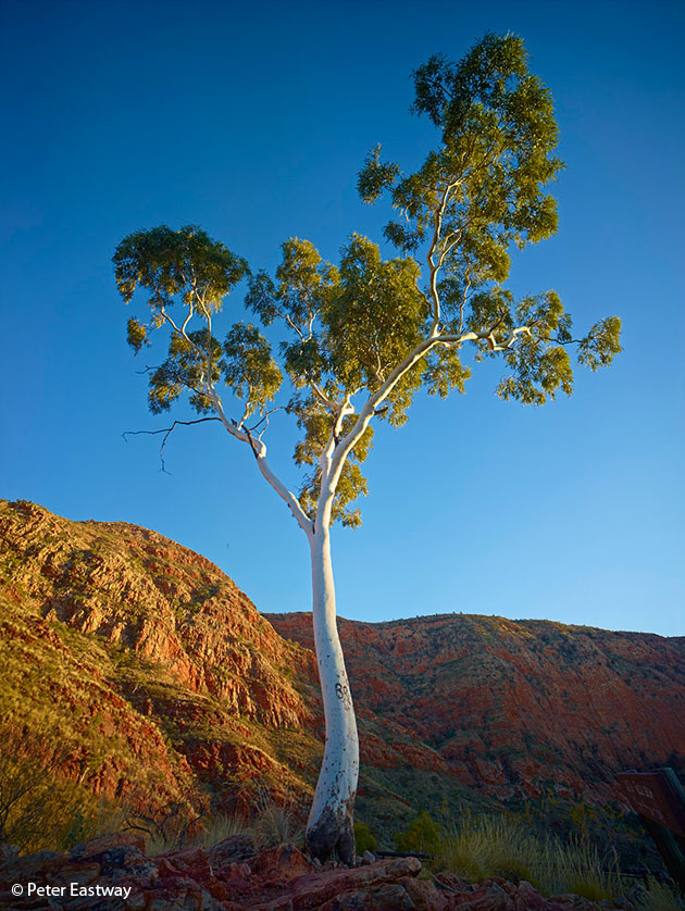 The other option is to climb up a path. There’s a great gum tree up the top of the rise and it can be photographed from a point half way up, or up at the tree itself. I went all the way to the top and spent a magical hour watching the light intensify, the sun rise and the light snake its way from the top of the gum tree down to the bottom of its trunk.
Just being up and out at this time of the day is wonderful enough, taking a few great landscape shots even better!
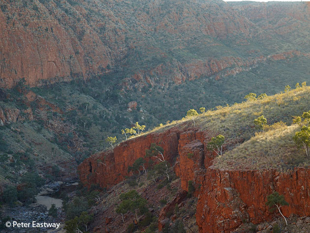
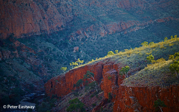
Across from the tree, a finger of land pushes into the Gorge, requiring it to dog-leg around. As the sun rises, its rays skim across the top of this land, lighting up the trees and grasses, but I’m also seeing the strong reds come through in the rock faces below and behind. To my eye, it’s a strong composition, but it requires a telephoto to make it happen. Although many people think landscape photography is best approached with a wide-angle or a panorama camera, I find a lot of my shots work better by simplifying the scene with a telephoto.
The accompanying image is photographed with a 110mm Schneider Kreuznach, so it’s only a mid-telephoto, but long enough to crop the scene and eliminate the sky behind. By removing the sky, the image has the feeling that the rock face behind goes upwards forever, plus it reduces the number of compositional elements to deal with.
And while I might be teaching most readers to suck eggs, when shooting into the light, it’s important to not only use a lens hood, but perhaps shade the lens hood with a cutter or your hand as well. It’s essential to keep any unwanted flare under control.
Post Production
In Capture One, the processing was relatively simple, especially with the new High Dynamic Range algorithms running around inside.
However, to start I struggled with the colour balance a little. The natural or ‘correct’ colour was a little yellow to my eye and I wanted there to be more contrast between the colour in the sunlight and the colour in the shade. The camera had set the Kelvin at around daylight, which was very sensible, but I found by dragging the Kelvin slider down to 4600-4700 that I was able to produce a little coolness in the shadows, and this contrasted well with the warmth of the sunlight on the yellow grasses.
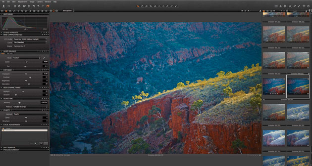 The exposure was pretty right, so next step was to increase the contrast and give the image some guts. This worked well, except in two places. The highlights on the grasses lost detail and appeared too light, while the shadow areas in the bottom left became a little muddy. No trouble, the High Dynamic Range tool is the answer.
Using the Shadow slider, I lightened up the shadows without going overboard. I still want this to be a dark part of the image, but I want you to be able to see what’s in it. Similarly, the Highlight slider allowed me to return detail and colour in the grasses up the top.
I find when using the High Dynamic Range tool that I have to return to the Contrast slider in the Exposure tool and, usually, add in a little more contrast. Not always, of course, but if you’ve been using the High Dynamic Range tool and struggling a bit, try using it in combination with the Contrast slider and between the three controls, Capture One Pro 7 is remarkably powerful.
 Sitting back and looking at the image, I then increased the colour saturation (I like colour), cropped the top of the sky out of the image completely, added in a vignette to darken the edges and, finally, added a Local Adjustment to darken down the rock wall in the distance. This helps to emphasise the separation between it and the finger of land in sunlight.
Cheers,
Peter
Peter Eastway
Peter Eastway’s passion is undoubtedly for landscape photography, but he is equally comfortable with portraiture, advertising and travel. He is currently an AIPP Grand Master of Photography, one of only a dozen in Australia and earned from a career spanning over 30 years.
To be totally honest I’m not at all impressed with either pre or post, post is far to over saturated it must be very disappointing to most people who go to these places after seeing over saturated photos of the place. Or a big relief it’s not like that at all. Sorry but fed up with seeing these Van Gough type images.
The image in this post is surely used to illustrate the capabilities of the software to compensate for the restrictions of camera dynamic range in comparison to the eye. Saturation is subjective, as are the other ‘variables’ in processing – I can only identify what looks good to me, through my eyes, if it relates to the original view, and if the image is pleasing to ‘my’ eye. I have no problems with the final image, but would also comment that the original, if RAW, would be pretty flat also, and wouldn’t represent the original view.
I enjoy reading your posts Peter – please keep it up.
I have to say the post processing simply takes the scene way to far – you’re handing ownership of the image to the computer. The web sharpening is also very poor. This article isnt a great advert for the photographer or the remarkable equipment it is shot with.
Is the world really so dull and ugly that we have to do this to out photographs?
Is pleasing or Puritan landscape images the issue here? Luckily, we are different persons and although I too do find Peater Eastways Ormiston Gorge landscape image slightly over the edge of colourfulness to my likings, I appreciate the issues in the motive, which Peter adresses. Hence, the PhaseOne processing in Peters example becomes a very sensible exercise at least, takng us through the potentials of PhaseOne. Thanks for that.
PS my best shots from Ormiston Gorge on the morning of the 18. of December 2012 were 2 10 shots stitched images executed in the French panorama software Autopano Giga – 10 shots of 36 MP each easily outranges any Hasselblad shot by more than 5 times! The detailing in such landscape pictures are simply stunning!
PPS Hopefully, PhaseOne intends to include an anti haze buttom for landscape image in their future upgrade 8, as is the case in Photoshop – an upgrade feature presented by Kolor / Autopano Giga.
I totally agree. Back when people were developing B&W negatives in the darkroom (which I did for 20 out of the 24 years I’ve been doing photo), they used different developing times or different developers to bring out detail, or they used a mask, a piece of cardboard moved over the wanted area of the paper during exposure to lighten some areas. Using a computer to reach the same image quality is no different. The photographer either tries to make up for what the camera cannot record but what his/her eyes could see, or he tries to give the photograph a pleasant look that catches and retains the attention of the viewer, something the original picture doesn’t do very well. Mind, the saturation might be too high for some, but in the world of travel photography, where travel agencies and magazines will buy your pictures for advertising purposes, this is usually that saturation they want.
To those who are so critical of the post production on these images, I must ask this: Was the world presented by Ansel Adams similar to his prints? Was the sky really that dark in Hernandez, New Mexico that evening? Were the blacks that black, and the whites that white in Yosemite the day the storm was clearing? Image manipulation has been used by fine art photographers since the days of the Camera Obscura. Photography, as with any art form, is inherently subjective. Personally, I too find the image a bit too saturated, and the shadows too cool. But, it is pleasing to the eye, and a well done photo. Some of my images I’m sure are just as saturated, and some are even more so. Many are quite a bit less. I’ve even been known to add some blue to the shadow areas myself. It’s a great way to increase contrast without losing details, and a trick painters have been using for centuries.
This article is about the capabilities of CaptureOne. Mr. Eastway was fortunate enough to be chosen to be the featured shooter. For that he should be congratulated. I’ve been a C1 Pro user since 2005, and have anxiously waited to see “what’s next” with each update. Some have been more successful than others (current buggy version for example), but for the most part, each update and upgrade has increased the number of tools in our arsenal. These, if used correctly, give us even more ability to provide the perfect image to our clients or viewers.
As with Adams’ work, some will like images one way, and some another. Though we should express our opinions of other’s work (you know what they say about opinions…), maybe we should keep those snarky and ill-spritied ones to ourselves.
I’m sorry but Ansel Adams prints are art. These are cartoons. Very poorly done.
Vic Moss. I am sorry that you are getting bad talking here.
I do not think that liking or not liking contrast and saturation is the issue. The issue is to achieve the tonality that you desire.
Actually I have myself found that I am using the the sliders almost the same way that you does. It works. And it is absolutely no problem to obtain different tonality and saturation.
Best wishes from Erlend Sæteren
Opinions are often mistaken for fact. Something I believe is happening here.
I am not equating Mr. Eastway’s work with Mr. Adams’. I am simply using Mr. Adams’ work as an example of image manipulation.
As I mentioned I’m not a fan of some of the post production done here. However, his use of a short telephoto compresses the scene very nicely. His understanding of the light fall also makes this a very nice photo. There is also some very nice vignetting added, another tool Mr. Adams used extensively in his darkroom.
His use of the sliders in CaptureOne can certainly be left to interpretation and personal judgement. But that was not the intent of the article. Photographers, by default, live by their egos, myself included. However, we shouldn’t build our egos by denouncing the work of others. Something I also believe is happening here.
Mr. Adams used to say the the negative was like the score of symphony, and the print was like the performance. Just because a clarinet is slightly off key, or maybe a violin string has loosened during a performance, it doesn’t mean the entire performance is ruined. You ignore the bad, and concentrate on the good.
How about some comments on how well the sliders of CaptureOne were used on a technical level.
As an architectural photographer myself, there are MANY times when I am unable to completely control the light in my photograph. Using the sliders in the HDR tab, along with the contrast and others, is indispensable in my work flow. As with everything else, there are times for moderation, and times for wild abandonment when sliding those little suckers back and forth. In my opinion, Mr. Eastway’s use of the sliders is probably a bit on the wild abandonment side, but not terrible far. They were appreciated enough by the staff at Phase One to pick him as the photographer to use to illustrate the capabilities of this feature in CaptureOne.
Agreed, let’s not confuse opinions and facts. And let’s keep this debate a constructive one. I’ve seen too many forums in which people end up saying other posters’ were “biased” just because they didn’t agree with their “findings”.
Comparing the work of Hansel Adams to what Peter Eastway as done with Capture One’s HDR tools serves a purpose, which is to prove that photo editing did exist back then and that Hansel Adams wasn’t only an excellent photographer, but also an image editing expert.
It’s a fact that Adams did edit his photos (to produce much darker skies, for instance), and that in many cases, produced pictures that were going beyond the original nature of the landscape he photographed. The point is not about the truthfulness of the picture. It’s only about how a software can help you improve contrast and color in certain circumstances.
So let’s focus on what M. Eastway’s is trying to show us all here, which is how you can use Capture One to produce photos which are more to your liking. If you think it’s too saturated, just use the same tools to produce a picture with less saturation.
For those who want to debate about photo aesthetics, find a forum about photo aesthetics. For those who want to exchange about how the similar results could be achieved using other Capture One tools (like levels, exposure, local adjustments, etc.), this is the place.
All of these comments are valid in my humble opinion.
I fear the only error in judgement to be (not to take anything away from Peter who’s work I often admire) to try and justify image manipulation by citing the efforts of Ansel Adams. He hiked into remote inhospitable locations weeks at a time carting heavy, large format equipment shooting sheet film and devised and applied his zone system for capturing HDR.
Attempting to compare the two in order to validate modern image manipulation technique, like reaching into Capture 1 and sliding some high dynamic range sliders, is something of a slap in the face to his memory.
The danger with such power at our fingertips is that we can get so carried away with what we can do it’s easy to lose sight of whether or not we should.
Ultimately the image is everything and given that it’s appeal is so subjective who is to say what’s right and what’s wrong.
Beauty is in the eye of the beholder.
Bump: “The danger with such power at our fingertips is that we can get so carried away with what we can do it’s easy to lose sight of whether or not we should.”
Beautiful!
The shadow slider in C1pro 7 is great. A big improvement over C1pro 6. Often find the highlight slider works a little too globally though, when trying to pull in just the very top end of highlights. Anyone else find this?
I agree with Jason. The advantage of version 7 on version 6 is that the highlights slider does not reach into the shadows nor the shadow slider into the highlights. I am very happy with that. We would still have better control upon highlights and shadows recovery if we could specify the end of the tail of the correction curve.
Until now I did not compensate with the contrast slider the loss of overall contrast due to the use of the HDR sliders – another good idea. Thanks for the hint. I actually tend to enhance local contrast rather than looking for dramatic overall contast – just a matter of personal taste.
In version 6 I often made use of LCC profiles as described by Peter two years ago in this post: https://blog.captureone.com/2011/01/13/the-secret-hdr-tool/. It was a good tip, even if you had to take care of some visible artefacts at the transition towards homogeneous surfaces like sky blue.
Peter’s pictures have often been way too saturated to my personal taste. But on the other hand, I don’t know how many of you would like my pictures, nor do I know if I would like the pictures of the despising contributors above. Actually the pictures in this blog are not the point and nowbody is obliged to like Ernst Haas… nor Ansel Adams.
Actually I struggle with halos a lot since I use CO7 – a problem I did not have in CO6. For me it would make sense to chose between both ways of image manipulation, maybe an idea for an update?
I think there may be few additional challenges for many of us with this image.
As Peter says – he likes colour. And colour is an interesting thing in Australia – or can be.
Quite by chance I have been rambling around in a web site dedicated to living and travelling in the Australian Outback for the past hour or so and on eof the things that struck me was how similar the colours in Peter’s image is to the colours in the low resolution photos on the site. Less intense in the site’s jpgs, not the same balance of contrast and so on, but generally very similar and quite different to what we expect to see coming from other parts of the world.
I have only been to Australia twice. Once to Melbourne and the surrounding area but with little time to spend outside the city. However out amongst the trees the films I was using at the time showed very deep greens in the leaves and generally very rich colours.
A little over a year ago I returned and we did some wider travelling and I was armed with 3 digital cameras so I have a lot of images.
There are some that almost defy processing.
In the Blue Mountains near Sydney in late morning things looked promising though the sun was a little high perhaps bit on the day I had not been able to pick my schedule to suit photography. But the greens of the Eucalyptus forest are Blue at that time of day and to produce the colours that one sees and get a balance across the image proved to be a real challenge.
Before that we had been at Uluru and I managed to get 2 dawn sunrise shoots and almost 2 sunset shoots. The colours constantly change (more obvious when you look at the shots afterwards) and are not always anything like you expect to see.
But the images taken around Uluru are likely to be primarily red (or rather purple shadows through red to orange and yellow) with Blue sky and some areas of yellow/green foliage. The same sort of colours as in Peter’s image but not all at once in a single shot. The balance of the mix of colours is different with, usually, one of two relatively complementary colours at ground level and a blue sky. No real sudden and dramatic colour and contrast boundaries between large areas of the image.
But in the places like Ormiston Gorge it seems that all of the elements of contrast and colour blocks and the temperature of the light illuminating them – the same things that one might see around Uluru to different degrees at different times – come together in one place and in a short period. It’s an unusual experience for our eyes. The colour seems a little wrong perhaps – but is likely to be quite a reasonable rendition. (Despite Peter’s prediliction for strong colours. 😉 ) I can’t be sure – I have not been there. But it seems quite a reasonable assumption based on my own experiences.
I liked what C1 V6 allowed me to do with the Uluru shots and I’m looking forward to re-visiting them with V7.
My Blue Mountain shots were more of a challenge in some ways and I’m hoping that I will find a way to get to at least my V6 results (hopefully better) but taking far less time using the enhanced tools.
Thanks for the insights.
Lot of strange or should I say extraneous comments regarding Peter’s article. To me his articles have been about the ways & possibilities of using a utilitarian tool in post processing & are very instructive. The great thing about printed magazines was the EDITOR who would filter out the riffraff so as not to waste valuable time & space. I imagine if one were to see Peter’s personal portfolio of images that small, petty minded people might be somewhat humbled.
It was Man Ray who once observed ” I paint what I cannot photograph and I photograph what I cannot paint” Painting with light, yes. Perhaps the filters in Capture One could best be renamed “Chocolate Box” and go up to “eleven” like the Marshall amp in Spinal Tap, that gave them “one more loud” In commercial photography, the client gets what he wants.
I think every one is right. The pros and the contras. In the end, what counts is what and why you’re doing. To me, nature is nature. The world does not need to be made up like a pinup! A great way to get better pictures is to hunt for the right trio: right time + right light + right composition. Sure, a cute child wearing some crazy colours is appealing but must not wear make up to catch one’s eye.
I use Capture One too. The tool is good. But to me, it seems like Peter did not use all his wisdom to make the decision as to when or where to stop.
What is the purpose to get around with high-end equipment hoping to perfectly shoot a world that one does not intend to render truthfully? One of the trio’s member was not at the shoot? Live with it, but don’t lie!
PS. Keep VanGogh out of this. Bad taste to put him there.
PPS. But I like the insertion of Adams in the discussion. Very clever and interesting.
Daniel hits the nail on the head!
After all it is everybody’s own taste and target group. Peter Eastway choosed the more “American” Style. And Natur purists prefer may be mor natural coulours.
As a European photographer, I tend to the second. But as we say: “jedem Tierchen sein Plaisierchen” ( to each his own). And Ansel Adams is a Master mainly in B&W. His Darkroom work was and is reference for all of us. Photoshop still hangs on his uterus!
Articolo interessante e colgo l’occasione per complimentarmi per questo sito! veramente ben fatto e con tanti articoli utili!
Beauty is in the eye of the beholder. If we all liked the same “thing” life would be pretty boring eh!.
If you like it – fine, if not – then also fine.